
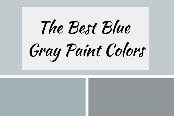
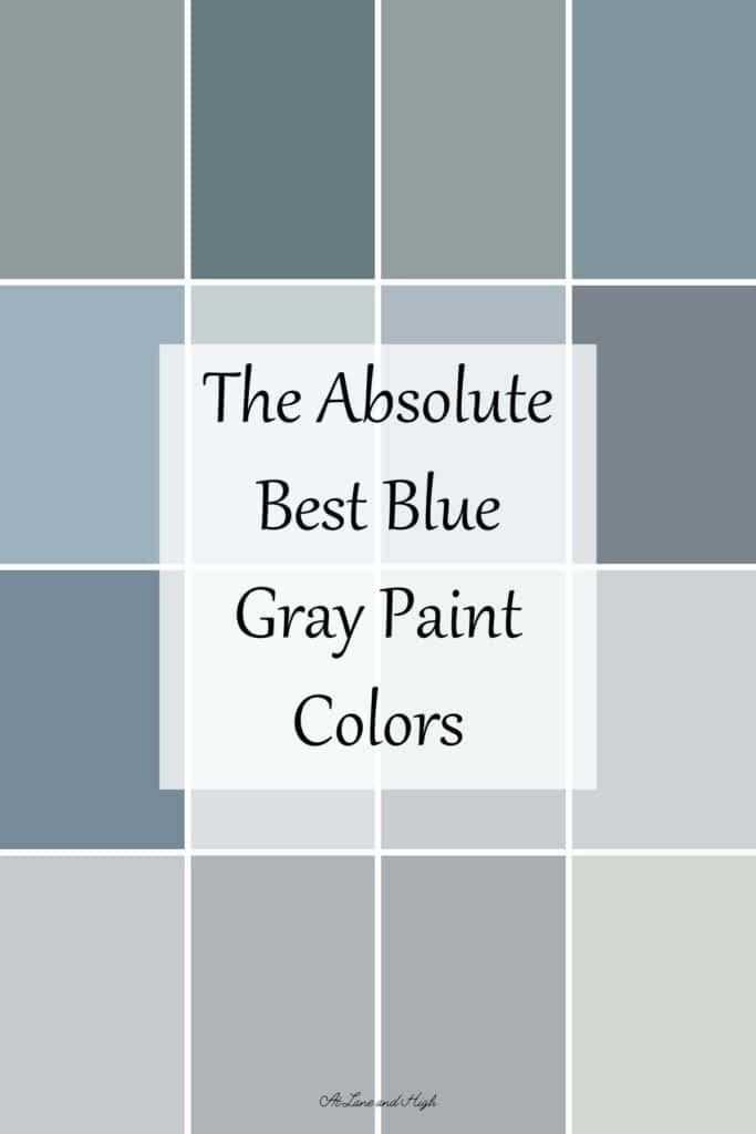
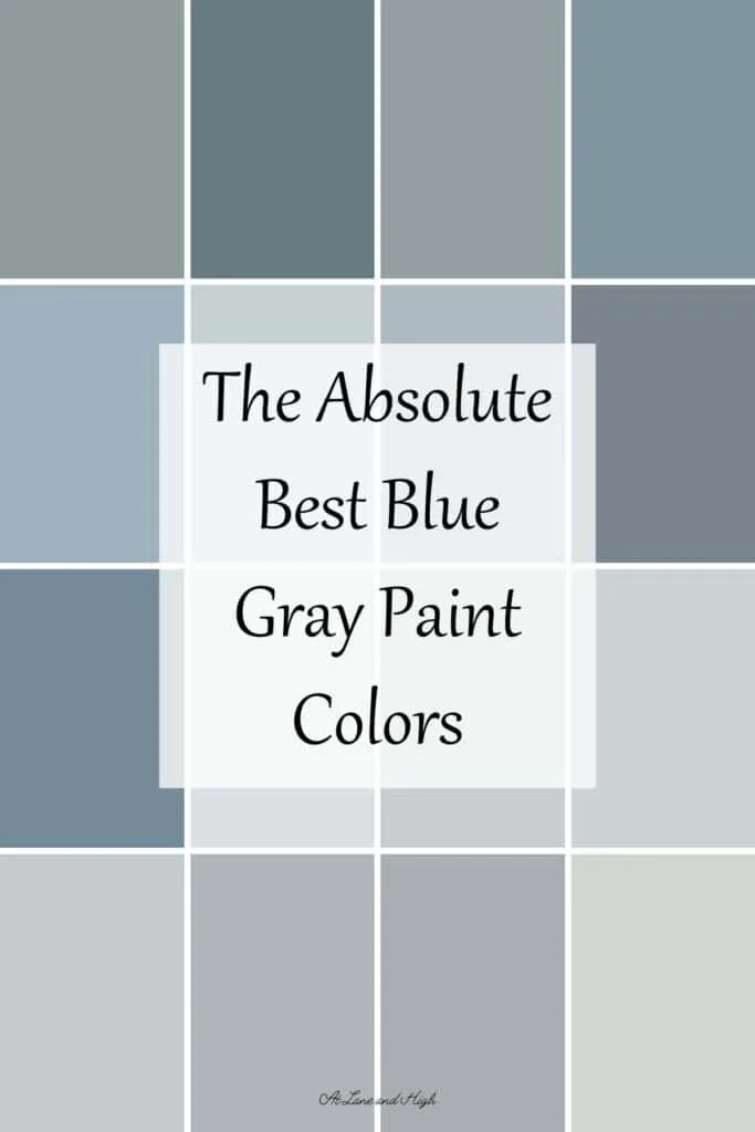
Blue Gray Paint Colors are so popular and for good reason! They can act like a neutral and let your decor stand out but they also add a touch of color to a space to give it some personality.
Another reason blue gray paint colors are so popular is that they work in any design style. It doesn’t matter if you have a modern look to your home or decorate with modern farmhouse style, blue gray paint colors will be perfect in your space.
I have gravitated towards the grays with blue in them a lot over the last several years. The home we moved into looks so much better with blue colors rather than the greige colors. Warm gray paint colors just look muddy here.
Because of this I feel like I have done the work and can give you a good list of amazing colors that will work in your home.

*This post contains affiliate links, for more details see my full disclosure.
What is a Blue Gray Paint Color?
This wording can get very confusing when you start mixing different colors together! I hear ya! So what does blue gray mean?
Blue paint colors have a very cool feel to them. You see the range from baby blue to dark navy. When they have gray undertones the blue is more muted rather than bright.
When they have a lot of blue undertones you can really see it come through. These are the colors that are considered blue gray.
Blue Gray vs Gray Blue – What’s the difference?
You might think these word combinations are interchangeable but they aren’t. The first word in these color combos is always the more dominant of the two colors.
Blue gray colors are more blue with lots of gray. They can also have other undertones but these are the most prominent colors.
Gray blue colors are more gray with lots of blue. They can also have other undertones.
How to know which color is right for you.
I highly suggest getting a paint sample and putting it on the walls. Look at it over the course of several days so you can decide which one looks best in all the different lights.
You can get a sample from the paint store but I really like Samplize. They will send you a 12X12 peel and stick sample that you can put on the wall and when you are done just toss it. No leftover paint can, no mess, just easy.
Where to use blue gray paint colors.
The easy answer here is anywhere. They can be very neutral and make a great backdrop for almost any decor.
Some darker blue grays should only be used in small doses due to their low LRV value. But here are my favorite places to use blue grays:
- Bathrooms are great for light to mid tone blue grays
- Bedrooms are perfect due to the calm feeling blue grays give
- Cabinetry is a popular choice
- The exterior of a home is a great place.
- Kitchen islands are a very popular place for blue grays.
Best Blue Gray Paint Colors From Sherwin Williams


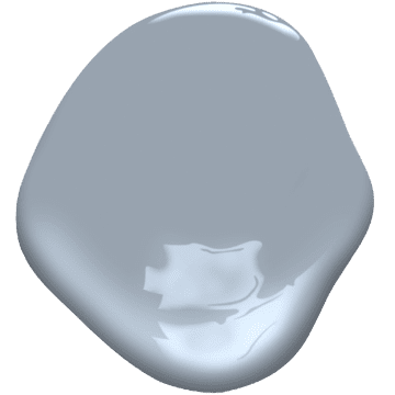
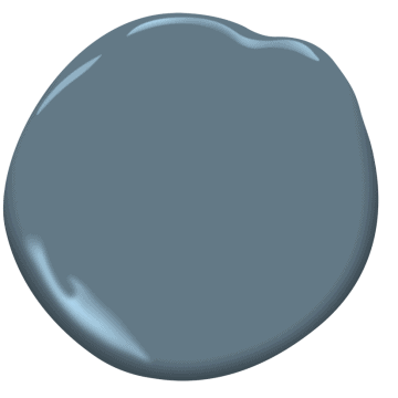
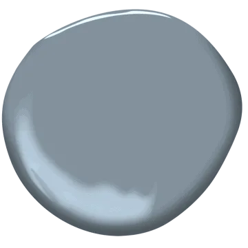
Gray Screen
Its popularity no doubt is due to its neutral color, yes it pulls more blue-gray but this color is one of the most neutral grays out there. That’s why people love it so because it works in just about any room with any kind of light.
Click here to get a 12X12 peel and stick sample of Gray Screen sent right to your home!


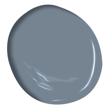
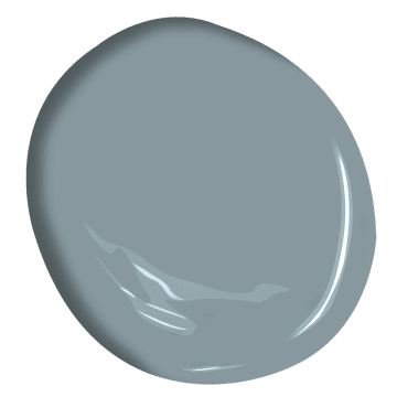
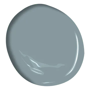
Online
Online is a more mid-toned color, not too light not too dark.
As you can see from this picture it pairs nicely with the bolder colors and blends well with subtle materials like marble. This would be a great color for a coastal theme because of its ability to work so well with other colors.
Click here to get a 12X12 peel and stick sample of Online sent right to your home!


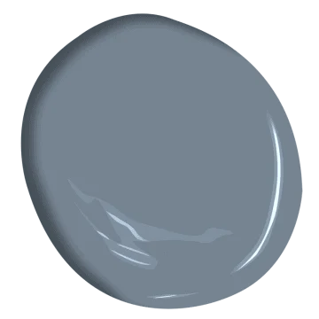
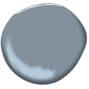
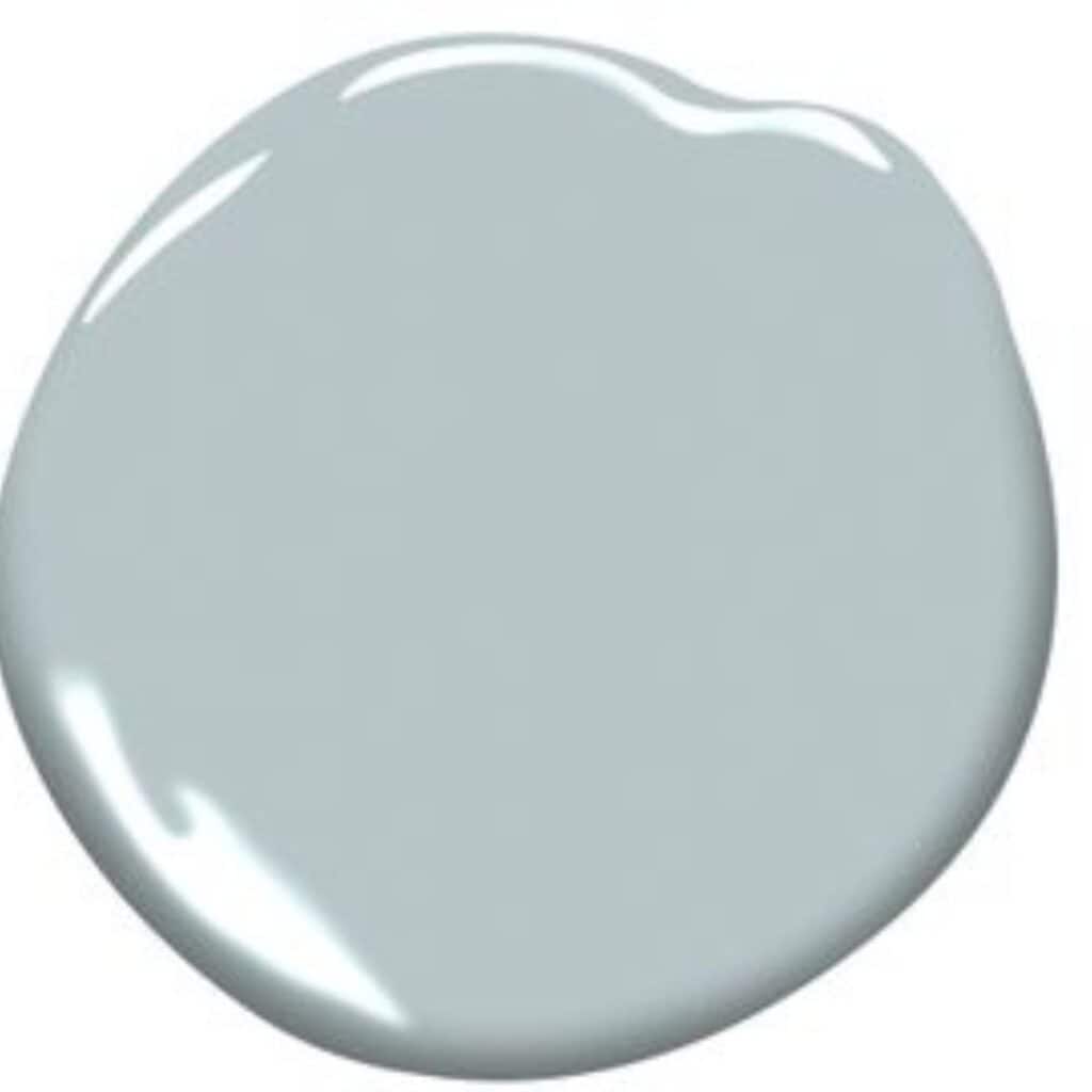
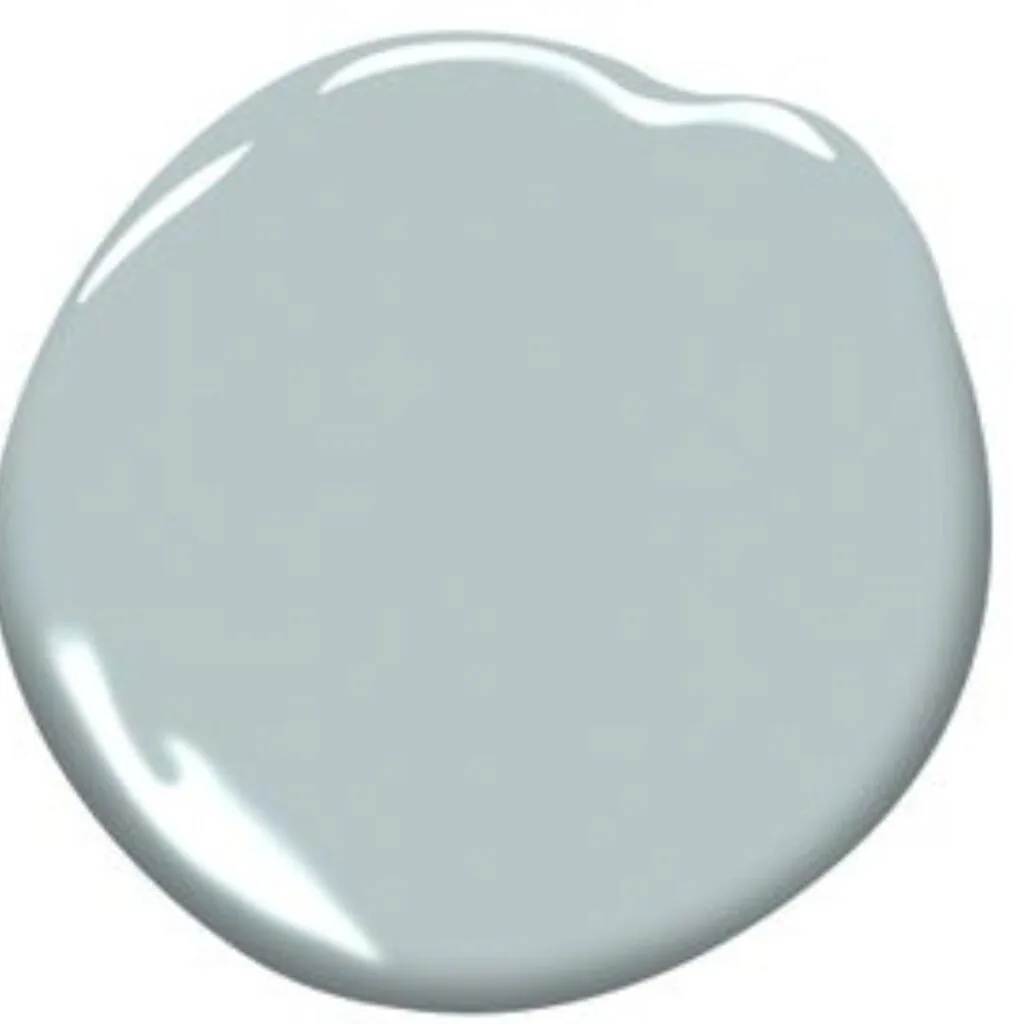
Software
This color is so dramatic I just love it. If you have a room with tons of natural light then this color with lots of white accents would be stunning!
If you are looking for a dark room, such as a theater room, but don’t want to go charcoal or black then this is the way to go. I love the steely blue nature of this color, perfect for an accent wall on a headboard wall in a bedroom!
Click here to get a 12X12 peel and stick sample of Software sent right to your home!


Morning Fog
Morning fog is a beautiful silvery-blue and has an LRV of 42. It reflects a ton of light but is a great accent color to the whites in the room.
Click here to get a 12X12 peel and stick sample of Morning Fog sent right to your home!


Reflection
As you can see Reflection is a very light color and true to its name, reflects a ton of light. The LRV for Reflection is 66 so if you have a dark room and want to brighten it, Reflection is a perfect choice.
It’s almost white but when paired with white trim you can definitely see the walls have color.
Click here to get a 12X12 peel and stick sample of Reflection sent right to your home!


Steely Gray
Steely Gray is the perfect name for this color. Its pull towards blue is apparent in this dark color.
This is my favorite of the darker colors mentioned here. It’s not too dark to overwhelm a room. You could use this on all the walls or just as an accent wall.
Click here to get a 12X12 peel and stick sample of Steely Gray sent right to your home!


Krypton
Krypton looks really well with warm wood tones! It’s mostly blue with a touch of gray and when paired with white it looks amazing.
Click here to get a 12X12 peel and stick sample of Krypton sent right to your home!


Serious Gray
This is one of Sherwin Williams darker gray colors. It has an LRV of 23 so it doesn’t reflect much light at all. This is a great color for accent walls, cabinets, or furniture makeovers.
I used this color in my modern coastal powder room as well as my mothers modern laundry room. It’s a stunning color and one of my personal favorites!
Click here to get a 12X12 peel and stick sample of Serious Gray sent right to your home!


Distance
Distance can vary its look in different lights. It’s a dark blue gray but when used in a room with tons of natural light really brightens up.
Click here to get a 12X12 peel and stick sample of Distance sent right to your home!


Granite Peak
Granite Peak is a lot like Distance but it has more gray in it. Both are very dark colors and are best used on focal walls, furniture, and cabinetry.
Click here to get a 12X12 peel and stick sample of Granite Peak sent right to your home!


Daphne
Daphne is a little more blue than gray but the gray in it mutes the blue and makes it not your everyday baby blue.
Click here to get a 12X12 peel and stick sample of Daphne sent right to your home!


Misty
Misty is a light blue color with a slate gray undertone. It has an LRV of 64.
This color is cool but pairs really well with warm colors as well as different wood tones.
Click here to get a 12X12 peel and stick sample of Misty sent right to your home!


Rock Candy
Rock Candy is a very light color with an LRV of 75.
Sherwin Williams considered this color a bright white with cool blue undertones. It also has a touch of gray. If you are looking for something close to white with a touch of color this is a great option.
Click here to get a 12X12 peel and stick sample of Rock Candy sent right to your home!


Upward
Upward is the color of the year 2024 for Sherwin Williams! It is a gorgeous blue with just a touch of gray.
This color evokes a sense of calm which we can all use in our busy lives.
Click here to get a 12X12 peel and stick sample of Upward sent right to your home!


Jubilee
Jubilee is a mid-toned color that is more. of a slate blue gray.
It is elegant and cool and perfect for a bedroom or bathroom.
Click here to get a 12X12 peel and stick sample of Jubilee sent right to your home!


Evening Shadow
Evening Shadow straddles the line between light and mid-toned. It’s a gorgeous neutral color with hints of blue and gray.
Click here to get a 12X12 peel and stick sample of Evening Shadow sent right to your home!


Icicle
This color is more of an off-white with blueish undertones. It’s very light and will brighten a dark room.
Icicle is considered a pastel with blue and purple undertones and a touch of gray.
Click here to get a 12X12 peel and stick sample of Icicle sent right to your home!


North Star
North Star is about 50% blue and 50% gray. Which makes one wonder if you should call is blue gray or gray blue.
This color is perfect for bedrooms and bathrooms because it is so calming.
Click here to get a 12X12 peel and stick sample of North Star sent right to your home!


Bracing Blue
This color gives a nod towards the color of denim. It’s cool and soothing.
Bracing Blue has the perfect amount of gray to keep the blue muted and it pairs really well with other colors in the room.
Click here to get a 12X12 peel and stick sample of Bracing Blue sent right to your home!
Best Blue Gray Paint Colors From Benjamin Moore

Comet
Here is what Benjamin Moore has to say about Comet:
Like the comet itself, this somewhat icy, dusty shade of gray takes its color cue from deep within the magnificent Solar System. Touches of blue and violet add to its striking depth.
Comet has an LRV of 35 so it’s not as light of a color as one would think when just looking at the paint swatch.
Click here to get a 12X12 peel and stick sample of Comet sent right to your home!
Bachelor Blue
Bachelor Blue is part of the Classic Collection which completely makes sense when you look at the color. It pairs really well with classic paint colors such as reds, yellows, and greens.
Click here to get a 12X12 peel and stick sample of Bachelor Blue sent right to your home!

Stillwater
Stillwater is a lot like Bachelor Blue and has many of the same traits. However, this color has an LRV of 17.55 which makes it darker.
If you are looking for a color that will stand out then this is the one! Stillwater will definitely steal the show in any room.
Click here to get a 12X12 peel and stick sample of Stillwater sent right to your home!
Water’s Edge
I really like Water’s Edge. It’s the perfect mid-toned blue color that is muted by that addition of gray. This color is considered a neutral because it pairs really well with just about any color.
Water’s Edge has a lot of blue with a touch of green and all pulled together and muted by the gray in it.
Click here to get a 12X12 peel and stick sample of Waters Edge sent right to your home!
Mineral Alloy
Quite a bit darker than Water’s Edge is Mineral Alloy. It’s also a neutral but on the darker side, still being firmly in the mid-toned range.
Mineral Alloy is one of those colors that pairs really well with just about any wood tone.
Click here to get a 12X12 peel and stick sample of Mineral Alloy sent right to your home!

Van Courtland Blue
In a well-lit room, this color can pull much more blue than gray. If that’s what you want then great! But if you are looking for more gray with hints of blue make sure you use this in a room with more artificial light than natural.
Click here to get a 12X12 peel and stick sample of Van Courtland Blue sent right to your home!


Manor Blue
Benjamin Moore says the addition of gray to Manor Blue gives it an elegance and sophistication.
Click here to get a 12X12 peel and stick sample of Manor Blue sent right to your home!


Silvery Gray
Silvery Gray is a light blue with a touch of silver, which makes it a little different than other colors listed here.
It also sits right between being a light and mid-toned paint color.
Click here to get a 12X12 peel and stick sample of Silvery Gray sent right to your home!


Slate Blue
Slate Blue is more of a blue green color with gray undertones. The gray keeps the color from pulling too gray or too green.
It’s also sits more on the darker side of the mid-toned range.
Click here to get a 12X12 peel and stick sample of Slate Blue sent right to your home!


Amsterdam
Amsterdam is a darker color with an LRV just under 30. Benjamin Moore says it has an old world elegance that blends with modern industry.
Click here to get a 12X12 peel and stick sample of Amsterdam sent right to your home!


Van Deusen Blue
Van Deusen Blue has an LRV just under 12 which makes it a very dark color.
This color fits very easily in both traditional and modern rooms.
Click here to get a 12X12 peel and stick sample of Van Deusen Blue sent right to your home!


Cloudy Sky
Cloudy Sky is just in the dark range. It’s a blue green color with strong gray undertones. You can almost consider it a gray with blue green undertones.
Click here to get a 12X12 peel and stick sample of Cloudy Sky sent right to your home!


Providence Blue
Providence Blue is a cool toned blue with slate gray undertones. It’s definitely on the dark side with an LRV just under 20.
Click here to get a 12X12 peel and stick sample of Providence Blue sent right to your home!
Smoke
Smoke is a mid-toned blue with both gray and green undertones. This color gives the illusion of the ocean. It’s absolutely stunning!
Click here to get a 12X12 peel and stick sample of Smoke sent right to your home!


Gibraltar Cliffs
Gibraltar Cliffs is a gorgeous mid-toned almost dark paint color with gray and green undertones.
Click here to get a 12X12 peel and stick sample of Gibraltar Cliffs sent right to your home!
Are you painting yourself? Then you will probably want to check out these posts:
- 5 Tips on Choosing the Perfect Paint Color for your Home
- 11 Must-Have Supplies for Painting a Room like a Pro
- The Best Paint Brushes For Latex Paint
Blue Gray Paint Colors FAQ’s
Do gray and blue go together?
If you made it down this far in the post then you have seen firsthand how blue and gray can go together. The truth is gray goes with just about every color!
Consider the color taupe, it’s a combination of beige and gray leaning heavily on the beige side. And there is greige color. This color is similar to taupe but leans more heavily on the gray side.
I have several other posts that have examples of how colors blend with gray. Check out my green paint colors post, black paint colors post, and greige paint colors.
What goes well with blue gray paint?
Blue gray paint colors on the walls go really well with just about any other color. The one thing I would encourage you to stay away from going gray on gray. For example, blue gray paint with gray carpeting and gray furniture is way too much gray.
Adding a little beige will go a long way. However, adding white will really make your blue gray paint colors pop! I highly recommend adding a crisp white with your blue gray colors.
What accent colors go well with blue gray walls?
Like I mentioned white is an amazing color to pair with blue gray walls. Other jewel-toned colors look really well too. Green colors look really well with blue gray, and happen to be extremely trendy right now!
If you are looking for more neutrals to go with your wall color try creamy whites, navy’s, and blacks.
See Related Paint Color Posts:
- The Best Black Paint Colors for Any Room in your Home
- The 12 Best Green Paint Colors for your Home
- Best Modern Farmhouse Paint Colors
- The Best Greige Paint Colors for your Home
- 6 of the Best White Trim Paint Colors
- The Best Blue Gray Paint Colors from Benjamin Moore


As a licensed Real Estate Agent and an avid home decorator, I strive to give my clients the very best I can when it comes to staging, selling, and decorating their homes. I have lots of experience with paint color choices and love to DIY my home so I can have everything just the way I want it. I share my ideas and projects with the world in the hopes that I can help others have their homes just the way they want as well.
Cathy
Thursday 5th of October 2023
Good evening. I have a brand new kitchen with SW Light French grey cabinets and white/grey quartzite countertops and backsplash. I would love a blue/grey recommendation for a wall colour. We have east facing windows. Any ideas? Thank you.
atlaneandhigh
Tuesday 24th of October 2023
Hi Cathy. Light French Gray is a gorgeous color! It's one of my favorites. Most people think because it's called light it is a light color but it's not. It's more mid-toned. I would go with a lighter color because dark might make the kitchen too dark and you need light to see what you are cooking. I really like Paper White or Oragami White. They are very light but with the slightest touch of blue-gray in them. And in the evenings they will be gorgeous when the sun is setting.
Gina D.
Thursday 6th of July 2023
I just saw this post while searching for blue gray BM paints. I have a typical cream/beige linen upholstered bed in a room with southern exposure. We also live in LI, NY so the weather during the winter months can be gray out which cuts down on the light. That side of the house has a neighboring house painted dark orangey beige. The 2 windows are only 34 x 35. Would BM pebble beach work or should I look choose something else? The floors are standard traditional oak orange/yellow. The closets and moulding are painted BM White Dove. The furniture is medium dark brown (walnut) but I may get new furniture in the near future. Thanks so much for your help.
atlaneandhigh
Tuesday 11th of July 2023
Hi Gina. I think Pebble Beach would look great. My only concern would be how it looks with your floors. I would definitely do a sample before committing to a whole can.
Dorene Habecker
Wednesday 9th of February 2022
Thankyou for the great insight here. Please comment- I have a west bedroom with a large widows along the west wall. There is warm colored oak flooring running throughout this 2000’s Tuscan style open design home . I painted Reflection in an east exposure music room which is beautiful. I am looking at reflection or on the rocks for this bedroom. The entire house has alabaster ceilings and creamy (sw) wood trim. What color would you suggest for the bedroom?
atlaneandhigh
Tuesday 15th of February 2022
Hi Dorene! I think you should give Reflection a try since you love it so much in the other room. You will notice a difference between the rooms though. In the bedroom, you will feel like the color is a bit darker in the morning but then when the sun is high and shining in the afternoon it will get really bright. The color will feel washed out a bit. If you love it in the other room and it works with your flooring then I think it should work in the bedroom as well.
Renda Downing
Tuesday 7th of September 2021
Would love to get your recommendation on exterior brick paint colors. We like sherwin Williams Cyberspace for the front door and black roof. What shade of gray would you recommend to paint the brick? What color for the garage doors? Trim?
Renda Downing
Tuesday 19th of October 2021
@atlaneandhigh, Thank you getting back to me. Update....... We are building a west facing home and love the clean modern farmhouse look. We are now committed to black roof, black windows and SW Cyberspace. I love the look of white with black windows but our neighbor's home is white. I am concerned that SW Network Gray brick body maybe too dark. We have been looking to use one of the fellowing for the body.....SW Online, SW Gray Screen, SW Light French Gray, or SW Argos. Can you please help us with a color combination that could work best together? Thank you so much.
atlaneandhigh
Tuesday 7th of September 2021
Hi Renda! So you want to paint the brick, I think I am reading that correctly. I would recommend two different grays, one a little darker than the other. You can choose how light or dark you want from there. Both of them are Sherwin Williams, Site White and Network Gray. For the garage door I would probably go the same color as the front door, the Cyperspace. I hope that helps!
Gabriela
Thursday 8th of July 2021
Hello can u help me please, I want to make my living room look like coastal beach look have blue curtains and few white furniture and black sofas what pain colour will you recommend, I like the blue grey theme paint but don’t want the room to look blue in between worm and relaxing, I got pebble beach but I find it to blue, gentle grey or eternity also eternity is from Benjamin or Sherwan William and do you recommend white ceiling thank you 🙏🏼
atlaneandhigh
Friday 9th of July 2021
Hi Gabriela! I feel you on the blue, and it's hard because every home is different. I would give Online a try, another option would be Reflection. Reflection is lighter than Online. Both are from Sherwin Williams. Coventry Gray from Benjamin Moore is also a great option. I would grab a sample of all three and put it on the wall and see which one you like best. Good luck!