
2019 Paint Colors of the Year
Each year the makers of all paint brands will come up with Paint Colors of the year. I have researched all of them and put together a list of them with pictures of them in use so you can see how that color looks in a home.
Some of the paint brands also have paint color trends for the year that I am sharing with you as well.
I have paint on my mind right now. I am getting ready to paint the interior of my home and have been thinking a lot about colors. Which brought me to these paint colors of the year.
*This post contains affiliate links. For more details see my full disclosure.
How to know which paint color to choose.
If you are interested in a new paint color and don’t know which one is right for you give Samplize a try. They will send you a 12×12 square of the paint color of your choice that sticks to the wall. When you are done it easily peels off. You can check out their website here.
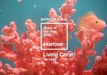
Pantone – Living Coral
Pantone describes Living Coral as “an animating and life-affirming shade of orange with a golden undertone”. Obviously, you can gather from the name that the color is based on the color coral but with a feeling of life and movement.
This is an amazing color that can add a major pop of color to your home. I personally would use this color in accessories.
It might be too much on the wall or an upholstered piece of furniture. Something fun would be to use it in an accent piece of furniture, like a side table or buffet.
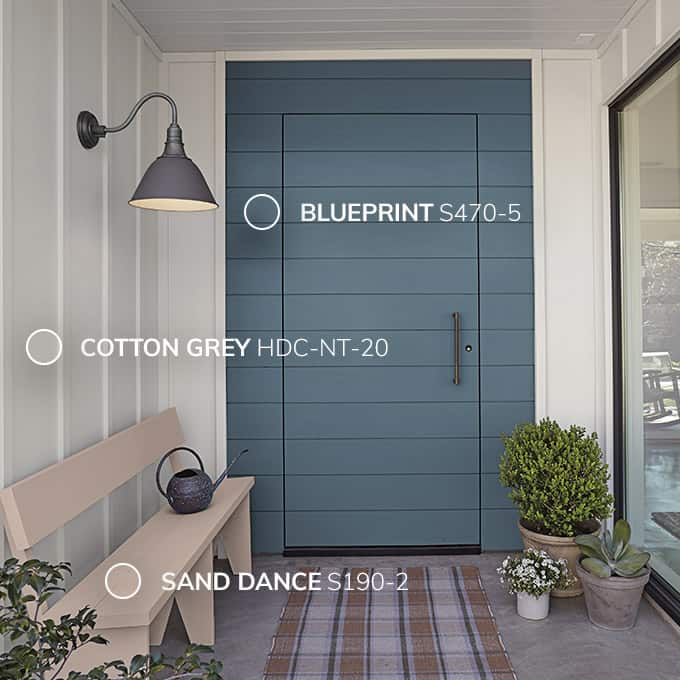
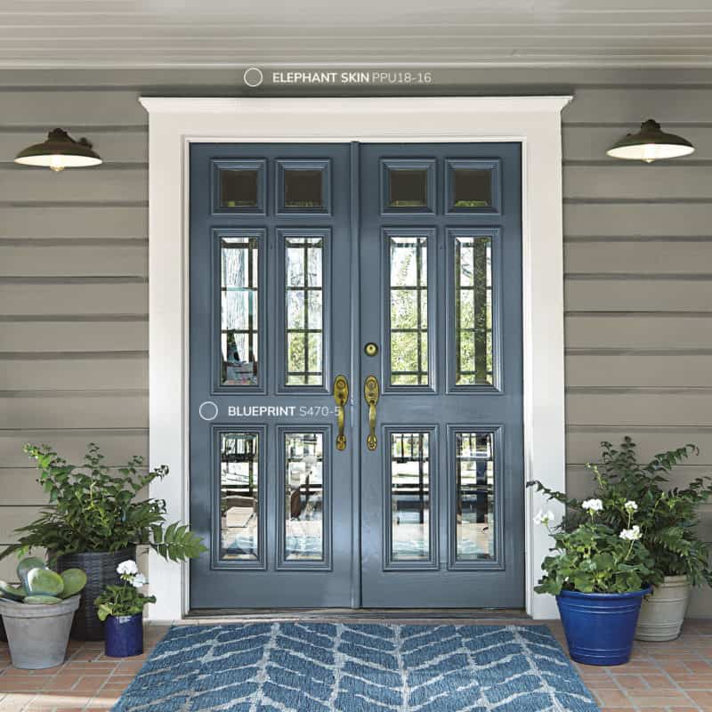
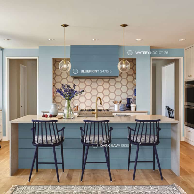
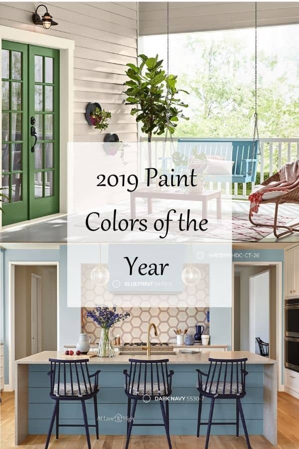
Behr – Blueprint S470-5
Blueprint is based on the color from architectural blueprints. It is a beautiful blue-gray that is a little muted.
I love this color and can’t wait to find somewhere in my home to use it. I think this would look amazing on a piece of furniture, cabinets, or front door.
Behr paint is available at your local Home Depot.

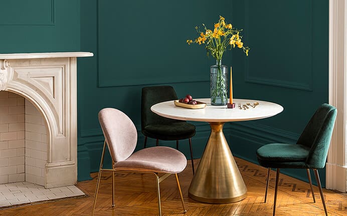
PPG – Night Watch (PPG 1145-7)
Night Watch is all about bringing the calming color of nature into your home.
The exact color of green is dark and cool which makes it very calming. I love using nature as color cues to decorate my home.
PPG has paint stores all over the country but it is also available at various local hardware stores. You can go here to see where a store is located near you.
Dutch Boy – Garden Patch 326-5DB
Garden Patch is another green but not the dark moody green of Night Watch. It’s more mossy, subtle and warmer.
The goal of Garden Patch is to create a feeling of rejuvenation and calm to your home.
Would you like to save this?
Dutch Boy can be purchased at Menards and other local stores. Here is a link to find one in your area.
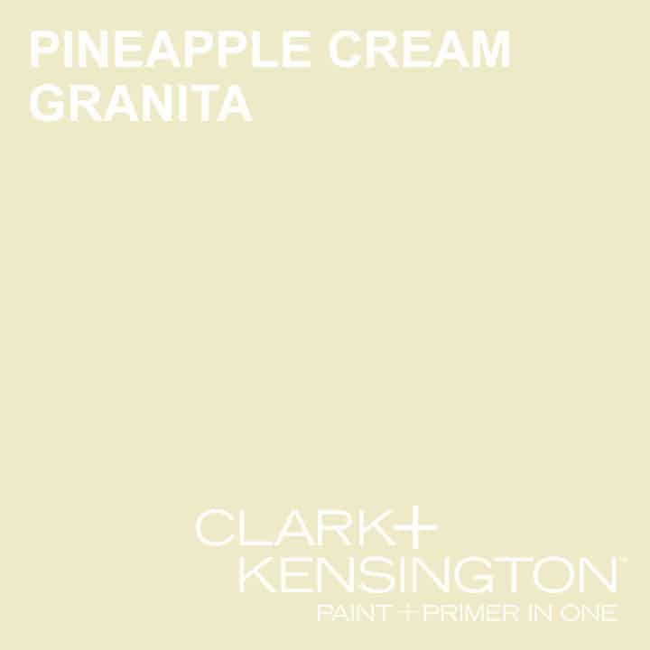
ACE (Clark and Kensington)- Pineapple Cream Granita
Pineapple Cream Granita reminds me of a beigey yellow color. It’s a beige that pulls yellow. I had a color similar to this in my second house.
I think this would make an amazing pop of color for a door or piece of furniture. Not to mention in pillows and accessories.
Clark and Kensington can be purchased at ACE Hardware stores.
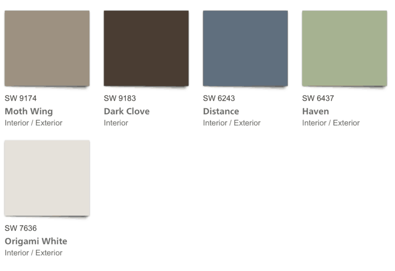
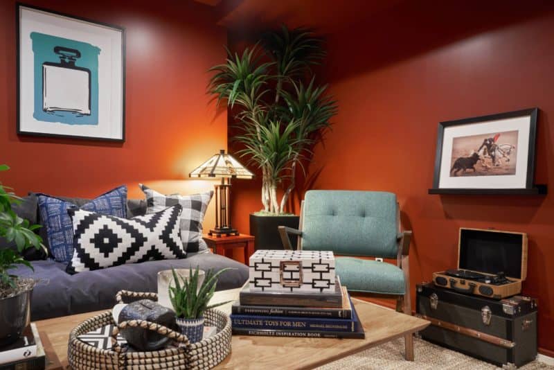
Sherwin Williams – Cavern Clay
Cavern Clay is a warm terracotta color that is just stunning! It really reminds me of the Southwest part of the United States, which is of course what they were going for.
This color would pair great with leather furniture, dark hardwood floors, and lush greenery.
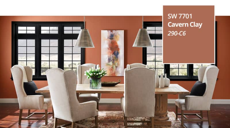
Sherwin Williams has put together a color palette which pairs well with Cavern Clay. Here it is.
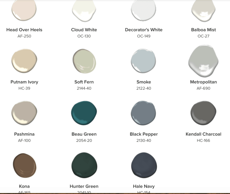
Benjamin Moore – Metropolitan AF-690
Metropolitan is a cool gray which is funny because I think the trend has been really going towards the warm grays. For example, the greige trend has been hot lately, maybe they see that trend changing.
It is a beautiful color, you can use it anywhere! I love this color for walls first because it creates a beautiful backdrop for your pops of color.
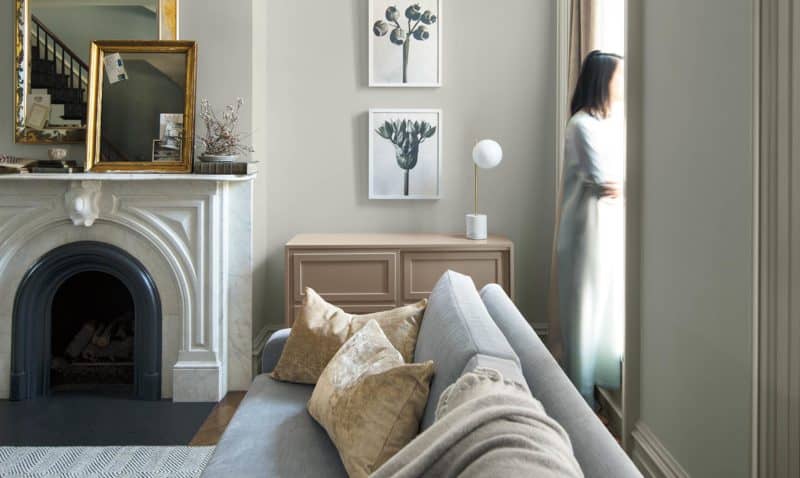
Benjamin Moore also has a paint color trends palette and shows some great options to pair Metropolitan with.
Dunn Edwards – Spice of Life
Spice of Life is a dark browned, fire brick red with orange undertones.
This color reminds me a lot of Cavern Clay from Sherwin Williams but it’s a bit richer. A little more red in it than Cavern Clay. It’s a stunning color!
Unfortunately, Dunn Edwards stores are only available in Arizona, California, Colorado, Nevada, New Mexico, Oregon, Texas, and Utah.
Related Paint Color posts:
- The Best Greige Paint Colors for your Home
- 6 of the Best White Trim Paint Colors
- The Best Cool Toned or Blue-Gray Paint Colors
- 2020 Paint Colors of the Year

Changing the paint color in your home can make a huge difference in the look and feel. Which of these paint colors of the year do you like best? Let me know in the comments!

As a licensed Real Estate Agent and an avid home decorator, I strive to give my clients the very best I can when it comes to staging, selling, and decorating their homes. I have lots of experience with paint color choices and love to DIY my home so I can have everything just the way I want it. I share my ideas and projects with the world in the hopes that I can help others have their homes just the way they want as well.


You’ve solved my dilemma! I’ve been searching for a color to paint my kitchen island and I’m in love with Blueprint!! These are such gorgeous paint colors and I can’t wait to try some of them.
What a great list! Now I want to go forth and paint all the things!
I am an off-white person myself. The entire inside of our house is that color. There is a reason. I have asthma and I am allergic to everything I breathe so I am not outside very often. I chose the off-white to bring light into my home and to brighten my days. I love it.
I love some of the colors you have displayed. I know that a lot of people are using gray and it looks nice but for me it is just sort of drab. I am not a fan of black or green either. I guess the off-white is a good choice for me.
Hi Linda! I remember that you have allergies. I am looking for an off white for my house, I have it narrowed down to two colors. Our new house is in the trees and so dark! Thanks so much for reading! I hope all is well with you.
Hi Wendy!
I came across your site and fell in love with the Blueprint color for my front door. It looks amazing. I was wondering if you remembered where the front door mat came from. I love that combo.
Thank you!
I love the glass double front doors featured in the Sherwin williams Blueprint color. Can you tell me a resource for that exact door set and transom?
I wish I could but that photo came from the Sherwin Williams website. Wish I could help!
Hi. I live at the beach and am painting my house. I want to make it look current and thought white trim would look good with SW Agreeable Gray but it is too washed out. What are your thoughts on SW blueprint with the agreeable gray?
Gina I absolutely love Blueprint! It’s no wonder that was their color of the year in 2019. I think that they would look amazing together. Since you already have the trim painted try putting a swatch of the blueprint next to it and see if you like it before committing to painting a whole wall or room. Oh how I wish I could live at the beach too! Enjoy!
Who makes the paint color, Watery? I also love the color Blueprint which looks good with watery. Thanks, Sheila
Hi Sheila, Sherwin Williams makes Watery. It’s number 6478, hope that helps!
Who makes the double door painted in blueprint with the glass panels. I believe it is an 8 ft door. 6 panels on each door