Cream Kitchen Cabinets: The Best 11 Colors
Upgrading your kitchen to cream kitchen cabinets is a really great way to give the space a modern feel without going too trendy. Today I will share the best cream colors for your kitchen cabinets as well as photos of them in real kitchens!
Cream is white with yellow undertones. It’s not as stark as white so your kitchen won’t feel too institutional.
Cream isn’t as bright as white either, most of the time. Some cream colors can be very white in rooms with lots of natural light but some have a gorgeous depth of color.
Which one is right for you? We will go into all that here.
*This post contains affiliate links. For more details see my full disclosure.
How to know if a paint color is right for you?
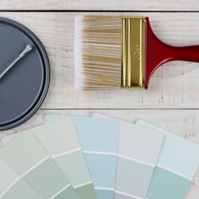
The best way to judge if a color is good for you then you will want to put a swatch on the wall and look at it over a few days. Look at it in different lights and decide if you really like it.
You can do this by getting a sample from the paint store and using a brush to put it up on the walls, but then you are left with a can that you can’t do anything with. Those samples are used with poor-quality paint and aren’t meant for use on your walls permanently.
I recommend going with Samplize. They are a company that will send you a 12X12 peel-and-stick swatch of a paint color that you can stick to the wall. When you are done just peel it off and throw it away.
It’s easy and much less messy!
Cream Kitchen Cabinets
Let’s break this into two categories, colors from Benjamin Moore and Sherwin Williams.
Benjamin Moore Cream Kitchen Cabinets
I love the colors from Benjamin Moore. They really are some of the most popular colors on the market.
Benjamin Moore Natural Cream
Benjamin Moore Natural Cream is a gorgeous creamy paint color that is really gaining in popularity! It is a modern take of off-white with touches of gray that gives you a feel of warmth without being too warm.


Natural Cream is probably one of my favorite cream colors available. Here Emma Courtney uses it on her kitchen cabinets. It pairs so well with the lighter wood tones, greens, and whites.
I love the monochromatic look between the cabinets, counters, and upholstery. That makes the accessories and table really the star of the show.
Benjamin Moore Soft Chamois
Soft Chamois is a gorgeous soothing off-white with just the right amount of yellow, not too much and not too little. It has an LRV of 77.4 which makes it a really bright color.
This color has the amazing ability to make a room feel much larger than it really is!


Soft Chamois is a lot like Natural Cream but it’s a good bit lighter as you can see here. The bright natural light of the room also makes the color a bit softer. If you are looking for a cream that isn’t too yellow this is a great choice.
Benjamin Moore Swiss Coffee
Swiss Coffee is a complicated off-white paint color. It has undertones of yellow, green, and a touch of gray. The gray keeps the yellow and green from being too dominant.
What you see instead is a beautiful creamy paint color that goes really well with most other paint colors.
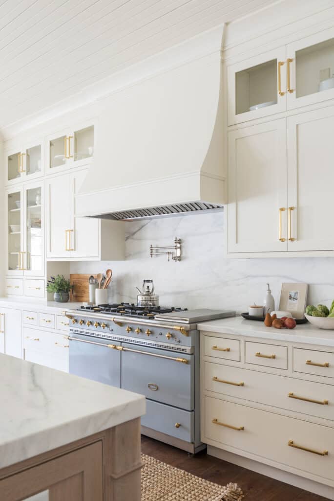
My friend used Swiss Coffee on her kitchen cabinets and they turned out gorgeous! As you can see here this color goes with just about every wood tone, color, and hardware finish. I absolutely love it with the gold!
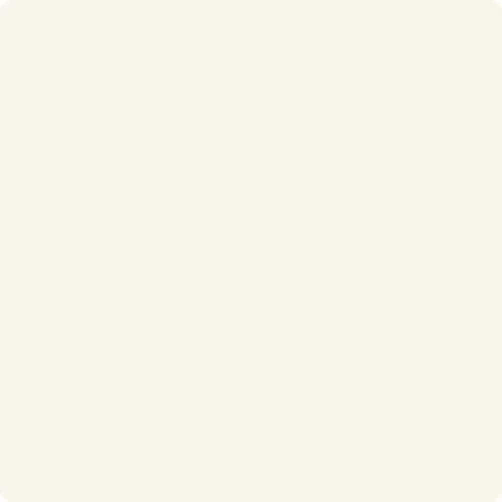
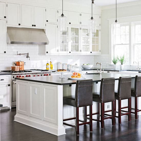
Benjamin Moore Linen White
Benjamin Moore Linen White is a gorgeous creamy white that honestly is more creamy than it is white. It is warm-toned.
This color gives your home a fresh feel just like fresh new linens feel on your bed or your upholstered furniture. And with an LRV of 82.45 it will definitely lighten and brighten your space.

This kitchen is a perfect depiction of how the yellow undertones shine through. But it gives such a beautiful warmth to the space and looks amazing with the white in the sink and countertops and the colorful pattern in the curtains.
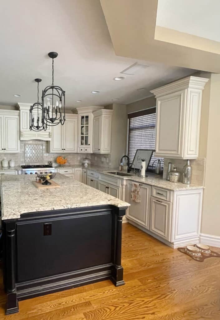
Benjamin Moore Cloud White
Cloud White is a warm white paint color with slight yellow undertones. What’s great about this color is that even though it has yellow undertones it has a neutral base which keeps it from being as warm as some of it’s counterparts.
The LRV of Cloud White is 87 which makes it very bright. While it is bright it also has this touch of softness that makes is like sitting on a cloud.
Would you like to save this?
As you can see this is a very light and bright kitchen. The paint color has just enough warmth to it which keeps this space from feeling stark.
You can also see how wonderful this color goes with the dark wood tones. And I love the black hardware.
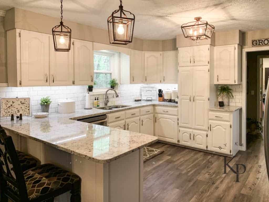
Benjamin Moore Navajo White
Both Benjamin Moore and Sherwin Williams have a paint color by this name. This BM version is a wonderful cream paint color but the neutral base is very stong which keeps the yellow subdued.
If you want a cream paint color but don’t want too much yellow this one might be right for you!

I love the look of this kitchen. This color pairs so well with the flooring. If you have wood stones that have an orange base this color will coordinate perfectly with them!
Sherwin Williams Cream Kitchen Cabinets
Sherwin Williams paints are one of my favorites. I think the quality is top of the line.
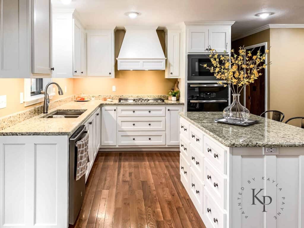
Sherwin Williams Alabaster
Alabaster was actually Sherwin William’s Color of the Year in 2016! It pairs nicely with dark colors, such as Urban Bronze and Gray Area. Sherwin Williams says the color sets the tone for healing, calm and restfulness so would be great in a bedroom.
Alabaster has decidedly yellow undertones which makes it a warm white paint color. It also has an LRV of 82.

This gorgeous kitchen looks great with the darker colors in the walls and floors. I also love how nicely it goes with the countertops. This space is definitely warm and inviting.
Sherwin Williams Natural Linen
This color is more of a light color with an LRV of 66. It is a warm neutral with greige undertones which really tones down the yellow.
This color looks amazing with light wood tones. Here is an example of Natural Linen in my small wine cellar in my own home.

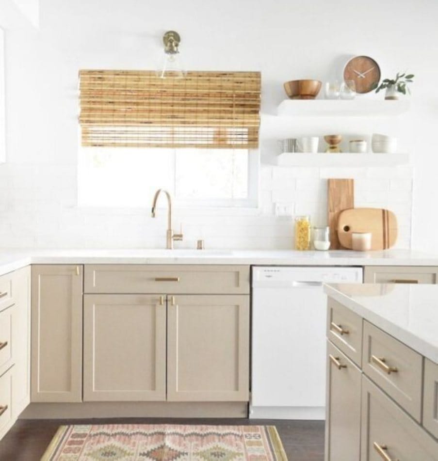
This is definitely one of the darker cream colors you can get. If you are looking for a light cream but one with a little more depth of color this is the perfect option.
Sherwin Williams Creamy
Creamy is a great paint color with an LRV of 81. This means it is really bright, almost a white. In a room with lots of natural light you will see it becoming more washed out while in a room with not a lot of light you will get more of the color that you are seeing here.


As you can see this color is very light and in a room with ample natural light it almost looks bright white. But pairing it with the lighter wood floors and the black and white counters you can really see the creaminess coming through.
Sherwin Williams Dover White
Dover White is another very popular color for trim. It tends to pull a little more orange than yellow but as far as neutrals go, this is the perfect warm white color. Dover White has an LRV of 82.

Here is another one that is very light. It has just enough cream in it go really pop off the darker wood floors. This is a great color to keep the kitchen from feeling too stark.
Sherwin Williams Antique White
Antique White is one of Sherwin Williams’s most popular light paint colors. It has an LRV of 72 so it’s a little dark to be considered an off-white but only barely.
This color has a gorgeous neutral base with a hint of yellow. It’s a stunning color if you don’t want to go too yellow.

This is another color that looks great with wood tones that have an orange base. I love how the Antique White cabinets play off the dark island color. This is a great contrast!
Other Kitchen Posts You Might Like:
- Kitchen Island Decor: 8 Styling Tips and Tricks
- How to Decorate Kitchen Counters
- Gorgeous Backsplash Ideas for Kitchens with White Cabinets
- 13 Timeless Black and White Kitchen Design Ideas
- The Ultimate Guide to White Kitchen Counters
- 17 Popular Kitchen Cabinet Colors
- The Best Kitchen Island Colors
- Kitchen Cabinet Hardware Trends


As a licensed Real Estate Agent and an avid home decorator, I strive to give my clients the very best I can when it comes to staging, selling, and decorating their homes. I have lots of experience with paint color choices and love to DIY my home so I can have everything just the way I want it. I share my ideas and projects with the world in the hopes that I can help others have their homes just the way they want as well.