The Best Kitchen Island Colors
Kitchen trends are always coming and going and with it being one of the most expensive rooms to renovate it’s hard to be too trendy. That’s why I like to stick to paint when keeping things on-trend because it’s always easy to paint over. Today I am sharing the 15 best kitchen island colors that are not only trendy but also very classic in nature.
One of the most popular trends in kitchen design right now is to have your island different color than your perimeter cabinets, or your lower cabinets different than your uppers. This can be achieved either through paint or wood tones and it creates a lot of interest and dimension in what can sometimes be a dull room.
Today I am going to give your examples of popular paint colors and stains that would be great options for you to use on your kitchen island!
*This post contains affiliate links. For more details see my full disclosure.
How to know if a paint color is right for you?
The best way to judge if a color is good for you then you will want to put a swatch on the wall and look at it over a few days. Look at it in different lights and decide if you really like it.
You can do this by getting a sample from the paint store and using a brush put it up on the walls, but then you are left with a can that you can’t do anything with. Those samples are used with poor-quality paint and aren’t meant for use on your walls permanently.
I recommend going with Samplize. They are a company that will send you a 12X12 peel and stick swatch of a paint color that you can stick to the wall. When you are done just peel it off and throw it away.
It’s easy and much less messy!
There are many pros and cons to having your island be a different color than your other cabinets. Let’s explore what they are.
Should a kitchen island be a different color than cabinets?
This is 100% personal opinion. I really like the look and feel like it can give a kitchen a lot of personality especially if the other design elements are muted.
If you have a flashy backsplash then you might not want to go with a different color island because they will compete with each other. You have to choose which of these elements you want to be the star of the show.
Pros
- A different color island creates a focal point for a kitchen space.
- A pained island can break up an all-wood look.
- Painting is affordable – no need for an expensive remodel.
- This type of look is very on-trend and can modernize your kitchen.
Cons
- A different color island can make a small kitchen look busy especially if you also have different types of countertops.
- This can sometimes create competing focal points with another design element.
- This type of look is trendy and can become outdated in a matter of a few years.
What kind of paint should you use on your kitchen island?
There are a lot of different types of paint that can be used from chalk paint to latex and everything in between. My first choice would be a latex and oil-based paint combination that has the durability of oil-based but the ease of applying of a latex.
I use a product from home depot on all my cabinets, furniture, and baseboards that is called Alkyd. I have used this on my stair renovation, my board and batten projects, as well as my beadboard. I am about to use it on a piece of furniture that will go in my daughter’s college room.
You can buy this type of paint from about any paint manufacturer, I know Benjamin Moore and Sherwin Williams make this type as well. It is a little bit pricier than regular latex paint.
Now if you need something a little cheaper you can totally use regular latex-based paint. Just keep in mind that you will probably have to do touch-ups from time to time, especially if you have kids and dogs.
The type of finish you want for your cabinets would be either a semi-gloss or satin. A semi-gloss will have a bit of shine to it and if this turns you off completely then the satin will work just fine.
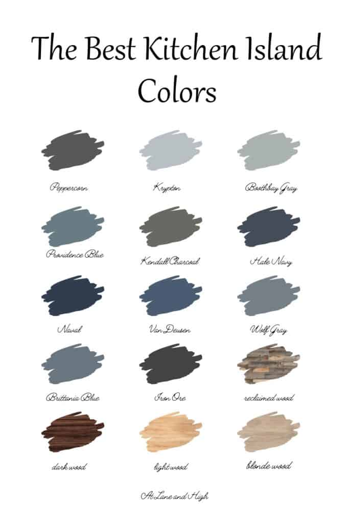
Kitchen Island Colors
Here are the most popular colors for kitchen islands as well as some amazing photos of them in real homes. Each photo is linked to the original post for that color if you want more details on any of them.
Sherwin Williams Peppercorn
Peppercorn is a gorgeous almost black paint color. I just love these dark paint colors for islands, they create such a contrast from lighter cabinet colors.
This color also looks amazing with just about every color of wood so if you have hardwood floors this is a great option.
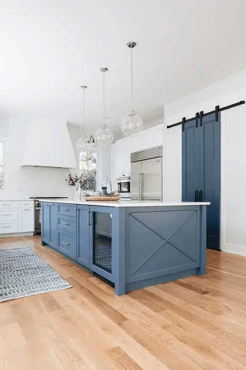
Sherwin Williams Krypton
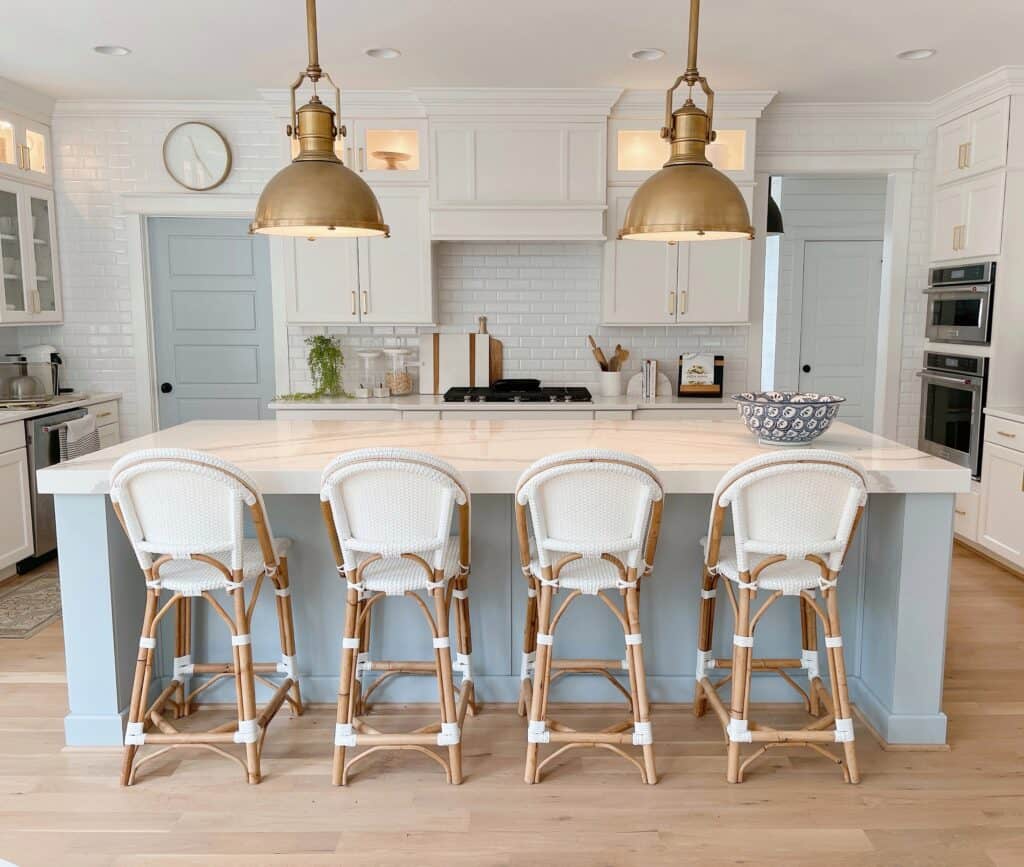
This light blue color blends really well with other light colors and gives a wonderful coastal or nautical vibe. I love that Chrissy took the color from the island and used it on the door. Using the color in multiple places makes it more intentional.
Benjamin Moore Boothbay Gray
Ah Boothbay Gray is one of my favorite paint colors! This color looks amazing with black, silver, or gold hardware. Not to mention how gorgeous it looks with the floors in this photo!
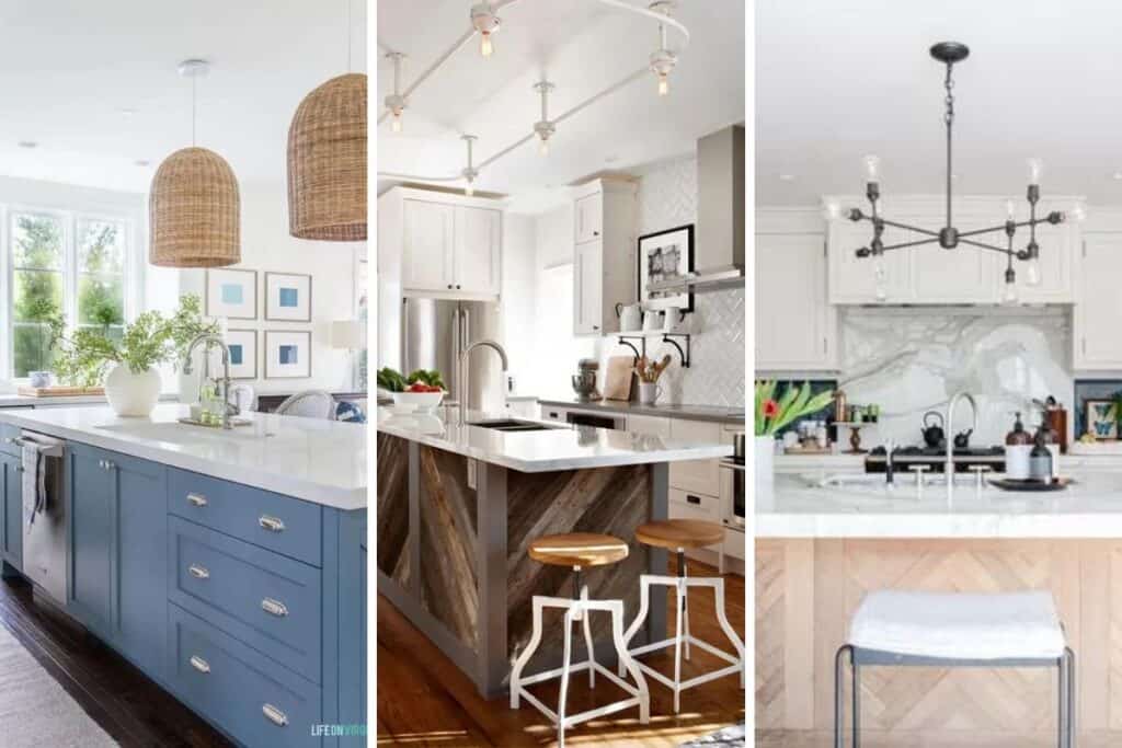
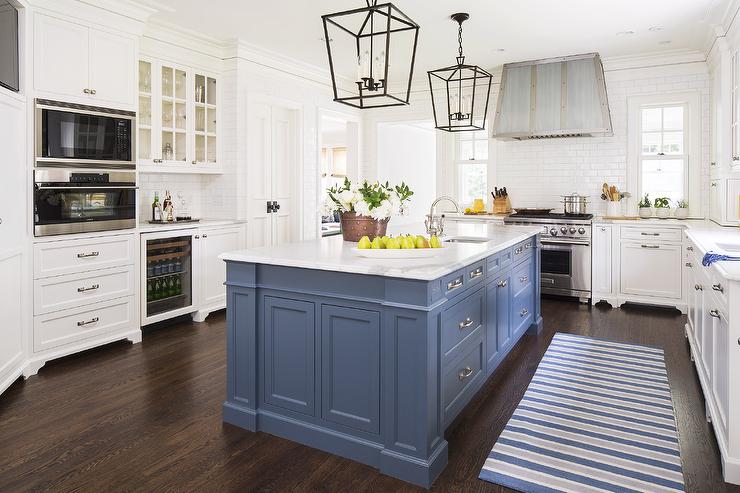
Benjamin Moore Providence Blue
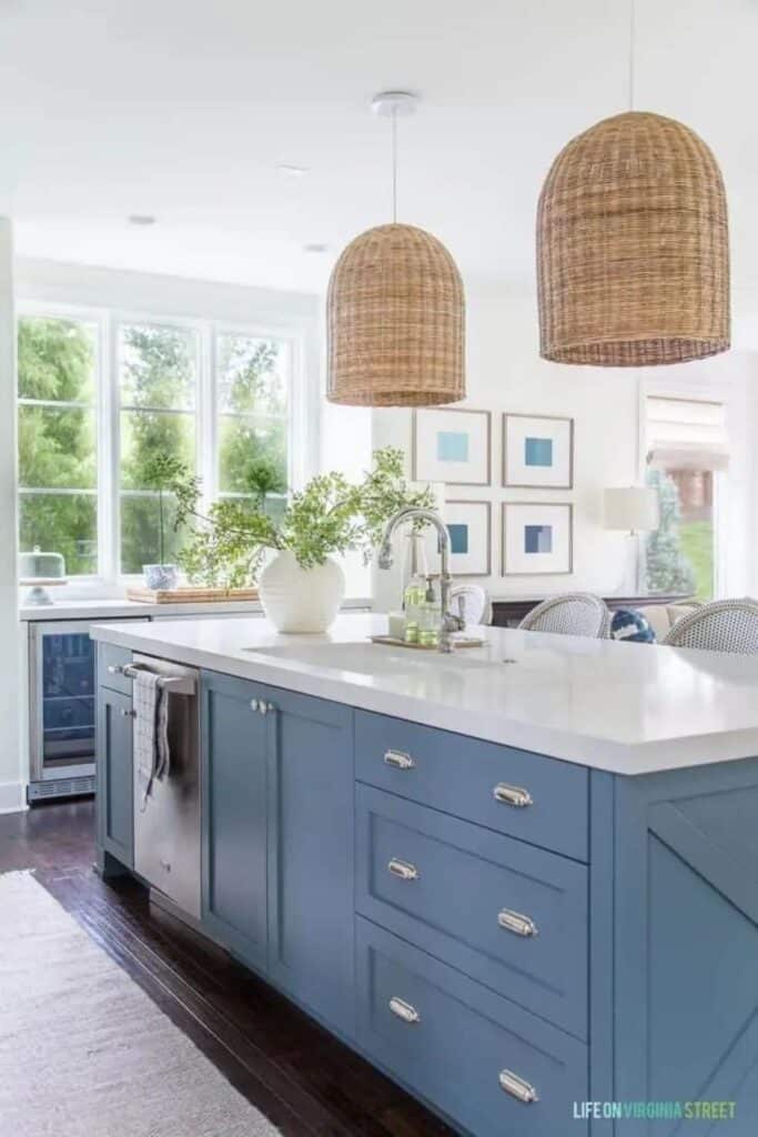
There is no doubt that blues are very popular choices for kitchen island colors. Providence Blue is great at creating a contrast with both woods and white. If you have an all-wood kitchen it would be gorgeous paired with it just like it’s gorgeous here with the white.
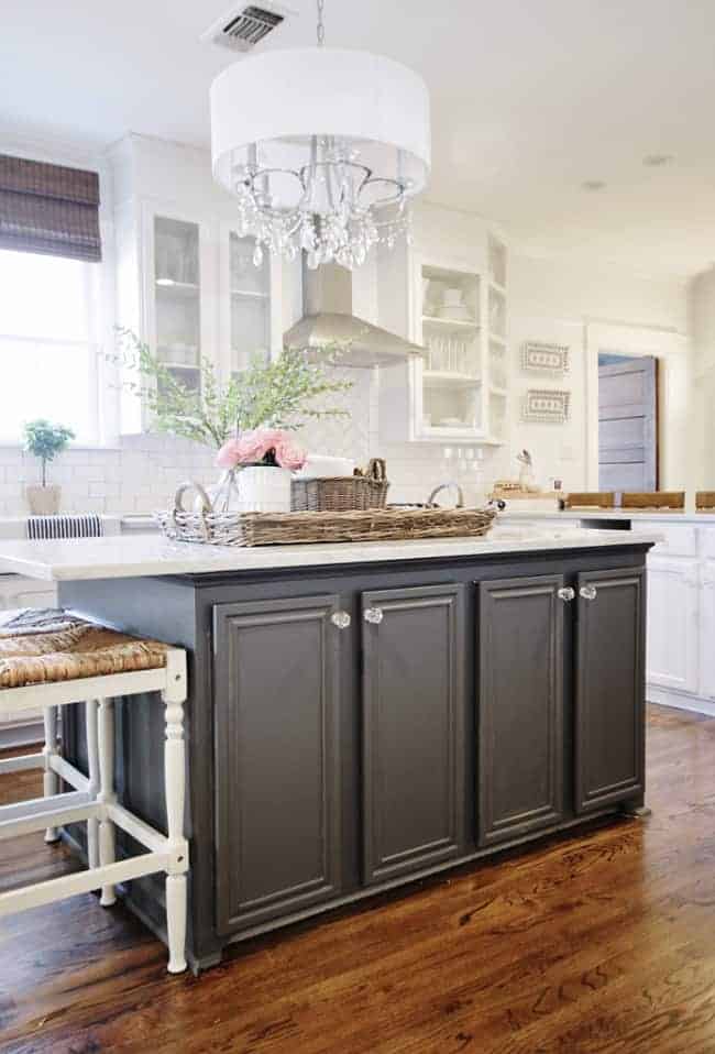
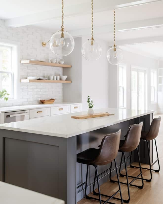
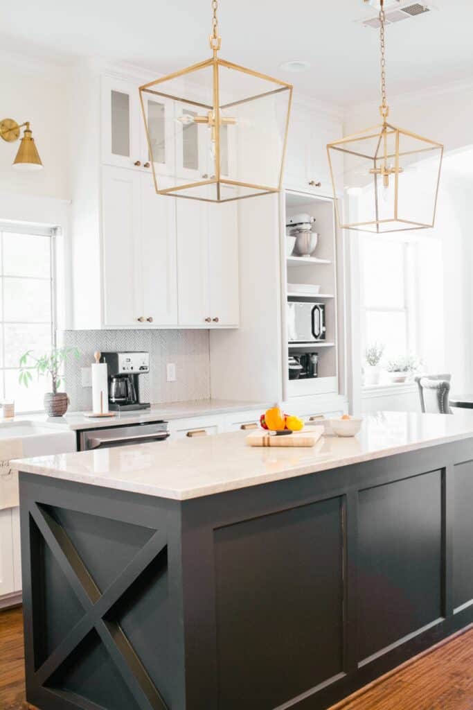
Benjamin Moore Kendall Charcoal
Would you like to save this?
Just as blues are very popular so are dark colors. Kendall Charcoal is a stunning dark gray that almost looks black in some lights. I love how well it goes with the browns in the wood floors as well as the browns in the leather bar stools.
It contrasts so nicely with the white on the perimeter as well. Notice here they do not have a contrasting backsplash, that would compete with the contrasting island.
Benjamin Moore Hale Navy
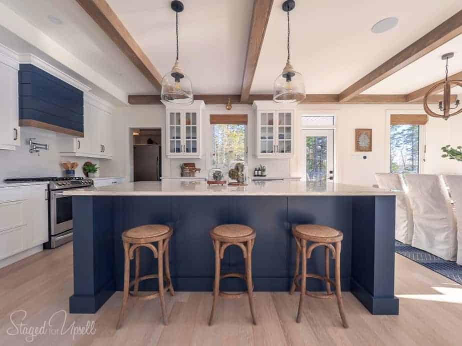
Hale Navy is one of the kings when it comes to navy blues, at least for Benjamin Moore it is. It’s a very nautical color that looks amazing with different shades of wood and contrasts beautifully when paired with lighter paint colors.
Sherwin Williams Naval
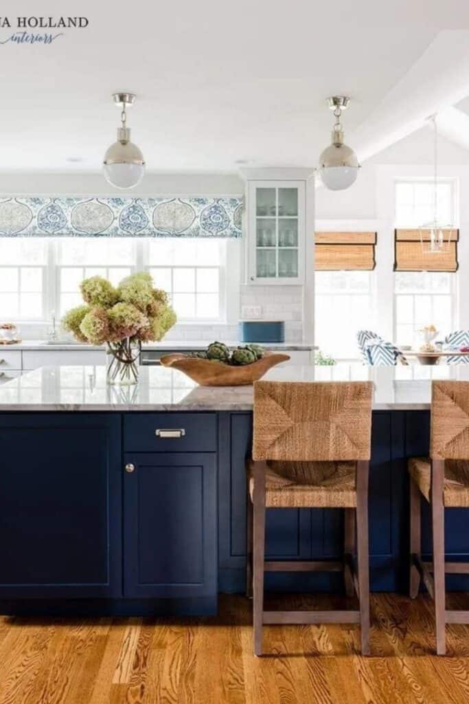
Naval is the king of navy blue for Sherwin Williams. It’s a touch darker than Hale Navy but has the same characteristics when paired with woods and light colors.
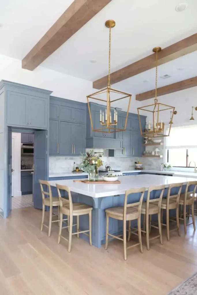
Benjamin Moore Van Deusen
Van Deusen is a lot like Providence Blue. They both look amazing with all different finishes of hardware and when paired with marble countertops you will have a stunning combo!
Benjamin Moore Wolf Gray
Even though it’s called Wolf Gray this color definitely has strong blue undertones. It looks amazing when contrasted with white (especially marble) and the light hardwood floors.
Benjamin Moore Brittania Blue
Brittania Blue is similar to Van Deusen but is a touch lighter so if you want to go for lighter and brighter this would be a great choice. It gives great contrast without being overpowering and goes with just about any finish of hardware.
Sherwin Williams Iron Ore
Iron Ore is a perfect color if you want something very contrasting. It works really well with white perimeter cabinets but also would be great if your perimeter cabinets are wood toned!
Reclaimed Wood Island
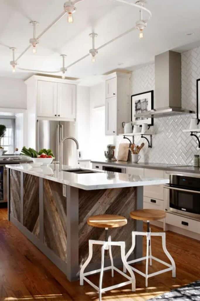
One way to break up color is to use wood instead of paint! I love the look hear of the rustic reclaimed wood contrasting with the crisp painted white cabinets.
The combination of rustic and refined can really inject a ton of personality into what is normally a very sterile space.
Dark Walnut Island with White Cabinets
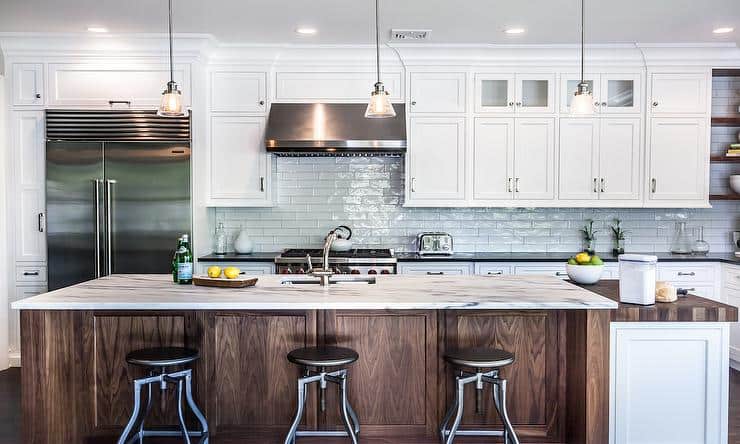
If you like the wood island but the reclaimed wood look is too rustic for you then just go with a dark stained wood island contrasting with white cabinets. You can still have that refined look with the contrast of wood and white.
Notice also here they used black counters on the white cabinets and marble-looking counters on the wood. Love this, it’s also very on-trend.
Wood Island with Dark Painted Cabinets
You don’t always have to use a wood contrasting with a white paint color. You can contrast a darker paint color with a lighter wood-toned island and have the same dramatic effect! I love how they used the same counters and hardware and have the finishes different.
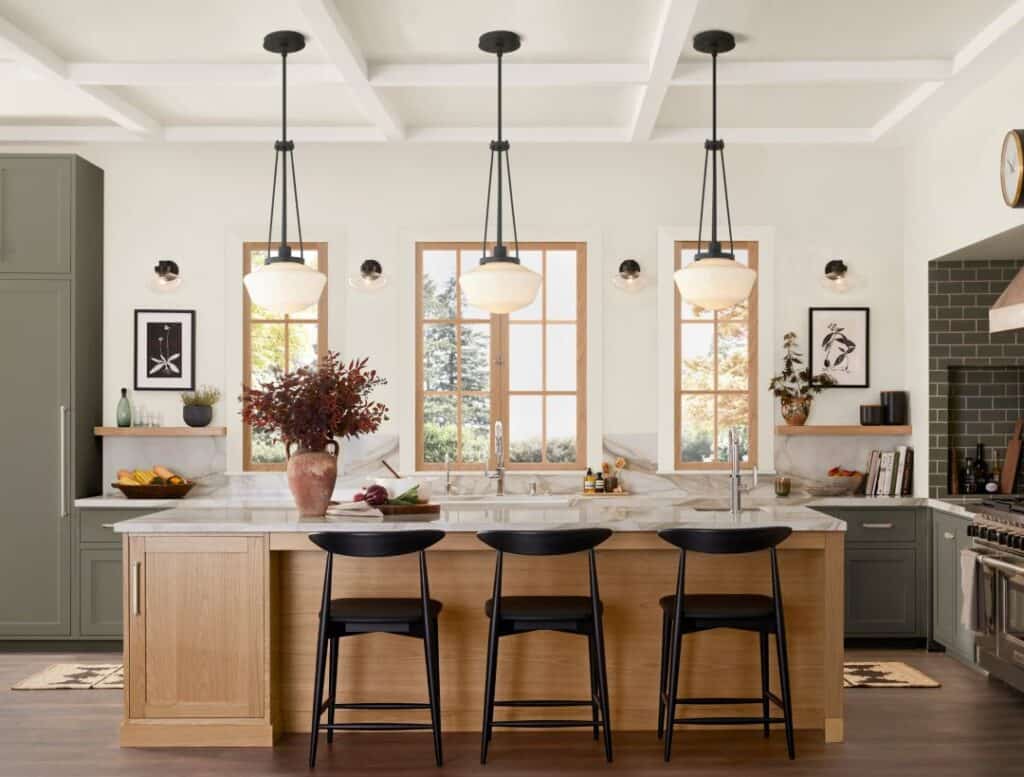
Light Wood Kitchen Island
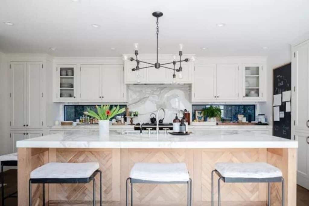
Light wood islands aren’t just for contrasting with dark paint colors. I love the light wood tones here paired with white. What I love even more is how they created texture with the herringbone pattern on the island. I am a sucker for herringbone!
Other kitchen posts you might like:
- 25 Kitchen Cabinet Organization Ideas
- The Ultimate Guide to White Kitchen Countertops
- 13 Black and White Kitchen Desing Ideas
- 17 Popular Kitchen Cabinet Colors
- 12 Ways to Update Your Kitchen Without Remodeling
- The Best White Paint Colors for Kitchen Cabinets
- Kitchen Staging Ideas: Low-Cost Tips to Make Your Kitchen Shine
- 13 Small Kitchen Storage Ideas: Organization Tips and Tricks
- Kitchen Cabinet Hardware Trends
- The Best Paint Colors for Honey Oak Cabinets
Kitchen Island Colors Conclusion:
The most popular way to use a different color in your island is to go with a contrasting color. I have shown you many options here today.
If you want something similar you can choose one of the lighter colors but just a shade darker or a light blue with white or light wood cabinets. These will all be great options and by treating your island with a different color you can make your kitchen on-trend without having to remodel!

Kitchen Island Colors

As a licensed Real Estate Agent and an avid home decorator, I strive to give my clients the very best I can when it comes to staging, selling, and decorating their homes. I have lots of experience with paint color choices and love to DIY my home so I can have everything just the way I want it. I share my ideas and projects with the world in the hopes that I can help others have their homes just the way they want as well.