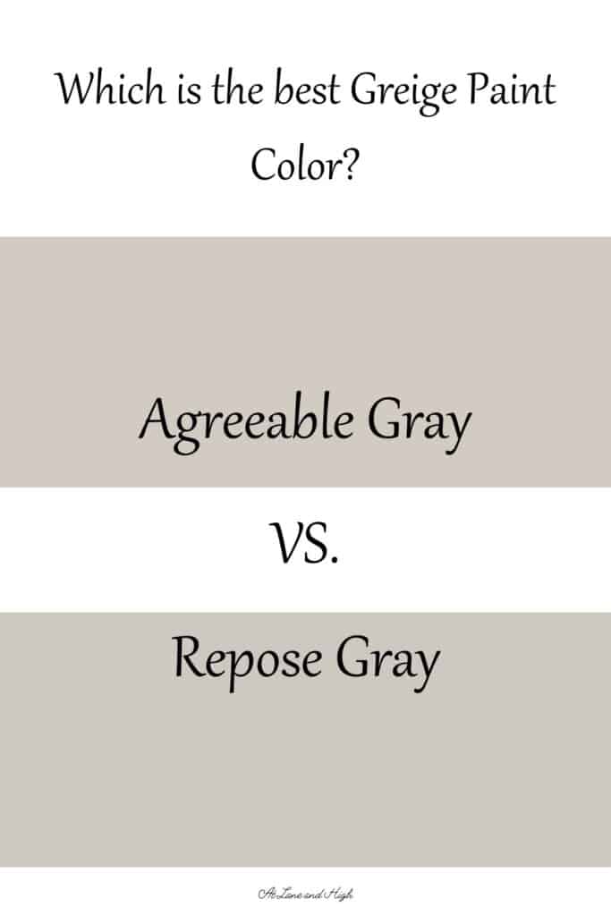
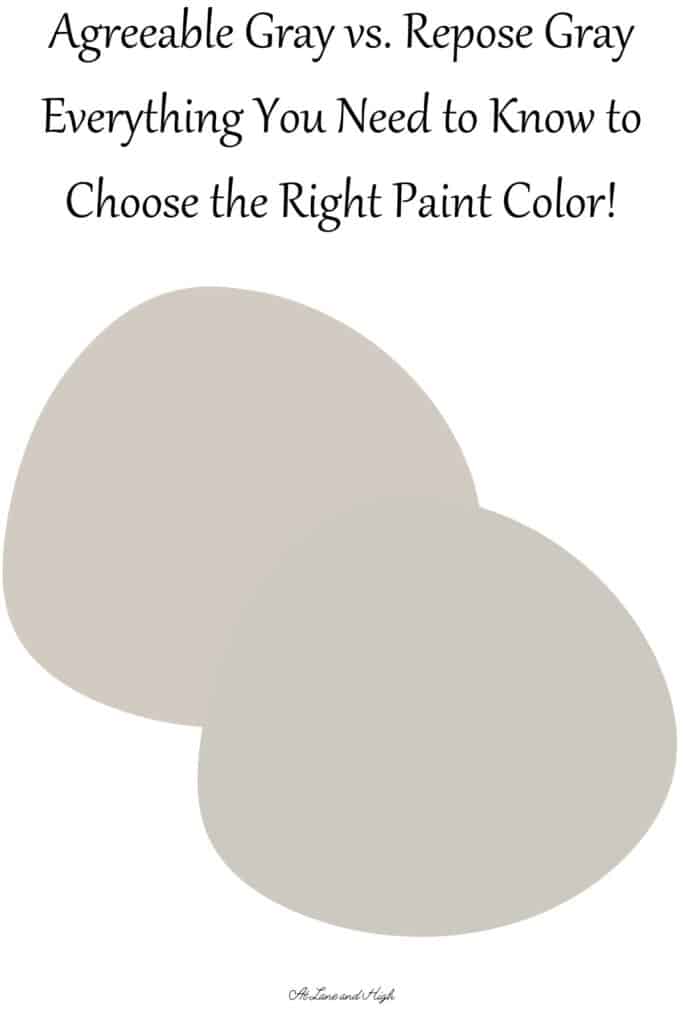
Agreeable Gray vs Repose Gray: A Deep Dive into These Colors
Trying to decide between Agreeable Gray vs Repose Gray can be a daunting task. I want to help you make that decision by giving you all the facts about each color and great ways to use them in your home.
I am the type of person who researches a lot before making a decision on something. Especially when that something is going to cost me about $50 and a day’s work.
When it comes to choosing paint colors I am no different. I have done a ton of research on greige paint colors and today I will take you through all the details on each color.
If you want to you can go to my post on Agreeable Gray and Repose Gray to get more in-depth info on each color as well as tons of pictures of the colors used in real homes!
Before we dive in I also want to mention that the best way to know if a color is right for you is to put a sample on the wall and look at it in different lights of the day. I like to use Samplize for this.
Samplize is a company that will send you a 12 by 12 peel and stick sample of any color and when you are done you just throw it away. You won’t have to deal with any leftover paint cans and it’s totally mess-free!
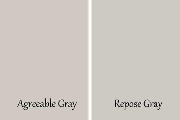
A Quick Look at Agreeable Gray vs Repose Gray
Most of the time when you look at these paint colors on a large scale you won’t see much of a difference. It’s when you put them side by side the real differences come to light.
Agreeable Gray is a mid-light gray paint color that has a lot of beige in it. Because of this beige, it is considered a greige paint color.
Repose Gray is also a mid-light gray paint color that has a touch of beige in it. It is considered a greige but only just so. Both of these colors are warm and will give your home a cozy feel.
Agreeable Gray has an LRV of 60 and Repose Gray has an LRV of 58. What does that mean? It means Agreeable Gray is slightly brighter than Repose Gray.
If you are looking for a color that will be brighter and bounce more light around then Agreeable Gray is the better choice. The higher the LRV number the more light the color reflects.
Undertones of Agreeable Gray vs Repose Gray
The undertones really make all the difference when comparing these two colors. While they both are considered a greige they are very different shades in terms of what colors make them up.
Agreeable Gray
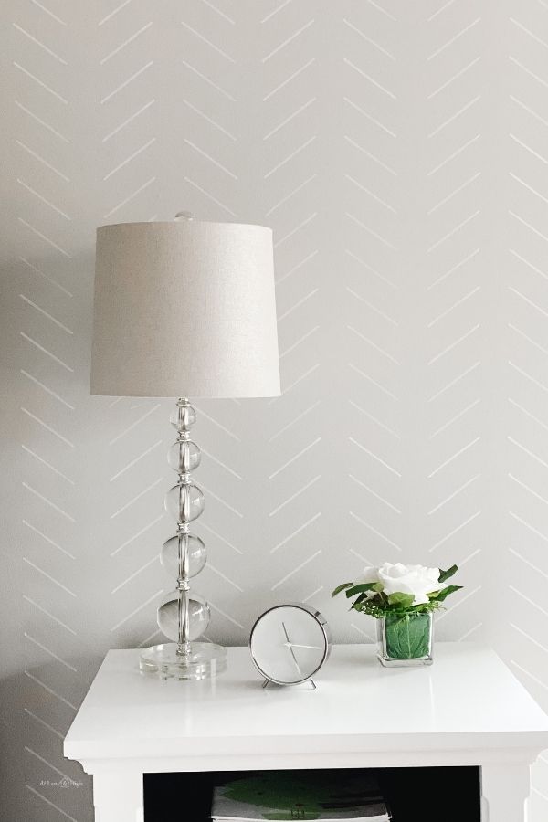
Agreeable Gray has more beige in it but it also has some pink and purple to it. In other lights, it can pull slightly blue. This is one of the things that makes it so popular is that it changes and can meld to its environment depending on the light and other decor in the room.
I am going to tell you that 99% of the time you will have a warm greige that will be slightly more beige in a south-facing room or a room with little natural light. In a room that has tons of natural light, you will see this color pull more gray.
I have this color painted in my daughter’s bedroom on our lower level. There isn’t much light at all in there from the windows and this color has a slight purple pull to it. When you look at it the color doesn’t look purple but when you pair it with other cool-toned colors you tend to see the purple come out.
Repose Gray
Repose Gray is also a greige but only has a touch of beige to it. This color has a strong undertone of green which keeps it from being as warm as Agreeable Gray.
The addition of this green tones down the warmth just a bit and can sometimes be seen as more neutral than Agreeable Gray.
Would you like to save this?
It’s really important what other colors you pair it with. If you have a lot of green in the room, for example in window treatments or a large area rug, you will see the green undertones come out more. If you pair it with other warmer tones or even whites then Repose Gray will look like a very neutral gray color.
The Best White Colors to go with AG and RG
Since Agreeable Gray and Repose Gray are both warm white colors I suggest any of these white colors to go with them for the trim or even cabinetry or any other place you want to have a white color.
- Sherwin Williams Dover White
- Sherwin Williams Alabaster
- Sherwin Williams Pure White
- Sherwin Williams Extra White
- Sherwin Williams Eider White
Best Coordinating Colors to go with AG and RG
If you are looking for coordinating colors I like to pair Agreeable Gray and Repose Gray with other tones that are contrasting rather than similar.
I have a post dedicated all to Agreeable Gray Coordinating Colors, you can check that out here if you wish.
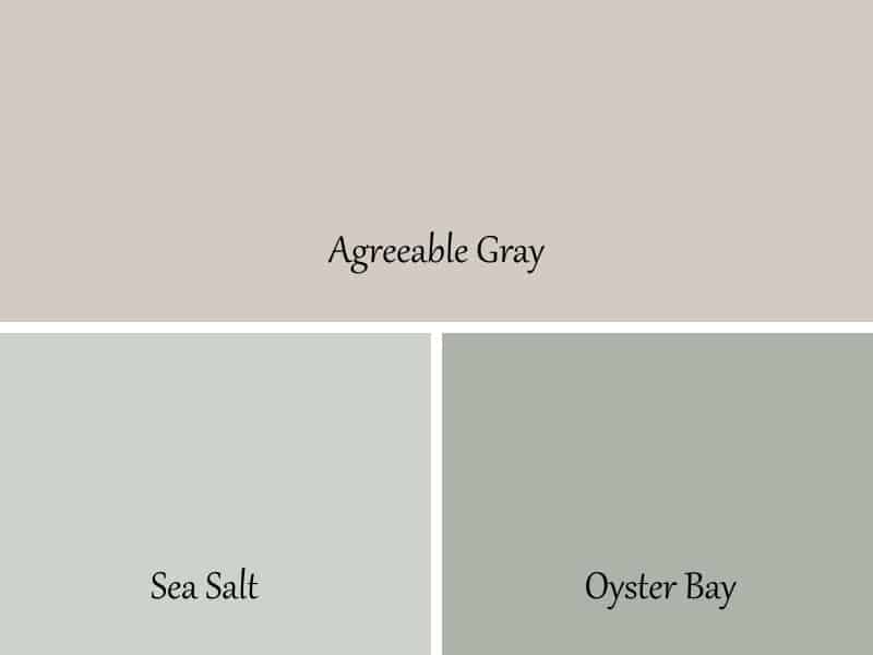
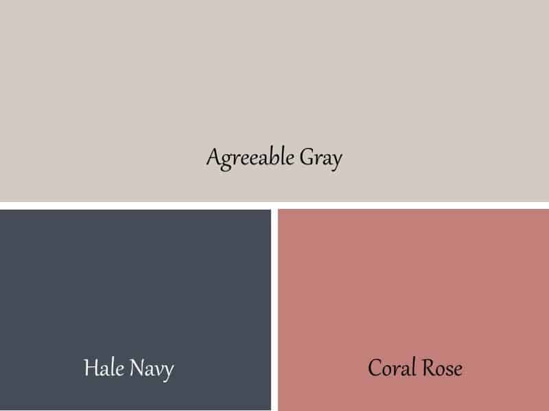
Agreeable Gray
Agreeable Gray looks amazing with just about any color. It’s such a chameleon!
I love to pair it with Sea Salt or Oyster Bay. They are two blue-green colors that look really well with Agreeable Gray.
If you want to go a little bolder then try using it with Hale Navy or Coral Rose. Use one of the whites that I listed above and you will have a showstopper of a home!
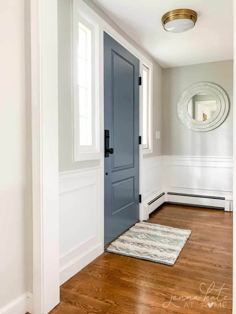
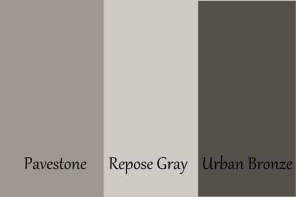
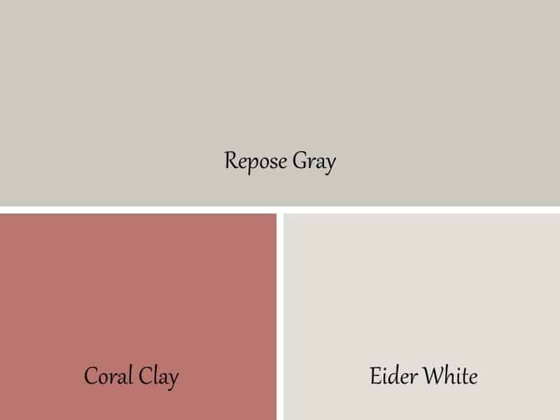
Repose Gray
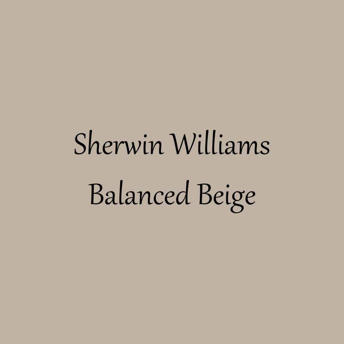
I love to pair Repose Gray with Pavestone and Urbane Bronze. Pavestone is a mid-dark greige paint color and Urbane Bronze is a dark greige color. I used Urbane Bronze on my front door and I just love it!
If you want to go a little lighter then try pairing Repose Gray with Coral Clay and Eider White. I just love Coral Clay for it looks so nice with Repose Gray!
Other Colors Similar to AG and RG
Now if you want to confuse yourself even more I will share some other colors that are similar to Agreeable Gray and Repose Gray. But I will say that there is a reason these two colors are the top greige paint colors from Sherwin Williams.
They are amazing and you won’t go wrong with either one of them. But if you are like me and you just can’t stop looking at them all then here are some others you might want to check out:
- Sherwin Williams Worldly Gray
- Benjamin Moore Edgecomb Gray
- Sherwin Williams Useful Gray
- Sherwin Williams Accessible Beige
- Benjamin Moore Revere Pewter
If you plan on painting your home yourself, and I highly encourage you to do so, then you might want to check out these posts that will help you prepare for the job:
- The Right Way to Test Paint Samples in Your Home
- The Best Paint Brushes for Latex Paint
- 11 Must-Have Supplies for Painting Your Room Like a Pro
- 5 Tips on Choosing the Perfect Paint Color for your Home


As a licensed Real Estate Agent and an avid home decorator, I strive to give my clients the very best I can when it comes to staging, selling, and decorating their homes. I have lots of experience with paint color choices and love to DIY my home so I can have everything just the way I want it. I share my ideas and projects with the world in the hopes that I can help others have their homes just the way they want as well.