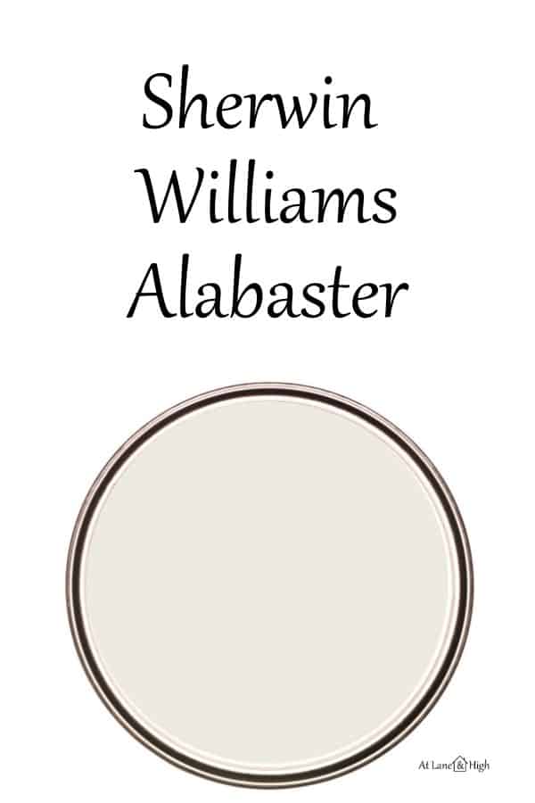
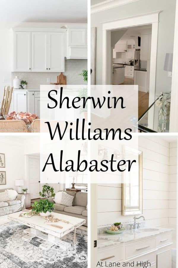
Sherwin Williams Alabaster
Sherwin Williams Alabaster is a beautiful creamy white paint color. It’s one of Sherwin Williams’s most popular whites and for good reason.
Alabaster was actually the color of the year in 2016! It’s no surprise that it has become so popular. Neutrals have been king for a long time now. Alabaster can be the perfect neutral for many homes, today we will explore why.
I am going to be completely honest, I was not really a fan of Alabaster for a long time. Whenever I saw it in action it just looked yellow to me. I am not a fan of yellow.
Everyone kept recommending it and I was like eeewww, no. It wasn’t until recently that I saw some beautiful spaces that used Alabaster in the correct sense that I saw why everyone loved it.
I saw Alabaster used in the correct lighting and it’s now one of my favorite white paint colors. I can now see what all the hype is about!
*This post contains affiliate links. For more details see my full disclosure.
Sherwin Williams Pure White Stats
Let’s get into what makes this color what it is.
- R: 237
- G: 234
- B: 224
- Hex Value: #EDEAE0
- Color Family(s): White
- Color Collections: Color ID (Nurturer), Colormix Forecast 2021 (Encounter), Living Well (Unplug), Top 50 Colors, Pottery Barn (Fall/Winter), Pottery Barn Kids (Fall/Winter), Pottery Barn Teen (Fall/Winter), Colormix Forecast 2022 (Ephemera), Finest Whites & Neutrals
Wow, that is a lot of color collections to belong to! Here is what Sherwin Williams has to say about Alabaster:
When you want the brightness of a white without sacrificing a warm coziness, try this soft, warm but balanced white. And turn up the peaceful.
Sherwin Williams
Is Alabaster a warm white or cool?
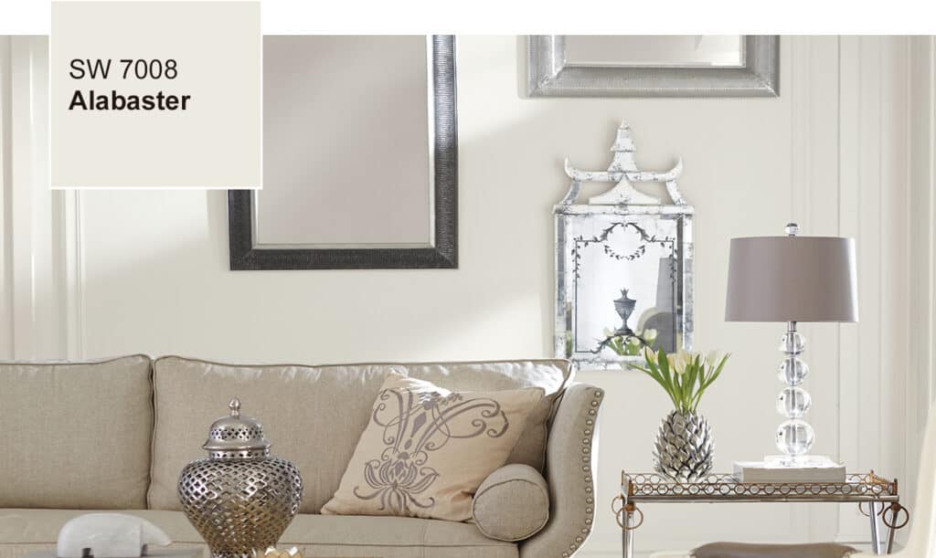
Alabaster is a creamy white paint color that falls on the warm side. It’s not a stark white at all. This color has warmth and creaminess that is the perfect backdrop for your decor.
The paint color pairs really nicely with brass and gold hardware, making it an excellent choice for cabinetry. It also looks great with grays. You really can’t go wrong with this color.
What are the undertones of Alabaster?
Alabaster is a white paint color but it’s not a stark white or the brightest white. It has a little bit of depth of color. More than a stark white would have.
Alabaster’s undertones consist of a touch of yellow with a neutral base. That’s what gives it the warmth and creaminess. If you are looking for a bright white paint then this would not be a good choice.
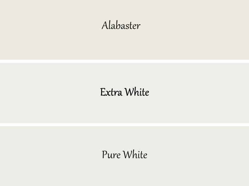
Here are some popular whites next to each other so you can see the difference.
Alabaster LRV
LRV stands for Light Reflective Value. It’s a scale from 0-100 that measures the amount of light a paint color reflects. Zero is the darkest black and 100 is the brightest white.
Alabaster sits at an 82 which is pretty bright! It is a white paint color but more of an off-white. It’s not stark or crisp but rather a cozy paint color.
Does Sherwin Williams Alabaster look yellow?
The simple answer to this is no. But let’s be honest, there is rarely a simple answer when talking about paint colors. For this color in particular it’s all about the lighting and other decor in the space.
Alabaster is in the white collection at Sherwin Williams. Alabaster has a touch of yellow in it, but it keeps Alabaster from being yellow with the neutral base.
That being said, I have learned through my personal experience that a paint color looks completely different in every home. So it’s a really good idea to put a swatch on the wall to make sure you like it. I would also compare swatches with the other paint colors you plan to use in the home and make sure they complement each other.
How Lighting Affects Alabaster
As I mentioned, lighting is everything when it comes to this color. Let us look at different lights and discuss how they affect Alabaster.
- North-facing rooms have a light that tends to be a little cooler in nature and will come off slightly blue. Light colors will be a bit more muted or washed out while darker colors will be stunning.
- East-facing rooms will have brighter light in the morning and less in the evenings. The evening light will be a bit cooler. In the morning with sunrise, the bright sun will be warm. Warm color palettes are great for these spaces because they will help balance the cool feel of the evenings.
- South-facing rooms have consistent warm light throughout the day. The light really shows off the colors, dark will be very bright, and light colors will shine. Both warm and cool color palettes look good in a south-facing room.
- West-facing rooms have warm light in the evening and cooler light in the morning. Basically, it’s the opposite of east-facing.
So you are wondering how the heck this impacts Alabaster. Well if you use it in a south-facing room the warmth of the light is going to bring out the warm undertones so it could look a little yellow.
The same thing can happen in east and west-facing rooms during the time of light. Not as strong as south-facing but depending on the other major decor pieces in the room (like upholstery, flooring, etc.) it can pull a bit yellow.
The best place to use this color is in a north-facing room if you don’t want the color to pull yellow at all. The cooler light from he north will keep the yellow undertones at bay and this color will look amazing!
Can you see why I had such a hard time with this color at first? Being a person that is not a fan of yellow I just needed to learn where to use it so it looks its best.
How to know if Sherwin Williams Alabaster is right for you.
You can go to the paint store and buy a sample and put a swatch on the walls. But then you are left with this sample paint can that you can’t use anywhere else. I suggest using Samplize instead.
Samplize is a company that will send you a peel and stick 12X12 inch sample that you can put on the wall, look at over the course of a couple of days and then peel it off and throw it away. No mess, no fuss just easy peasy. Click the link below to check it out.
Sherwin Williams Alabaster Whole Home Color Palette
Get this free whole home color palette for Sherwin Williams Alabaster and you will also be part of the At Lane and High Community! You will receive weekly newsletters on new posts and you can unsubscribe anytime.
The Best Place to Use Sherwin Williams Alabaster.
Sherwin Williams Alabaster is a great color and can be used almost anywhere! Here are some examples of popular places to use it.
Alabaster on Trim and Doors
Alabaster is a popular color for trim and doors. It pairs nicely with greige paint colors for walls, which is super popular right now.
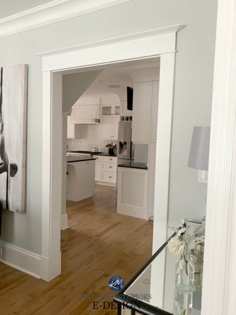
Here is a great example of Alabaster used on the trim, with Gray Owl on the walls. They look amazing together!
Alabaster on Shiplap Walls
Shiplap is a popular wall treatment that many people install in their homes. Alabaster is a popular color to use on shiplap.
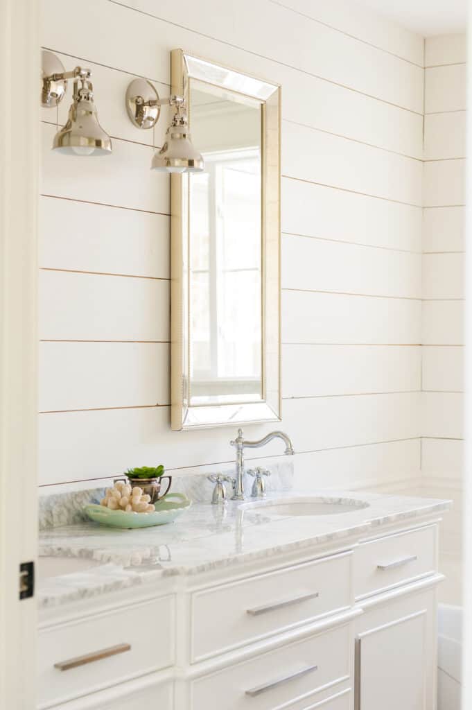
Christy from The Harper House used Alabaster on the shiplap walls in her bathroom. As you can see this color does not look yellow at all. In fact, it pairs really well with the white cabinets and marble countertops.
Alabaster on Cabinetry
Because of the creaminess in the color, it looks great on cabinetry. You can pair almost any hardware with it and it will look amazing, especially gold or black.
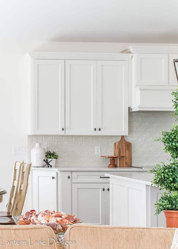
My friend Jenna over at Lantern Lane Designs helped her parents redo their condo. They painted everything Alabaster! Here is a view of their kitchen cabinets. I think this is a great example of how white Alabaster really is. When used in the right light it won’t look yellow at all.
Alabaster on Walls
Can you use Alabaster on the walls? ABSOLUTELY! If you want white walls as a neutral backdrop for your amazing decor then Alabaster is a great choice.
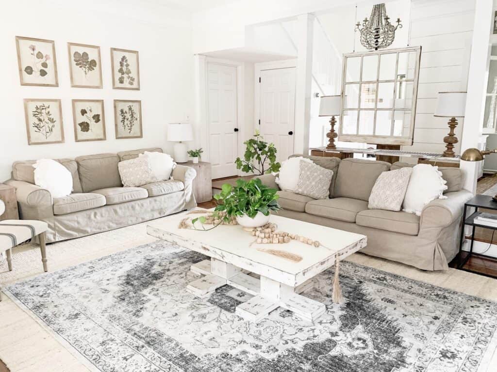
Carissa from Bless This Nest used Alabaster on the walls of her living room. She says her favorite part of using white on the walls is how your accessories can pop. You can really see that here with the rug and artwork. Just so pretty!
What colors go well with Alabaster?
This is an easy one…all of them! No I mean truly. Alabaster goes with every other color on the planet.
If you want a few suggestions to get you started on the right path then take a look at other greige paint colors both light and dark.
Would you like to save this?
I also love it with greens and blues. It works really well with blush paint colors and other pastels.
Don’t forget those dark grays and blacks!
The Best White Trim Color to go with Alabaster
I really like to use Alabaster on both trim and walls. If you do this make sure you use a step up in paint sheen on the trim.
For example, if you use satin on the walls use semi-gloss on the trim.
If you want a more crisp white for the trim you might want to check out Extra White or Highly Reflective White.
If you do this keep in mind that using a crisper white on the trim with Alabaster on the walls can bring out the yellow undertones.
What You Need to Know if Painting on Your Own
If you are thinking about painting a room on your own then good for you! This is one of the easiest things you can do yourself and you will get so much satisfaction out of it. Just make sure you have the right supplies.
You need a good quality paintbrush and roller cover. This is the most important thing! If you don’t use high quality the finish will not be to your liking.
Here are some other posts to help you with your DIY paint project that you should check out before you get started:
- The Right Way to Test Paint Samples in Your Home
- The Best Paint Brushes for Latex Paint
- 11 Must-Have Supplies for Painting a Room Like a Pro
- 5 Tips on Choosing the Perfect Paint Color for Your Home
Color Comparisons
I love doing color comparisons because when you put colors next to each other their “true colors” really come through! See what I did there…I know. That was a terrible joke.
But it’s really true. When put side by side you can really see undertones so much better. Let me show you!
Alabaster vs Pure White
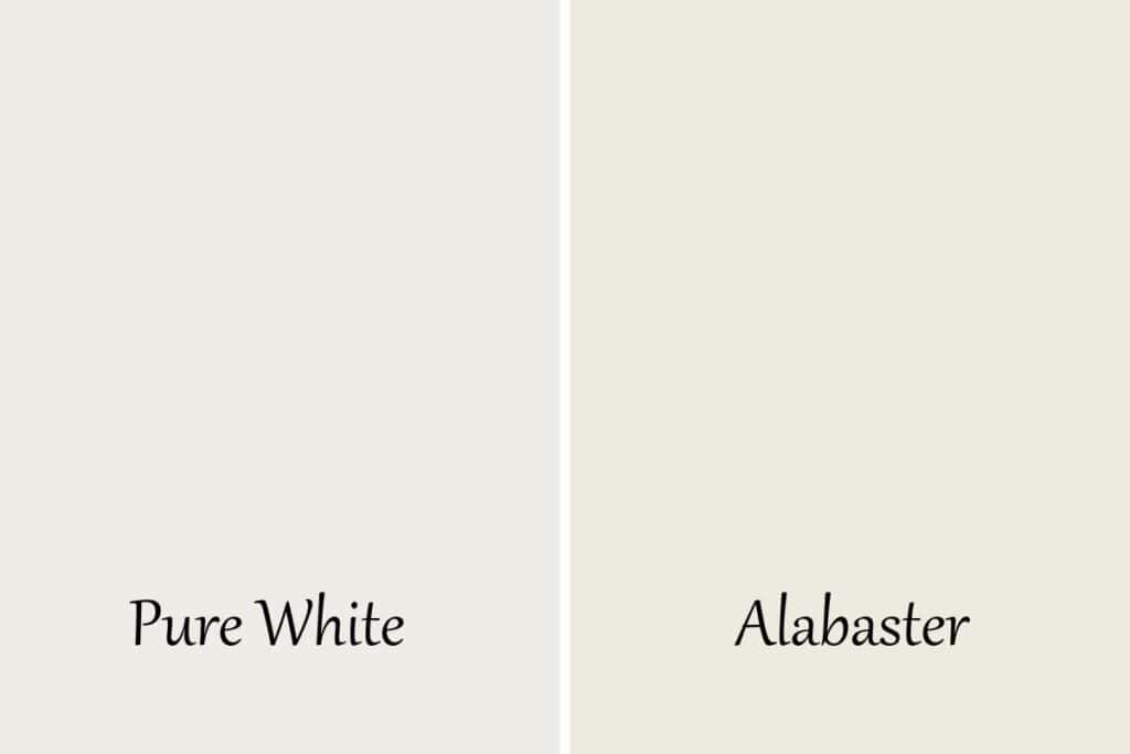
Here are some of the similarities and differences of these two colors.
- Pure White has an LRV of 84, Alabaster an 82.
- Pure White is slightly lighter than Alabaster, but only barely.
- Alabaster has more yellow undertones. Pure White has yellow undertones but also a touch of gray which tones down the yellow.
Alabaster vs Extra White
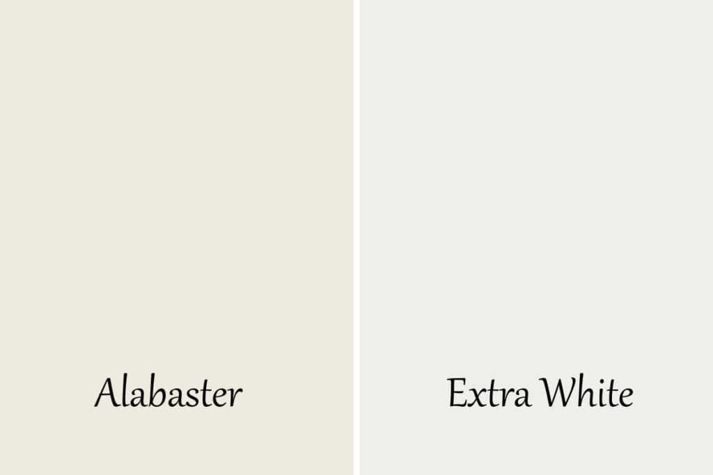
These are two very popular but as you can see, very different colors.
- Alabaster is a warm white.
- Extra White is a neutral to slightly cool white.
- Extra White has an LRV of 86, Alabaster is at 82.
- Alabaster is a slightly darker color.
As you can see when you pair Alabaster with a neutral or crisp white the yellow undertones really show through.
Alabaster vs White Dove
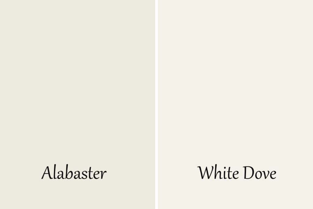
These colors are so closely related, although they are from different manufacturers.
- Alabaster has an LRV of 82 and White Dove sits at 83.
- With only one point different White Dove is just a tad lighter.
- Both of these colors have yellow undertones but White Dove is a little more muted.
Alabaster vs Swiss Coffee
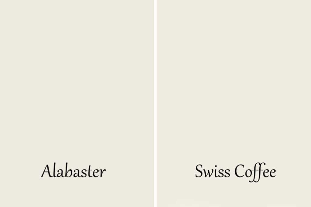
These two are very similar! They have very subtle differences.
- Bot have the same LRV of 82.
- Alabaster has yellow undertones
- Swiss Coffee has subtle green undertones that lean towards yellow.
- Swiss Coffee looks less creamy on the walls than Alabaster.
Alabaster vs Greek Villa
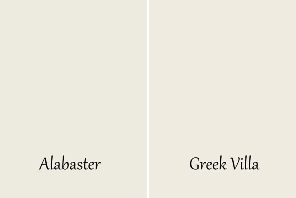
There are a lot of similarities with these colors but as you can see they are different colors.
- Alabaster has an LRV of 82, Greek Villa an 84
- Alabaster is slightly darker but only just a touch.
- They both have yellow undertones but Alabaster has more.
- Greek Villa has a touch of beige which keeps the yellow from being too strong.
- Greek Villa could be considered a light griege while Alabaster is strictly an off-white.
Alabaster vs Cloud White
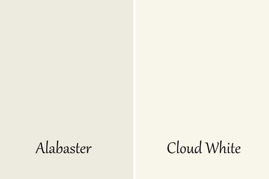
Next to each other these colors look very different. Here’s white:
- Alabaster has an LRV of 82, Cloud White sits at 85.
- Cloud White is lighter and brighter.
- Alabaster has yellow undertones and Cloud White has taupe undertones.
- Cloud White looks less creamy on the walls than Alabaster.
Alabaster vs Benjamin Moore Alabaster
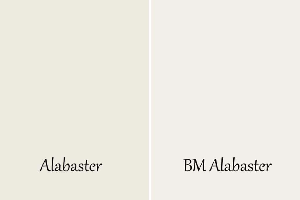
Surprise! Yes, Benjamin Moore has a paint color called Alabaster as well! I know right, MIND BLOWN. Here are the subtle similarities and differences between the two:
- Benjamin Moore Alabaster has a higher LRV of 87.04, Sherwin Williams Alabaster is at 82.
- Sherwin Williams Alabaster is a warm white with yellow undertones.
- Benjamin Moore Alabaster is a neutral to cool white with a touch of pink in the undertones.
Frequently Asked Questions
Why is Sherwin Williams Alabaster so popular?
Sherwin Williams Alabaster is popular because of its softness. The creamy nature of this color keeps people using it again and again.
Is Alabaster gray or beige?
Alabaster is definitely not a gray. It’s hard to say if it’s a beige too. The color is a creamy off-white with a warm feel.
It leans more towards the feel of beige but it’s not beige.
Does Sherwin Williams Alabaster look yellow?
It can look yellow in certain lighting. Especially in south-facing rooms.
If you aren’t a fan of yellow use it in a north-facing room or choose another color.
Does Sherwin Williams Alabaster look white?
Yes! This color is a white to off-white. If you use it in north-facing rooms or on the exterior of the home it will look very white.
What is the Benjamin Moore equivalent of Alabaster?
There is no equivalent between paint manufacturers, there are only close resemblances. Each company uses different formulas to create their paint.
That being said, if you are looking for the closest thing to Alabaster at Benjamin Moore I would look at White Dove.
Is Alabaster a popular white for exteriors?
You bet it is! This color looks amazing on the exterior of the home! With all the natural light, this color becomes a bright white with a softness that you will love.
Is Alabaster a white or cream?
Yes. Sorry, that was a bit rude of me. It’s both! Alabaster is a white paint color that lies close to the off-white range. Because of the yellow undertones, it also has a gorgeous creaminess to it.
So if I had to pick one I would say it’s a white but it leans close to cream.
Should I use Alabaster on kitchen cabinets?
Alabaster is a very popular color to use on kitchen cabinets. Kitchens and bathrooms can be cold, sterile rooms. The creaminess in the Alabaster color really softens the harshness and makes it feel more cozy.
Other Paint Color Posts:
- The 10 Best Sherwin Williams Paint Colors
- Sherwin Williams Greek Villa
- Sherwin Williams Worldly Gray
- Accessible Beige by Sherwin Williams
- Sherwin Williams Passive
- Sherwin Williams Alpaca


As a licensed Real Estate Agent and an avid home decorator, I strive to give my clients the very best I can when it comes to staging, selling, and decorating their homes. I have lots of experience with paint color choices and love to DIY my home so I can have everything just the way I want it. I share my ideas and projects with the world in the hopes that I can help others have their homes just the way they want as well.