
Is Sherwin Williams Passive the Best Cool-Toned Gray?
Sherwin Williams Passive is a beautiful gray paint color that is very neutral and will go with almost any decor style. Today we will review all the details and see if it’s right for you and your home.
I am so excited you stopped by for another paint color review! I am super excited about this one. Sherwin Williams Passive is a stunning gray paint color and one I closely considered for my own home.
I didn’t end up choosing Passive and I will explain more later, but if I had I think it would have been stunning. Unfortunately, it just wasn’t right for me.
This paint color is part of the top colors from Sherwin Williams but I really think it isn’t used nearly enough. Once you are done reading this post I think you will agree with me.
*This post contains affiliate links. See my full disclosure for more details.
What color is Sherwin Williams Passive?
I love discussing paint colors with you because it’s the easiest (and cheapest) way to update your home and it’s a great project that you can do yourself!
Sherwin Williams Passive 7064 is from the Living Well Collection as well as the Top 50 Colors! I do love this color and I hope you understand just how much after I share all the details with you.
Here are the stats on Passive:
- R-203 G-204 B-201
- Hex Value #CBCCC9
- Location Number:236-C1
- Color Family(s): Neutral
- Color Collections: Top 50 Colors, Top Interior Colors, Top Exterior Colors
Passive is a gray paint color that can show differently in different rooms depending on light, furnishings, and more. It is one of those colors that is a chameleon.
What are the undertones of SW Passive?
Most gray paint colors have blue, green, purple, or brown undertones. Passive has blue undertones with hints of green and purple.
You rarely see the green and purple, most people notice the blue as the strongest undertone.
Will my walls look blue?
That’s a great question. The quick answer is yes, they can. It depends on the lighting and other fixed furnishings you have, such as flooring. We will get into the lighting aspect soon.
I mentioned earlier that I considered choosing this color for my open floor plan but decided against it. Passive looked very blue on my walls and I wanted more of a gray look.
I have cool-toned floors and lots of light which contributed to the blue undertones coming to the surface.
Is Passive a warm or cool color?
Because Passive has strong blue undertones it is a cool color. It won’t look cold or sterile but actually more on the calm side like an ocean look. Who doesn’t love the ocean right?!
But if you are like me and don’t want any blue on the walls then Passive might not be the right color for you.
What is the LRV of Passive?
It has an LRV of 60 which makes it in the medium-light range.
If you haven’t checked out my other paint posts LRV stands for Light Reflective Value. It’s a scale from 0-100, 0 being the darkest black and 100 being the brightest white. The scale determines how much light is reflected by a paint color.
Passive falls into the lower end of what is considered a bright paint color.
How to know if a paint color is right for you?
The best way to judge if a color is good for you then you will want to put a swatch on the wall and look at it over a few days. Look at it in different lights and decide if you really like it.
You can do this by getting a sample from the paint store and using a brush to put it up on the walls, but then you are left with a can that you can’t do anything with. Those samples are used with poor-quality paint and aren’t meant for use on your walls permanently.
I recommend going with Samplize. They are a company that will send you a 12X12 peel-and-stick swatch of a paint color that you can stick to the wall. When you are done just peel it off and throw it away.
It’s easy and much less messy!
How Light Affects Sherwin Williams Passive
Lighting is a biggie when choosing a paint color. It can make a color look bright, dark, muddy, and more! Here is some more info on natural light and how it affects paint colors.
- North-facing rooms have a light that tends to be a little cooler in nature and will come off slightly blue. Light colors will be a bit more muted or washed out while darker colors will be stunning.
- East-facing rooms will have brighter light in the morning and less in the evenings. The evening light will be a bit cooler. In the morning with sunrise, the bright sun will be warm. Warm color palettes are great for these spaces because they will help balance the cool feel of the evenings.
- South-facing rooms have consistent warm light throughout the day. The light really shows off the colors, dark will be very bright, and light colors will shine. Both warm and cool color palettes look good in a south-facing room.
- West-facing rooms have warm light in the evening and cooler light in the morning. Basically, it’s the opposite of east-facing.
When you have a color like Passive that has a lot of blue undertones a north-facing room will bring that our. So if you aren’t crazy about blue then don’t use it in a room that faces north.
In east, west, and south-facing rooms you will see Passive be a bit more gray and the blue won’t shine through as much.
Where to use Passive
Passive is a great color to use almost anywhere. Here are a few of my favorite places:
- bedroom
- bathroom
- dining room
- entryway
- family room
- nursery
- exterior
Let’s look at some real-life examples of Sherwin Williams Passive in an actual room.
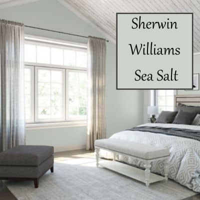
Passive in the Bedroom
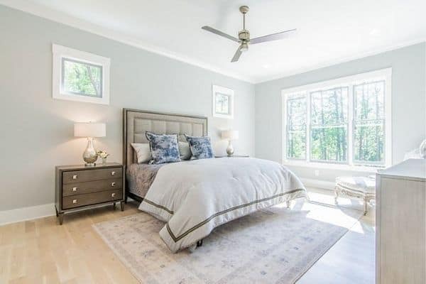
This example shows how light the paint color can be when there is ample natural light coming in the windows.
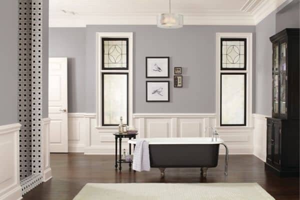
SW Passive in the Bathroom
This gorgeous bathroom showcases the color in a space without as much natural light. I love how the color pairs with the black and white in the room.
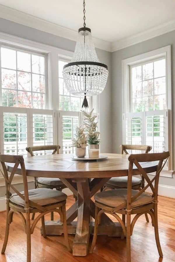
Passive in the Dining Room
Here the paint color fades into the background and allows the gorgeous decor to be the star of the show. This happens because again, lots of natural light. This color also pairs really well with wood tones.
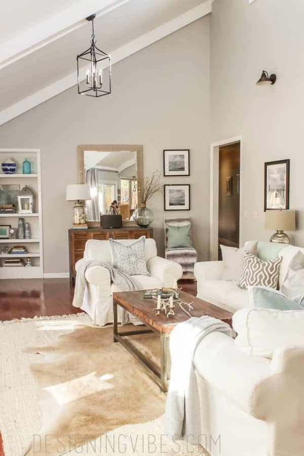
Sherwin Williams Passive in the Family Room
This example shows how cozy this paint color is. Even though its a cool-toned color it doesn’t act cold and unfriendly. This family room looks like a space to sit back, put your feet up and relax.
Are You Painting the Room Yourself?
If you are doing the job yourself then good for you! Painting is one of the easiest DIY projects a person can do and it makes such a big impact on the look and feel of your home.
If you are doing the work yourself then you want to check out these posts:
- The Right Way to Test Paint Samples in Your Home
- The Best Paint Brushes for Latex Paint
- 11 Must-Have Supplies for Paint a Room Like a Pro
- 5 Tips on Choosing the Perfect Color for Your Home
Would you like to save this?
What are similar colors to SW Passive?
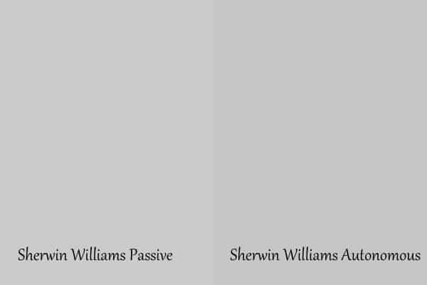
Autonomous is a very similar paint color to Passive. You will notice that Autonomous has more green undertones than Passive.
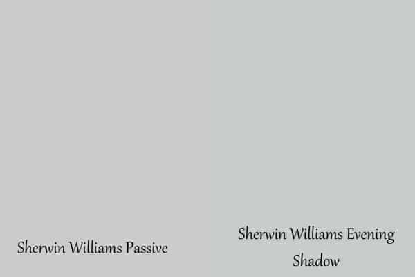
Evening Shadow is another paint color that is close to Passive. Evening Shadow is cooler than Passive with more blue undertones.
It’s actually pretty hard to find a color that is very similar to Passive. It’s very unique.
Read more about Sherwin Williams gray paint colors.
What is the Benjamin Moore equivalent to Passive?
Again, this is tough because Passive is so very unique. There. area couple that are similar but none that are an exact match.
Benjamin Moore Sterling is a close contender. Stonington Gray is also similar too.
Read more about Benjamin Moore Gray colors.
What colors coordinate with SW Passive?
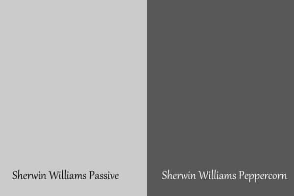
Peppercorn is on the same paint strip as Passive and therefore is a perfect coordinating color. It’s a dark color and would be great as an accent wall or used on a piece of furniture.
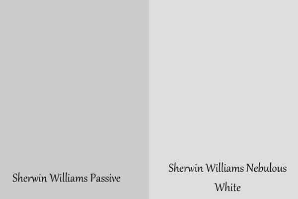
Nebulous White is a light color that is almost white but has hints of gray. This would be great to use as a trim color with Passive or in an open floor plan as a color for an adjoining room.
Here are a few other notable colors that look great with Passive:
- Grizzle Gray
- Pure White
- Green Onyx
Sherwin Williams Passive Whole Home Color Palette
Get this free whole home color palette for Sherwin Williams Passive and you will also be part of the At Lane and High Community! You will receive weekly newsletters on new posts and you can unsubscribe anytime.
Passive vs. Repose Gray
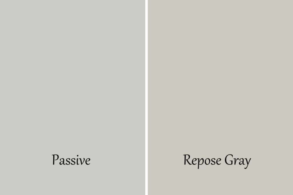
These colors are very different. Passive is a cool color and Repose Gray is warm.
Repose Gray is actually considered a greige color because of its beige undertones (and a touch of green too).
One thing that is similar about these colors is their spot on the LRV scale. They are only two apart from each other with Repose Gray sitting at a 58.
Get a Sample of Repose Gray from Samplize!
Passive vs. Reflection
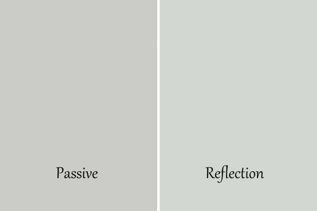
Reflection is another one that I considered for my first floor wall color, but again it was too blue. As you can see it has a ton of blue undertones.
Reflection is a bit lighter than Passive, sitting at a 66 on the LRV spectrum.
Get a Sample of Reflection from Samplize!
Passive vs. Light French Gray
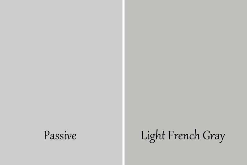
The name of this color is so deceiving. Light French Gray is anything but light! Sherwin Williams is trying to pull a fast one on us!
The LRV for Light French Gray is 53 and Passive is a 60. LFG is definitely a medium-toned color where Passive is sitting right on the line between light and medium.
The thing I really love about Light French Gray is it has hardly any undertones. There is a touch of blue but this color is very neutral.
I actually seriously considered this color for my first floor but it wasn’t bright enough for what I wanted.
Get a Sample of Light French Gray from Samplize!
Passive vs. Big Chill
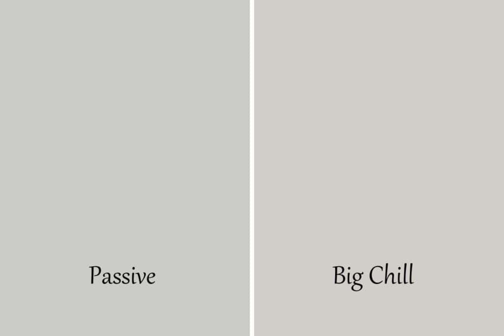
Passive and Big Chill are close on the LRV scale, only two digits between them. Big Chill is slightly lighter.
When you see them side by side Passive is cooler with Big Chill having a bit of green in the undertones as well as blue. They are both cool gray paint colors.
Get a Sample of Big Chill from Samplize!
Passive vs. Gray Screen
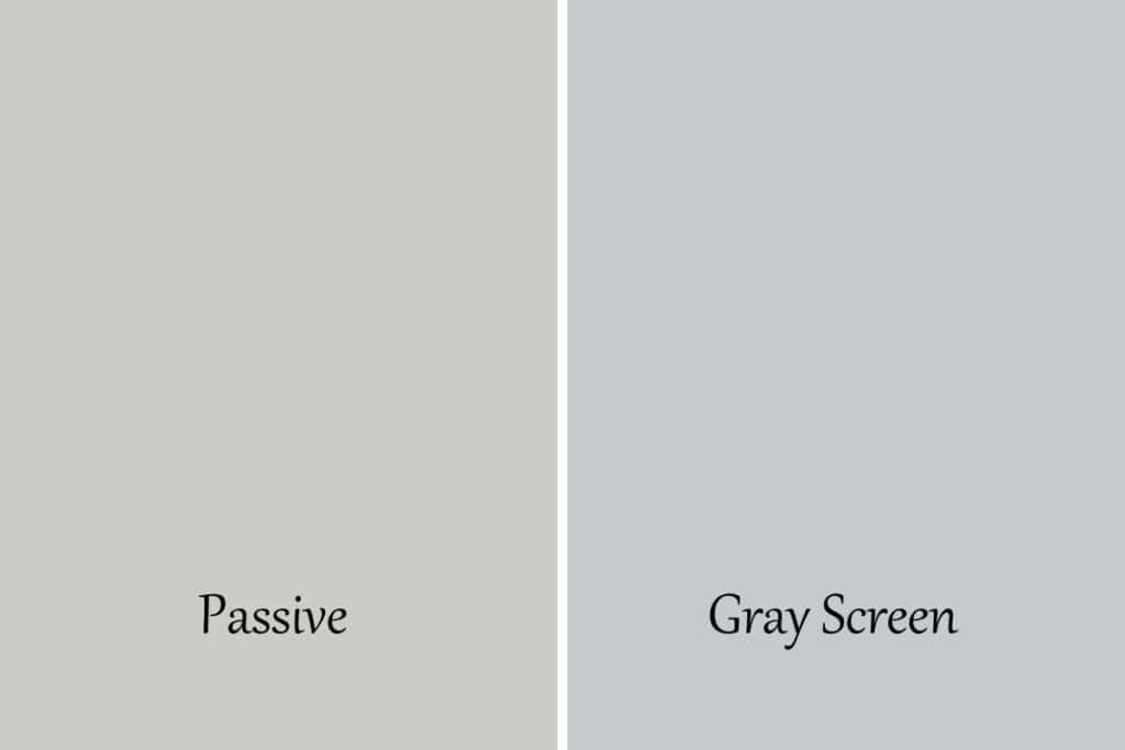
It’s funny because you think Passive has a lot of blue in it until you put it next to Gray Screen. Gray Screen has a ton of blue undertones, much more than Passive.
They are fairly similar on the LRV spectrum, with Gray Screen being a 59 whereas Passive is a 60. So not a big difference in how much light they bounce around.
Get a Sample of Gray Screen from Samplize!
Let’s Recap Sherwin Williams Passive
We talked a lot about Passive today so let us do a quick little recap of everything we learned:
- The LRV of Sherwin Williams Passive is 60.
- Passive has blue undertones.
- Passive is considered a cool-toned gray.
- This paint color looks best in a bright well-lit room.
Sherwin Williams Passive is a stunning light gray paint color that has cool tones that give you a very calm feel. If you love that type of look then this is a great paint color for you.
You might be interested in checking out my other paint posts so you can compare the colors to Passive.
- Sherwin Williams Repose Gray
- Benjamin Moore Revere Pewter
- Sherwin Williams Agreeable Gray
- Paint Colors of the Year
- Benjamin Moore Quiet Moments

I hope you learned a bit about Sherwin Williams Passive. It’s a great light gray color that will make any room you use it in feel relaxed and welcoming.

As a licensed Real Estate Agent and an avid home decorator, I strive to give my clients the very best I can when it comes to staging, selling, and decorating their homes. I have lots of experience with paint color choices and love to DIY my home so I can have everything just the way I want it. I share my ideas and projects with the world in the hopes that I can help others have their homes just the way they want as well.


Hi! Can you tell me the trim color in the last photo? The living room. Thanks!