
Revere Pewter Paint Color Review + Color Palette
Gray paint colors have taken the world by storm in the last 10-15 years. They aren’t all the same though, you’ve heard of 50 shades of gray right?! Today we will dive into one of the most popular gray paint colors which is Benjamin Moore Revere Pewter.
At one point in time, Benjamin Moore Revere Pewter was the most popular paint color available. It was known as “the” color to use if you want to sell your house fast and for top dollar.
As a Real Estate Agent, I typically recommend Agreeable Gray now rather than Revere Pewter only because it’s a bit lighter and brighter. Otherwise Revere Pewter is still a great color to use for selling your home.
*This post contains affiliate links. For more details see my full disclosure.
What Color is Revere Pewter?
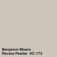
Revere Pewter is a paint color created by Benjamin Moore and its number is HC-172.
This color is a warm gray that has a great depth of color. It is a mid-toned warm gray that is widely considered a neutral.
This color has been one of Benjamin Moore’s most popular colors for well over a decade!
Is Revere Pewter a Gray, Beige, or Greige?
Good question and the answer is YES! Benjamin Moore Revere Pewter is considered both a gray and a beige, which is nicknamed greige.
Greige paint colors are by far the most popular right now. The undertones in the paint give it this color. It’s like gray wrapped in a great big hug.
Revere Pewter Undertones
The fact that Revere Pewter is a greige means that it’s a gray color that pulls more on the warm side rather than cool. It’s the green undertones that give it that warm feel.
When used in rooms that get a lot of natural light Revere Pewter can look more gray and much lighter. In rooms without a lot of natural light, the paint color can look more beige. Hence the name greige!
Most of the time you will see the color with green undertones. Occasionally you might see something a little different.
Sometimes you will see a touch of purple and occasionally (not often) you might see it pull blue. It’s all about the natural light, artificial light, and other furnishings in the room.
This is one of those colors that can look very different from room to room and I suggest getting a sample to make sure it’s right for you.
Benjamin Moore Revere Pewter’s LRV
LRV stands for Light Reflective Value and is a scale that measures the amount of light a paint color reflects. Zero is the darkest black and 100 is the brightest white.
Revere Pewter sits at 55.51 which makes it a lighter mid-toned color almost in the light paint color range.
How Lighting Affects Revere Pewter
Light makes a significant difference in how a paint color looks. Here are a few rules of thumb.
- North-facing rooms have a light that tends to be a little cooler in nature and will come off slightly blue. Light colors will be a bit more muted or washed out while darker colors will be stunning.
- East-facing rooms will have brighter light in the morning and less in the evenings. The evening light will be a bit cooler. In the morning with sunrise, the bright sun will be warm. Warm color palettes are great for these spaces because they will help balance the cool feel of the evenings.
- South-facing rooms have consistent warm light throughout the day. The light really shows off the colors, dark will be very bright, and light colors will shine. Both warm and cool color palettes look good in a south-facing room.
- West-facing rooms have warm light in the evening and cooler light in the morning. Basically, it’s the opposite of east-facing.
How to Know if Revere Pewter is Right for You!
I always suggest getting a sample of the paint color and looking at how the color looks in the room in all the different lights of the day. You can get a sample can from the paint store but then you are left with a can of paint and nothing to do with it. They add up, trust me.
A great option is Samplize. They will send you a 12×12 inch sample of your paint color and it sticks to the wall and is easily removable. This is a great alternative!
Paint Colors Similar to Revere Pewter
Revere Pewter has a lot of friends that look similar to it but when you put them up against one another you can really see the difference. Again, that 50 shades of gray reference!
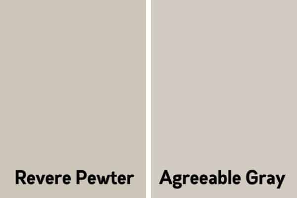
Revere Pewter vs. Agreeable Gray
Agreeable Gray is a paint color from Sherwin Williams and it is very similar to Revere Pewter. The biggest difference is in the LRV number, Agreeable Gray is brighter at a 60 compared to Revere Pewter at 55.
Revere Pewter can tend to pull a little bit green while Agreeable Gray has more gray in it, a little less green in the undertones. I have an entire article on Agreeable Gray that you can check out here.
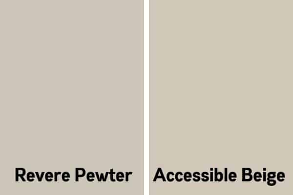
Accessible Beige vs. Revere Pewter
This is another good one to compare. Accessible Beige is not a gray color but is very close to the family and compliments well with the greiges.
They both have a slight green undertone but Accessible Beige is definitely a little brighter with an LRV of 58. Remember Revere Pewter is at a 55.
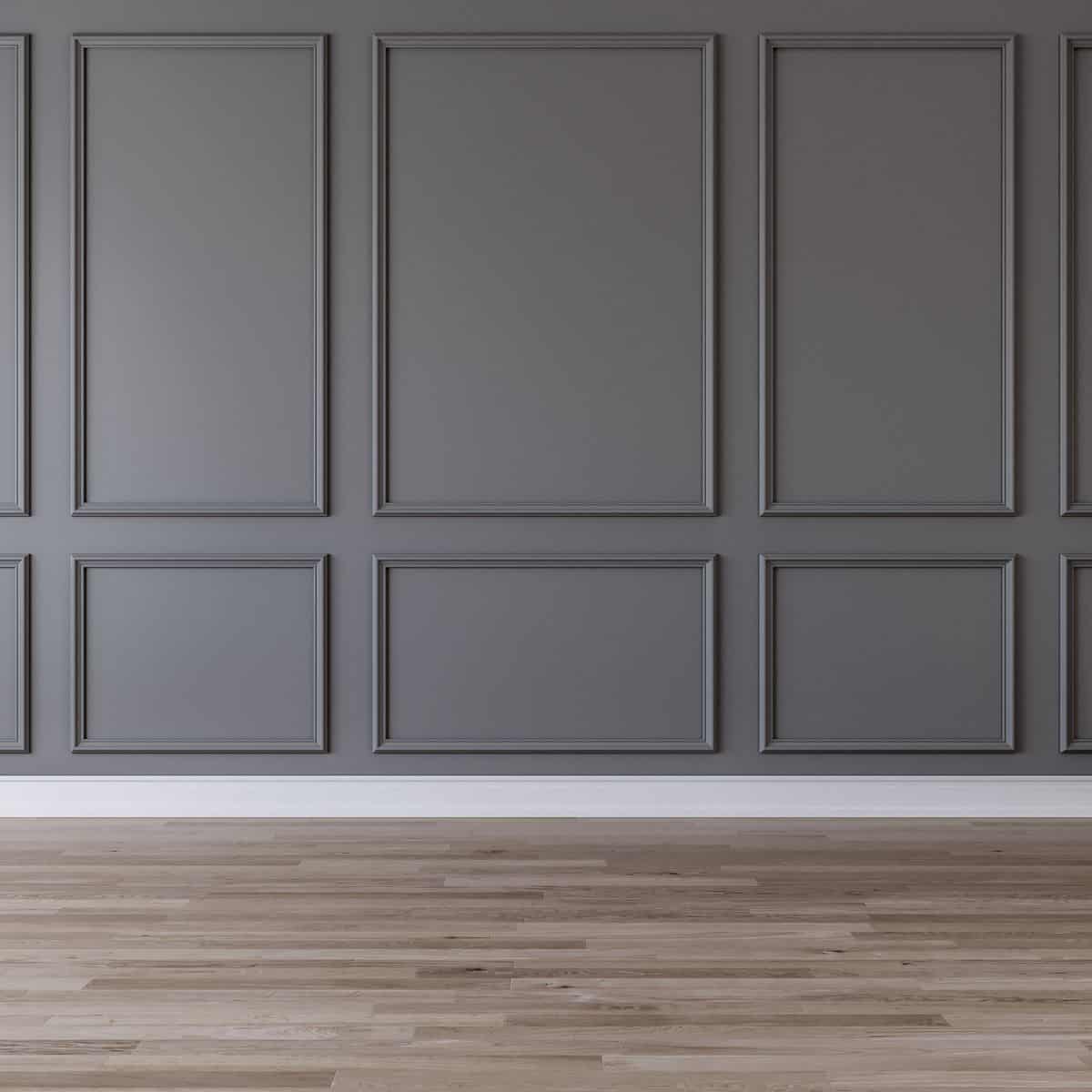
The Best Places to Use Benjamin Moore Revere Pewter
You can use this color in any room. It is a nice color that goes with just about everything. It can tend to be a little darker in a room that doesn’t get a lot of natural light so I think a room that is well lit with natural light is the best choice.
Here are my favorite places to use this color:
- Cabinets and furniture
- Family Rooms
- Exterior
- Interior doors and trim
- Open floor plans
Revere Pewter in Real Homes
Revere Pewter in the Bedroom
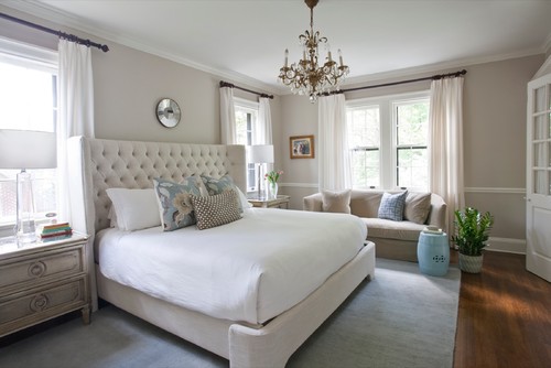
This room is so gorgeous. I love the bed so much. Regarding the paint color, you can really see how light it is on the wall on the left where the light hits it and how much darker it is on the right where the light doesn’t.
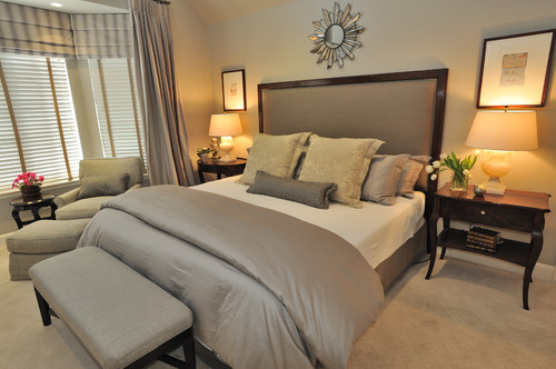
This room is a tribute to neutrals. It’s so calming. You can see how artificial light affects Revere Pewter in this bedroom photo.
Revere Pewter in the Living Room
Would you like to save this?
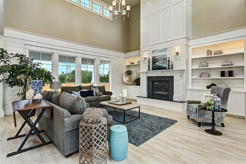
This living room has all the most amazing feels! I love the balance between the white trim work and the paint color. This beauty won all kinds of awards at its Parade of Homes and I can see why.
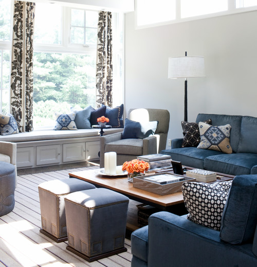
The paint color here is stunning! What I love about Revere Pewter is you can pair it with cool-toned colors and it still looks amazing. Here the blues in the upholstered furniture and throw pillows are decidedly cool.
Revere Pewter in the Bathroom
This room has awesome natural light, gorgeous dark wood floors, and lots of white. The warm paint color as well as the floors do an amazing job of taking a room that is usually very stark and hard and makes it softer.
This room has marble countertops and look how wonderfully the paint color coordinates with it. By the way, this is my dream bathroom!
Revere Pewter in the Dining Room
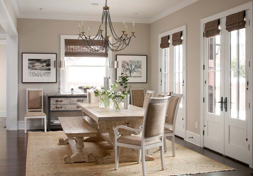
I love the modern farmhouse look here. One of the things I particularly love is how Revere Pewter pairs so nicely with the different wood tones in the room. It also looks great with all the white and black accents.
Revere Pewter in the Entryway/Halls
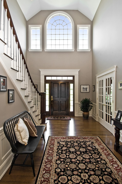
This gorgeous entryway has Revere Pewter on the walls. It looks a little darker even though there is ample natural light and I think it’s because the furnishings are all dark, some even black. I think the paint color really provides a natural welcome to guests.
Revere Pewter on the Exterior
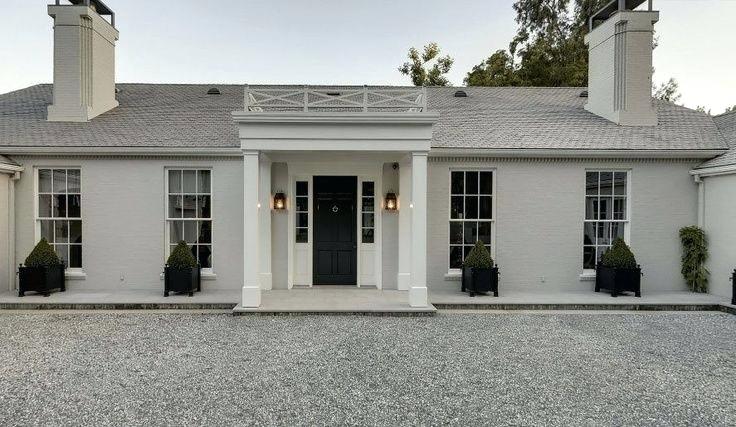
The exterior of a home obviously gets all the natural light. So when you use a mid-toned color it really comes off much lighter than when used on the inside of the home.
Benjamin Moore Revere Pewter Whole Home Color Palette
Get this free whole home color palette for Benjamin Moore Revere Pewter and you will also be part of the At Lane and High Community! You will receive weekly newsletters on new posts and you can unsubscribe anytime.
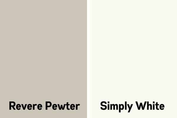
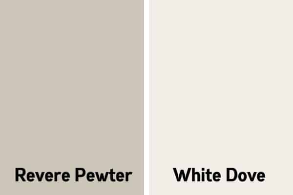
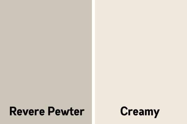
The Best White to Pair with Revere Pewter
I also have an article on white paint colors! This is more geared towards trim but you can see that some of the colors tend to pull a little warmer than others. Here are the ones I would suggest to pair with Revere Pewter
- Benjamin Moore White Dove
- Benjamin Moore Simply White
- Sherwin Williams Creamy
Colors That Go Well With Revere Pewter
My favorite thing to do to find coordinating paint colors (other than trolling Pinterest) is to go to the paint manufacturers’ website and see what they suggest.
In this case, Benjamin Moore says that it pairs nicely with Fog Mist, Copley Gray, Shadow Gray, and Amherst Gray. Here they are pictured together.
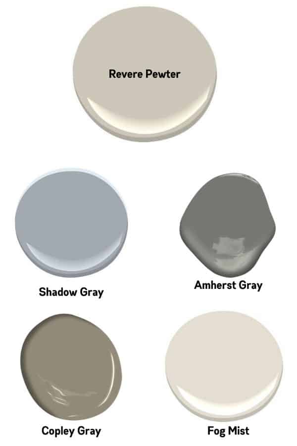
Notice that most of these colors are warm except for one, Shadow Gray. This cool-toned color pairs really well with the warm-toned ones.
Is Revere Pewter Outdated?
That’s an interesting question. It’s been one of the most requested colors in over a decade, especially among those selling their homes.
In the last few years other colors have been growing in popularity, typically those that are lighter and brighter.
I wouldn’t say that it’s outdated but I would say that other colors have taken the top spots in the popularity contest.
Tips on Painting a Room Yourself
I love painting rooms because it makes such an amazing impact, in one day and for the least amount of money! Here are the tools you will need in order to paint a room on your own. Many of them are reusable!
- A good paint brush
- A roller and cover
- A paint tray
- Blue painters tape (at least 2 inches thick)
- A drop cloth
- A ladder
- Paint and a can opener (and maybe a stir stick)
Prep work makes the dream work, yes I totally just made that up and it is totally cheesy! But it’s true!!! If you do the prep work well then the finished product will be as amazing as you picture in your head.
Tape off ceilings, baseboards, and anything else on the wall that is fixed and you don’t want to paint over.
Make sure you have a high-quality paintbrush! This is important because cheap ones tend to shed bristles and you really don’t want that.
Use the paintbrush on the edges to get a crisp line and the roller on the open wall space. It will go faster than you think.
You might have to do 2 coats to get the best coverage. I almost always do at least 2 coats. If you are doing a dark color you might have to do 3!
Remove the painter’s tape as soon as you are done and then step back and admire your hard work!
Painting Guide
For a step-by-step tutorial on exactly how to do all of this with a materials checklist click here or on the image below and I will email you a copy of my Painting Guide.

Related Paint Color Posts:
- The Best Warm Gray or Greige Paint Colors For Your Home
- Sherwin Williams Repose Gray Paint Color Review
- Sherwin Williams Alpaca: Paint Color Review
- Benjamin Moore Stonington Gray: Is it right for you?
- 5 Tips on Choosing the Perfect Paint Color for your Home
- Sherwin Williams Accessible Beige: Not Your Typical Beige
- Sherwin Williams Worldly Gray (Is it a greige?)
- Benjamin Moore Edgecomb Gray
- Benjamin Moore Pale Oak: A Warm Greige Paint Color
- Benjamin Moore Gray Owl


As a licensed Real Estate Agent and an avid home decorator, I strive to give my clients the very best I can when it comes to staging, selling, and decorating their homes. I have lots of experience with paint color choices and love to DIY my home so I can have everything just the way I want it. I share my ideas and projects with the world in the hopes that I can help others have their homes just the way they want as well.


Is there a navy blue that looks great with revere pewter?
Or other accents for a wall in our office?
Try Hale Navy. It’s a great color that seems to go with everything. It’s also from Benjamin Moore.
Hi there, what I great way to explain those amazing color! I thought I had all down till you showed me acessíble beige from Sw, which made me confuse again, I had a house w brown/ beige furniture that I’m trying to change the wall colors, I have gold/ beige tones from Benjamin Moore also! I love both of your suggestion I just got confused, help please? Lol.
I also need accent a wall where I have my tv in my living room/ dinning room combination. Thanks
Hi Layana! Sorry to confuse you, LOL. Between the two colors, Accessible Beige is more beige than Revere Pewter. So if you were trying to get away from the brown family I would stick with your first choice of Revere Pewter. As far as the accent wall give SW Dorian Gray a try, it’s more in the mid tones. If you want darker give BM Kendall Charcoal a try. It’s a really pretty color! Good luck!
I tried a sample of Revere Pewter on my living room wall and it looks very beige. I have it in my kitchen and it is a nice warm gray but I am glad that I did a sample board. Is there another colour that Benjamin Moore has that is a bit more grey but no blue tones and has the same depth of colour that Revere Pewter has as Edgecomb Gray came out white. Would appreciate any help.
Hi Janice! Yes, I had the same problem in my home. If you want something similar that has the same depth of color try Seattle Mist, Apparition, or Nimbus. They are still warm grays so you might still have the same issue. Nimbus is the most neutral of the three. Good luck and I hope one of these works.
Hi. I see this is a 3 yo post but I’m down to the wire picking shutter colors for our exterior brick ranch. The body is revere pewter and trim is white dove.
I’m torn between Kendall Charcoal and Chelsea Gray. Thoughts?
Hi Lisa! I would go with Chelsea Gray. I think it would look amazing with Revere Pewter and White Dove.
Hi, I have painted my bedroom revere pewter and trying to find the best color of stain master carpet that would coordinate with this color. Would you have any suggestions?
Hi Gina. Unfortunately I am not really knowlegable in carpet colors. Sorry I can’t be more help. I know there are some stores that will let you bring a sample home to look at it against all your furnishings. Maybe give that a try.
Hello! That bathroom picture is beautiful! What color Sherwin WIllimas creamy white would you use to go with BM Revere Pewter? I need to repaint cabinets and trim and everything looks off. All my walls are Revere Pewter!
Hi Abbey. My go to Sherwin Williams white is Pure White. I think it has the perfect touch of creaminess but will be a good contrast to Revere Pewter.