
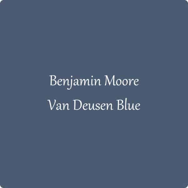
Benjamin Moore Van Deusen Blue
Benjamin Moore Van Deusen Blue is a stunning mid-dark blue paint color. Today I am sharing all the details on this gorgeous color with color comparisons and photos of it used in real homes!
Van Deusen Blue is really a stunning color. It’s part of the Historical Collection at Benjamin Moore and it’s easy to see why.
I just love the depth of color in VDB and I think this is a great color for people to use in their homes for a variety of reasons. Here are a few of them:
- A moody gray blue paint color that would be great for bedrooms and dining rooms.
- Perfect for a bathroom vanity or island in a kitchen.
- Gorgeous as an accent wall in kids bedrooms or a family room.
Really the possibilities are endless for this color. Without further ado, let’s get into those details.
*This post contains affiliate links. For more details see my full disclosure.
Is Van Deusen Blue a navy blue?
You bet your bottom it is! I would say that it’s a lighter navy blue compared to some other colors from Benjamin Moore but to say that it isn’t a navy is just not true.
What are the undertones of Van Deusen Blue?
Van Deusen Blue has strong gray undertones and this keeps the blue in it from being too bright. The color also has slight green undertones, which also keep it from being too blue.
Is Van Deusen Blue warm or cool?
Van Deusen Blue is cool because of the blue in the color. The color also has those gray undertones which keeps it more muted than other blues.
What is the LRV of Van Deusen Blue?
LRV stands for Light Reflective Value and in a nutshell, is a scale from 0-100 to measure the amount of light a color reflects. Zero is the darkest black and 100 is the brightest white.
The LRV of Van Deusen Blue is 10.4 which makes it pretty dark but not the darkest out there. Lighting is going to play a huge part in how this color looks in a room.
In east and west-facing rooms you will get a lighter color when the sun is shining in the windows and it will feel very dark when the sun is on the other side of the house.
In north-facing rooms, the color will be the lightest and feel slightly more gray. While in south-facing rooms the color will take on more of the blue hue with the warm sunshine coming in.
How to know if a paint color is right for you?
The best way to judge if a color is good for you then you will want to put a swatch on the wall and look at it over a few days. Look at it in different lights and decide if you really like it.
You can do this by getting a sample from the paint store and using a brush to put it up on the walls, but then you are left with a can that you can’t do anything with. Those samples are used with poor-quality paint and aren’t meant for use on your walls permanently.
I recommend going with Samplize. They are a company that will send you a 12X12 peel-and-stick swatch of a paint color that you can stick to the wall. When you are done just peel it off and throw it away.
It’s easy and much less messy!
The best whites to pair with Van Deusen Blue?
My favorite white to pair with Van Deusen Blue is Sherwin Williams Pure White. It’s a gorgeous warm white that balances the cool of VDB.
Benjamin Moore Chantilly Lace is another great color to go with Van Deusen Blue. Chantilly Lace is a brighter white with yellow undertones and that plays well with the slight green in VDB.
Another good one is Benjamin Moore Simply White. Simply White is a lot like Pure White, it’s slightly off-white in a warm tone but the yellows aren’t too strong.
Really you can’t go wrong with any of these in my opinion.
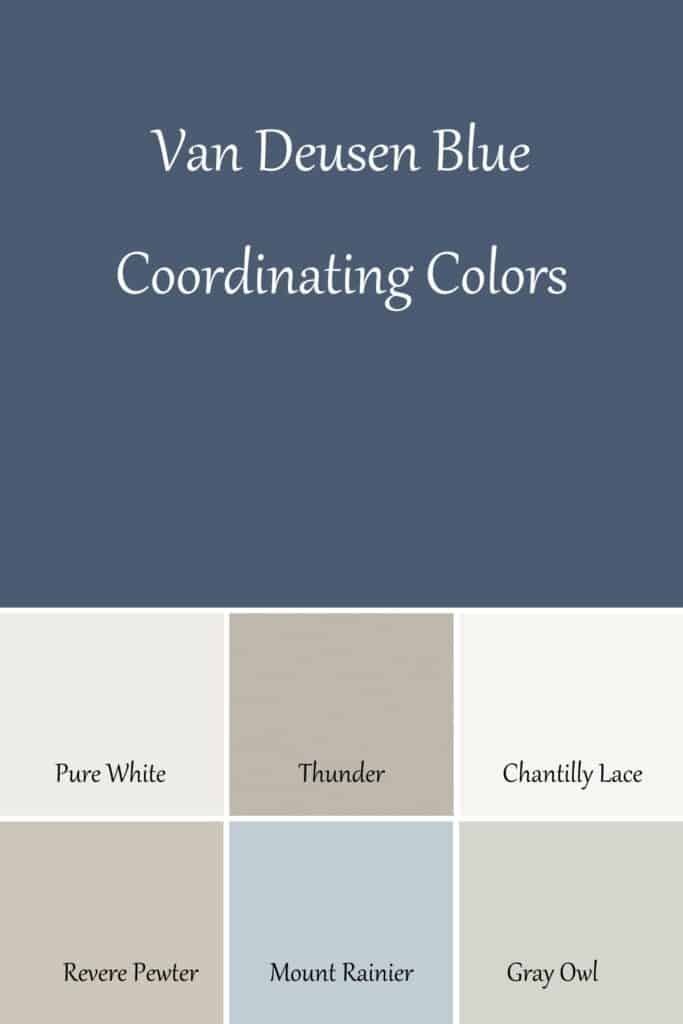
Coordinating Colors for Van Deusen Blue
Would you like to save this?
Okay, the list here is long and varied! The strong gray undertones in Van Deusen Blue make it very neutral which means it goes with pretty much everything!
Great right, except not when you are trying to narrow down a color scheme for your home. Here are a few options to get you started…
Benjamin Moore Thunder is a great warm gray color that would look amazing with VDB and Pure White.
VDB also looks amazing with Revere Pewter and Gray Owl which are a warm mid-toned gray paint color.
I also love it with a lighter blue like Mount Rainier Gray and one of the whites mentioned earlier.
And for an option that is a little darker than VDB give Benjamin Moore Iron Mountain a try!
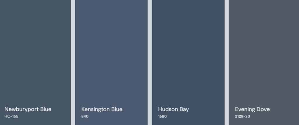
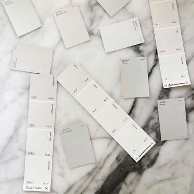
Similar Colors to Van Deusen Blue
Now if you don’t feel like Van Deusen Blue is exactly right for you but we are in the ball park then you might want to try one of these colors. They are all very close to Van Deusen Blue with subtle differences.
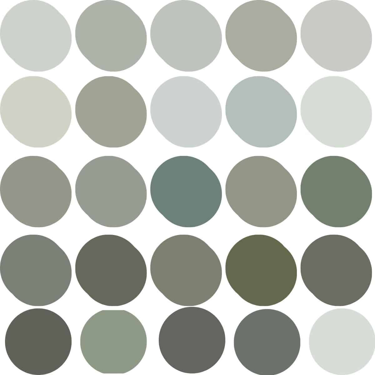
Benjamin Moore Van Deusen Blue Whole Home Color Palette
Get this free whole home color palette for Benjamin Moore Van Deusen Blue and you will also be part of the At Lane and High Community! You will receive weekly newsletters on new posts and you can unsubscribe anytime.
Benjamin Moore Van Deusen Blue in Real Homes
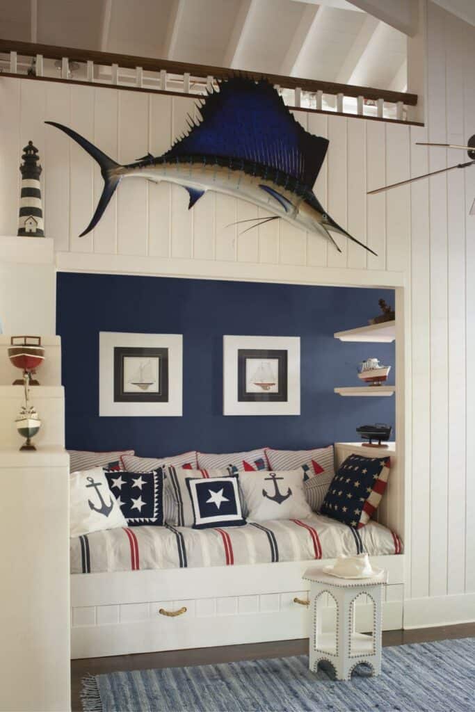
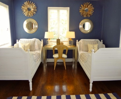
This is a great example of the color used as an accent wall. This amazing kids’ bedroom would be the envy of the neighborhood! I love the vertical shiplap, the use of red, white and blue in the room as well as all the nautical accents in the details.
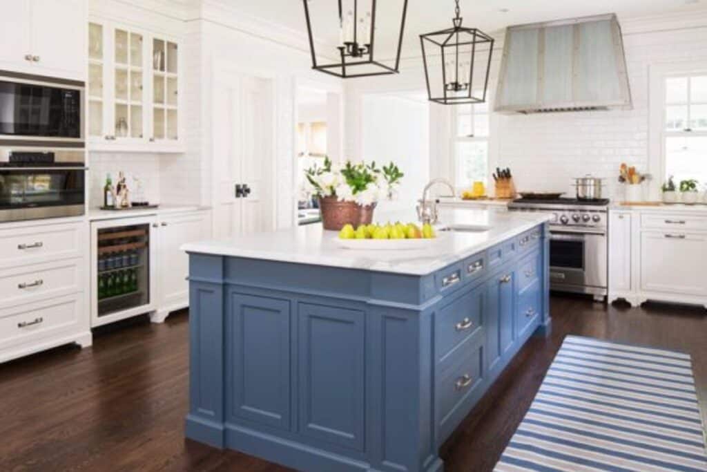
I don’t know anyone who wouldn’t want this kitchen! I love how Van Deusen Blue works with the white countertops, the stainless steel appliances as well as the dark hardwood floors.
Also, I would love to know where this rug came from because it matches perfectly!
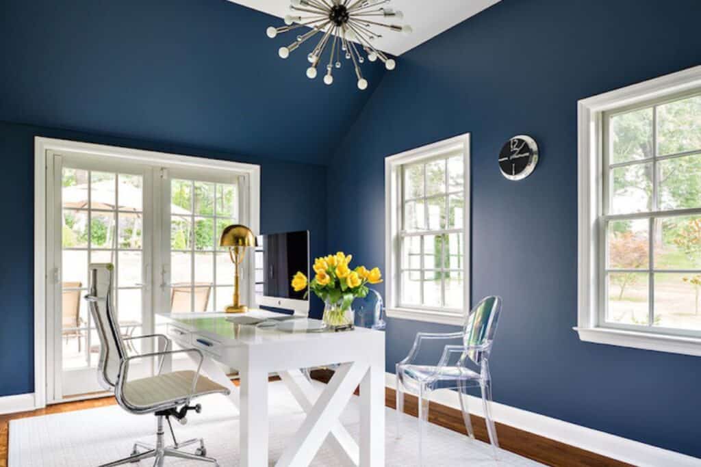
This shows how you can use Van Deusen Blue on the walls without it turning the room into a cave. Use it in a room with tons of windows for natural light and use lots of light furniture pieces to keep it bright.
Here you can see the furniture is mostly white, even the rug. Also the chair that is acrylic is perfect for keeping rooms from having that cave-like feel.
This bedroom is perfect for a guest room, kids’ bedroom as well as a space for when the grandkids visit! What I really think this space highlights is how well Van Deusen Blue pairs with gold. You can see it in the accent mirrors as well as other accessories in the room.
I hope you have picked up a lot of good info on Benjamin Moore Van Deusen Blue today. It’s a gorgeous blue that should not be overlooked!
Other blue paint colors you might like:
- Benjamin Moore Quiet Moments
- Sherwin Williams Naval
- Benjamin Moore Hale Navy
- Benjamin Moore Boothbay Gray


As a licensed Real Estate Agent and an avid home decorator, I strive to give my clients the very best I can when it comes to staging, selling, and decorating their homes. I have lots of experience with paint color choices and love to DIY my home so I can have everything just the way I want it. I share my ideas and projects with the world in the hopes that I can help others have their homes just the way they want as well.


Hi! Just used soot on shutters and garage door. Would love your opinion pls. Siding is Collingwood . Trim white dove. Brick Colonial and Front door is Van Courtland Blue. Something seems off . 🙁
Can I email a photo? Thanks!
Hi Grant. You can definitely email me. [email protected].