
Sherwin Williams Agreeable Gray: A Neutral Color
Sherwin Williams Agreeable Gray is one of the most popular paint colors and for good reason. For many years it has been the go-to recommended paint color from Real Estate Agents as well as designers.
When used in the right room it is one of the best neutrals you can find. What room is the right room? Stick around and I will explain everything.
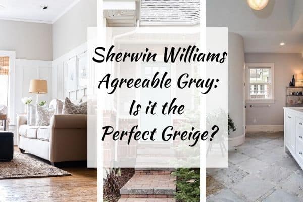
Agreeable Gray is a light paint color with a lot of color depth. It is one of the top 50 Sherwin Williams’ most popular paint colors.
I have first-hand knowledge of this paint color as I used it in my daughter’s bedroom on our lower level. Plan to see those pictures and lots more!
I have been asked so many questions about greige colors and what to pair with them. How do they compare to this color and that color are also hot topics. So today I wanted to share my thoughts on Agreeable Gray because I think it could be one of the most versatile greige paint colors.
*This post may contain affiliate links. See my full disclosure for details.
Is Agreeable Gray still popular in 2024?
You bet it is! As a real estate agent, this is my go-to paint color for selling houses. It’s also a great color to pair with honey oak cabinets.
It is also a great color because it’s a neutral but very light. White walls can be a little intimidating and feel cold but this color warms up a space nicely while keeping the color light and bright.
What Color is Agreeable Gray SW 7029?
Agreeable Gray is also known as SW 7029. Can be found #243-C1.
It is a mid-light gray paint color that has a lot of beige in it.
The LRV for Agreeable gray is 60. What does that mean? LRV stands for light reflective value. That basically means how reflective a paint color is for light.
It is a scale of 0-100 with 0 being the darkest black and 100 being the brightest white. Sixty straddles the border between light and mid-toned.
Agreeable Gray Stats
To understand a color you need to know what goes into that color. Here are the stats on Agreeable Gray:
- Red: 209
- Green: 203
- Blue: 193
- Hex Value: #D1CBC1
- Color Family(s): Neutral
- Color Collections: Living Well (Renew), Top 50 Colors, Pottery Barn (Fall/Winter), Gallery Series, Top Interior Colors, Top Exterior Colors, Pottery Barn Kids Collection 2024, Pottery Barn Teen Collection 2024, Pottery Barn Collection 2024
A color belonging in that many color collections has to be extremely popular!
Agreeable Gray Undertones
Greige colors have undertones of blue, purple, and green. Agreeable Gray has green undertones with a touch of purple. You don’t see the purple unless you have a space with very cool natural light (north facing) or rooms that have very little natural light.
The reason this is the #1 paint color for Sherwin Williams is that when painted in certain lights it can pull slightly blue/purple in color and in other lights it has that warmer beige tone where the greens are more the star.
How Lighting Affects SW AG
If your room faces north you will find that this color shows more of the purple undertones and gives a cooler look. I recently painted my daughter’s bedroom and this is the feel I am getting from the paint color. It’s cooler but still has a cozy feel.
If your room faces south then you will generally have a warm feel to the room because of the natural light so that will make the paint color take on that warmer tone of the greige.
Agreeable Gray really is a chameleon! It changes color based on the lighting situation.
Indoor lighting can also make an impact on how AG looks. I always recommend going with LED light bulbs because they are the closest thing to natural light.
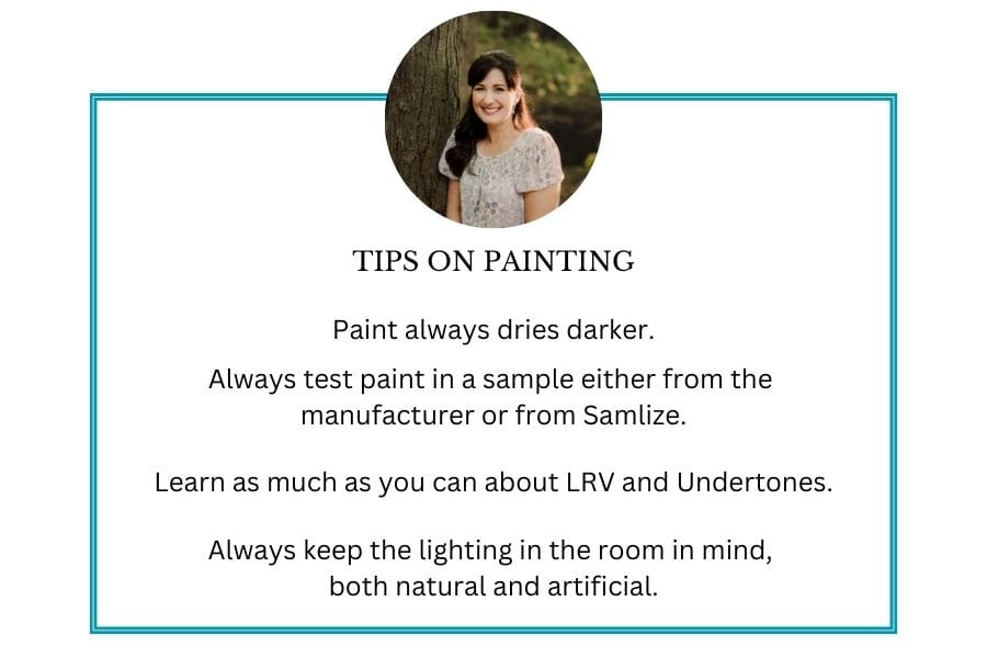
How to know if a paint color is right for you?
When picking a paint color for any room I always suggest getting a sample and looking at it with all the different lights of the day. This can really help you choose the right color for your home.
You can get paint samples from the store but then you have all these colors on the wall you have to paint over, and cans that can’t be used for anything else.
Using Samplize is a great option. Samplize will send you a 12X12 inch sample of whatever color you want and it’s peel and stick so easy to remove once you are done with it.
Sherwin Williams Agreeable Gray Whole Home Color Palette
Get this free whole home color palette for Sherwin Williams Agreeable Gray and you will also be part of the At Lane and High Community! You will receive weekly newsletters on new posts and you can unsubscribe anytime.
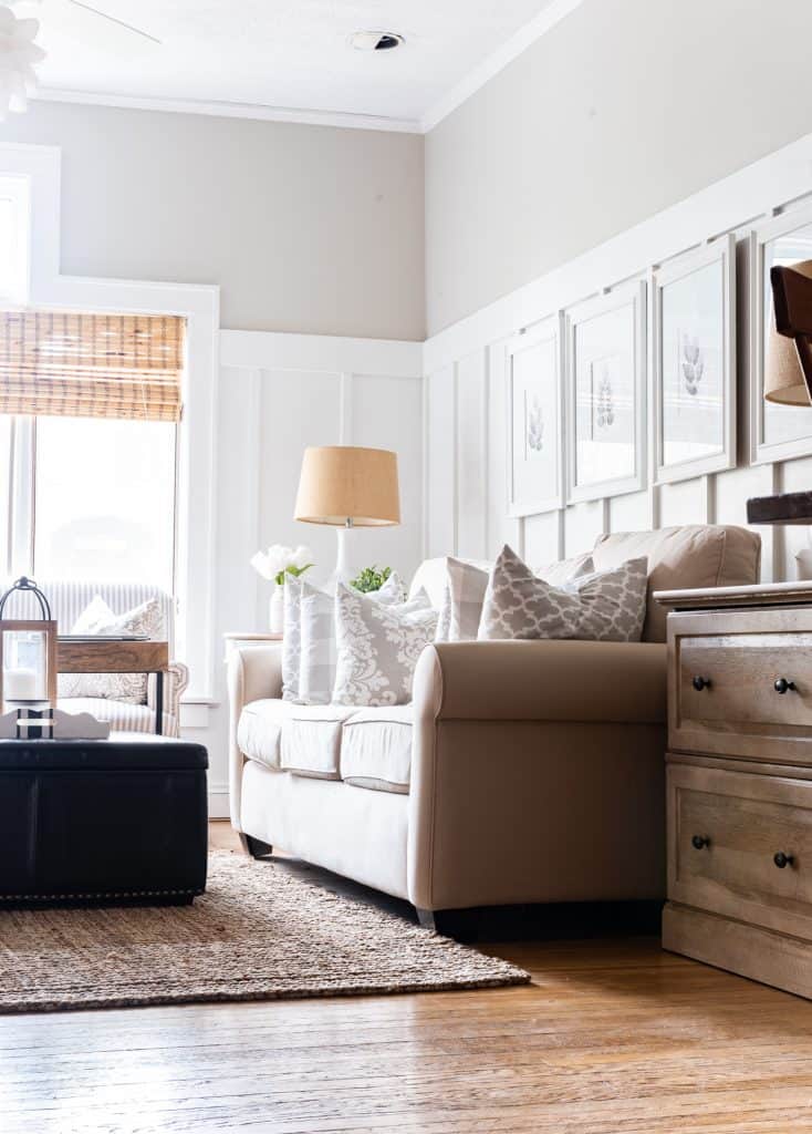
The best room you use SW 7029?
Well, the quick answer to that is EVERY ROOM! But seriously, it’s a gorgeous color that gives every room it’s in a wonderful backdrop without stealing the show.
Agreeable Gray in Real Homes
Agreeable Gray in the Family room
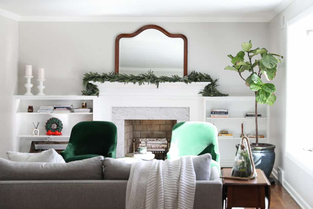
This room gets a lot of natural light so you can see the paint color is very light. When paired with the white it looks amazing!
This is a great example of how paint colors look with different facing walls. The wall on the right gets direct sunlight and looks lighter than the wall on the left.
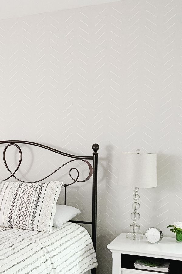
Agreeable Gray in the Bedroom
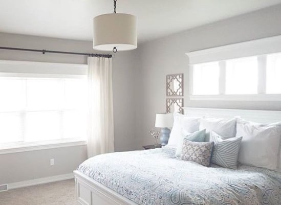
The two walls here both have windows so they aren’t really getting the direct sunlight and Agreeable Gray definitely looks a little darker than the first photo I shared.
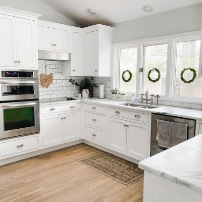
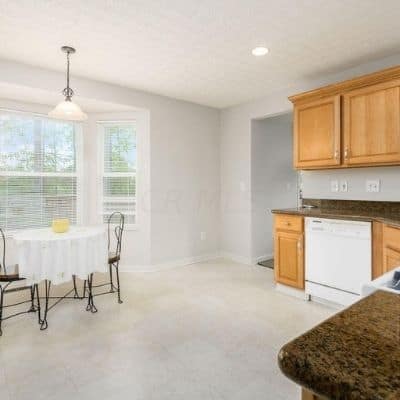
Agreeable Gray in the Kitchen
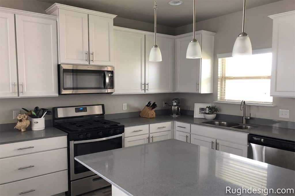
This kitchen has very little natural light and the paint color reflects accordingly. But you can also see how well Agreeable Gray goes with other grays with the color in the countertop.
Agreeable Gray in the Bathroom
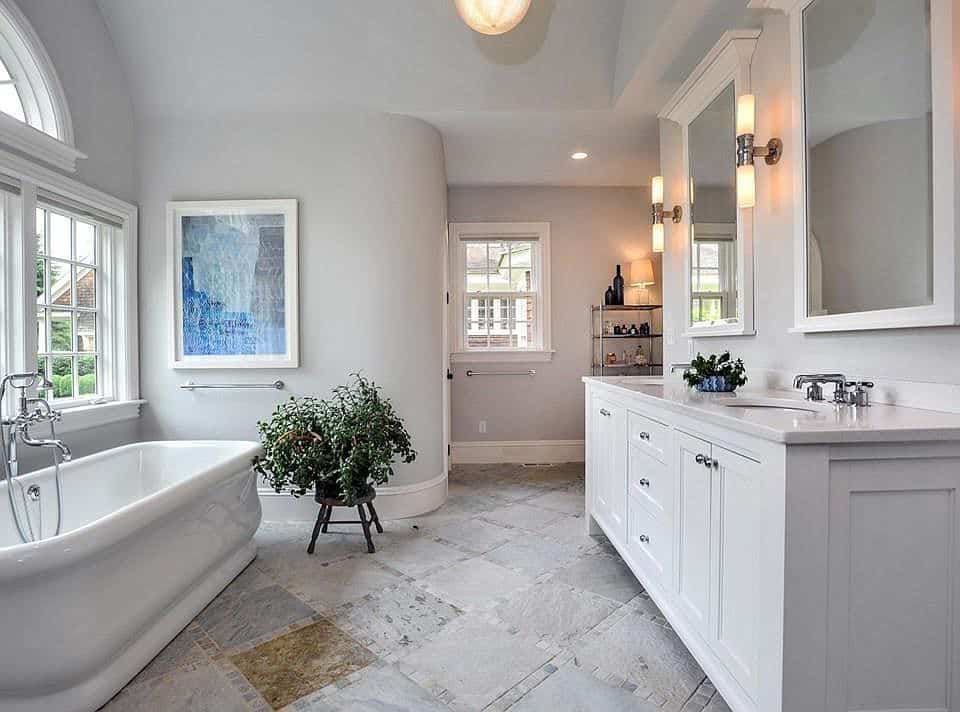
I absolutely love this bathroom! I think Agreeable Gray really softens all the harsh surfaces that you find in bathrooms.
Agreeable Gray in the Entryway
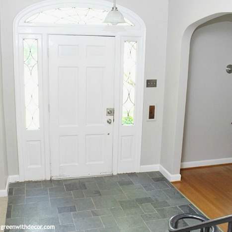
This photo showcases how well Agreeable Gray goes with wood tones seen on the floor. This is my go-to for clients who have these honey oak wood colors.
Agreeable Gray on the Exterior
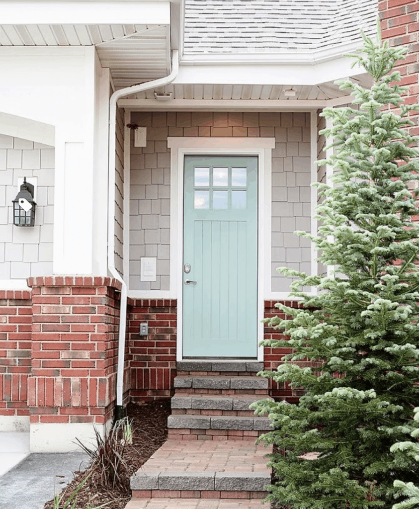
This home has gorgeous colors! You can see that Agreeable Gray goes really well with red brick!
AG is a great color for the exterior because the sunlight really brights it about 10 times as much as it looks on the interior of the home. Whites can really become stark but Agreeable Gray gives the home a warm feel without being too bright.
Agreeable Gray in a Basement
This is my daughter’s bedroom in our lower level. Outside her windows is a patio with a second story deck. We also have a forest surrounding the back.
To say that her room gets little to no natural light is an understatement. Here is how AG looks in a room with only natural light.
Would you like to save this?
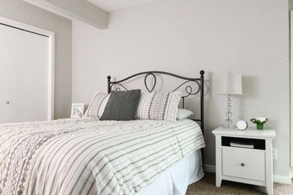
I love how cozy the room feels but it’s still light enough to keep the room from feeling like a cave. But the purple in the undertones do have a little bit of a moment when the blinds are closed and only a lamp is on. Something to definitely keep in mind.
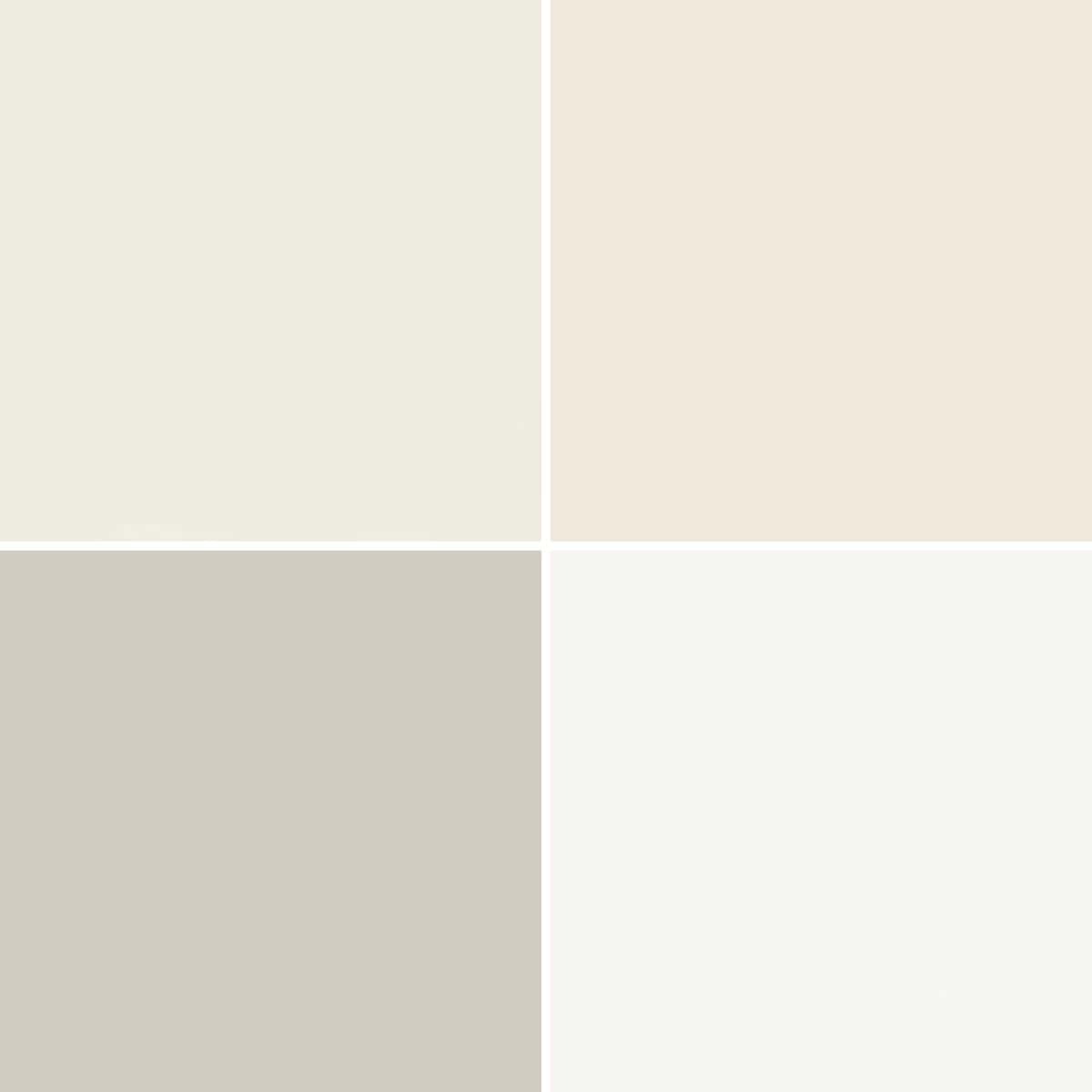
What Colors are Similar?
Here is how Agreeable Gray stacks up next to some of its color friends.
AG vs Wordly Gray
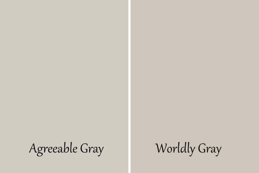
These two are very similar but as you can see Wordly gray has more of those green undertones and it’s LRV is a touch lighter. AG sits at 60 where WG sits at 57.
AG vs. Repose Gray
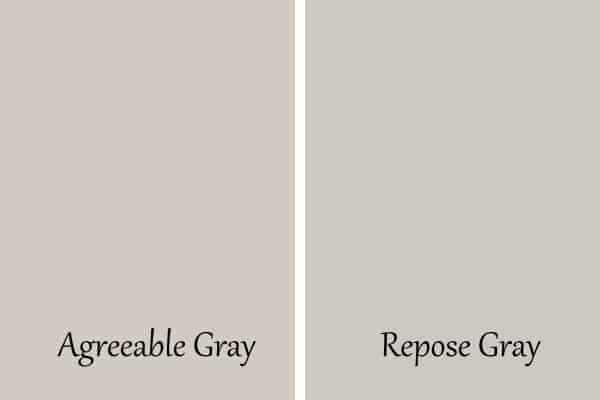
You can see in this side-by-side how different these colors are. Agreeable Gray has green and purple undertones and Repose Gray has more green, a touch of blue, and some beige.
Repose gray is also a touch darker with an LRV of 58 (remember AG is a 60).
I have a post all about comparing Agreeable Gray and Repose Gray if you want to dive into the differences a little more.
AG vs. Edgecomb Gray
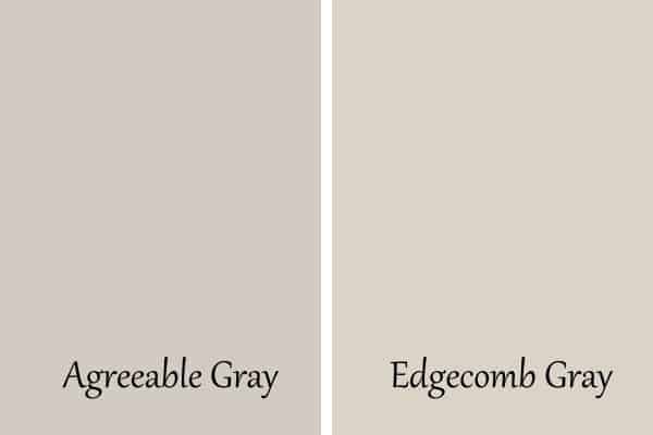
In this side-by-side, you can see that Agreeable Gray is grayer than Edgecomb Gray. EG looks a lot more beige than AG does. It’s also slightly brighter with an LRV of 64.
AG vs. Useful Gray
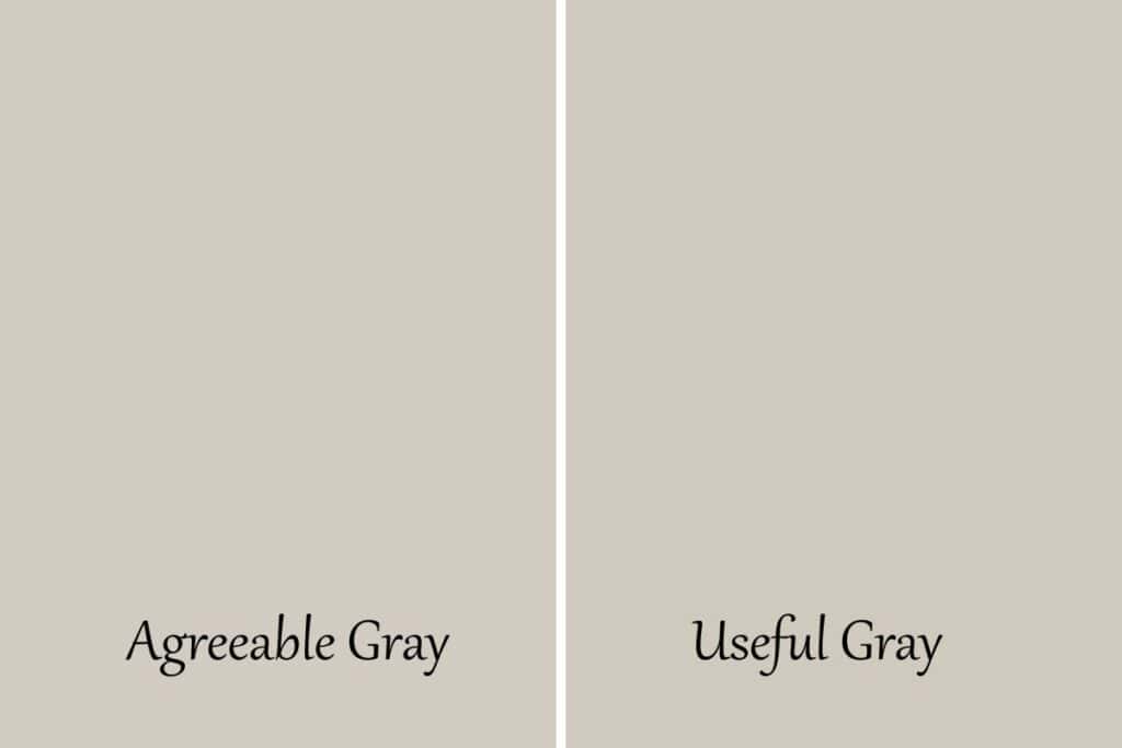
Useful Gray is a bit lighter than Agreeable Gray but again, they are more on the green side of the undertone whereas Agreeagle Gray is can pull more purple.
AG vs. Accessible Beige
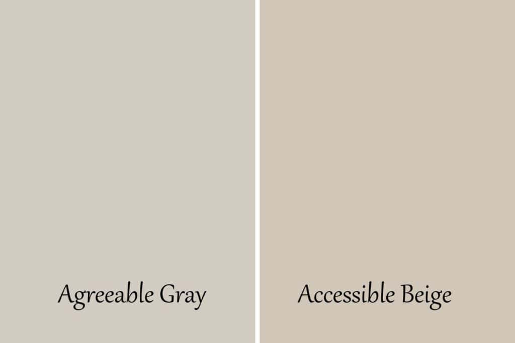
I included Accessible Beige because this color can really look like a greige. I would say it’s more beige than gray but it is in the family.
AG vs. Revere Pewter
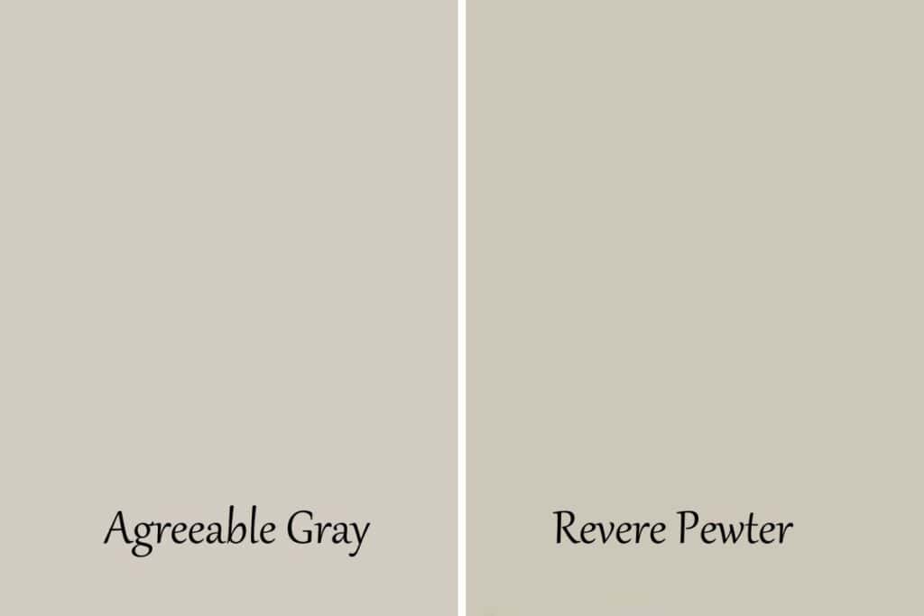
I think it’s safe to see Revere Pewter is darker than Agreeable Gray. RP has an LRV of 55 whereas AG sits at 60. Revere Pewter is definitely a mid-toned color.
The other difference again is the undertones Revere pulling a big toward green where AG is more green and purple.
It’s really true, undertones make the color world go round!
Coordinating Colors
I have a post dedicated all to Agreeable Gray Coordinating Colors but here are some of my favorites.
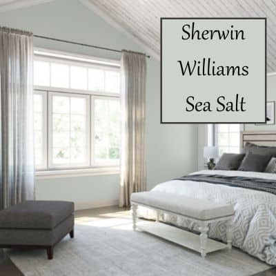
AG and Sea Salt


One of the fun things about this color is that it pairs so nicely with other colors. One of my favorite Sherwin Williams colors is Sea Salt. It’s a beach blue-green color that works so well with this greige color. Sea Salt doesn’t work well with all grieves that’s what makes this pairing so special.
AG and Oyster Bay

Oyster Bay is kind of a darker version of Sea Salt. It’s a pretty coastal color consisting of blue’s and greens. That is the reason it pairs so nicely with the blue undertones of Agreeable Gray.
AG and Coral Rose

Coral Rose is such a gorgeous color! The name also lends itself to the ocean. This dusty rose color pulls the purples out in Agreeable Gray.
AG and Hale Navy

Hale Navy is obviously a blue color, I know duh! But because it’s blue it pulls the blue undertones from Agreeable Gray. I love love love these two together. I think Hale Navy would be a great accent wall or furniture piece in a room with Agreeable Gray.
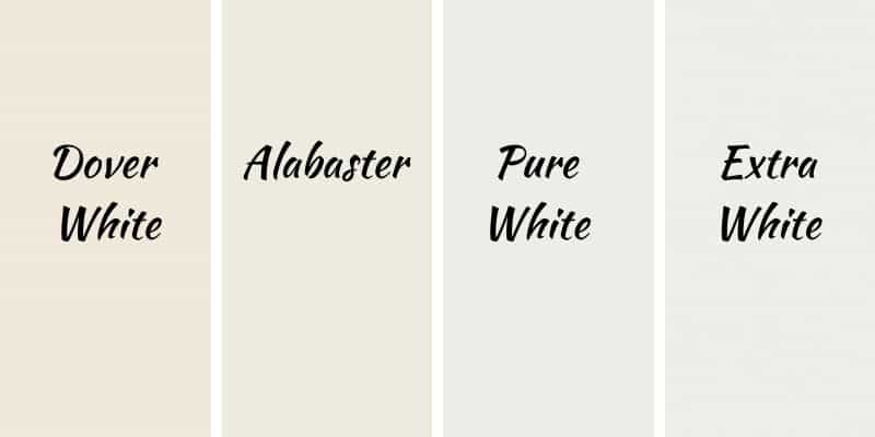
Best Whites to Pair With AG
Because of the versatile nature of Agreeable Gray, it really goes with anything.
I have a post just on white that I think you should check out if you want more options.
But I think these four whites work really well with Agreeable Gray: Dover White, Alabaster, Pure White, and Extra White. It all depends on what kind of contrast you want from your walls and trim.
How to Paint a Room
I have a really hard time paying someone to do something that I can physically do myself. It’s just the way I am.
I always do it myself and I realize that for some people who didn’t grow up in a home of do it yourselfers that this might be a daunting task. So we are going to break it down for you.
Paint Tools You Need:
- A good paint brush
- A roller and cover
- A paint tray
- Blue painters tape (at least 2 inches thick)
- A drop cloth
- A ladder
- Paint and a can opener (and maybe a stir stick)
This is important!
You want a good brush because if you get a cheap one it will leave bristles all over your wall and you will go crazy trying to pull them out.
You want a good roller cover because if you get a cheap one it will leave chunks of it all over your wall and you will go crazy again!
Prep is the most important. I buy the 2-inch tape because when you are getting tired you will get messy. Buying the thicker tape will give you more room for error when you are trying to cut in on the edges.
You need to plan for a whole day. Even for a small room, most of the time you will need to do 2 coats of paint. And you will find that the prep time and clean-up time take as long as each coat of paint does.
So give yourself the time of the whole day. Plus you will be tired after. And if you are anything like me you will have to wash your hair because I ALWAYS get paint in it! LOL
Painting Guide
Now that you have your supplies you just need to get painting! I have created this handy painting guide to help you get through all the steps of painting a room. It’s a pdf and you can easily download it from your inbox.

Related Paint Color Posts:
- Benjamin Moore Balboa Mist
- Sherwin Williams Crushed Ice
- Benjamin Moore Gray Owl
- Sherwin Williams Alpaca: Paint Color Review
- Benjamin Moore Pale Oak: A Warm Greige Paint Color

I hope you feel like you have a thorough knowledge of Sherwin Williams Agreeable Gray. That was my goal, and also to inspire you to use it in one or all the rooms of your home!

As a licensed Real Estate Agent and an avid home decorator, I strive to give my clients the very best I can when it comes to staging, selling, and decorating their homes. I have lots of experience with paint color choices and love to DIY my home so I can have everything just the way I want it. I share my ideas and projects with the world in the hopes that I can help others have their homes just the way they want as well.

I’m having such a hard time picking up paint colors for my home. We went Chantilly Lace and it’s sooo bright, it’s painful to look at. We have warm tones in our counter tops and espresso cabinets. Wood floors. Any help you can offer would be amazing. Thank you!
Hi Samantha. I can totally understand your issue. Chantilly Lace has an LRV of 92! Super bright paint color. Give Pale Oak a try if you still want a light color but not quite as bright. Edgecomb gray is a little darker than Pale Oak but would be really pretty too. Good luck! Might need to get your sunglasses out;)
I have a kitchen that leads into dining room, then into a family room. We are remodeling our home with white cabinets, white calcatta counters, with tiled backsplash very close to Rainwashed. Because it’s one shared wall from kitchen to family room, I’m having a difficult time figuring out the paint color. The same wall will also have a dark gray tiled fireplace wall, from floor to ceiling. Any suggestion you throw at me will be greatly appreciated 🙂 Thank you.
Hi Michelle, it sounds like your kitchen is going to be amazing! I love rainwashed. Because it’s a blue-green color I would stick with a cool-toned gray to tie it all together. A couple of my favorites are reflection and gray screen from Sherwin Williams. Good luck with the remodel!
Hey there. I have painted my interior home, including my kitchen “Agreeable Gray”. Absolutely love it. My trim is “Extra White”. I am having my cabinets painted white. My question is, What color white should I paint them? I want a warm white, not a cold white. Recommendations?
Hi Karen! Sounds very light and bright! I love it. I would give Benjamin Moore White Dove and Sherwin Willimas Alabaster a try. Both are warm whites, Alabaster warmer than White Dove but White Dove has a very pretty pull towards gray that might look nice with the wall color. Good luck!
I’m having my southern facing LR and foyer painted. I chose pale oak but the sample looks so light. I do want a change from my beiges but is pale oak a good choice. It looks more cream than greige. Can you assist?
Hi Nancy! Pale Oak is a really pretty color and in a southern facing room, it can fade away a bit because of the light that is coming in. If you wanted something with a little more color give Light French Gray a try. Despite its name it’s not that light and in my opinion more of a neutral gray. Pale Oak is a warm gray which means it leans towards beige. Good luck!
I’ve been looking for a post exactly like this!! We just finished off our unfinished basement that has very little natural light. I’ve been wanting to try agreeable gray but was hesitant. We are also repainting everything in our upstairs main living room that has large west facing windows with a fireplace with building in half wall bookshelves in stained rustic alder. I have had such a hard time deciding on what to paint in there since I really wanted to use a type of navy. After seeing your post I know what to do! I’m going to paint the two side walls agreeable grey and the fireplace wall hale navy for an accent with the medium rustic stained alder. Do you think that would work?.
Jess, I think that will look amazing! If you don’t mind please send me pics when it’s done! [email protected]. I can’t wait to see the finished product.
i have looked at a lot tonight may not be on the right page for comments on this,
I want to paint the whole house agreeable gray but need to know what color white for cabinets and vanities, and would you do a different white for trim or same, We have a lot of natural light
open floor plan with whit ice granite for kitchen & ornamental for bathrooms all hardware black
Hi Angela! Agreeable Gray is a great color. I would choose a white that would go on the cabinets and trim, keep it the same. I think Extra White and Dove White would be great choices. I would get a sample from the store and try them both and see which you like better. Good luck!
Totally unrelated to gray paints. My house is east west facing but with lots of shade and with solar screens, thus tends to be on the darker side. I painted my walls retry much throughout Sherwin Williams Creamy just to get rid of the basic flat white the previous owner had painted it for resell. I’m happy with the color choice. It looks pretty and creamy (no pun intended) but now I would like to add some color to some of the other rooms, upstairs bedrooms and bath and master bath but I’m struggling with coming up with colors to coordinate. Any help would be appreciated. Kids are all grown and so upstairs are all guest bedrooms and bath. Is it okay to paint them all the same color or should they be different? Also, my creamy just did not look good in the one bedroom I did put it in. Just kind of washed out as it is a west facing room but with solar screens. Help!
Hi Becky! I think you can do whatever you want in the upstairs bedrooms and bath. If you want them all the same color go for it, if you want them different that’s good too. Creamy is a warmer toned color so you might want to stick with warmer tones. They will blend well that way. For that west-facing room, you might want a greige paint color so it won’t get washed out so much.
I need help. My cabinets are serious gray and our flooring is warm gray lvt. I’m trying to warm up the cabinets…they look really blue, I think because the flooring is so warm. I’ve been adding in wood tones on the white quartz countertops, but want to find the right color to paint the walls. Wondering if agreeable gray would work? Thanks in advance!
Hi Nancee! I love Serious Gray! I painted that in my powder room last fall and am just obsessed with it. I think Agreeable Gray is a good choice. It’s a warm light gray that would look great with the floors and should pair nicely with the cabinets. I would definitely get a sample and test it first before you commit. Good luck!
Hello!!! I was curious what color door that was?! I love it!!! Thank you!!
Hi Christine. It’s Sherwin Williams Tidewater.