
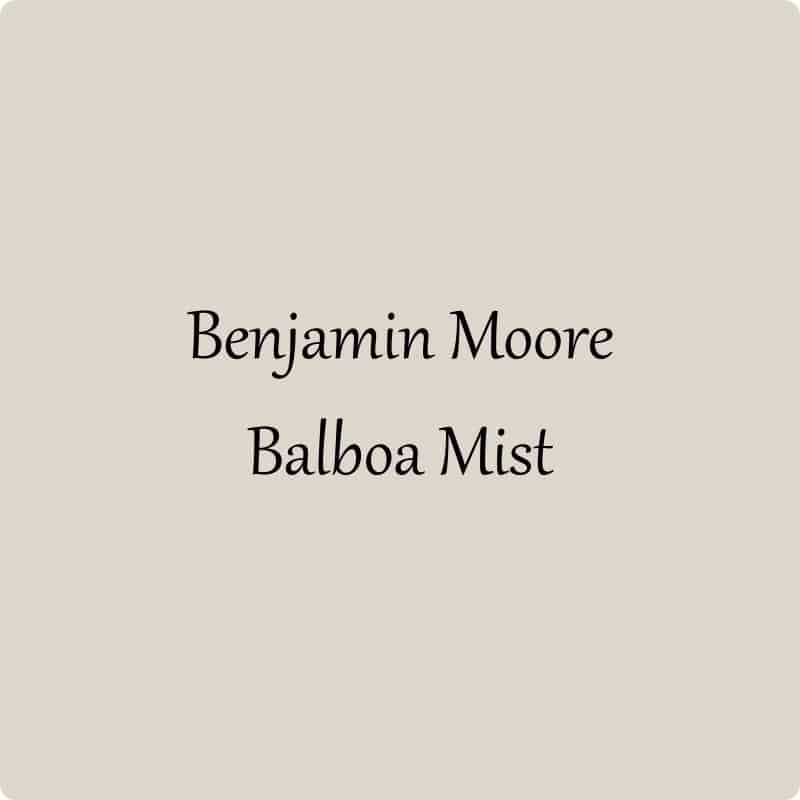
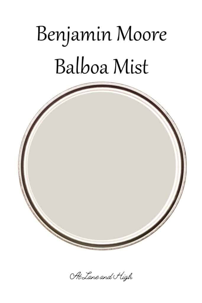
Benjamin Moore Balboa Mist
Benjamin Moore Balboa Mist OC-27 is a beautiful creamy color that sits between a gray and a beige. It is in Benjamin Moore’s off-white collection and is one of their most popular paint colors! Today we are going to dive into why that is.
What I love most about this color is that it really ties together all the different elements of the home. From rustic hardwood floors to crisp white trim and all the different hard surfaces in a kitchen or bathroom, this color brings them all together and lets them shine.
*This post contains affiliate links. For more details see my full disclosure.
Balboa Mist Undertones
Balboa Mist is a gray paint color that pulls towards beige. That makes it a greige paint color. Typically beiges have yellow undertones and you will see with this color that is the case, but the gray neutralizes. So you won’t have yellow walls if you choose this color.
While Balboa Mist has yellow undertones it also has purple in it which makes it a wonderfully complex color.
Is Balboa Mist Warm or Cool?
Because Balboa Mist has yellow undertones and is considered a greige paint color it falls on the warm side of the spectrum. There are other greiges from Benjamin Moore that are warmer. For Balboa Mist it all depends on what type of natural light a room receives.
- In rooms that have the cooler north-facing light, Balboa Mist will pull more gray therefore toning down the warmth in the paint color.
- In rooms that have the warmer south-facing light, Balboa Mist will pull more beige therefore enhancing the warmth in the paint color.
Balboa Mist LRV
If you aren’t familiar with the term LRV it stands for Light Reflective Value and is a scale from 0-100. Zero being the blackest black and 100 being the brightest white. Anything over 60/65 is considered a bright color and this is where Balboa Mist falls.
The LRV of Balboa Mist is 65.53 which makes it a fairly bright paint color, but not nearly as bright as some others in the off-white collection. This color has a little more depth while still being fairly bright.
How Light Affects Benjamin Moore Balboa Mist
- North-facing rooms have a light that tends to be a little cooler in nature and will come off slightly blue. Light colors will be a bit more muted or washed out while darker colors will be stunning.
- East-facing rooms will have brighter light in the morning and less in the evenings. The evening light will be a bit cooler. In the morning with sunrise, the bright sun will be warm. Warm color palettes are great for these spaces because they will help balance the cool feel of the evenings.
- South-facing rooms have consistent warm light throughout the day. The light really shows off the colors, dark will be very bright, and light colors will shine. Both warm and cool color palettes look good in a south-facing room.
- West-facing rooms have warm light in the evening and cooler light in the morning. Basically, it’s the opposite of east-facing.
In rooms that have the cooler north-facing light, Balboa Mist will pull more gray therefore toning down the warmth in the paint color.
In rooms that have the warmer south-facing light, Balboa Mist will pull more beige therefore enhancing the warmth in the paint color.
How to know if a paint color is right for you?
The best way to judge if a color is good for you then you will want to put a swatch on the wall and look at it over a few days. Look at it in different lights and decide if you really like it.
You can do this by getting a sample from the paint store and using a brush put it up on the walls, but then you are left with a can that you can’t do anything with. Those samples are used with poor quality paint and aren’t meant for use on your walls permanently.
I recommend going with Samplize. They are a company that will send you a 12X12 peel and stick swatch of a paint color that you can stick to the wall. When you are done just peel it off and throw it away.
It’s easy and much less messy!
Benjamin Moore Balboa Mist Whole Home Color Palette
Get this free whole home color palette for Benjamin Moore Balboa Mist and you will also be part of the At Lane and High Community! You will receive weekly newsletters on new posts and you can unsubscribe anytime.
Where to Use Benjamin Moore Balboa Mist
Balboa Mist is a great color for any room. It’s also fabulous as a color for an open floor plan.
Here are some great places to use this color:
- Bedrooms
- Bathrooms
- Family Rooms
- Basements
- Kitchens
- Kitchen/Bathroom Cabinets
- Dining Rooms
- Exterior
- Entryways
Let’s look at Balboa Mist in some of these spaces.
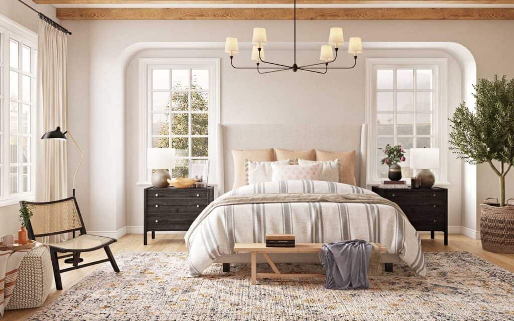
Balboa Mist in the Bedroom
This bedroom from Havenly is a great example of the calming effects a neutral space can have. The neutral walls, neutral fabrics, and light hardwood floors really lend themselves to calm.
I also love the added touches of greenery throughout the space. Plants always give that natural touch and leave a person feeling calmer.
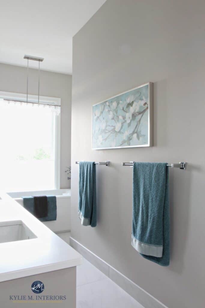
Balboa Mist in the Bathroom
This gorgeous bathroom from Kylie M. Interiors illustrates how light can affect the color of Balboa Mist. With all the natural light beaming in through that window the color on the walls looks decidedly more gray than beige.
With that pull towards gray the homeowner added the cooler touches of blue and teal which go very nicely with the paint color.
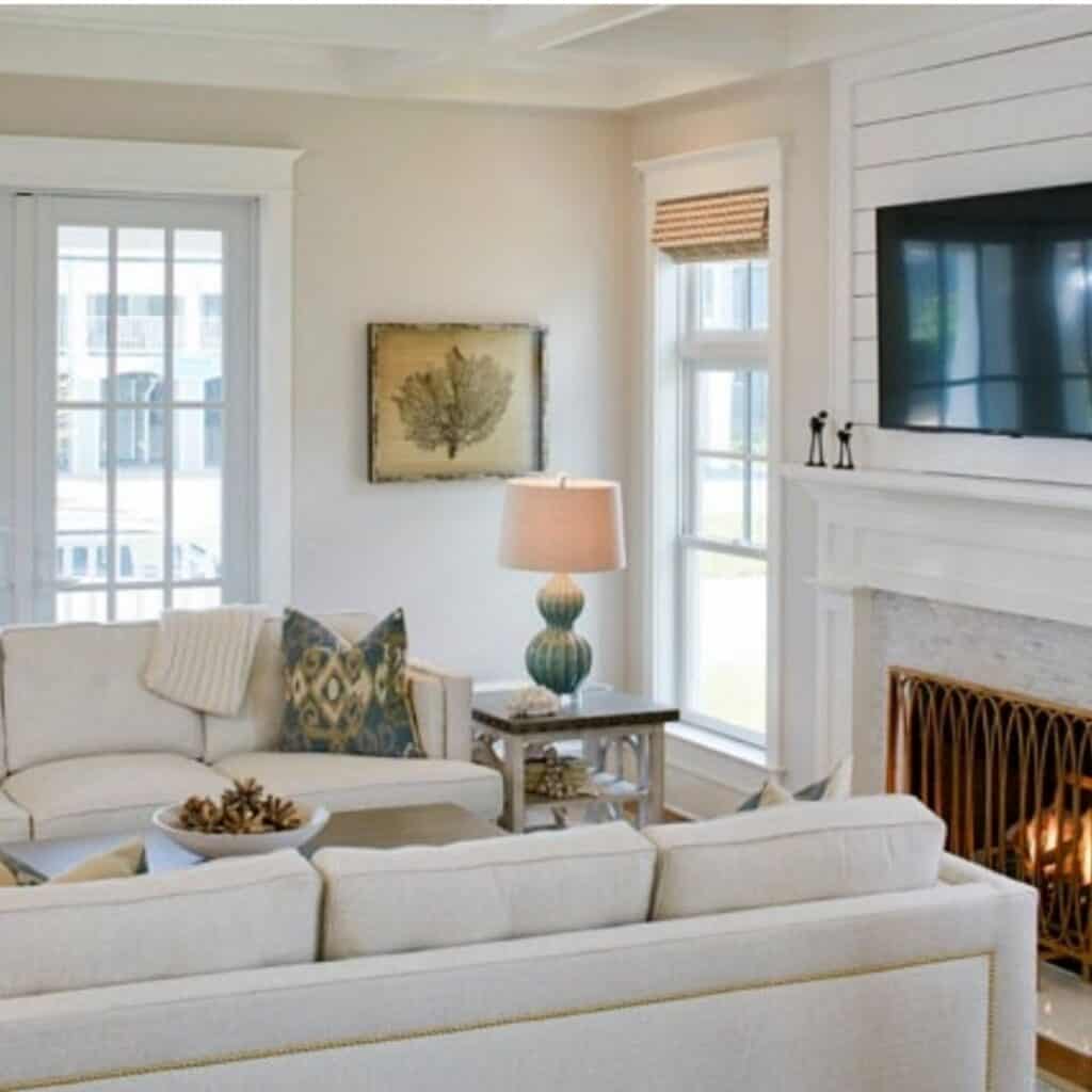
A Family Room in Balboa Mist
In this family room, you have the opposite effect. The lack of ample natural light makes the paint color pull more beige. The crisp white ceiling, trim, and shiplap make that stand out more.
I love how they paired the color with the neutral upholstery. This leaves the star of the show in the accessories. Well done Marnie Custom Homes!
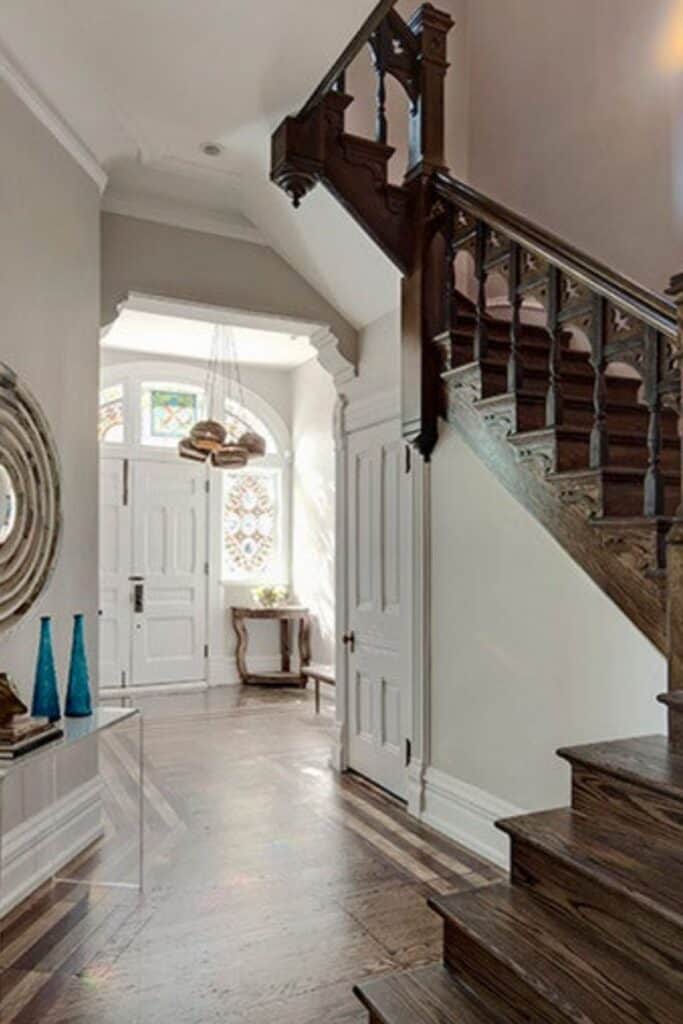
Balboa Mist in the Entryway
I think the staircase here is the star of the show, it’s simply gorgeous! The perfect way to allow an architectural detail to be the star is to make the walls the perfect neutral backdrop and this is what we have here.
SPACE Architects and Planners did a wonderful job of letting the staircase and details on the floor stand out by allowing everything else to fade away. Even the use of an acrylic table so it just disappears does the trick!
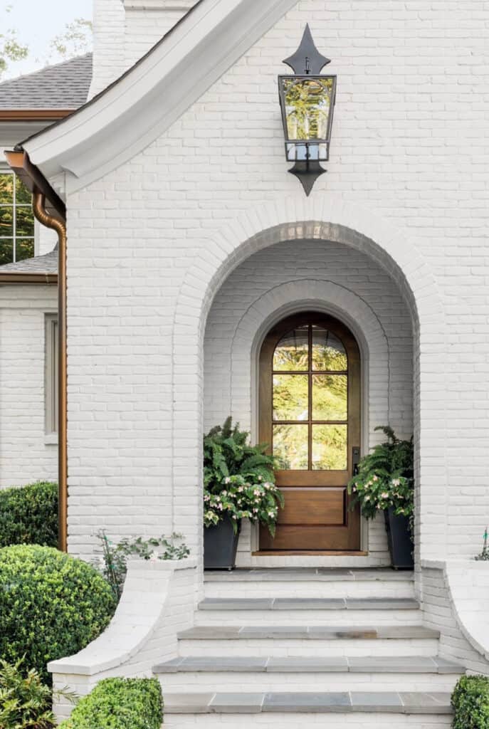
Balboa Mist on the Exterior
This gorgeous home from Ladisic Fine Homes has a painted brick in Balboa Mist. I love how it looks with both the black and copper accents. It also pairs beautifully with the wood front door and gray slate steps.
Coordinating Paint Colors
Balboa Mist looks amazing with gray paint colors with similar undertones. It also looks great with off-white paint colors and warm neutrals.
Gray-blue colors are a good choice to pair with Benjamin Moore Balboa Mist.
You can even consider warm whites as a good choice!
The Best White Paint Color to Pair with Balboa Mist
The best whites to go with Balboa Mist in my opinion are Chantilly Lace or Oxford White. Chantilly Lace is a brighter, white color and will give a nice contrast to the greige Balboa Mist.
Oxford White however is a softer white and will blend more than contrast with BM.
Would you like to save this?
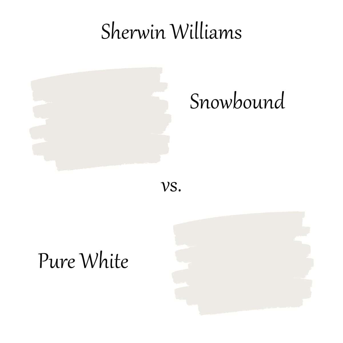
A good Sherwin Williams white color that will work with Balboa Mist would be Pure White. It’s a little on the warm side but not as creamy as others and will still be a good crisp white to pair with Balboa Mist.
Let’s Compare Other Colors to Balboa Mist
I love comparing Balboa Mist to other paint colors. When you put them side by side you really can see how the undertones are different and which ones are lighter and darker.
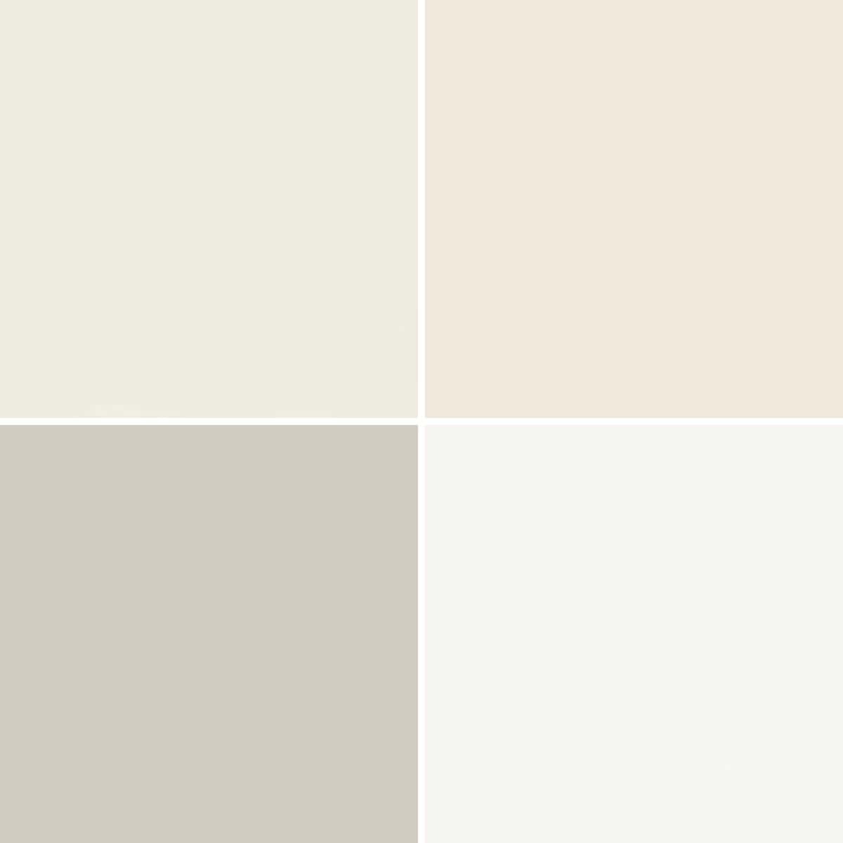
Balboa Mist vs Classic Gray
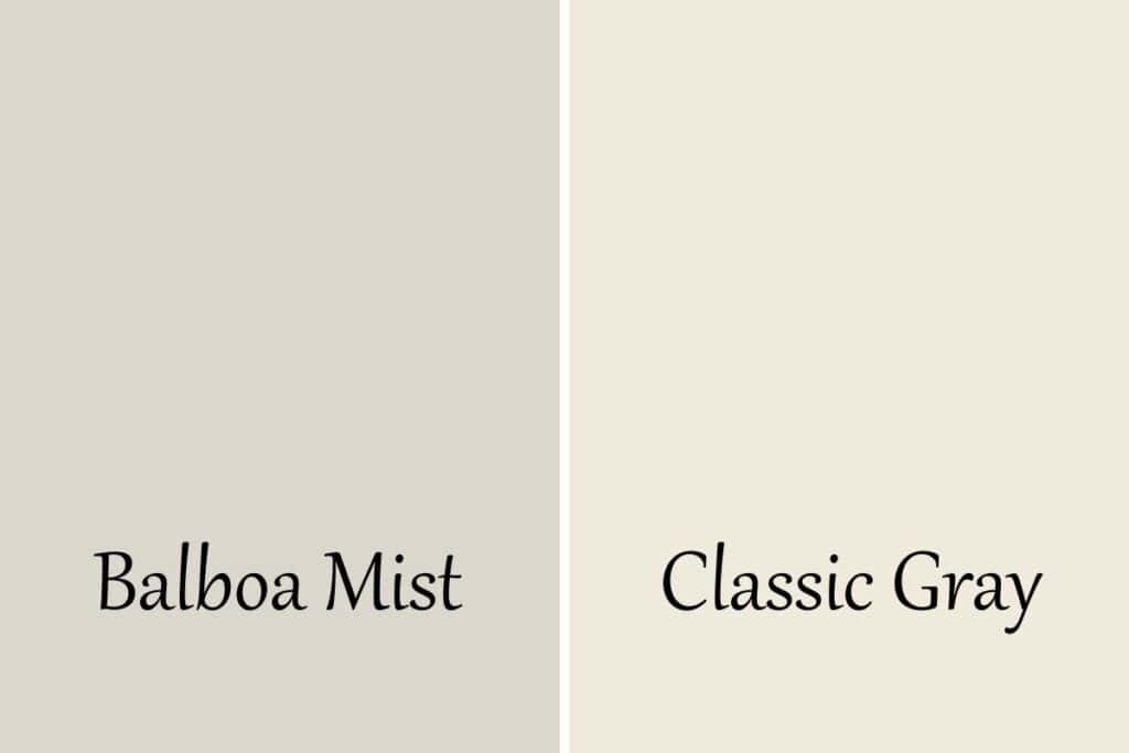
Both of these colors are considered greige paint colors but the big differences between them are the undertones and LRV.
Balboa Mist has an LRV of 65.53 and Classic Gray is at 75. So Classic Gray is much lighter. Classic gray also has green undertones with a touch of violet where Balboa Mist is more yellow undertones with a touch of violet.
Balboa Mist vs Sherwin Williams Egret White
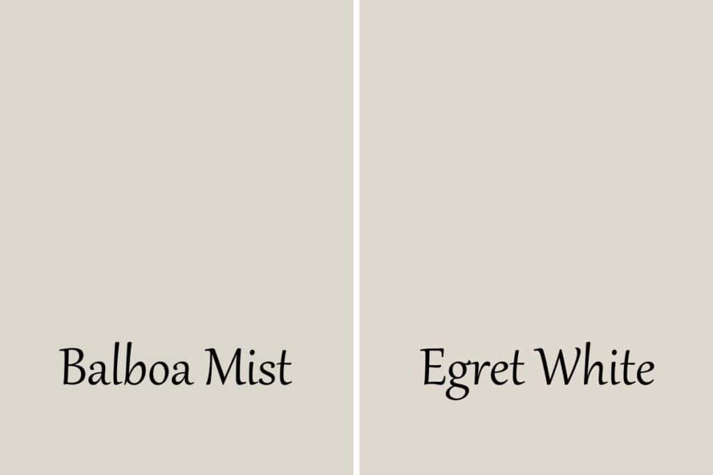
Egret White isn’t really a white, definitely an off-white. It is bright with an LRV of 70 so it’s brighter than Balboa Mist. Egret White is also different from Balboa mist because it’s not a greige. It’s more of a taupe.
Balboa Mist vs Collingwood
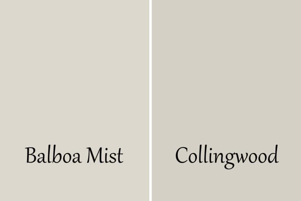
If you love Balboa Mist but it’s a bit too light for you then give Collingwood a try. They have the same undertones but Collingwood has an LRV of 61.52 which is definitely darker than Balboa Mist’s 65.53.
Balboa Mist vs Sherwin Williams Agreeable Gray
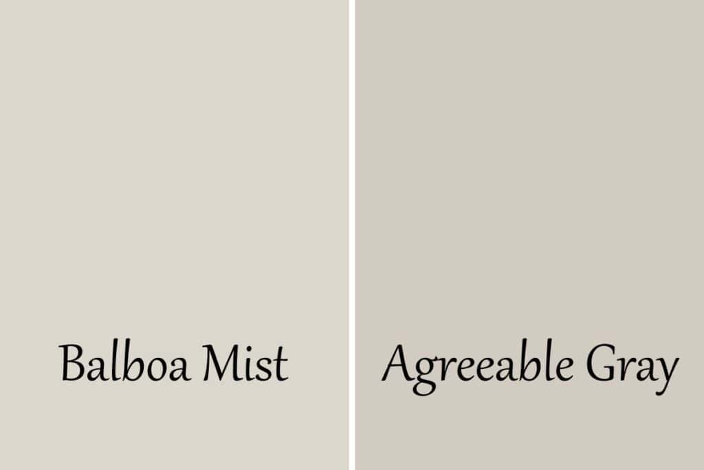
Here you can see that Balboa Mist is much lighter with an LRV of 65.53 and Agreeable Gray at 60. Agreeable Gray also has green undertones with a touch of purple. Balboa Mist is more yellow with a touch of purple.
Balboa Mist vs. City Loft
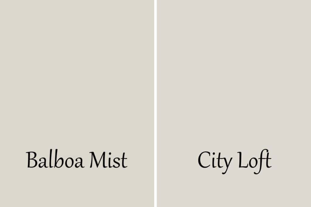
City Loft is pretty close to Balboa Mist. The biggest difference between the two is the LRV. Balboa Mist is a 65.53 and City Loft is at 70, so City Loft is lighter.
Balboa Mist vs Edgecomb Gray
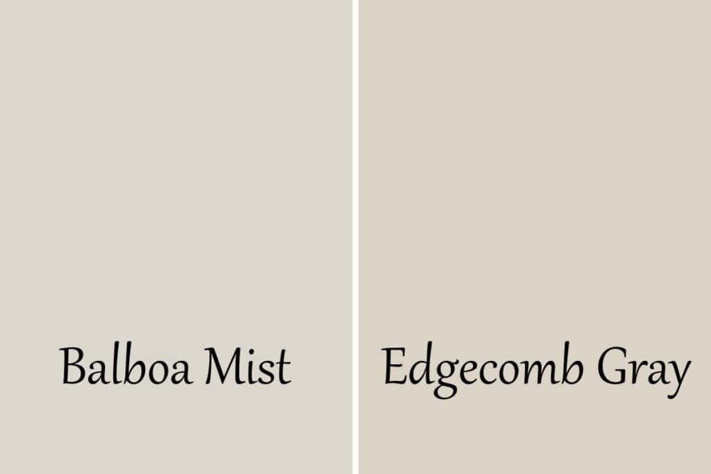
As a side by side you can really see how these colors are very different. Edgecomb Gray has strong green undertones and leans much more beige than gray. It also has a lower LRV of 63.09 making it a bit darker.
Balboa Mist vs Pale Oak
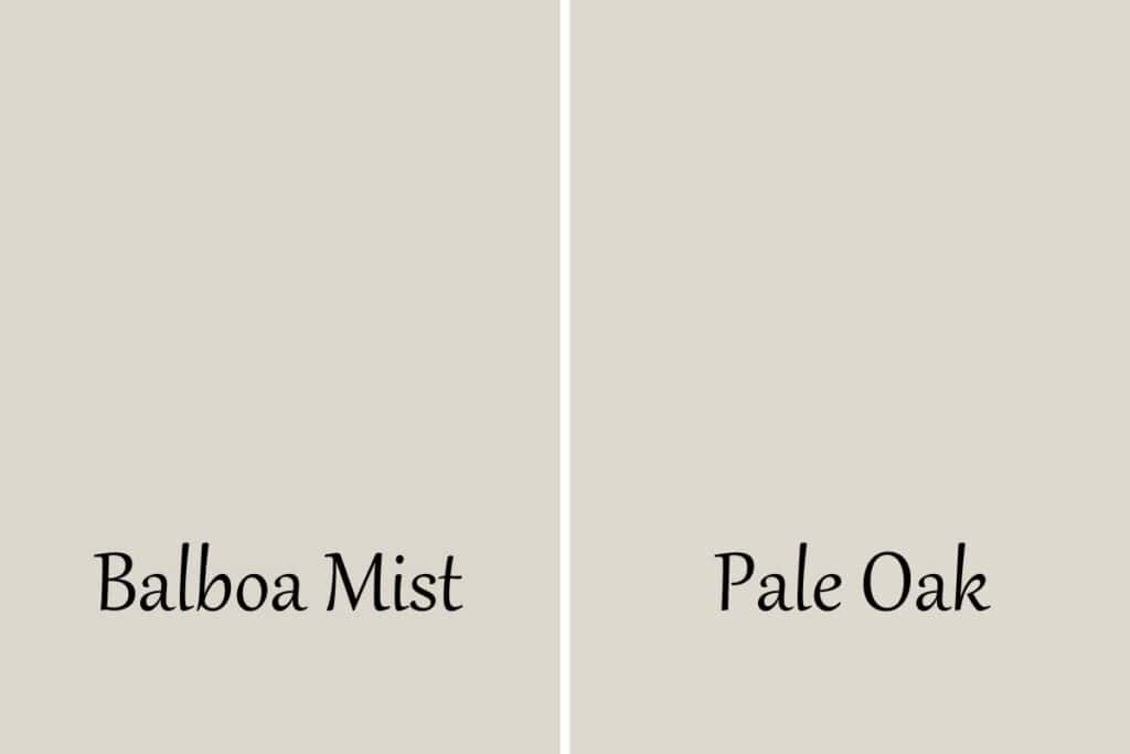
These colors look very similar but the big difference is that Pale Oak has more taupe undertones. It’s also a tad brighter with an LRV of 68.64.
Balboa Mist vs. Sherwin Williams Gray Heron
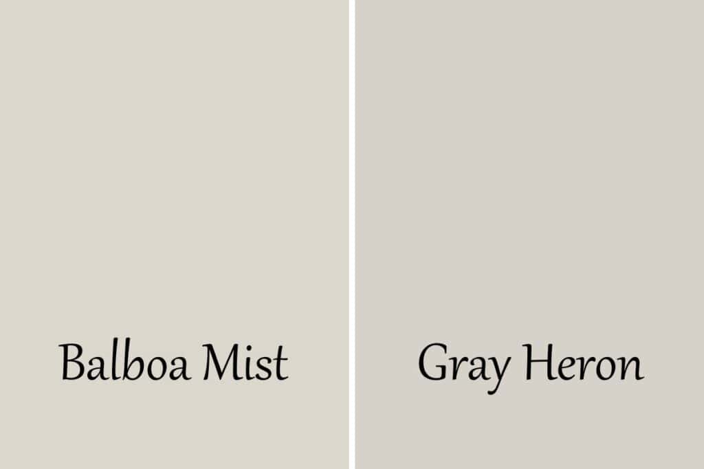
These two are ver similar even though they come from different paint manufacturers. Gray Heron is a touch darker with an LRV of 65 where Balboa Mist is at 65.53. That’s really the only difference!
When should you avoid using Balboa Mist?
I would avoid using Balboa Mist in two ways. I would stay away from pairing it with gray green colors. The undertones will not go well together.
I would also avoid using Balboa Mist in a monochromatic way. Your space will end up looking dingy.
Frequently Asked Questions
Will Balboa Mist ever look pink?
Because Balboa Mist does have a slight pink/purple tint in it’s undertones there are certain times it can look pink. But this will only be a slight wink and not a full on blush.
Will Balboa Mist ever look green?
Balboa Mist should not look green in your home. If it does it’s because of the combination of several factors such as natural light, artificial light, other colors in your space, and the reflection of nature from the outdoors.
Is Balboa Mist a good exterior paint color?
Balboa Mist is a great exterior color! It can get a bit washed out with all the natural light. If you are looking for a color that has more of an off-white look there are others that are better. But if you are going for a bright white, this is a great choice!
What dark paint colors work with Balboa Mist?
There are a ton of really great dark paint colors that work with balboa mist. I love black and dark charcoal gray with blue or brown undertones.
If you want specific ideas then click on the whole home color palette above and you will get some really amazing ideas.
Can I use Balboa Mist as an interior trim color?
You can but it’s a darker color to be considered a white trim color. If your walls are white and you want a contrasting color on the trim without being too dark this would be a good option.
Can I use Balboa Mist for cabinets?
Balboa Mist is a great choice for cabinets! This is especially true when off-whites are just too bright in the space and creamy paint colors are just too yellow.
What is the Sherwin Williams equivalent to Balboa Mist?
There are no equivalents between paint manufacturers but the closest color at Sherwin Williams to Benjamin Moore Balboa Mist would be Gray Heron. City Loft is a close second but it’s much lighter.
Which is better Pale Oak or Balboa Mist?
There really is no better paint color because what is better depends on the home and what a person wants. It’s subjective. So the better color is which color you personally like better for your personal home.
What is the difference between Agreeable Gray and Balboa Mist?
Agreeable Gray is darker than Balboa Mist and it has a different undertone. AG has green undertones and Balboa Mist has yellow. Both have a touch of purple undertones as well.
Recap and Final Thoughts
Let’s recap what we have learned about Balboa Mist:
- It’s a gray paint color that falls in the greige family.
- It has yellow undertones with a touch of purple.
- It’s a warm paint color
- In north-facing rooms, a slight purple undertone can peak through.
- It has an LRV of 65.53 which makes it a pretty bright paint color.
- It pairs really well with grays of similar undertones, off-whites, and gray-blue colors
My final thoughts on this color are it’s really important to know what kind of natural light you receive in a room to determine if it’s right for you. If you want a more gray color then make sure the room gets lots of natural light, especially on the northern side of your home. If you want a warmer, beige tone then less natural light or a south-facing room is best.
Light bulbs can also influence this. It’s all about lumens and the higher the lumens the more light natural daylight you will see.
In the end, I don’t think you can really go wrong with this color. It has so many great attributes that I believe you will love the end result.
More paint color reviews you might like:
- Sherwin Williams Agreeable Gray: Is it the Perfect Greige?
- Sherwin Williams Greek Villa
- Benjamin Moore Quiet Moments
- Benjamin Moore Revere Pewter
- Sherwin Williams Repose Gray Paint Color Review
- Benjamin Moore Stonington Gray: Is it right for you?
- Benjamin Moore Edgecomb Gray
- The Best Greige Paint Colors For Your Home
- Benjamin Moore Pale Oak: A Warm Greige Paint Color
- Benjamin Moore Gray Owl


As a licensed Real Estate Agent and an avid home decorator, I strive to give my clients the very best I can when it comes to staging, selling, and decorating their homes. I have lots of experience with paint color choices and love to DIY my home so I can have everything just the way I want it. I share my ideas and projects with the world in the hopes that I can help others have their homes just the way they want as well.


Is the paint color on the door in Marnie Custom Homes Benjamin Moore Cool Breeze?