
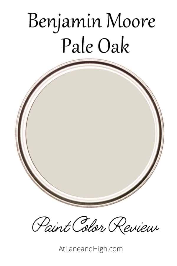
Benjamin Moore Pale Oak: A Warm Greige Paint Color
Benjamin Moore Pale Oak is one of the most stunning neutral paint colors you will find. Why? Well I will go into all the details on this color and where you should use it. I will also feature beautiful homes it is used in!
You guys know I love my paint colors and Pale Oak is just about one of my favorites. Benjamin Moore has some of the most gorgeous neutral paint colors on the market!
This gorgeous color is not just a neutral but a perfect backdrop for any home decor style, that’s why it’s so loved.
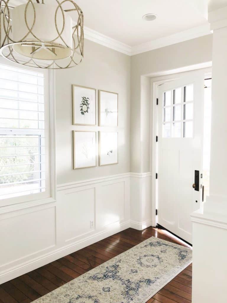
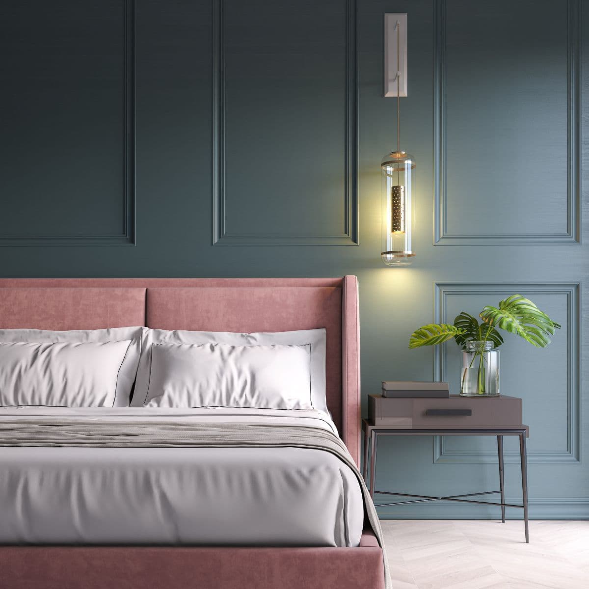
Look at this gorgeous entryway! I mean, how can you possibly argue that this isn’t a stunning color.
*This post contains affiliate links. For more details see my full disclosure.
What Color is Benjamin Moore Pale Oak?
I get asked about this paint color so many times it only makes sense to go into a deep dive of what it is and how you should use it.
It is a soft light gray paint color that makes me so happy. It definitely warms up your home and adds a neutral color that won’t steal the show from your gorgeous decor.
Benjamin Moore describes this color:
With its warm gray undertones, this versatile neutral conjures the quiet majesty of white oak.
Benjamin Moore
I like this description because white oak is neither white nor gray, it’s a mixture and that really gives a good explanation of Pale Oak.
Pale Oak Stats
Here are the stats on Edgecomb Gray:
- Hue Family – Yellow
- Value – 8.50
- Chroma – 0.73
- COLOR COLLECTIONS – Off-White Collection, Best-Selling Colors
What are the undertones of Benjamin Moore Pale Oak?
Pale Oak is a gray paint color that has green undertones. It also has a little wink of pink/purple.
Are you freaking out over that? Have no fear. You will rarely if ever see the pink/purple.
The only way you will see it is if you fixed furnishings, such as your flooring, cabinetry and furniture, bring them out. Also the lighting in the room is very important when it comes to undertones. We will get into all that here today.
What is the LRV of Pale Oak?
If you haven’t checked out my other paint color posts, let me tell you what LRV means.
LRV stands for light reflective value which is a scale that measures the amount of light a paint color reflects. The scale is from 0-100 and 0 is the blackest black, with 100 being the whitest white.
Pale Oak has an LRV of 68.64, which is a very light paint color.
It’s going to bounce around a ton of light. However, even though it is light when you pair it with a white trim you will definitely see a contrast in the color.
How does light affect Pale Oak?
Light has a huge effect on how a paint color will look in a room. Here are the basics:
- North-facing rooms have a light that tends to be a little cooler in nature and will come off slightly blue. Light colors will be a bit more muted or washed out while darker colors will be stunning.
- East-facing rooms will have brighter light in the morning and less in the evenings. The evening light will be a bit cooler. In the morning with sunrise, the bright sun will be warm. Warm color palettes are great for these spaces because they will help balance the cool feel of the evenings.
- South-facing rooms have consistent warm light throughout the day. The light really shows off the colors, dark will be very bright, and light colors will shine. Both warm and cool color palettes look good in a south-facing room.
- West-facing rooms have warm light in the evening and cooler light in the morning. Basically, it’s the opposite of east-facing.
What does all this mean for Pale Oak? In a north-facing room the color will be very washed out and you won’t see much of it at all because of the cool natural light. In a south-facing room the warmth will really come through and you might see a touch of those green undertones.
In the east and west-facing rooms, you will have the most gorgeous of colors with this paint color. During light times the color will be nice and bright but in the darker times, the paint color will help bounce around the light to help keep the room from being too dark.
Is Benjamin Moore Pale Oak warm or cool-toned?
Pale Oak is a warm-toned gray paint color. In rooms with little natural light Pale Oak looks more gray but in rooms with tons of natural light it pulls more off white, or creamy.
Is Pale Oak a greige paint color?
Yes, it is a greige color. Some people would even go so far as to say this is a very light taupe color because it leans very much to the beige side of greige.
However, because there is gray in the paint color you won’t see it lean too far in any other direction. The creaminess it has in it creates one of the most gorgeous greige colors.
How to Know if a Paint Color is Right for You
You can get a paint sample from the paint store but when you are done you will be left with a small can of paint you can’t use anywhere else. I don’t recommend going this route.
I highly recommend going with Samplize. It’s a company that will mail you a 12×12-inch peel and stick sample of just about any paint color.
You can put it on a wall, look at it over the course of a couple of days then when you decide which one you want you can throw it away. No mess, no fuss and that’s how I like to roll!
Check out Samilize and see if it’s the right fit for you!
What colors go well with Pale Oak?
Pale Oak goes with almost any color out there. I love to see it with muted blues, dark accents (especially black), pinks, and gray greens.
You can also pair it with blue-grays but try to go a little darker than pale oak, which really isn’t hard because it is such a light color.
What is the Best White Trim Color for Pale Oak?
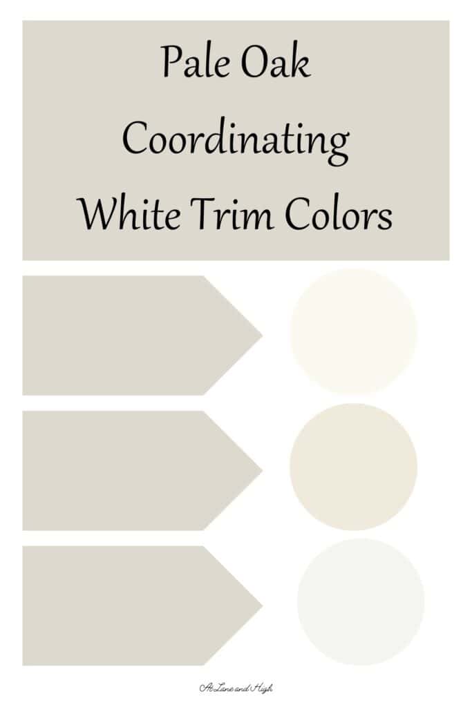
I have three white paint colors from Benjamin Moore that I think would look amazing with Pale Oak.
- Simply White
- White Dove
- Chantilly Lace
There is also another option. You can go for a monochromatic look which is very calming and keeps the eye from noticing the breaks in color.
The way to get a monochromatic look with paint is to use the same color paint on the trim as you use on the walls. This looks really good on light and darker paint colors.
The trick is to use one sheen up higher on the trim than you used on the walls. For example, if you use satin on the walls use semi-gloss on the trim. All in the same color.
This is a very chic and designer look that you will love!
Benjamin Moore Pale Oak Whole Home Color Palette
Get this free whole home color palette for Benjamin Moore Pale Oak and you will also be part of the At Lane and High Community! You will receive weekly newsletters on new posts and you can unsubscribe anytime.
The Best Places to Use Pale Oak
I have said it before, this color looks great everywhere! But here are my suggestions:
- walls in any room
- trim and walls for a monochromatic look
- trim with darker walls
- cabinetry
- exterior
Would you like to save this?
Benjamin Moore Pale Oak in real life rooms:
You saw earlier how pretty Pale Oak can look in an entryway. Here are some other rooms painted in Pale Oak and here you will see the way the undertones come out with different light and decor.
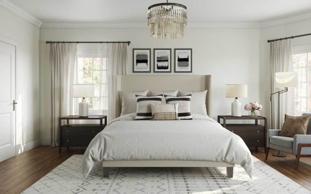
In this photo, I feel like Pale Oak is totally a neutral. I don’t see it pulling one way or the other. This pretty neutral bedroom being all neutral creates such a relaxed feeling.
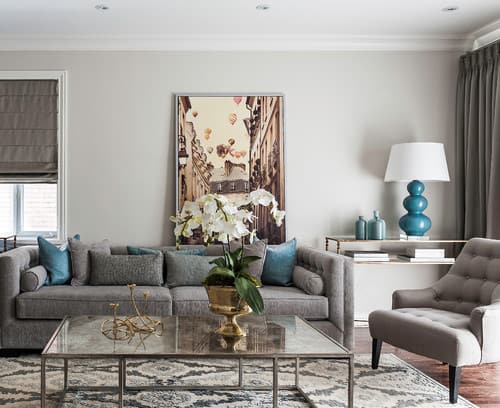
This transitional family room definitely pulls more gray. One reason is the dark gray furnishings but there also isn’t a flood of natural light. This makes the paint color look more gray than beige.
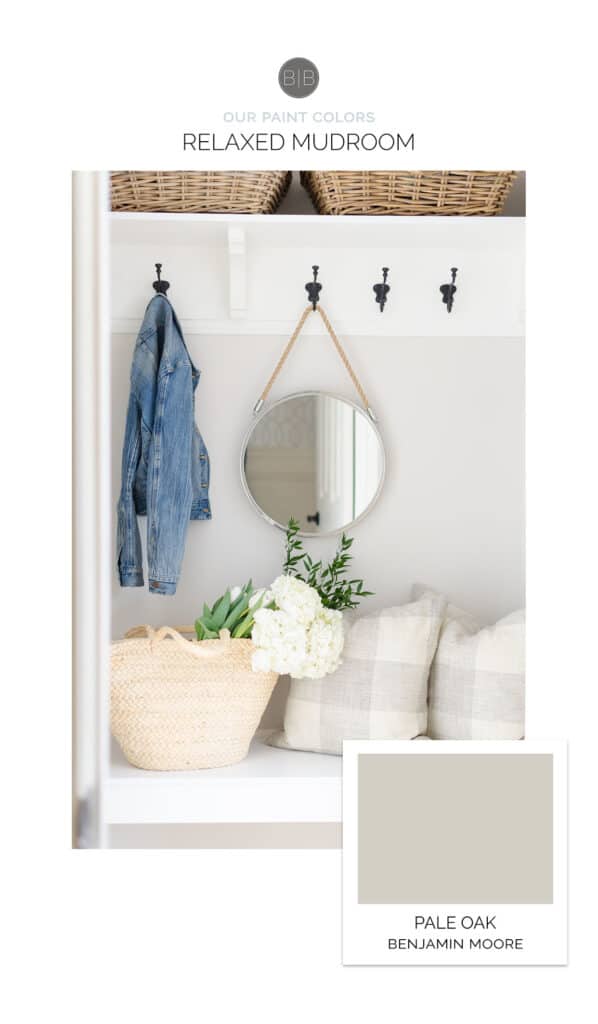
This mudroom is a great example of how sometimes you will see the slight purple undertones come through. I just love how soft it looks. Makes me wish I had a mudroom!
What colors are similar to Pale Oak?
Comparing similar colors is a great way to make a choice on which paint color you want for your home. It’s amazing how putting them next to one another you can really see the different undertones come through.
That being said you should still sample the color and look at it in the space in different lights for a few days before making the final decision.
Pale Oak vs. Classic Gray
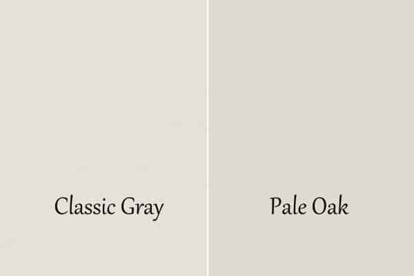
Classic gray is a bit lighter than Pale Oak having an LRV of 74.8 whereas Pale Oak sits at 68.64.
When you put them side by side here you can see the slight pink/purple undertones that are in Pale Oak. Classic Gray is more of a neutral greige, even though they are both from the yellow hue family. This is why I chose it for my basement family room.
Pale Oak vs. Revere Pewter
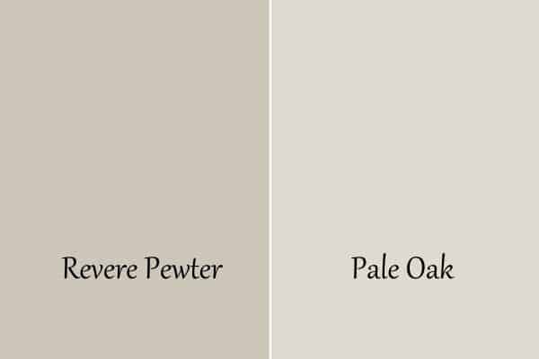
These paint colors are so similar, just different lightness. They have very similar undertones but Revere Pewter is definitely a darker color.
Pale Oak vs. Balboa Mist
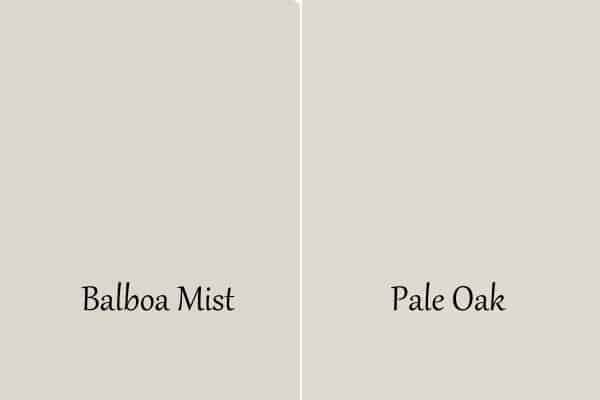
These two are very close on the LRV spectrum, Balboa Mist being a 65.5 and Pale Oak being a 68.64. That means they will bounce around almost the same amount of light, Pale Oak bouncing a touch more.
Both Colors are from the yellow hue family but Pale Oak is a little more greige, Balboa Mist has a touch more gray to it.
Pale Oak vs. Limewash
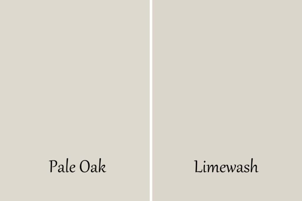
These colors are also very close but limewash is a touch lighter, it’s LRV is 70. It’s also a touch warmer with more of the pink/purple undertones.
Pale Oak vs. City Loft

Sherwin Williams City Loft is also almost identical with an LRV of 70. It has more gray in it though, not as much of a greige as Pale Oak is.
Pale Oak vs. Fog Mist
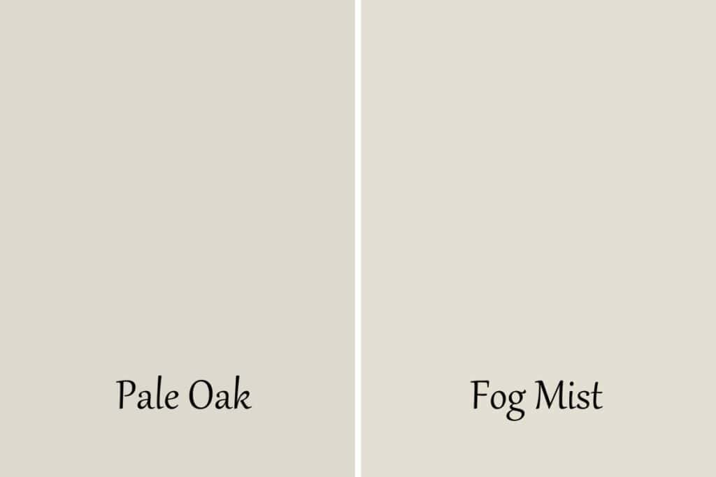
These two colors are almost identical except that Fog Mist is a touch warmer. It’s also every so slightly lighter with an LRV of 70.
Pale Oak vs. Collingwood
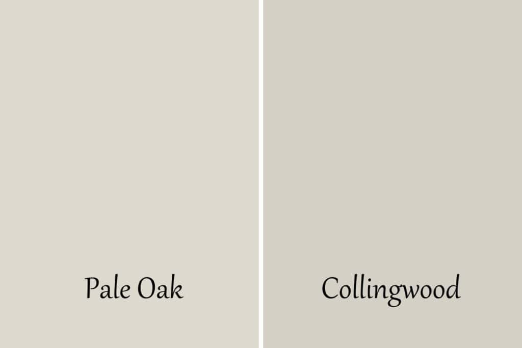
Collingwood is considerably darker with an LRV of 62 but it also is more of a gray, not a greige at all. These are the biggest differences.
Pale Oak vs. Swiss Coffee
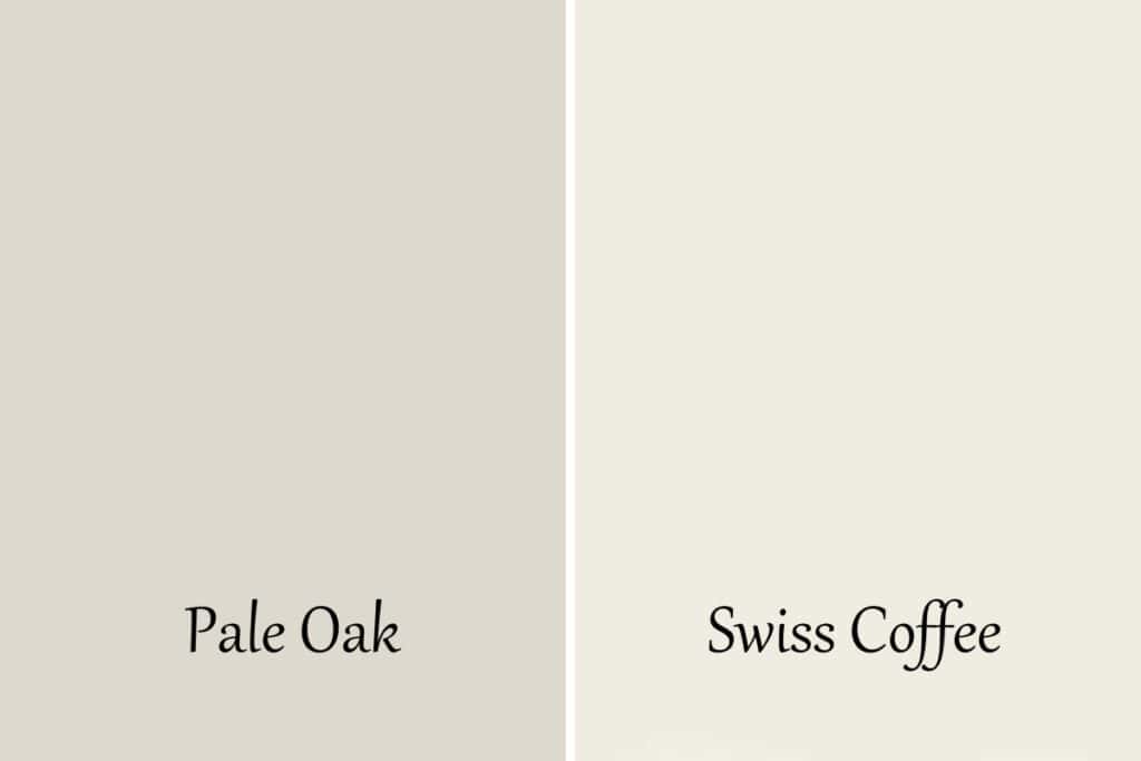
Swiss Coffee is significantly lighter than Pale Oak with an LRV of 83.9. Swiss Coffee is more of an off-white and Pale Oak is definitely a greige.
Pale Oak vs. Light Pewter
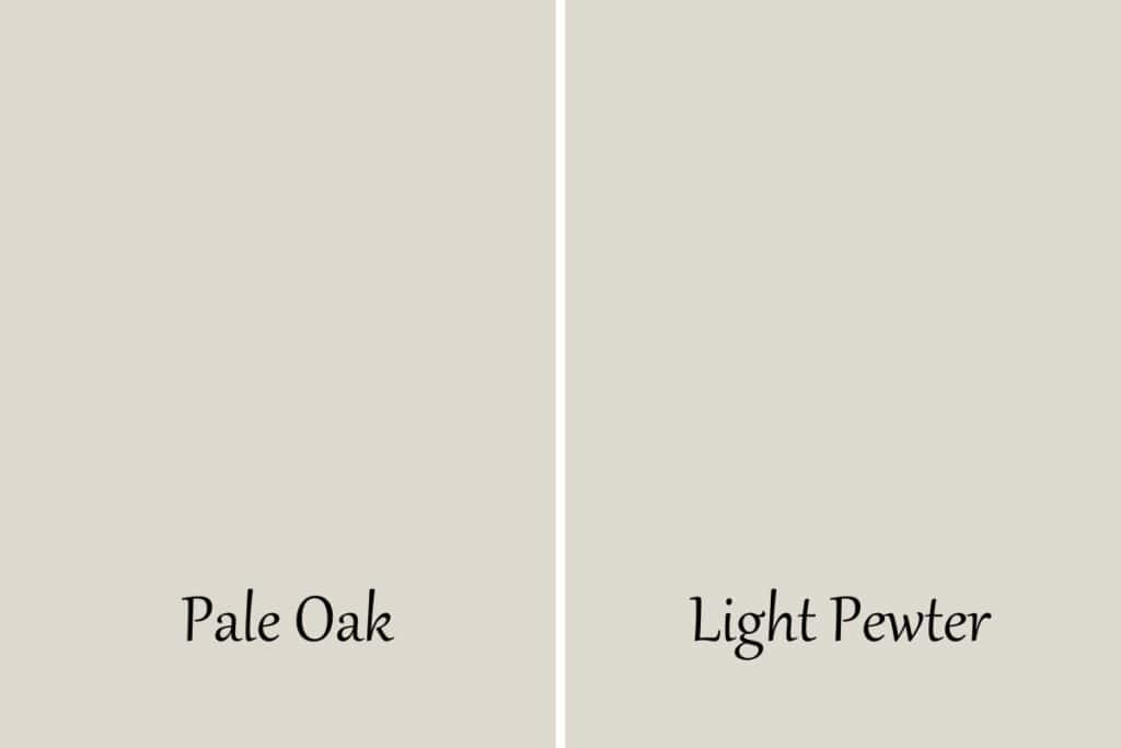
Light Pewter is a touch darker with an LRV of 67.52. Pale Oak is also a bit warmer than Light Pewter. The pink/purple warms it up. Light Pewter is just sporting the green undertones.
Pale Oak vs Agreeable Gray
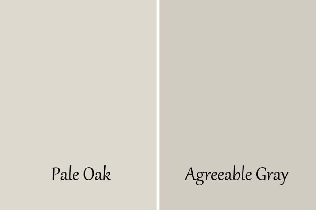
Agreeable Gray is definitely darker than Pale Oak with an LRV of 60, 8.64 points lower than Pale Oak. It also has a bit more gray in it as well as strong pink/purple undertones.
Frequently Asked Questions
What is the Sherwin Williams Equivalent of Pale Oak?
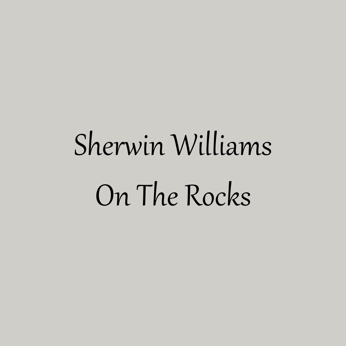
There are no exact equivalents between one paint manufacturer to another. The closest you will find to Benjamin Moore Pale Oak at Sherwin Williams is Limewash.
Is Pale Oak a good color for the exterior?
It’s a great color for the exterior. You just have to remember putting a color on the exterior makes it 10-15 times lighter than what you would see on the inside of the home. It will look more like an off-white than a greige.
It would also look great on the trim for a darker color such as a navy or dark greige.
What is one shade lighter than Benjamin Moore Pale Oak?
One shade lighter than Benjamin Moore Pale Oak would be Seapearl.
What You Need to Know if Painting on Your Own
If you are thinking about painting a room on your own then good for you! This is one of the easiest things you can do yourself and you will get so much satisfaction out of it. Just make sure you have the right supplies.
You need a good quality paintbrush and roller cover. This is the most important thing! If you don’t use high quality the finish will not be to your liking.
Here are some other posts to help you with your DIY paint project that you should check out before you get started:
- The Right Way to Test Paint Samples in Your Home
- The Best Paint Brushes for Latex Paint
- 11 Must-Have Supplies for Painting a Room Like a Pro
- 5 Tips on Choosing the Perfect Paint Color for Your Home
Benjamin Moore Pale Oak Recap
We have gone through a ton of information here today so let’s break it down into a little recap:
- Green undertones with a touch of pink/purple
- LRV of 68.64
- from the yellow hue family
- warm-toned
- considered a greige paint color
- is light but has enough depth of color to contrast with white trim
I hope you will seriously consider this color because I think it’s just gorgeous! Just look at the gorgeous homes that have used it and you can’t argue, this one is a keeper!
More Paint Color Posts:
- Benjamin Moore Stonington Gray
- Sherwin Williams Alpaca
- Sherwin Williams Repose Gray
- Benjamin Moore Revere Pewter
- Sherwin Williams Agreeable Gray
- Sherwin Williams Wordly Gray
- Benjamin Moore Edgecomb Gray
- Benjamin Moore Balboa Mist


As a licensed Real Estate Agent and an avid home decorator, I strive to give my clients the very best I can when it comes to staging, selling, and decorating their homes. I have lots of experience with paint color choices and love to DIY my home so I can have everything just the way I want it. I share my ideas and projects with the world in the hopes that I can help others have their homes just the way they want as well.


I was wondering how pale oak would be on the walls in the bathroom.The tile on the floor is called east beige . Its a taupe. My countertop countertop is quartz called porticio cream. Thinking about using pale oak on walls and revere pewter on cabinets. another choice would be balbora mist on walls with extra white on ceiling and collingwood on cabinets.
Hi Linda. Sounds like you have a good plan for your bathroom. Either option would be amazing. I suggest you get a swatch of pale oak and balboa mist and compare them next to your fixed features, the countertops and tile. I think if you look at them over the course of a couple of days you will have a winner.
Hi
The walls in my guest room are pale oak and the trim is white dove both by Benjamin Moore.
I am looking for a paint color for the walls in the connecting bathroom. The cabinet is white and so is the tile in the shower. The floors are terazzo tile that have mostly whites, tan and a very little touch of grey and gold. The tiles are probably 40 years old, 8 X 8″
Hi Noreen. It would be easy to take Pale Oak and continue it into the bathroom. If you want to brighten it up then use White Dove. However, if you are looking for some contrast then maybe go with a navy blue or a green. Since the floors have tan and touches of gray and gold I think a greenish gray would look really good. I hope that helps.
Hi I’m painting my kitchen and would love the paint to update the look of my 2008 Tuscan style looking kitchen! My cabinets are a creamy white. Definitely more creamy. I am leaning toward a light color . Hoping the color and changing the hardware and lightening might help update my kitchen. I was looking at the color Pale Oak by Benjamin Moore . I’ve used it before. Not sure about how it would work with my cabinets. Thanks for your input
Hi Josephine! I think Pale Oak would look amazing with creamy cabinets! You should totally go for it.
Hi. I have high ceiling, skylight and a ton of light. Concerned about the color reading too yellow. I don’t like yellow tones. In the room I have some red brick walls and wood floors that read a bit orange. What are your thoughts?
Hi Kat. If there is a lot of red and orange than the yellows will likely show more since they are right next to them on the color wheel. You might want to choose something on the opposite side with more blue undertones. I would go with a cooler color or one that can read both ways depending on the time of day. I really like Benjamin Moore Classic Gray. I would give that one a look and see what you think. Good luck!