
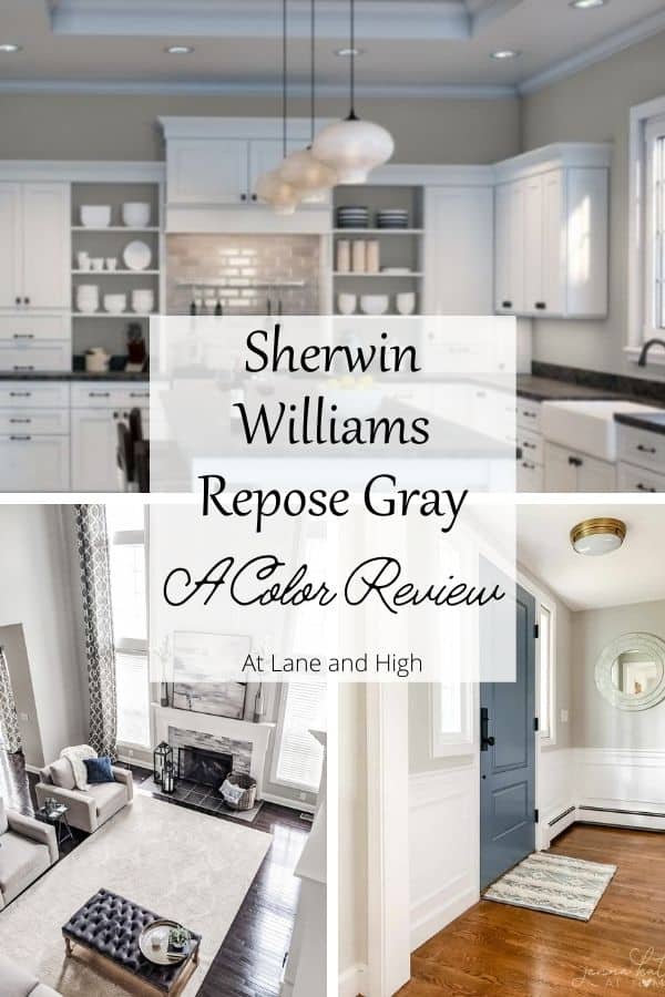
Sherwin Williams Repose Gray Paint Color Review

Sherwin Williams Repose Gray is one of the best grays. It’s also one of Sherwin Williams’ most popular paint colors. This color will warm your home and give it a very cozy feel. Need more details, stick around and you will find them!
Repose Gray has become one of the most popular paint colors. As a Real Estate Agent, I can honestly say that it is one of the go-to paint colors for selling your home. The top two would be Repose Gray and Agreeable Gray, both from Sherwin Williams.
Recently I took some clients to a local builder and when discussing paint colors they told me that they put Repose Gray in all of their model homes. It is a very universal and versatile gray that pairs nicely with just about everything.
*This post contains affiliate links. For more details see my full disclosure.
What Color is Sherwin Williams Repose Gray?
Repose Gray is considered a greige paint color. It has an LRV of 58 which makes it a medium light-light colored gray.
If you read any of my other paint posts then you know that LRV stands for Light Reflective Value, which is fancy for how much light the color reflects around the room.
Why is LRV important? Well, if you are trying to lighten up your space or keep a space from becoming too dark then you want to pay attention to this number and compare them when choosing your paint color.
Repose Gray has a touch of warmth to it but in some light can look cool. Because of its versatility, it looks really great with any decor style.
Repose Gray Stats
Is Repose Gray a Warm-Toned Gray?
Repose has some warm undertones and it is considered a greige, just barely. What is Greige? It’s a combo of gray and beige. While Repose Gray has some undertones of brown some do not consider it a greige. It’s just barely there in my opinion.
What I love about this color is that it’s warm without being overly beige. Typically only in a room with little natural light will this color look beige at all.
What are the undertones of Repose Gray?
The undertones for Repose Gray are brown with a hint of green. This addition of green keeps the gray from being very warm. But that green never feels cold, this color is very warm and cozy.
The fact that Repost gray has both brown and green is what keeps the color from leaning too far warm or cool. It’s very neutral which makes it a perfect color for just about anyone and any room!
Every once in a while, in the right light, you might even see a hint of a blue undertone in Repose Gray. It’s for this reason that I highly suggest getting a sample to make sure this is the right color for you.
How Light Affects Sherwin Williams Repose Gray
Here are some rules of thumb when it comes to lighting and paint colors:
- North-facing rooms have a light that tends to be a little cooler in nature and will come off slightly blue. Light colors will be a bit more muted or washed out while darker colors will be stunning.
- East-facing rooms will have brighter light in the morning and less in the evenings. The evening light will be a bit cooler. In the morning with sunrise, the bright sun will be warm. Warm color palettes are great for these spaces because they will help balance the cool feel of the evenings.
- South-facing rooms have consistent warm light throughout the day. The light really shows off the colors, dark will be very bright, and light colors will shine. Both warm and cool color palettes look good in a south-facing room.
- West-facing rooms have warm light in the evening and cooler light in the morning. Basically, it’s the opposite of east-facing.
When it comes to lighting and Repose Gray you will find that the color looks very gray in north-facing rooms. In south-facing rooms, the warm undertones will come out much more.
Is Sherwin Williams Repose Gray for you?
Every paint color looks different in every home. In my home, greige paint colors look muddy, and cool-toned grays look blue! Don’t even get me started on how many shades of white there are.
That being said, how do you choose the right color for you? Get a sample and put it on your wall. Look at the colors over the course of a few days in different lights.
You can get samples from the paint store or you get one from Samplize. Samplize offers a 12×12 inch peel and stick sample of any Sherwin Williams and Benjamin Moore paint color. This product is not messy and provides exactly what you need to choose the perfect color.
Is Repose Gray still popular in 2024?
You bet it is! This paint color still tops the charts for one of Sherwin Williams most popular colors.
It’s a great neutral greige that is light enough to give a bright feel to a room but also has a depth of color to contrast nicely with white trim and ceilings.
Sherwin Williams Repose Gray Whole Home Color Palette
Get this free whole home color palette for Sherwin Williams Repose Gray and you will also be part of the At Lane and High Community! You will receive weekly newsletters on new posts and you can unsubscribe anytime.
Sherwin Williams Repose Gray in different rooms
You will be able to see how grays look different depending on what room they are in. Generally, rooms that get tons of light a gray can look cooler and rooms that are darker will look warmer.
Repose Gray has just the right amount of warmth to it that even in a room with lots of light it is gorgeous! Never cool, always very warm and neutral.
Repose Gray in Family Rooms
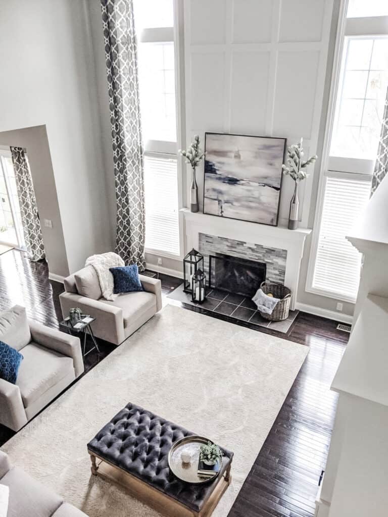
Peace and Pine Designs is a design firm that is local to me here in Columbus, Ohio. They do beautiful work and Repose Gray is one of their most requested and go-to paint colors for their clients.
I love how the color pairs with the crisp white trim and off the dark hardwood floors.
This room is flooded with natural light so the paint color shows as very light and neutral. A great backdrop for the beautiful decor.
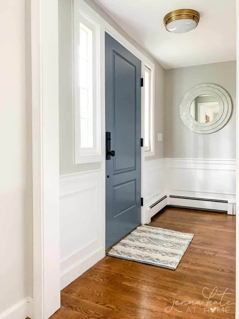
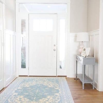
Repost Gray in an Entryway
Would you like to save this?
I just love Jenna Kate’s entryway! I also love that front door color, just beautiful.
The door’s color is Serious Gray, which I recently painted in my Modern Coastal Powder Room.
This space doesn’t have as much natural light so you can really see the depth of color here.
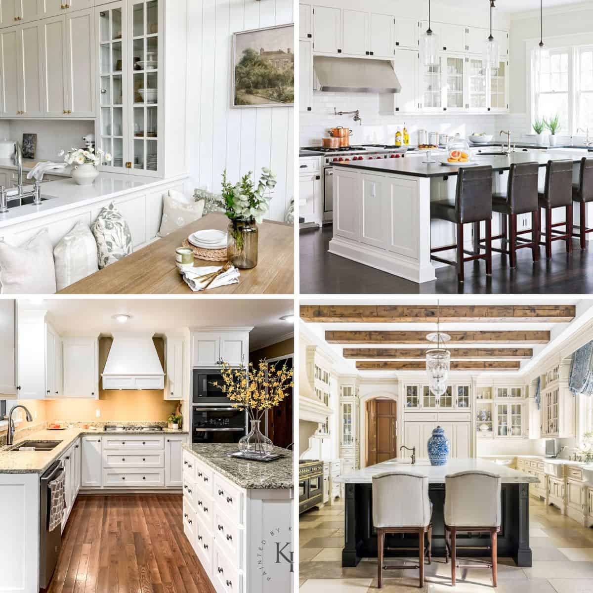
Repose Gray in Kitchens
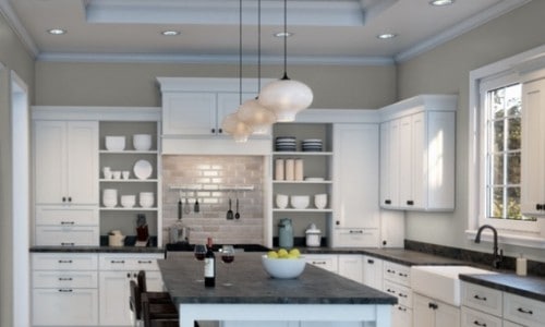
I love how the shadows show off this color against the white cabinets. You can really see how lighting makes a difference in the paint color.
Many people use Repose Gray on cabinets too. What’s great about using it on cabinets is that all different finishes of hardware look great with RG.
Repose Gray in Bedrooms
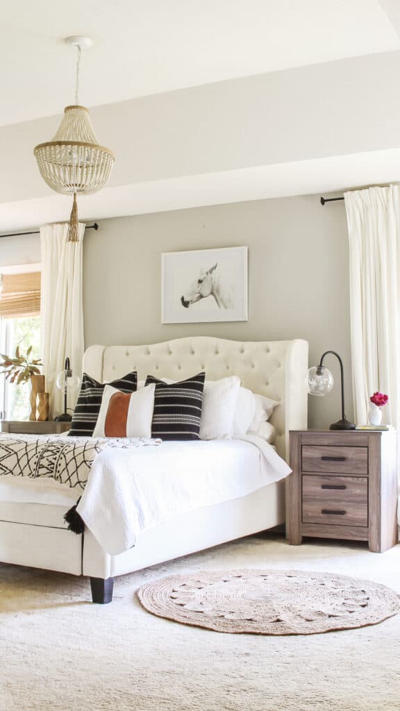
Repose Gray is the perfect backdrop for the gorgeous tufted headboard in Erica’s bedroom. It’s understated but provides just enough contrast to the fabric color and furniture.
Repose Gray on the Exterior
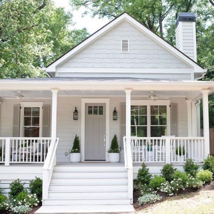
This is just a gorgeous home! Leah from Bell Sheep Studio chose the perfect colors to show off the clean lines of her home with the natural backdrop of the trees.
I love how she used different tones of gray on the door and shutters. They all blend so well together.
Keep in mind that no matter what color you use on the exterior of a home it will show lighter than the interior because of all the natural light.
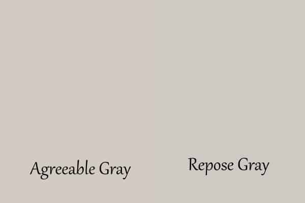
Repose Gray VS. Agreeable Gray
Repose Gray is slightly lighter than Agreeable Gray, it is 2 points lighter on the LRV scale. This difference is barely perceptible.
Agreeable Gray has more beige and purple undertones in it than Repose Gray which makes AG a true greige paint color while RG is sometimes considered not.
With the colors side by side, you can see those green undertones peeking out in RG.
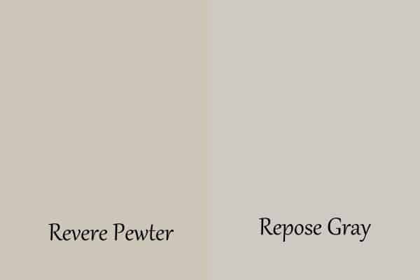
Repose Gray VS. Revere Pewter
Revere Pewter is slightly darker than Repose Gray with a lot more brown undertones.
SW Revere Pewter is definitely a greige paint color and in some lights can look brown/green or dare I say muddy on the walls. Typically in south-facing rooms, this can happen (I speak from experience on this one!)
Because of this and the fact that Repose Gray has both warm and cool undertones it has become one of the go-to colors for trying to sell your home.
What White goes well with Repose Gray?
When choosing coordinating paint colors I love to take a look at the paint strip. You can see that Eider White is the lightest color on the strip which means it is the perfect white to pair with Repose Gray.
Here are some other whites that look great with Repose Gray:
- Pure White
- Highly Reflective White
- Extra White
- Snowbound
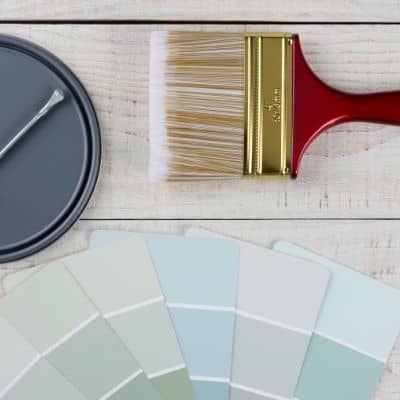
Painting Guide
Here is the complete guide for everything you need to know to paint a room. It’s a downloadable PDF you can print and use over and over again!
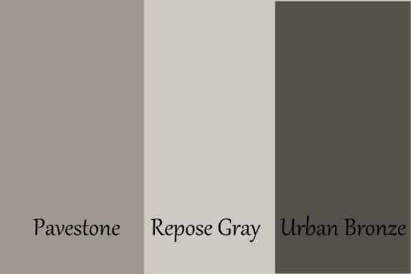
What darker colors coordinate well with Repose Gray?
Sherwin Williams Pavestone and Coral Clay are also great coordinating colors. If you go to the Sherwin Williams website they will tell you what are good coordinating colors. I also love to pair grays with Urbane Bronze.
Urbane Bronze is a dark, almost black color but looks like the oil-rubbed bronze finish on metal. I have it on my front door and it looks so good with the window trim and exterior color I have.
Urbane Bronze also happens to be the 2021 Paint Color of the Year for Sherwin Williams!
Read other Paint Color Posts:
- Benjamin Moore Revere Pewter
- Sherwin Williams Crushed Ice
- The Best Warm Gray or Greige Paint Colors For Your Home
- Benjamin Moore Balboa Mist
If Repose Gray is a little light for you then you might want to give Mindful Gray a try. Agreeable Gray is also a wonderful alternative to Repose Gray. But if you are still unsure I have a full accounting of the best Greige paint colors available.

I hope you learned something about Sherwin Williams Repose Gray today. As I always say, you need to give it a test to see if it’s right for your home.

As a licensed Real Estate Agent and an avid home decorator, I strive to give my clients the very best I can when it comes to staging, selling, and decorating their homes. I have lots of experience with paint color choices and love to DIY my home so I can have everything just the way I want it. I share my ideas and projects with the world in the hopes that I can help others have their homes just the way they want as well.


I’m doing a kitchen reno. I will be painting my walls Repose Gray and I want white cabinets. Which white do you suggest? Thanks.
Hi Sheena! A kitchen reno is so exciting! If you are doing Repose Gray I would give Simply White and Pure White a look for your cabinet colors. Good luck!
Hello ! I am changing my lake house siding for board and batten and i think of repose grey but i am scare it will look beige. I want it to feel like a calm and natural grey …
Hi Valerie! Is this for the exterior? I totally understand not wanting it to look beige and it can in some light. But for the exterior with all the natural light, it should show as gray. Hope that helps.
Hello! I hesitate between repose grey and passive for our board an batten lake house …
Looking for a calm ( not cold ) but still light grey home. What are your taugjts?
Hi Valerie! Passive can look very cool and Repose can pull warm. I think the best thing for you to do is get a swatch of both and paint them on the board and batten and look at it over a couple of days to decide. If you can’t do that paint it on a piece of posterboard and look at it to decide. Good luck! A lake house sounds so fun!
Hi. We’re thinking of Repose Gray for the walls in our home with a cream white for the cabinets and a white for the ceilings and baseboards/trim. Do you have suggestions on colors?
Hi Kim! I love Repose Gray so much. For your cabinets, I would consider Pure White. It’s a slightly creamy white without being too yellow. For the ceilings Highly Reflective White is perfect. It’s a crisp white. Make sure you get the ceiling paint in flat though. Here is a post that might give you more details on those colors. best-white-paint-colors-for-kitchen-cabinets
Hi there! I know this post is a few months old, but I thought I’d try anyways! We just pained our walls repose gray but are stumped on what color for our kitchen cabinets. We have had white in the past, but with 4 young children it’s really tough for me to keep them clean. So I was wondering what color would work that is pretty but also pretty low maintenance. Thank you!
Sincerely, someone who is terrible with interior design, but wants my house to look nice haha! Thank you!
Hi Katie! Thanks so much for stopping by my blog. I totally understand how you feel about white cabinets with four young kiddos. An off-white might be good. Eider White is a good coordinating color with Repose Gray. Or you could go a little bolder and choose a darker color. I would go with Pavestone or Urban Bronze. I really like the look of having the perimeter cabinets one color and the island another, that is if you have an island. Please let me know what you end up choosing!
If I paint my small kitchen cabinets respose gray what color should I paint the walls.
Hi Dorida! That’s a tough question. If you want a light color then I would go with a creamy white such as Alabaster or Pure White. If you want a pop of color dark greens are very popular right now. Also a navy blue would look amazing. Good luck!