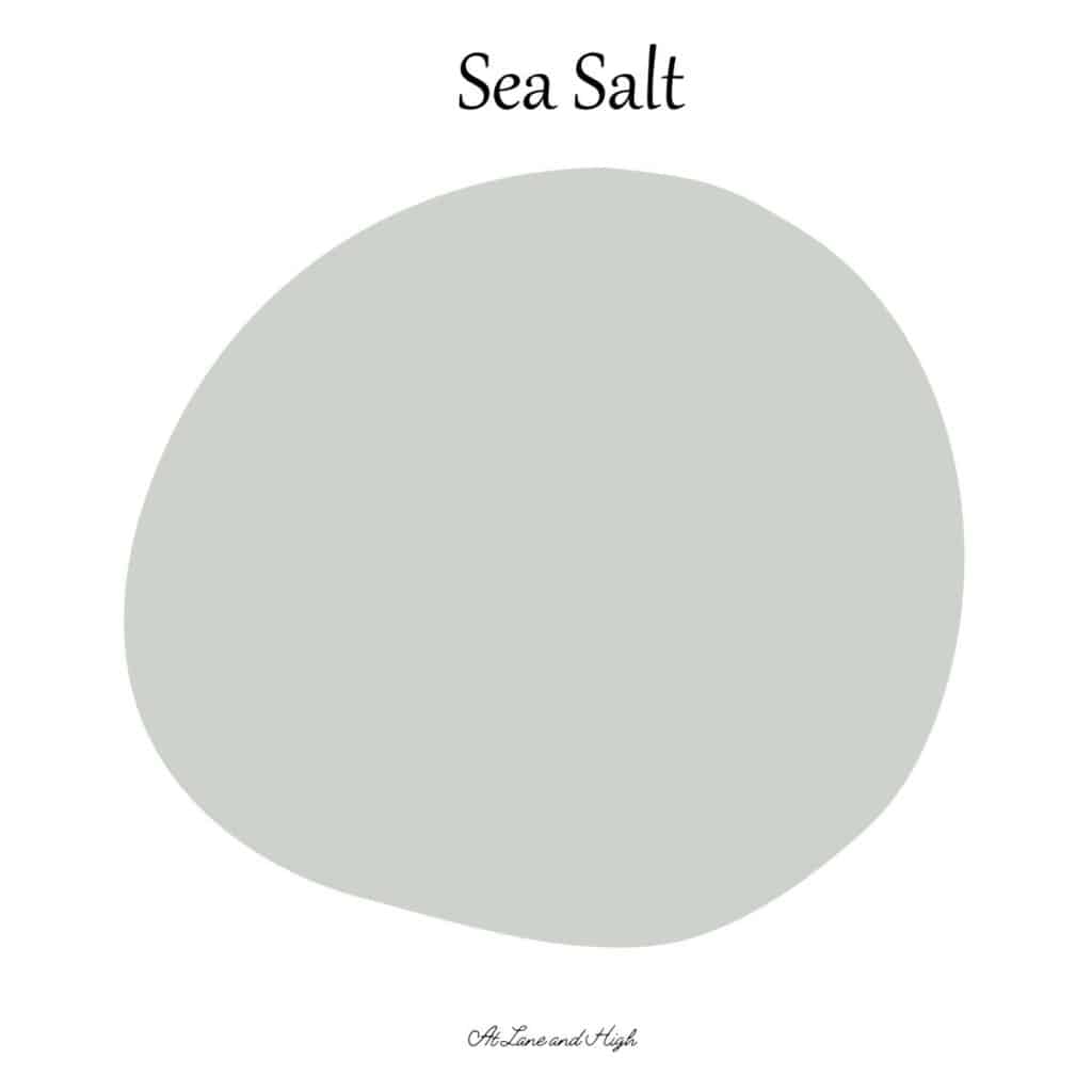
Sherwin Williams Sea Salt
Sherwin Williams Sea Salt is one of my all time favorite colors and I am so excited to share all the details on why!
One of the most popular colors out there is Sea Salt by Sherwin Williams. It’s a gorgeous blue-green color that when used in the right room can stand out and be the star of the show, or be a perfect neutral backdrop for your amazing furnishings.
In my last house, I had my kid’s full bathroom remodeled by Simple Bath. If you live in the Central Ohio area I highly recommend them.
This is not a paid plug at all, they had the whole bathroom gutted and redone in 4 days. It was a little pricey but soooo convenient! And they did a great job.
When we did that reno I knew I wanted the walls to be painted Sea Salt. I remember when we sat down to discuss what we wanted in the bathroom and she got to paint colors I just blurted it out, LOL. I think she liked that I knew exactly what I wanted though.
Unfortunately, I couldn’t find any photos of the bathroom, but I will show you plenty here today that should give you a good idea of how it looks.
*This post contains affiliate links. For more details see my full disclosure.
What are the undertones of Sea Salt by Sherwin Williams? Is it blue or green?
Sea Salt is a gorgeous gray paint color with both blue and green undertones. Honestly most of the time it can look blue or gray, only occasionally do they let gray be the star of the show.
It really depends on the lighting and other fixtures in the room as to what color will come through. Don’t worry, I have your back! We got into all of that here today.
What is the LRV of Sea Salt?
The LRV of Sea Salt is 63. Remember, LRV stands for Light Reflective Value and is a scale from 0-100. Sixty-three makes this color a pretty bright color and when used in a room with tons of natural light can be a little washed out.
When there isn’t a lot of natural light, or during dark hours, the color is the most gorgeous muted blue-green.
Is it warm or cool?
Because of the blue undertones this color is definitely a cool color. But remember it also has some green, that warms up the color. Are you confused yet?
Overall I would say it’s a cool color with warm undertones. What is great is that because of this the color pairs really well with both warm and cool-toned colors! It’s a win-win!
How Lighting Affects Sherwin Williams Sea Salt
Lighting is probably the biggest factor in how a color will show, after undertones of course. So here are. a few things you should know about different light situations.
- North-facing rooms have a light that tends to be a little cooler in nature and will come off slightly blue. Light colors will be a bit more muted or washed out while darker colors will be stunning.
- East-facing rooms will have brighter light in the morning and less in the evenings. The evening light will be a bit cooler. In the morning with sunrise, the bright sun will be warm. Warm color palettes are great for these spaces because they will help balance the cool feel of the evenings.
- South-facing rooms have consistent warm light throughout the day. The light really shows off the colors, dark will be very bright, and light colors will shine. Both warm and cool color palettes look good in a south-facing room.
- West-facing rooms have warm light in the evening and cooler light in the morning. Basically, it’s the opposite of east-facing.
How to know if a paint color is right for you?
The best way to judge if a color is good for you then you will want to put a swatch on the wall and look at it over a few days. Look at it in different lights and decide if you really like it.
You can do this by getting a sample from the paint store and using a brush put it up on the walls, but then you are left with a can that you can’t do anything with. Those samples are used with poor quality paint and aren’t meant for use on your walls permanently.
I recommend going with Samplize. They are a company that will send you a 12X12 peel and stick swatch of a paint color that you can stick to the wall. When you are done just peel it off and throw it away.
It’s easy and much less messy!
Sherwin Williams Sea Salt Whole Home Color Palette
Get this free whole home color palette for Sherwin Williams Sea Salt and you will also be part of the At Lane and High Community! You will receive weekly newsletters on new posts and you can unsubscribe anytime.
What room is best for Sea Salt?
Honestly, this color will look good anywhere but my favorite place to use it is in bathrooms and bedrooms. I used it in a bathroom in my previous house and plan to use it again in my master bathroom when I renovate it in the future.
The reason I like this color for these specific rooms is because of its calming nature. Blue-green paint colors really give the feeling of restfulness, kind of like being at the beach. They really have that beachy feel and everyone knows your blood pressure immediately goes down when at the beach.
This is one of my favorite colors to use if you are going for a beach house feel. If you are then you definitely want to check out my post on beach house paint colors to get all the details on how to use this color, and others in your home.
Sea Salt in a Bathroom
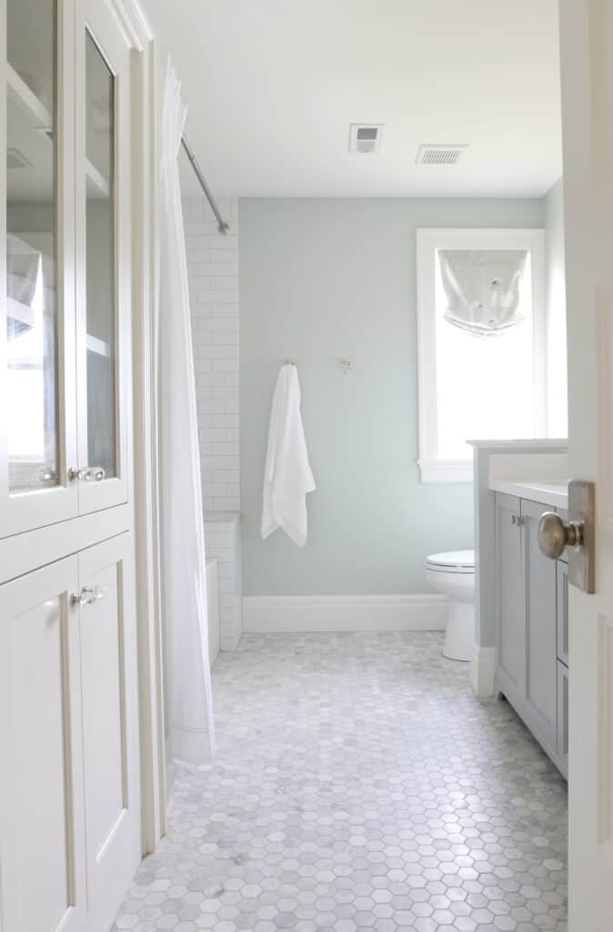
This bathroom by Studio McGee reminds me a lot of the bathroom I had renovated in my last home. The paint color definitely shows Sea Salt pulling in more of the green direction.
What I love about this paint color is how well it looks with marble, which is one of my favorite materials to use. It also really pops next to white and that makes using it in a bathroom so perfect, because of all the white fixtures.
Sea Salt in a Kitchen
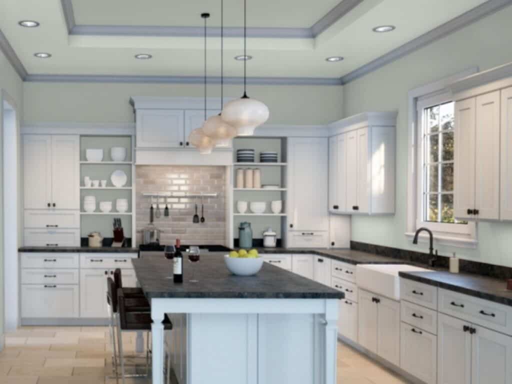
I know I mentioned that this color looks amazing in bedrooms and bathrooms but here you can see how well it looks in a kitchen. This image has been computer-generated through Sherwin Williams’ software but it gives you a great idea of how it can look in another room!
Sea Salt in a Bedroom
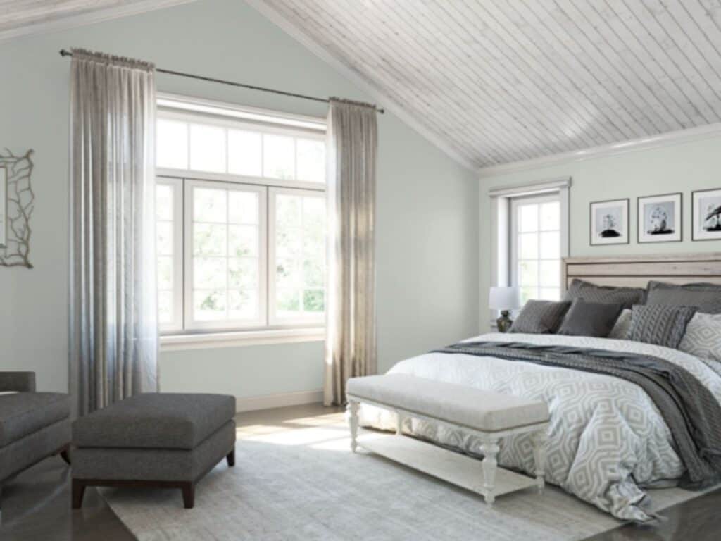
Here you can see how the color can pull slightly blue. I love how good it looks with the white-washed ceiling as well as the very dark hardwood floors.
The dark furnishings look good with the color as well. This is a great example of Sea Salt being a neutral because it just makes the other furnishings in the room stand out.
I love how Sea Salt looks in the bedroom. It looks amazing with the white bedding as well as the dark wood furniture.
Sea Salt in a Living Room
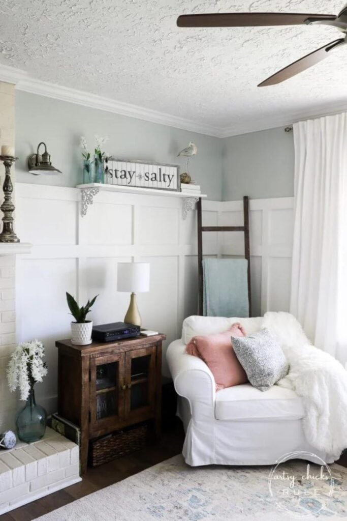
See how beautiful this color is on family room walls?! This room has some pretty gorgeous light colors in it.
Sea Salt on the Exterior

Here is a great example of Sea Salt being used on the exterior of a home. You don’t have to live by the beach to have a beachy house color. This would look great in any part of the world.
I love how well it goes with whites and blacks. The pretty flowers in the landscaping look really good with it too!
This color is a total win-win!
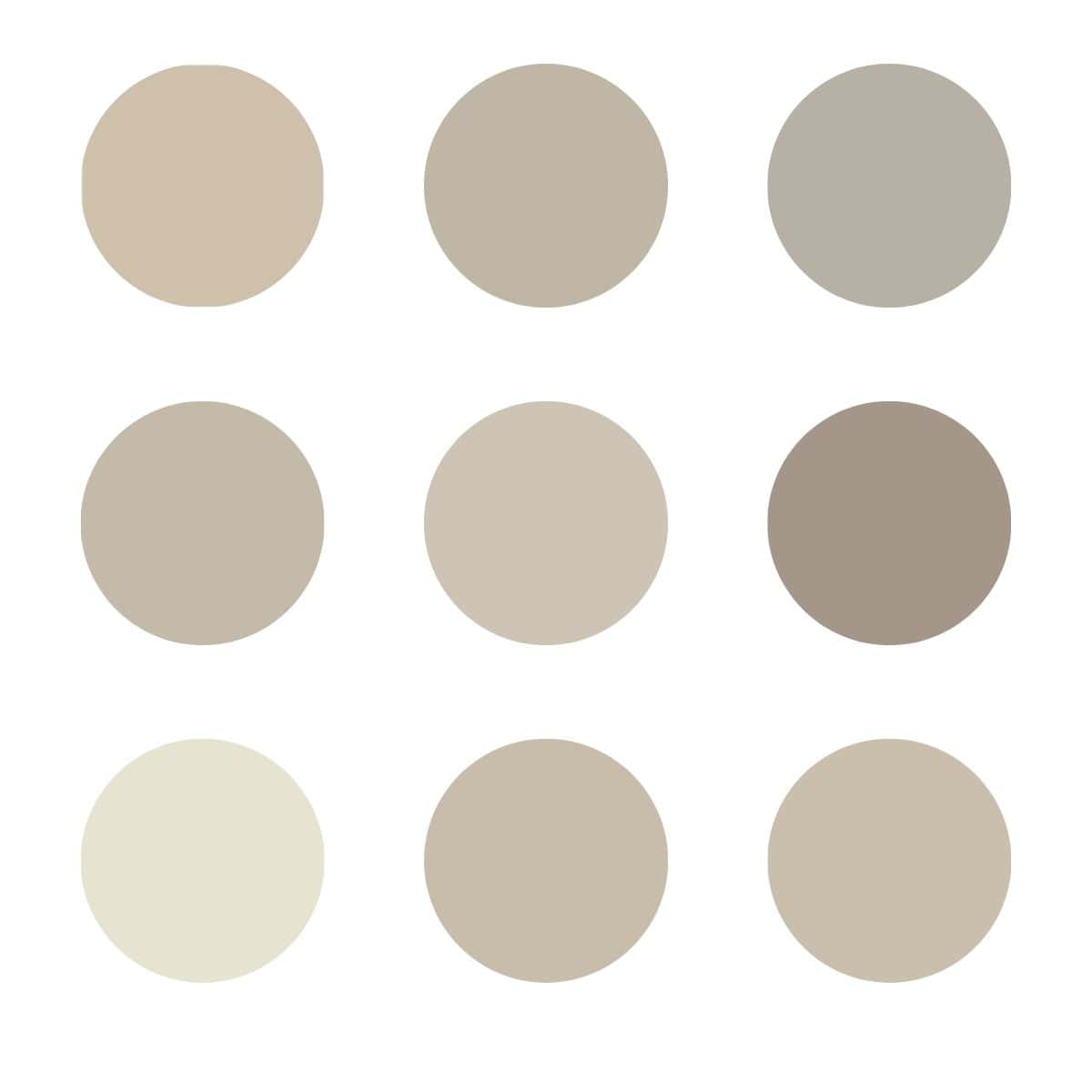
Coordinating Colors to Sherwin Williams Sea Salt
Sea Salt looks fabulous with both warm and cool neutral colors. Think about whites, creams, and all shades of gray…oh and beige too!
It also pairs really well with navy blues.
It also looks great with dark gray and black colors.
Would you like to save this?
What White Trim Color Goes Well with Sea Salt?
I really love Sherwin Williams Pure White paired with Sea Salt. It is a very true white with a touch of warmth which goes really well with the cool/warm nature of Sea Salt.
If you are looking for a Benjamin Moore color then look no further than Chantilly Lace.
Similar Colors
Let’s compare some colors that are very similar to Sherwin Williams Sea Salt.
Sea Salt vs Rainwashed
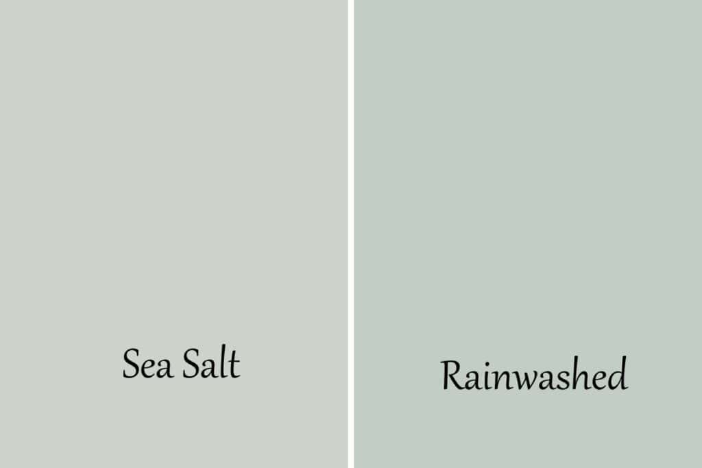
These two colors are pretty similar but they are also very different. Sea Salt is a green with a touch of blue and Rainwashed is blue with a touch of green.
Rainwashed is a touch darker too with an LRV of 59, Sea Salt is at 63.
Sea Salt vs Quiet Moments
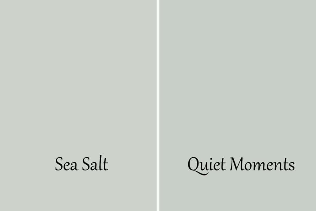
These two colors are very similar but Quiet Moments is definitely bluer.
- Sea Salt has an LRV of 63, Quiet Moments is at 61
- Quiet Moments is darker
- Both have green undertones
- Quiet Moments has more blue
Sea Salt vs Gray Cashmere
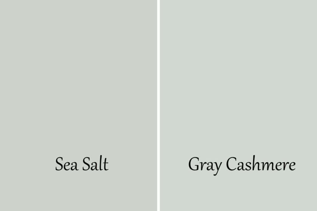
Benjamin Moore Gray Cashmere is incredibly close to Sea Salt. The biggest difference is Gray Cashmere has a little more blue in it.
- Sea Salt has an LRV of 63, Gray Cashmere is at 65
- Gray Cashmere is lighter
- Both have gree undertones
- Gray Cashmere has more blue
Sea Salt vs Comfort Gray
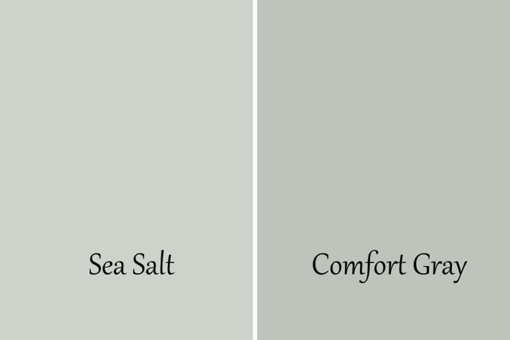
These two colors are very similar but very different. They are actually on the same paint chip!
- Sea Salt has an LRV of 63, Comfort Gray sits at 54
- Comfort Gray is darker
- Comfort Gray is more blue and more muted (meaning more gray)
Sea Salt vs Fleur de Sel
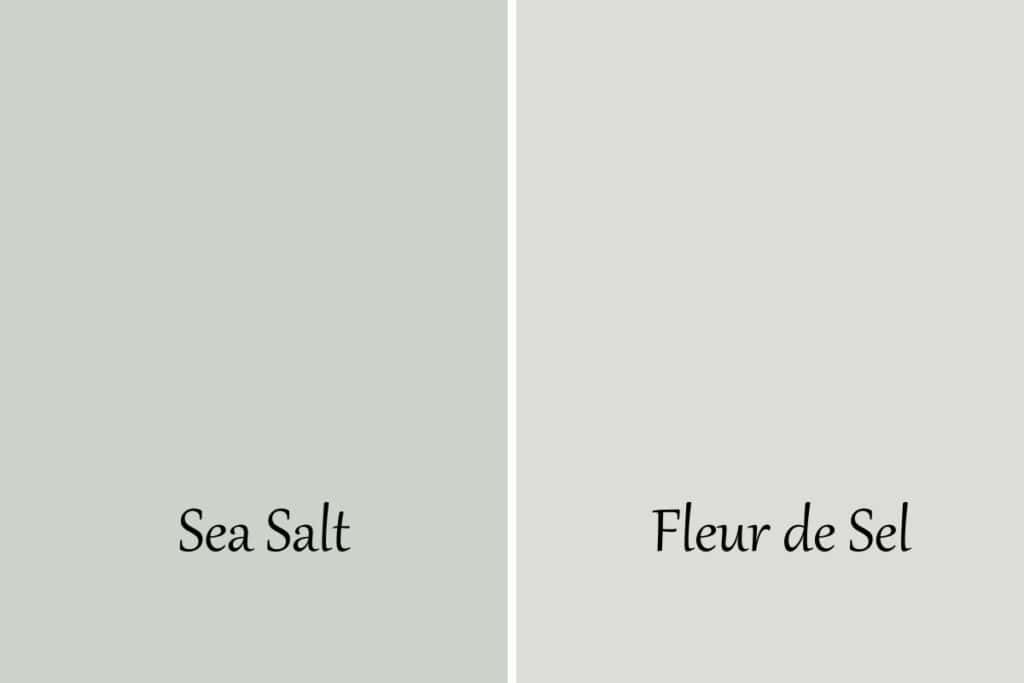
Fleur de Sel is a very pretty color, light and bright.
- Sea Salt has an LRV of 63, Fleur de Sel is at 72
- They both have green undertones
- Sea Salt has more blue in it
- Fleur de Sel has more gray
Sea Salt vs Pearl Gray
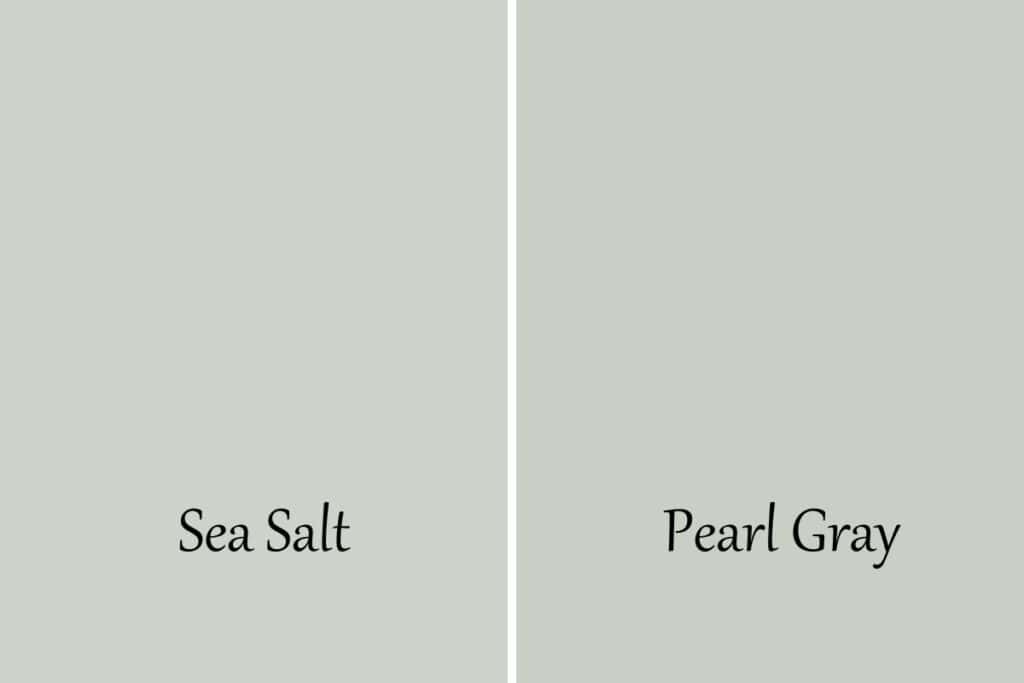
These two colors are very similar. They have slightly different undertones too.
- Sea Salt has an LRV of 63, Pearl Gray is at 61
- They both have green undertones
- Pearl Gray has more blue in it
Sea Salt vs Benjamin Moore Sea Salt
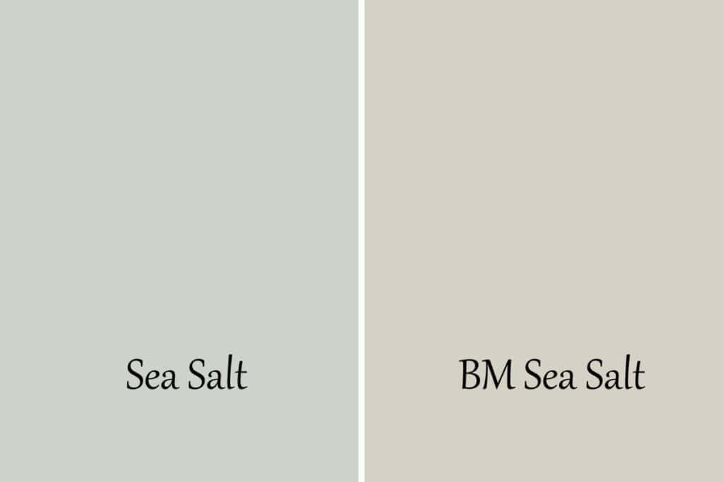
I had to include this color because (well for obvious reasons) they have the same name! As you can see they are totally different. But I wanted to let you know so you don’t confuse them.
Frequently Asked Questions
Can you use sea salt in darker space?
Absolutely you can. Just keep in mind that because it’s a darker space the blue undertones in Sea Salt will come out more.
Is Sherwin Williams Sea Salt a good color for living rooms?
Personally, I prefer to use it in bedrooms and bathrooms but you can absolutely use it in a living room. It especially looks amazing if you have white painted board and batten or wainscoting.
Is Sea Salt a popular choice for exteriors?
Yes it’s a good choice. If you have a more beachy vibe, maybe even live at the beach, then this is a fantastic choice!
What room does Sea Salt look best in?
I love it in bathrooms and bedrooms but it can really work in almost any space.
Can Sea Salt be lightened by 50%?
Sea Salt is a pretty bright color but if you want something even lighter you can have it lightened by 50%. Just make sure you test it on the walls because sometimes lightening a color like this changes it slightly.
What bedding colors complement Sea Salt?
Stick with other colors that are calming such as soft grays, crisp whites, and muted blues.
Is Sherwin Williams Sea Salt still a popular color?
You bet it is! It’s part of their Top 50 Paint Colors collection. One of the reasons it’s so popular is its versatility. It looks good with so many other colors and works for just about any type of design style.
Is Sherwin Williams Sea Salt a gray color?
In some lights, it is considered a gray but mostly it’s a blue-green color.
What is the Benjamin Moore equivalent to Sherwin Williams Sea Salt?
There are no equivalents in the world of paint manufacturers but there are colors that are very similar to one another.
The color at Benjamin Moore that is closest to Sherwin Williams Sea Salt is Gray Cashmere.
Recap
I hope you have some really good knowledge now of Sherwin Williams Sea Salt and feel comfortable using it in your home. It’s personally one of my favorites of all time and I wouldn’t hesitate to use it just about anywhere!
Let’s go over quickly what we talked about today:
- Undertones of blue and green
- LRV of 63
- Cool paint color with warm undertones
- Looks more blue in north-facing rooms
- Looks more green in every other direction
- Very calming and beachy feel
- Looks amazing in all design styles
- Looks best with white, soft grays, and navy blues
Other Paint Posts you Might Like:
- Sherwin Williams Urbane Bronze
- Benjamin Moore Quiet Moments
- Benjamin Moore Chantilly Lace
- The 10 Best White Paint Colors for Kitchen Cabinets
- Benjamin Moore Boothbay Gray
- The Right Way to Test Paint Samples in your Home


As a licensed Real Estate Agent and an avid home decorator, I strive to give my clients the very best I can when it comes to staging, selling, and decorating their homes. I have lots of experience with paint color choices and love to DIY my home so I can have everything just the way I want it. I share my ideas and projects with the world in the hopes that I can help others have their homes just the way they want as well.