
The 10 Best Sherwin Williams Gray Paint Colors
When it comes to paint colors gray is still the most popular and today we will discuss the best Sherwin Williams Gray Paint Colors!
Sherwin Williams is my favorite paint manufacturer. I have tried several and I love the coverage you get with SW paint. They also have some really amazing colors! Let’s talk Sherwin Williams gray paint colors.
*This post contains affiliate links. For more details see my full disclosure.
Best Sherwin Williams Gray Paint Colors
When it comes to gray there are two different kinds, warm and cool. Warm grays have more green undertones and some even pull towards the beige spectrum, those are called greige. Greige is a combination of gray and beige. Cool Grays have more blue undertones.
When it comes to paint colors it’s the undertones you really need to look at. The amount of natural light a room receives contributes greatly to what type of undertones come out. The colors in the decor in the room can also have an effect.
How to know if a paint color is right for you?
I highly recommend getting a paint sample, putting it on the wall, and looking at it in different lights. This will really help you see what the color will look like before you commit to the time and energy of painting the room.
Samplize is a great company that will send you a peel and stick sample that you can put on the wall then throw away when you are done. You can buy a sample from the paint store but you only use a tiny amount then you are stuck with this sample can that you really can’t use. Samplize is less messy and just easier all around.
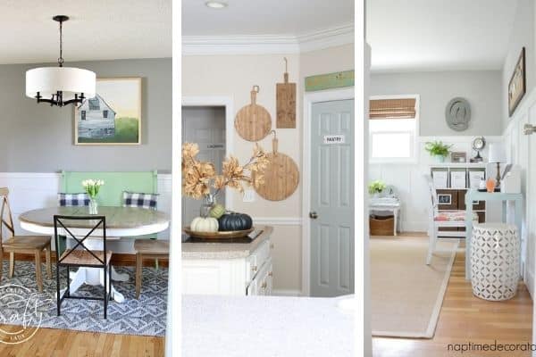
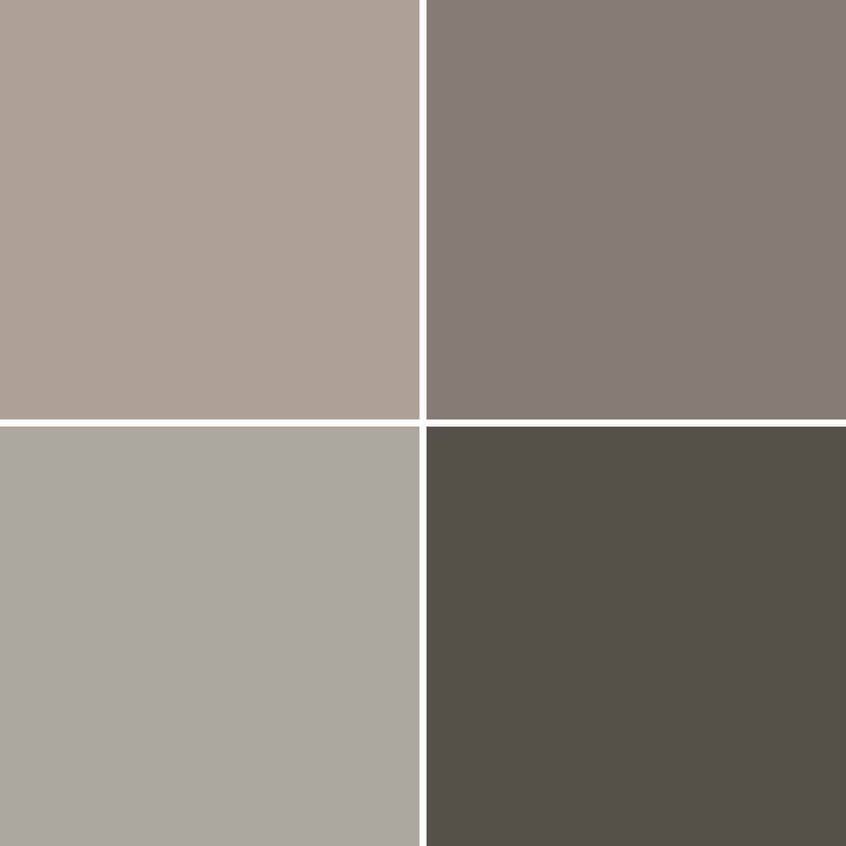
Agreeable Gray
Agreeable Gray is one of the most popular paint colors on the market. Real Estate Agents are using this paint color all the time for their clients. The reason this color is so popular is that it’s a light color, the most neutral of the grays, and goes with almost any decor and wood tones you can find.

You can see in the image above how light and airy this color is when there is a lot of natural light. Also, it looks amazing with the whiteboard and batten but also the wood tones in the furniture and floors. This is all around a wonderful paint color.
Check out my dedicated article for more details on Sherwin Williams Agreeable Gray.
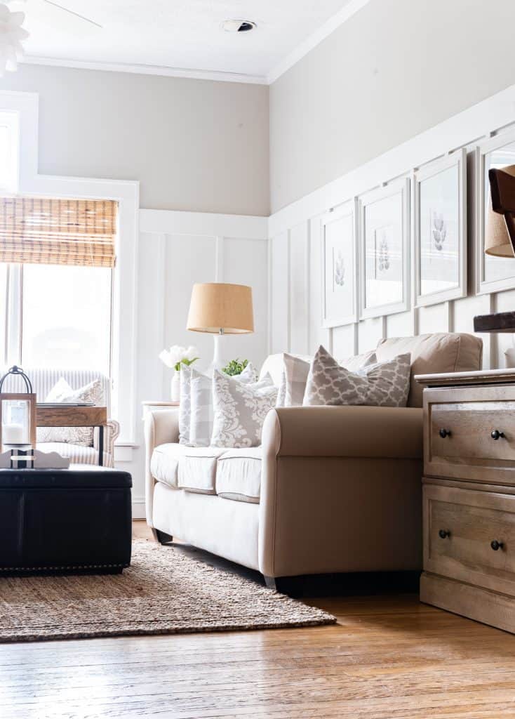
Repose Gray
The other popular paint color with Real Estate Agents is Repose Gray. I recently helped clients choose finishes for their new build home and the salesperson said they use Repose Gray in all their model homes. She also said many people building love it so much they choose it for their home paint color!
Repose Gray is a greige paint color. It’s a combination of gray and beige. It is just slightly lighter than Agreeable Gray which is why it’s so popular. Light, bright, and airy is the feeling everyone is looking for right now.

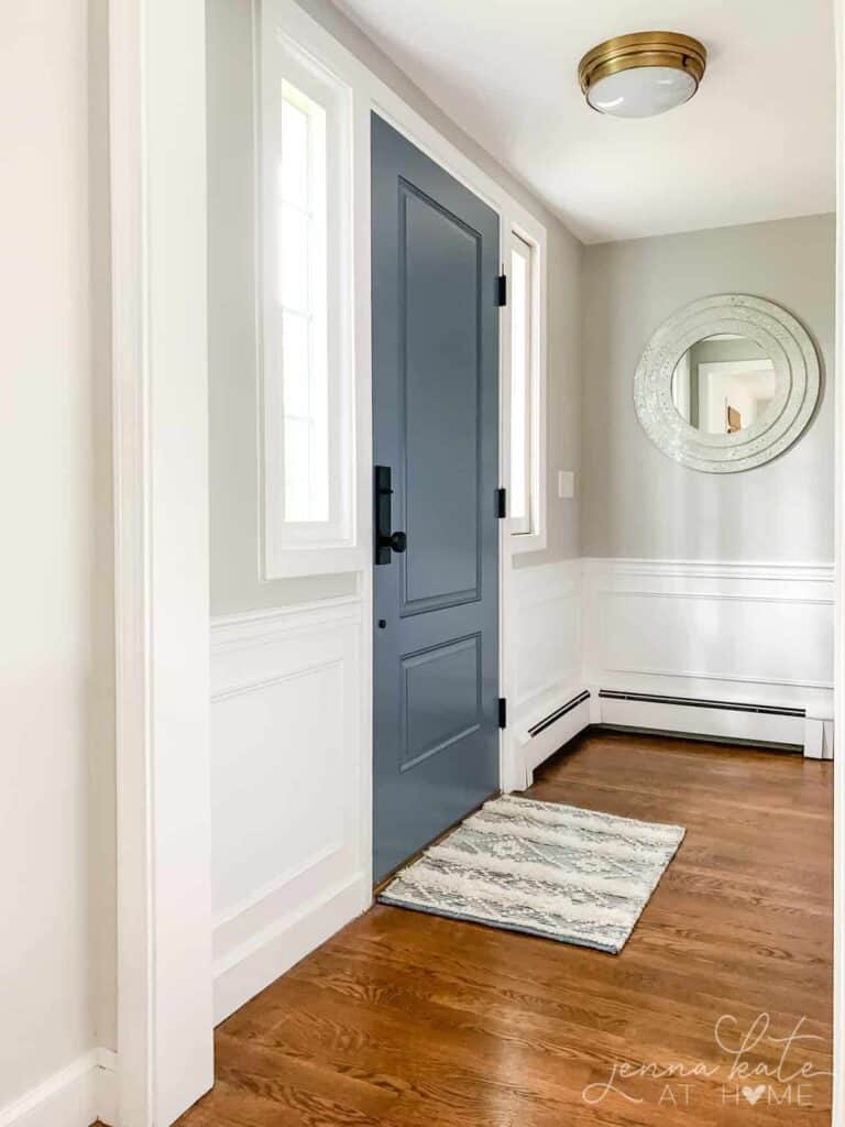
I love this entryway and how light and bright it is. I also love that Jenna Kate paired a greige color with a cool-toned blue for the front door. These colors pair so well together!
Check out my article on Sherwin Williams Repose Gray for more in-depth details.
Passive
Passive is a beautiful light gray paint color but unlike Repose Gray, Passive is a cool-toned gray. It has blue undertones, which makes it fall on the cool side.
What I love about Passive is that even though it’s considered cool it’s not stark and cold feeling. This paint color adds a fresh, crisp feel to a room.
This is a great example of passive. With all this natural light you don’t feel like the room is too cold. This color pairs really well with the wood floors too.
Check out my article on Sherwin Williams Passive for more details.
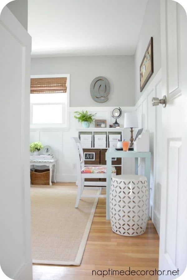
Worldly Gray
Worldly Gray is a beautiful greige paint color. It’s a warm gray that has hints of green undertones as well as purple. These two combinations are not common and because they are both here Worldly Gray becomes a bit of a chameleon.
Because of its undertones, it can look warm in some rooms and cool in others. In darker rooms with little natural light, the green undertones come forth and the room will feel warm. In rooms with tons of windows, the natural light softens the paint color, and the purple undertones tone down that warmth.

I just love this hallway and all the soft colors. It blends really nicely with the floors and the colors in the pillows. This color is considered a mid-toned color, it brings a bit more depth of color than the previous colors we have discussed.
Would you like to save this?
Check out my article on Sherwin Williams Worldly Gray for more details.
Light French Gray
The name of this paint color is a touch misleading. Light French Gray is not a light paint color. It’s a gorgeous mid-toned gray that is similar to Worldly Gray in saturation but different in that it falls on the cooler side of the gray family.
Light French Gray has more purple undertones which makes it a cool gray paint color, but don’t worry your room won’t turn out looking purple.

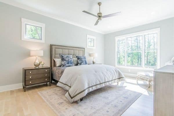
Amazing Gray
Amazing Gray is a warm-toned gray paint color. It is considered a greige, it leans a bit towards the beige color range. It is a bit darker than the others we have discussed. It’s not dark at all, just mid-toned so it brings more saturation of color to a room.

This bedroom is so beautiful and calming. I love how Amazing Gray goes with the cream furniture, gold in the artwork, and neutral bedding.
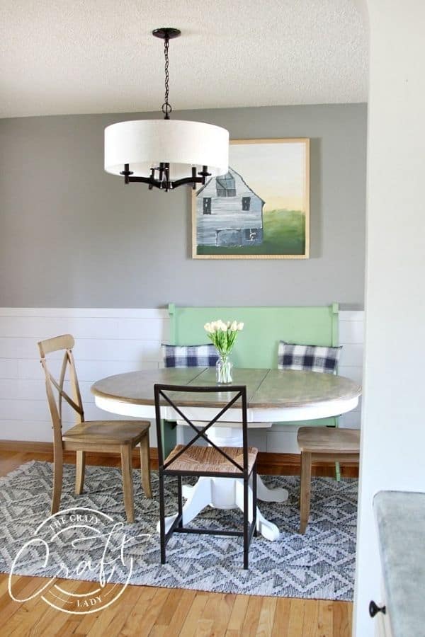
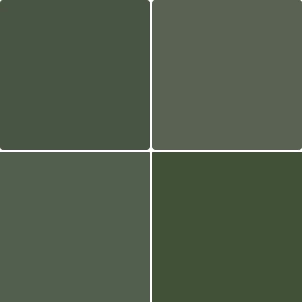
Comfort Gray
Comfort Gray is just what its namesake says, it’s all about comfort. You can breathe a sigh of relief when you walk into a room with Comfort Gray painted on the walls.
Comfort gray has blue-green undertones. It’s one spot up on the paint strip from Sea Salt.

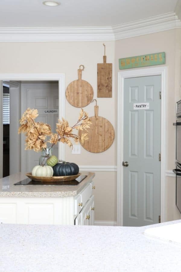
The pantry door is painted in Comfort Gray. It’s the prettiest gray-blue that really stands out amongst all the neutrals.
Mindful Gray
Mindful Gray is another mid-toned gray paint color. What makes this color different from the others is that it is much more neutral. It leans warmer but can look cool in some rooms.

Even though this is a medium-toned paint color it’s so bright in this space due to the natural light. I love how it pairs with the wood tones too.
Dorian Gray
We are moving darker as we go through these colors. Dorian Gray is slightly darker than the others but it still sits in the mid-toned range. It’s a warm-toned gray with slight undertones of purple and a touch of green, but it truly sits as a neutral.

This farmhouse dining room has shiplap as a wainscoting and Dorian Gray above. I love how it pairs with the different wood tones and colors in the room.
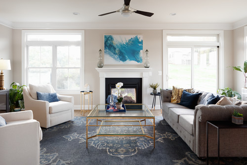
Online
Online is a beautiful cool-toned paint color that is in the mid-range. This paint color honestly reminds me of the ocean and when used in the home really brings a sense of calm.

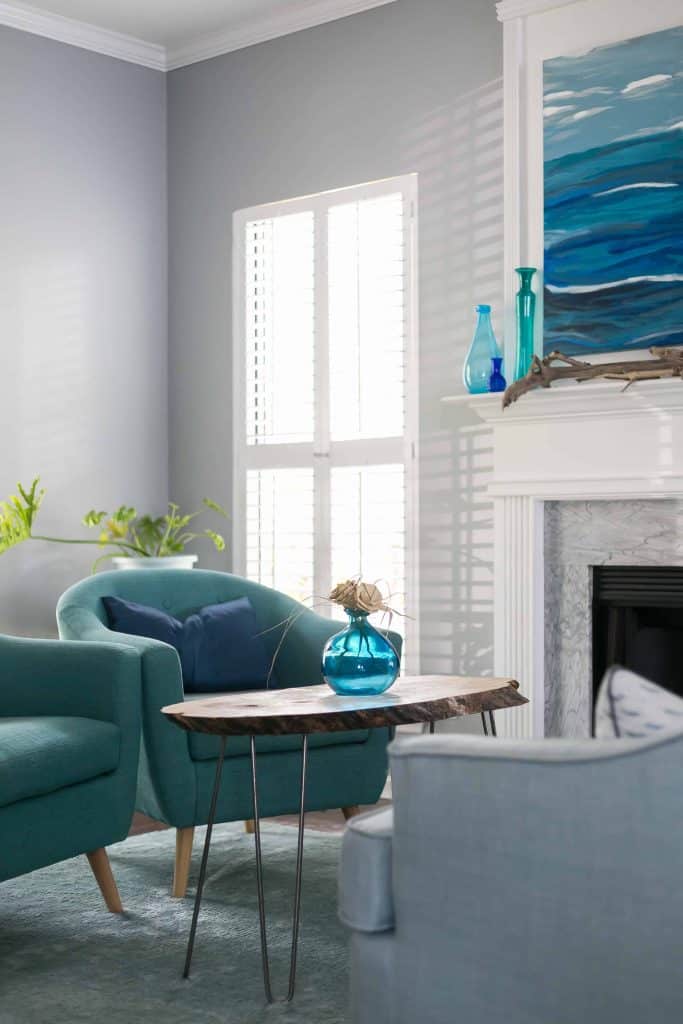
My friend Morgan @ Charleston Crafted used Online in her family room. With its cool undertones it looks amazing with all the blue and teal colors in the decor.
Other Sherwin Williams Gray Paint Color posts you might like:
- The Best Black Paint Colors for Any Room in your Home
- The 12 Best Green Paint Colors for your Home
- Best Modern Farmhouse Paint Colors
- The Best Greige Paint Colors for your Home
- The Best Cool-Toned or Blue-Gray Paint Colors
- 6 of the Best White Trim Paint Colors

I hope you found some great Sherwin Williams Gray Paint Colors here that you want to try. I truly love both warm and cool-toned it’s so hard to decide which way to go! What way are you leaning? Let me know in the comments.

As a licensed Real Estate Agent and an avid home decorator, I strive to give my clients the very best I can when it comes to staging, selling, and decorating their homes. I have lots of experience with paint color choices and love to DIY my home so I can have everything just the way I want it. I share my ideas and projects with the world in the hopes that I can help others have their homes just the way they want as well.


Hi,
I am trying to select colors for my north face home. We have tons of natural light comes from back side. Can you suggest exterior and interior colors? And also which color stone front side of the home up-to first floor?
Thanks in Advance!
Hi Anil! That is a tough one because I don’t know what colors stone are offered as options. I will say North-facing light tends to be cooler so light colors can become washed out. I would choose something mid-toned so you still have a bit of color. Then you can go with lighter ones for inside. This post has some great options but you might want to check out the Benjamin Moore Gray Paint colors post as well. Thanks for stopping by!