The 12 Best Green Paint Colors for Your Home
I have all the details on the best green paint colors, in all shades with real-life examples of them in homes!
Days of neutral on neutral are slowly coming to an end. Don’t get me wrong, I love neutral decor and I find it very soothing but color is not the enemy.
Choosing the right color is so important to have a home that feels cohesive. Today I will go over all of the best green paint colors and give you all the details so you can make the right choice every time!
*This post contains affiliate links. For more details see my full disclosure.
The Best Green Paint Colors
Green is a great color that can be used in any room of your home. I believe in taking my cues from nature when it comes to decorating and green is probably the most prevalent color in nature.
I am going to share the best greens from Sherwin Williams and Benjamin Moore. These are two of the most popular manufacturers of paint and have the best quality of paint in my opinion.
I am not saying I haven’t used Home Depot’s or Lowe’s before, I totally have. I just like Sherwin Williams and Benjamin Moore the most and if you hire painters to paint your home these are the stores they frequent and will want you to choose colors from.
One other thing I will mention in this post is each paint color’s LRV. This stands for Light Reflective Value and it’s a scale from 0-100 with 0 being the blackest black and 100 being the whitest white. This number is really helpful when you are trying to determine if a paint color is going to be light enough or dark enough for what you are trying to accomplish.
How to Know Which Is The Best Green Paint Color for you?
You can go to the paint store and get a sample, you will need a paintbrush too. Then you have these cans of paint and nothing to do with them. They are typically very low-quality paint so you won’t want to use them for anything.
I suggest heading to the Samplize website and ordering a paint sample from them. They carry almost all the main colors and they will send you a 12 by 12-inch peel and stick sample you can put on your wall. Look at it over the course of a couple of days. Try it in a couple of rooms. When you are done with it you can toss it!
The Best Green Paint Colors From Sherwin Williams
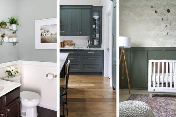
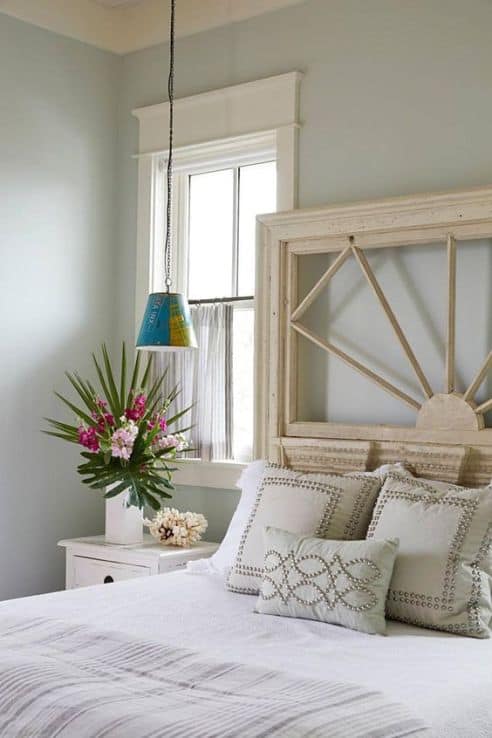
Sea Salt
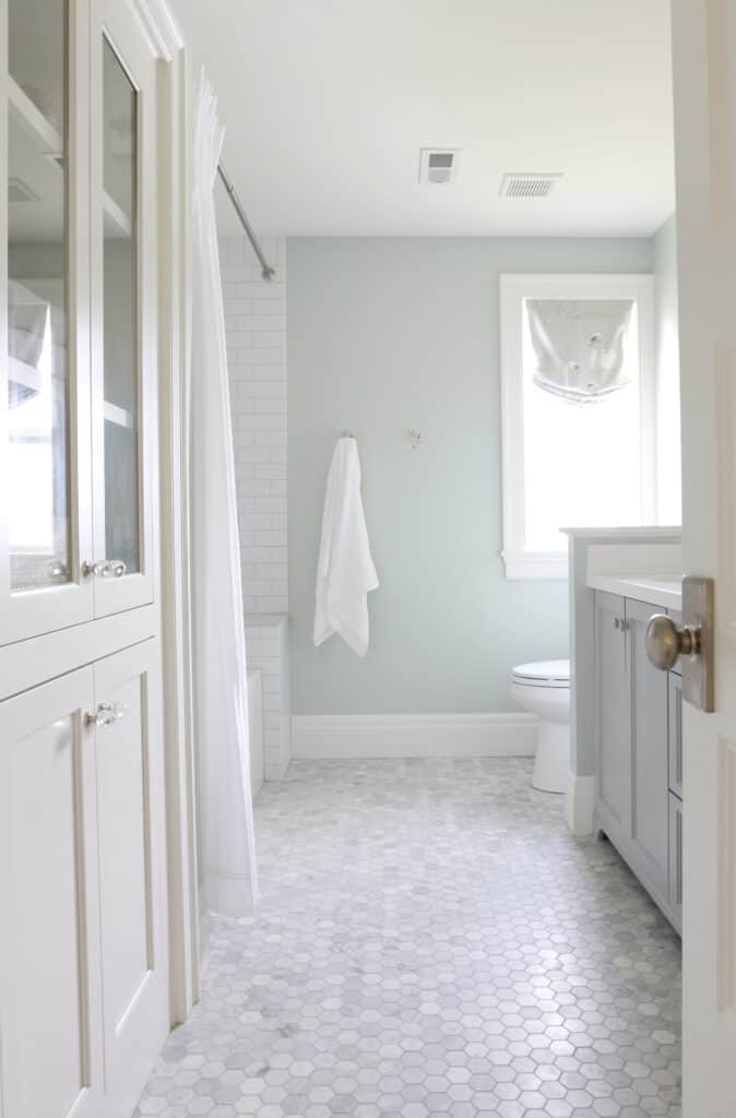
One of the most popular paint colors from Sherwin Williams is Sea Salt. I used this in my old house on the walls for a bathroom remodel and we loved the color!
Sea Salt is a beautiful blue-green color. It reminds me of the color of sea glass and because of that it gives the feeling of the ocean. What is more relaxing than the ocean!
In rooms with little light, Sea Salt can pull very green. In rooms with lots of light, the blue undertones really come forth. This makes Sea Salt a chameleon for sure!
The LRV of Sea Salt is 64 which makes it a light paint color and will brighten your room considerably.

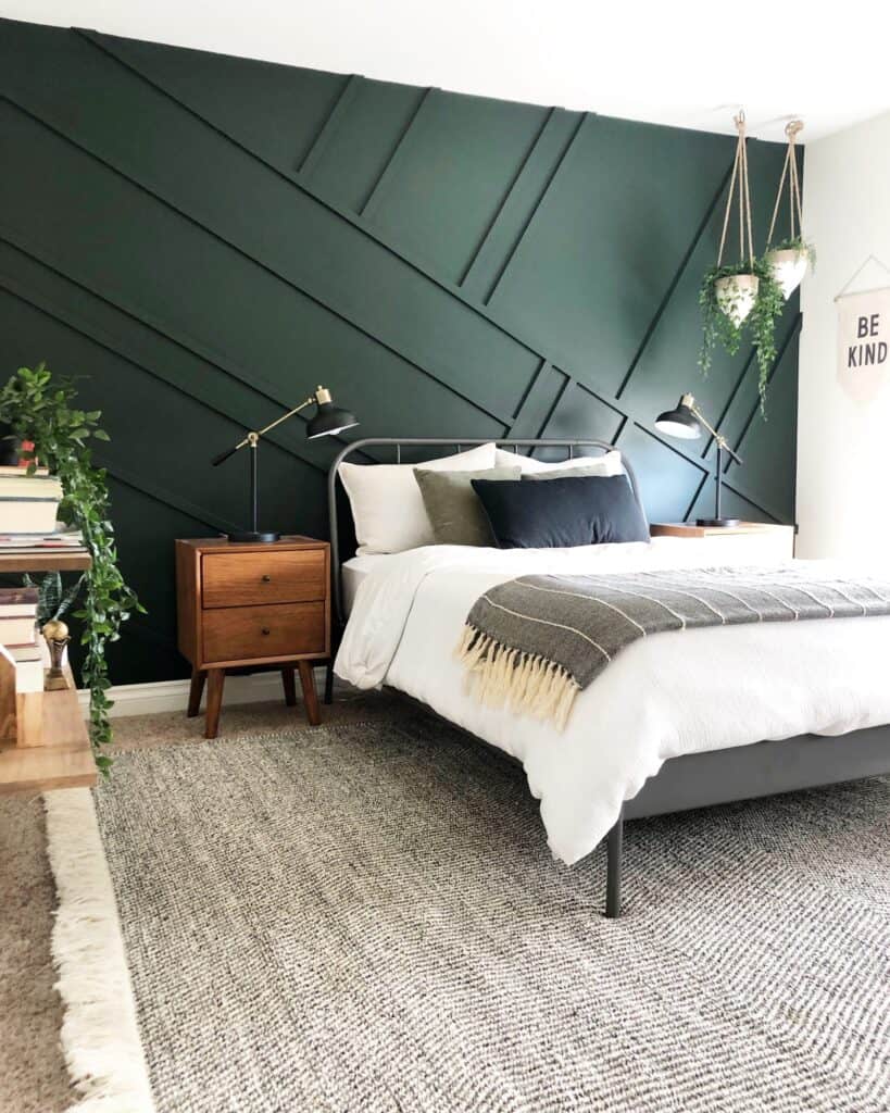
Evergreens
Sherwin Williams Evergreens is a beautiful dark green that is aptly named after the evergreens in the forrest.
If you want a dark and moody bedroom this would be a great color to put on an accent wall. If you are really bold then do the whole bedroom that color!
I wouldn’t use this color in a family room or kitchen, I like to stick with brighter colors for those spaces but in a bedroom or dining room this is a great color to use.
A couple other great places to use this color is on a front door or on a piece of furniture. I love dark painted furniture, they add so much character to a neutral room.
The LRV for Evergreens is 8.5, so this is definitely a dark color.

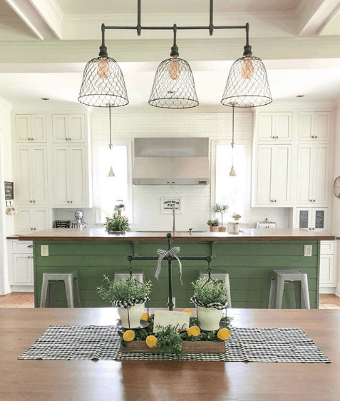
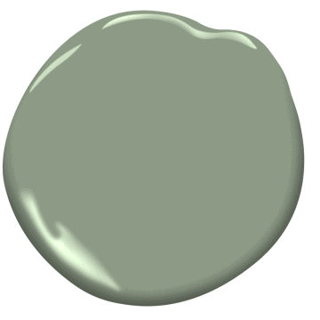
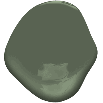
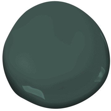
Basil
Basil is a medium-dark green paint color that tends to pull slightly gray. The LRV for this paint color is almost 15 which makes it lighter than Evergreens but it’s still pretty dark.
I just love the photo below where Basil is used on the island. The fact that this paint color pulls slightly gray makes it a great color to match in your home if you have a lot of grays in your upholstery fabrics or other decor.

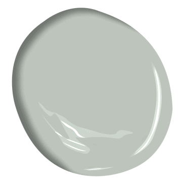
Oyster Bay
Oyster Bay is in the same color family as Sea Salt, just a couple of shades darker. It’s a beautiful blue-gray in a medium tone. It’s not a dark color at all but just a bit darker than Sea Salt. The LRV for Oyster Bay is 45, solid in the medium-toned area.
Like Sea Salt this is a beautiful blue green paint color with just a touch of gray to keep it from being neon. It has the feel of the ocean which makes it a very relaxing paint color. This would be a perfect color for a bedroom or bathroom.

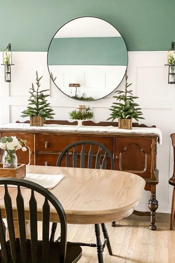
Studio Blue Green
This is one of my favorite paint colors. I used this color in my dining room above the board and batten. This is a beautiful blue-green paint color that is darker. It has an LRV of 21 which makes it a darker paint color.
This cool-toned paint color is perfect for accent spaces or pieces of furniture. It’s the perfect color for an accent wall, I used it as the top third paint color in my dining room above the white painted board and batten.

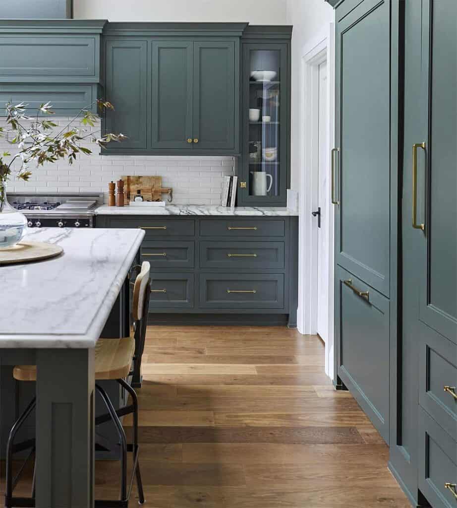
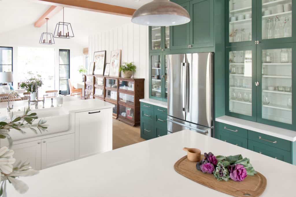
Pewter Green
Sherwin Williams Pewter Green is a beautiful dark green paint color! I am totally crushing over this color. It’s dark green with hints of gray and in some lights can show as much lighter than the dark paint color that it is.
This color is PERFECT for cabinetry and furniture. Paired with satin gold hardware and you will have a swoon worthy space.
Would you like to save this?

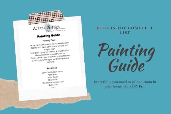
If you are new to Painting but want to do it yourself I have a great painting guide that will take you through everything you need to paint a room like a pro!
The Best Green Paint Colors from Benjamin Moore
Benjamin Moore paint is a tad harder to find compared to Sherwin Williams. Most of the time there will be a paint store that carries Benjamin Moore as one of their brands.
Here in my area, there is a store called Creative Paints and they carry Benjamin Moore. Their hours are tough though, they mostly cater towards contractors. That’s one reason that Sherwin Williams is a bit more attainable. The stores are more readily available and their hours are so much better.
Keep in mind that Benjamin Moore and Sherwin Williams can color match each other’s paint colors. So if you find a Benjamin Moore color that you love, the Sherwin Williams store can recreate that color for you, and vice versa.
Tranquility
Benjamin Moore Tranquility is a very similar color to Oyster Bay. It’s a light blue-green paint color with an LRV of 53, so it’s a mid-toned green but on the lighter side.
This color pairs so nicely with both white trim and wood. It brings calmness to a space so it’s perfect for bedrooms and bathrooms.
High Park
High Park is a medium green shade that reminds me of the color of some trees I see in my backyard. It’s not a light or dark green, really sits in the middle. The LRV for High Park sits just under 30, which means it doesn’t bounce around a ton of light.
Back in 2020 a lot of paint manufacturers had a shade of green as their paint color of the year. High Park reminds me a little bit of Behr’s Back to Nature but High Park has a bit more gray in it and it’s a bit darker.
This color can truly be used in any room. If you are looking to lighten and brighten a room then this isn’t the color you want but for a bedroom or dining room this would be a perfect choice.
Backwoods
With the Benjamin Moore colors I am getting progressively darker. Backwoods is a gorgeous dark green color that has so much depth. This color is part of their classic collection and it totally makes sense. This color has been around forever and will be around forever.
Backwoods is a warmer gray than some of the others we have discussed. It pairs very well with different wood tones as well as warm whites.
This is probably one of the more popular medium to dark green paint colors from Benjamin Moore. If you google it in images you will come up with a ton of great designers who have used it in their homes.
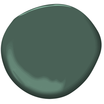
Lafayette Green
Lafayette Green has an LRV of 8, so we are definitely getting into the darker shades of green. This is a cool-toned Green, having lots of blue undertones.
Lafayette Green changes color in different lights, hello blue undertones. In rooms with lots of natural light it can look a lot lighter. When there isn’t as much natural light the depth of color really comes through.
Tarrytown Green
I told you we are getting darker and darker here. Tarrytown Green has an LRV of 7. Just a touch under Lafayette Green.
This color is very similar to Lafayette Green but it has just a bit more depth of color. I absolutely love these dark greens paired with gold and white accents. Using these greens on kitchen cabinetry is such a fabulous idea.
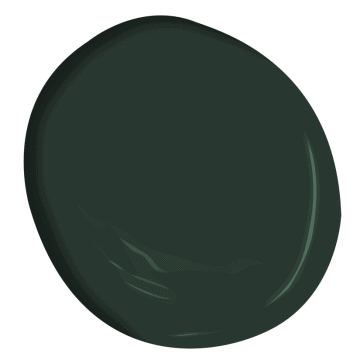
Essex Green
Last but not least we have Essex Green. This is a green that is almost black. It has an LRV of 3.53, so yeah, it’s really dark.
This color is a rich forrest green and looks amazing as an accent wall bringing warmth and coziness to a space. Like the previous two color Essex Green looks amazing on kitchen cabinetry, it really anchors the room.
You might be interested in some of my other paint color posts:
- Sherwin Williams Passive
- The Best Beige Paint Colors
- The Best Warm Gray or Greige Paint Colors
- Sherwin Williams Repose Gray
- Benjamin Moore Revere Pewter
- Sherwin Williams Agreeable Gray
- The Best Cool-Toned or Blue Gray Paint Colors
- The Best Farmhouse Paint Colors

I hope you have found some great ideas on the best green paint colors. Green has become one of the hottest trends in home decor and I hope you feel that you will give one of them a try!

As a licensed Real Estate Agent and an avid home decorator, I strive to give my clients the very best I can when it comes to staging, selling, and decorating their homes. I have lots of experience with paint color choices and love to DIY my home so I can have everything just the way I want it. I share my ideas and projects with the world in the hopes that I can help others have their homes just the way they want as well.