Designer Rules Worth Breaking and Which Ones To Follow
Design rules are meant to guide—not limit—your creativity. While principles like balance, scale, and cohesion can help you create a polished, timeless space, some of the most memorable interiors come from knowing exactly when to break the “rules.” From mixing metals to embracing bold color combinations, great design often lives in that sweet spot between structure and self-expression. In this post, we’ll explore which designer rules are worth sticking to for a cohesive look—and which ones you can confidently bend (or break) to create a home that feels uniquely yours.
*This post contains affiliate links. For more details see my full disclosure.
Designer Rules Worth Breaking
As I said, rules in design are really just guidelines. If you break it, you won’t be going to designer jail, you will just be creating a home that is uniquely yours. Let’s get into the ones you really don’t need to follow all the time.
1. Hang Your Curtains High, Wide, and Long
This is a great rule to follow if your home allows for it. You cannot always follow this rule. What if you have windows directly behind your sofa, and you have kids and dogs?
You will want to be able to open and close the curtains, but you might not be able to do that with the furniture up against it. And the kids are pulling on them, pushing the furniture against them. Not practical at all!

Here is another example. Curtains hung over a desk or table won’t be able to open and close easily.
2. Area rugs should be large enough that at least the furniture legs can rest on them.
This is one I like to follow most of the time. It just looks better. But not all rooms can allow for the rug size to manage this.

Another rule is in a dining room is the rug should be large enough that the chairs will still be on it when they are pulled out. As you can see here that is not the case. If the rug was much larger it wouldn’t fit in the room with the sliding door. But the smaller rug totally works.
3. Art should be hung at eye level.
Whose eye level? My eye level is much lower than a friend of mine who is 7 inches taller than me! This is such a subjective rule, and I don’t like it.

This room is so fun and colorful! If you notice the artwork goes all the way from about a foot above the floor to nearly the ceiling. It totally works in this space!
4. Gallery walls should be evenly spaced and have a finished arrangement.
If this is what you are going for, then do it! But not all gallery walls need to look like this. I can show you some really great examples of gorgeous gallery walls that are spaced unevenly and are really amazing.

This gallery wall is not evenly spaced, and it doesn’t just have photos. It uses artwork, photographs, and needlepoint pieces to create a gorgeous collection.
5. Metals and woods must match.
Mixing metals is actually a wonderful way to create a unique home. One that is curated and special. It just needs to be done right. That’s why designers like this rule. They think they are the only ones who can do it.

This gorgeous kitchen has a mixture of silver hardware and brass light fixtures.
It is incredibly hard to have a home with all matching wood tones. Practically impossible if you ask me. I have many different wood tones in my home. My stairs and handrails are Minwax Jacobean, which is extremely dark brown.
The entryway table is a medium brown tone. And the table at the top of my stairs is stained Minwax Red Oak. Putting them all together, the space looks amazing!
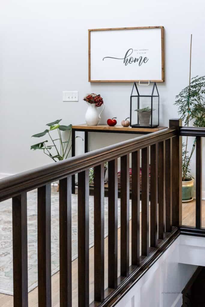
This photo is from my fall home tour. You can see my staircase that is very dark brown and the console table that is medium brown. Adding to that the hardwood floors are a gray/brown mix. Three different wood tones all in one space and it works!
If you want to see how different stain colors look on different woods then you need to go here!
6. Avoid dark paint in small rooms.
Oh, this is a fun rule to break! Dark paint in a small room makes the space feel cozy and dramatic. Now you don’t want to have dark walls, dark furniture, and dark accessories. Then it will just feel like a cave.
But dark paint with lighter furniture and cozy textures in pillows and throws will give you a really fun and welcoming space.

Let’s talk about this gorgeous powder room. First of all we have very dark walls with white trim and white bath fixtures. The white used in this room balances the dark paint.
Notice we have mixed metals and mixed colors of wood. Silver hardware at the sink and a bronze light fixture. Dark wood around the window and light wood around the mirror.
They have also added a touch of life with the flowers on the toilet. This is a well designed space.
7. Furniture must match.
When you go to a furniture store and shop for living room or bedroom furniture, they often have sets you can buy to make your space feel cohesive. But that’s not what you should do!
The best rooms are those that have been curated over time. Pieces of furniture that have been handed down from older generations and new pieces that complement them. Being too matchy makes your rooms feel like furniture showrooms.

This gorgeous room has a gorgeous antique coffee table and a modern sofa. The throw pillows are mixed patterns and the two arm chairs, that are very taditional in style, have a very modern print.
8. Choose one style and stick to it.
I am so guilty of flipping from one style to another. I just love them all! So I try to incorporate what I love about those styles into each of my rooms.
9. Symmetry is key to good design.
Symmetry is a great way to create a well-designed room, but that doesn’t mean that asymmetry is bad. It’s one of those things that some people love, and some don’t. You do what makes you happy.

This asymmetrical family room has a wider bookcase on the right and a narrow one on the left. This is because there is a hallway. They best thing you can do is take spaces like this and curate them the best you can. Add symmetry when you can and enjoy the uniqueness when you can’t.
10. Always paint ceilings white.
Painting ceilings white is, honestly, a common practice. If you want a bold room, then go with a different color on the ceiling. You can paint it the same color as the walls, or maybe a lighter or darker color than the walls.
Would you like to save this?

Designer Rules You SHOULD follow.
Use what you love.
If you find a piece that you absolutely love, then you should use it, no matter what anyone thinks.
Use what you have.
The first thing you should do when decorating, or redecorating, a room is to shop your home. Go through what you have and pull out the pieces you love, and make sure you use them.
Don’t push furniture against walls.
I personally break this rule in my home. I learned a long time ago, when I was first getting into design, that creating intimate spaces is not what you get when you push the furniture against the walls.
If you have a large room, then you will have way too much space in between pieces of furniture and it will be awkward when trying to converse with your guests.

You can see in my family room if I tried to push the sofa agains the wall behind it half the sofa would be bare and open to the breakfast nook. So I pulled it away, placed a console table behind it and created a hallway for people to get from one side of the house to another.
Choose pieces that are the right scale.
Too big a piece of furniture in a smaller space can make the room feel very constricted. Too small pieces will make the room feel cluttered.
Edit, don’t clutter
This is a big one. I am a firm believer that if your space is cluttered, your life will feel cluttered, and it will be hard to relax. When we are at home, we need calm and stillness. Not crap everywhere.
If you find that you have too many things that you want to display, you love them all, but by displaying them all, you will have too much clutter, then it’s time to edit. You don’t need to get rid of all of it, but try rotating the items around different times of the year.
You can mix and match and make your space feel new every time a season changes.
Balance old and new
I mentioned before that buying all matching furniture is bad and that a curated home is a mix of old and new. I love mixing an old, antique piece of furniture with a new one.
In my dining room, I have an antique buffet that I refinished with a traditional dining table and modern chairs. All of which are different wood tones!

Mix textures and materials
I mentioned before that it’s great to mix metals and materials. Especially patterns!
Add something natural
Nothing brings a room to life like adding something from nature. This could be any of the following:
- flowers
- plants
- jute rugs
- wicker furniture
- wood pieces
- stone
Any of these elements, or a combination of them, can bring life to a space.

Bathrooms are notorious for being hard because of all the materials. Adding a plant and a touch of wood really warms up the space.
Include something personal
Nothing makes a room feel special like adding personal elements. The most obvious would be family photos, but it’s not limited to that.
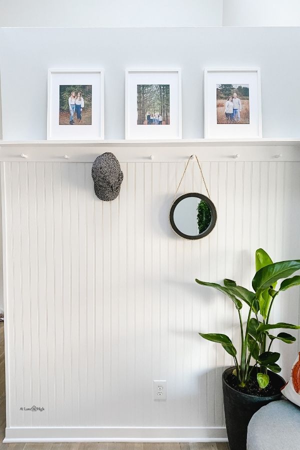
Here in my entryway where I added beadoard to the walls and a shelf I added personal touches such as family photos and a personal item such as my hat.
Pay attention to lighting.
Lighting is so important in how a space looks. Not only does natural light impact a room but the interior lighting does as well. Overhead lighting is the most obvious. Updating to timeless lighting in chandeliers is the best idea.
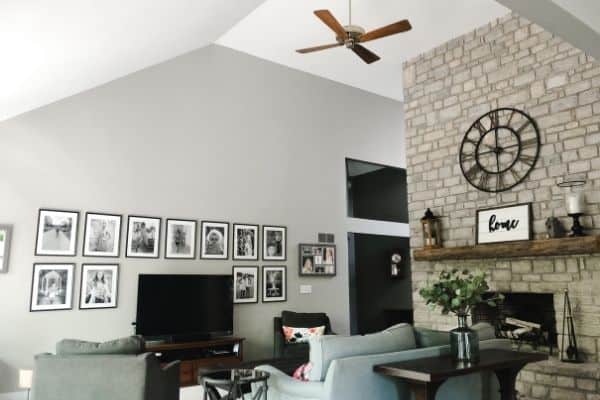
In my home, we had no overhead lighting in our family room, just a ceiling fan from 1985. We swapped it out with a black wagon wheel chandelier that is large, matching the size of the space, and the change in the look of the room was incredible.
Here is the room with the 1985 ceiling fan. No light meant that there was no reading at night or really anything because we couldn’t see!
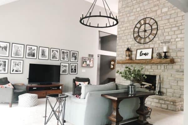
Here is the same space after the wagon wheel chandelier was installed. It has 12 lights and really illuminates the entire space. It’s also on a dimmer switch so if it’s too bright we can dim it.
Making sure you pay attention to size is very important.
Table lamps are a secondary form of lighting. Lamps are great for watching TV at night when you want a little light but not “the sun,” which is what my husband calls my chandelier.
Wall sconces are another fabulous option. You also don’t need them to be wired! You can add a wall sconce, remove the wire, and instead install LED battery operated lights that have a remote! Great idea to add lighting to a space where you don’t have any wiring.
Other Decorating Posts You Might Like:
- Inspirational Lake House Decorating Ideas
- How to Master the Coastal Grandmother Aesthetic
- Timeless Elegance: How to Master Transitional Home Decor
- How to Make a Bed Like the Magazines
- Living Room Decorating Do’s and Don’ts
- What is Cottagecore? A Guide to the Cozy Aesthetic
- What Is Grandmillennial Style? A Modern Twist on Timeless Elegance


As a licensed Real Estate Agent and an avid home decorator, I strive to give my clients the very best I can when it comes to staging, selling, and decorating their homes. I have lots of experience with paint color choices and love to DIY my home so I can have everything just the way I want it. I share my ideas and projects with the world in the hopes that I can help others have their homes just the way they want as well.