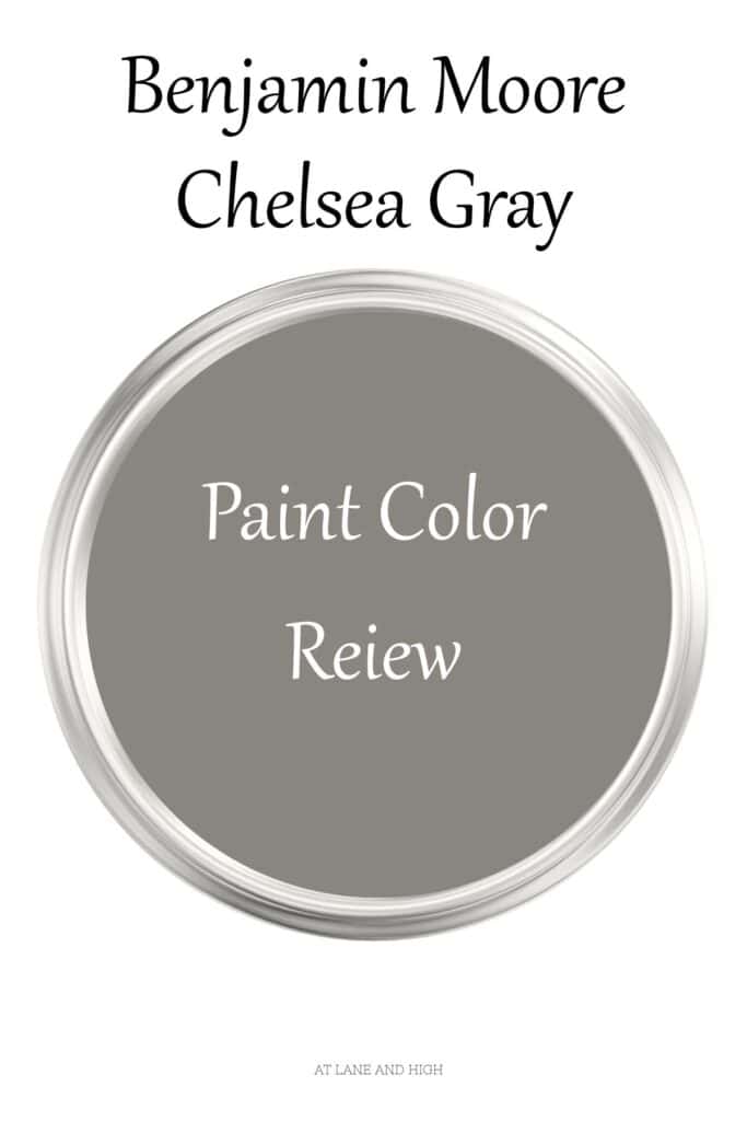
Chelsea Gray by Benjamin Moore
If you’re searching for a rich, timeless neutral that adds depth without overwhelming a space, Benjamin Moore Chelsea Gray (HC-168) is a standout choice. This sophisticated mid-to-dark gray is known for its subtle warmth.
It brings just enough depth to create contrast while still remaining versatile across a variety of lighting conditions and design styles. Whether used on walls, cabinetry, or as an accent color, Chelsea Gray delivers a balanced, polished look that pairs beautifully with crisp whites, warm woods, and layered neutrals—making it a go-to favorite for designers and homeowners alike.
One thing I want to make you aware of is Sherwin Williams has a Chelsea Gray paint color as well. It’s much lighter and cooler than Benjamin Moore’s version.
*This post contains affiliate links. For more details see my full disclosure.

What are the undertones of Chelsea Gray by Benjamin Moore?
Chelsea Gray has brown/green undertones, making it a warm paint color. However, every so often, it can flash violet, which can be confusing.
When you see it in a northern-facing room, the light coming in can be very cool, making Chelsea Gray look a little on the cool/neutral side.
When you see it coming in a southern-facing room, the light is very warm, so the color really warms up with the brown/green undertones.
What is Chelsea Gray’s LRV?
LRV stands for light reflective value, and it’s a scale that measures the amount of light a paint color reflects. Why is this important? It helps the homeowner choose the right paint color for their space.
The scale runs from 0-100, with 100 being the brightest white and 0 being the darkest black.
Chelsea gray sits at 23.33, which makes it a pretty dark color, but not the darkest. I would say anything below 30 is considered dark, but I have many colors in the single digits. So this color is dark but not super dark.
I know, clear as mud, right? Don’t worry, I will show you many examples of how this color looks in different spaces to help clear it all up.
How to know if a paint color is right for you?
The best way to judge if a color is good for you then you will want to put a swatch on the wall and look at it over a few days. Look at it in different lights and decide if you really like it.
You can do this by getting a sample from the paint store and using a brush to put it up on the walls, but then you are left with a can that you can’t do anything with. Those samples are used with poor-quality paint and aren’t meant for use on your walls permanently.
I recommend going with Samplize. They are a company that will send you a 12X12 peel-and-stick swatch of a paint color that you can stick to the wall. When you are done, just peel it off and throw it away.
It’s easy and much less messy!
Whole Home Paint Palette for Benjamin Moore Chelsea Gray
What is the best trim color to go with Chelsea Gray?
Honestly, the best white is almost any white. Chelsea Gray goes really well with most of the whites out there. That being said, I know you want me to name a color, so here are a few of my favorites that will look great:
- Benjamin Moore Chantilly Lace
- Sherwin Williams Pure White
- Shewin Williams High Reflective White
What are the best coordinating colors?
Again, Chelsea Gray looks fabulous with almost any other color. But here are my favorite looks.
Chelsea Gray looks great with creamy whites that don’t have too much yellow in them. It also looks good with blue-grays and greens.
Greige Paint colors look great with it, too, as long as they are lighter or considerably darker.
Pink is a wonderful coordinating color choice for Chelsea Gray!
What are some similar colors?
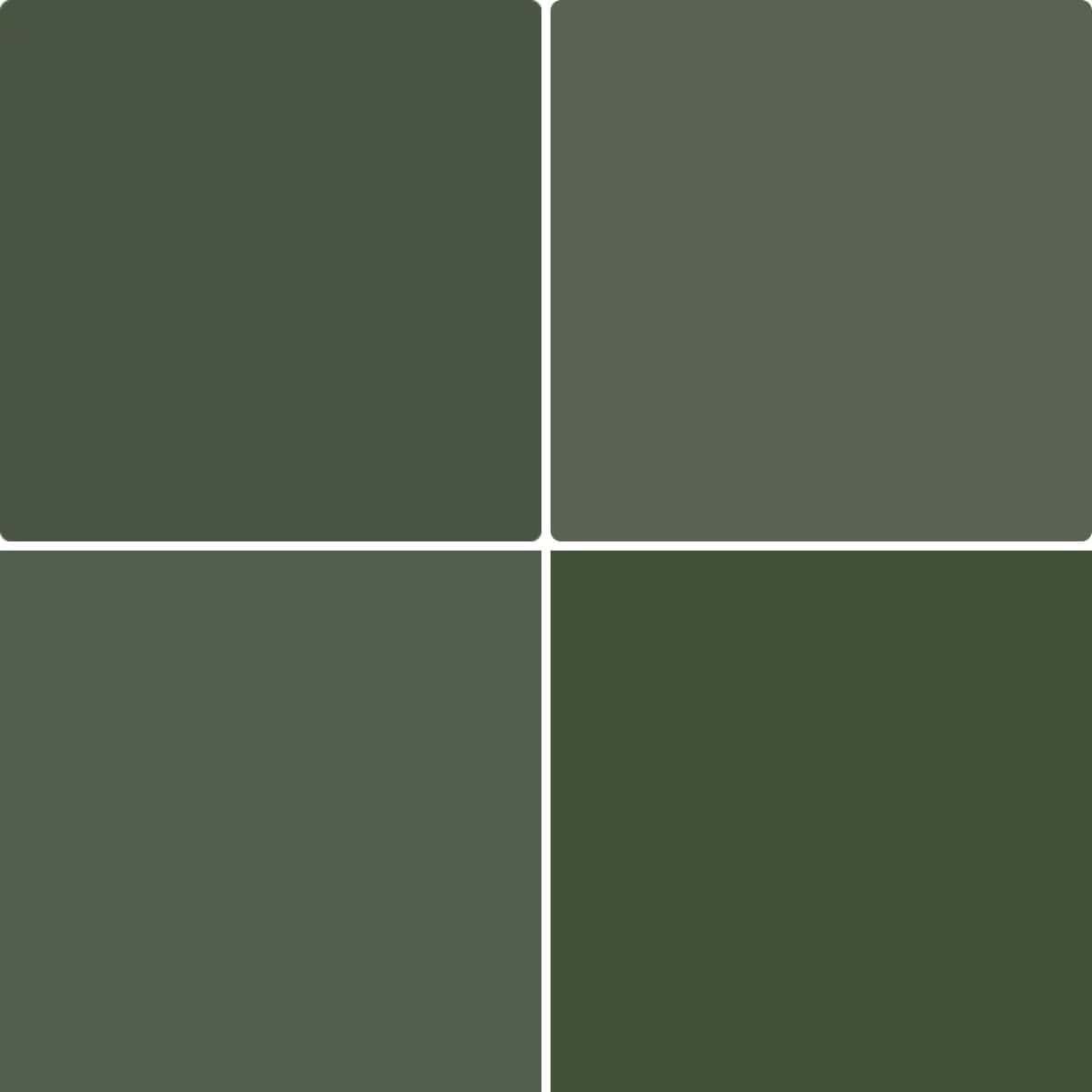
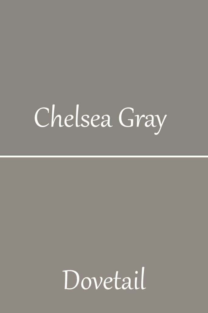
Chelsea Gray vs. Sherwin Williams Dovetail
Would you like to save this?
Dovetail is actually a touch lighter than Chelsea Gray with an LRV of 26. Dovetail also has violet undertones, making it a cooler color, whereas Chelsea Gray has green undertones, making it warm.
Chelsea Gray vs. Amhurst Gray
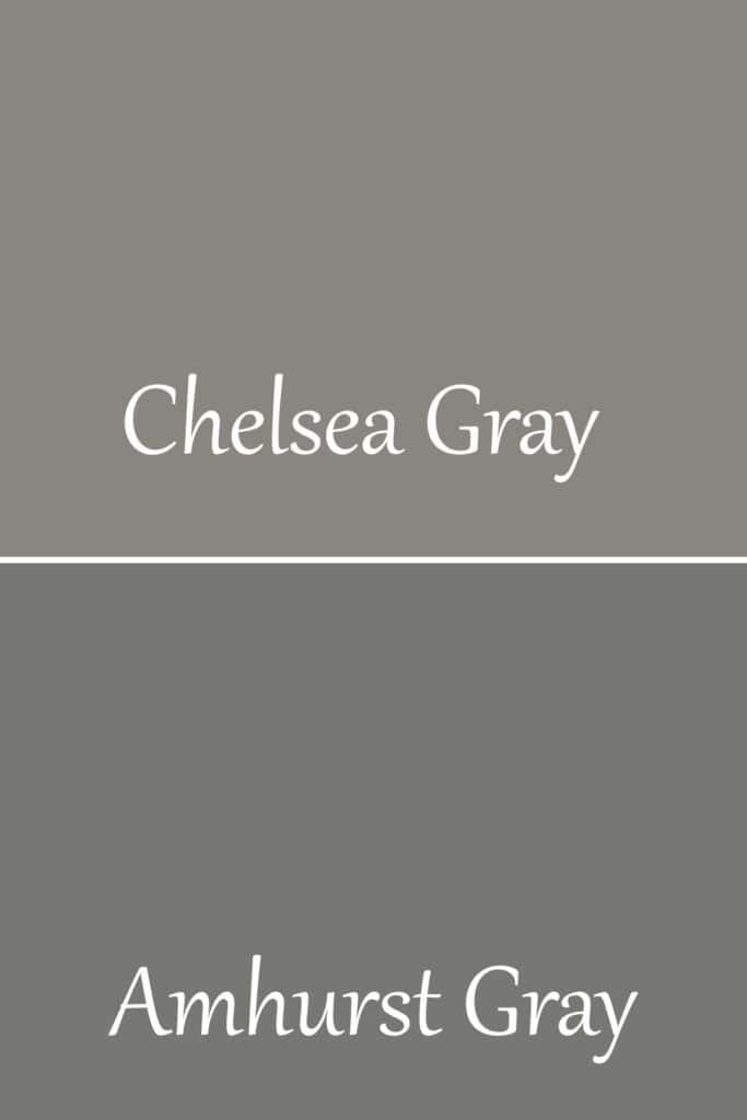
Amhurst Gray is darker with an LRV of 19, but it also has much stronger green undertones than Chelsea Gray, making it less neutral.
Chelsea Gray vs. Kendall Charcoal
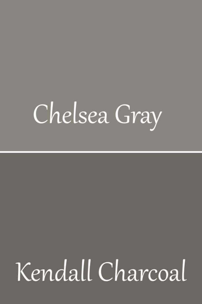
These colors are very similar, but Kendall Charcoal is much darker with an LRV of 14.61. Otherwise, they are both dark grays with green undertones.
Chelsea Gray vs. Sherwin Williams Gauntlet Gray
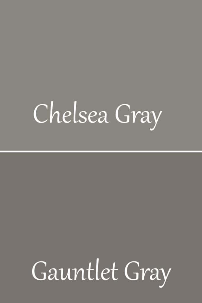
Gauntlet Gray is much darker than Chelse Gray with an LRV of 17, but they are different in other ways, too. Chelsea Gray has green undertones, but Gauntlet Gray has violet undertones, making it much cooler than Chelsea Gray.
Chelsea Gray vs. Dolphin
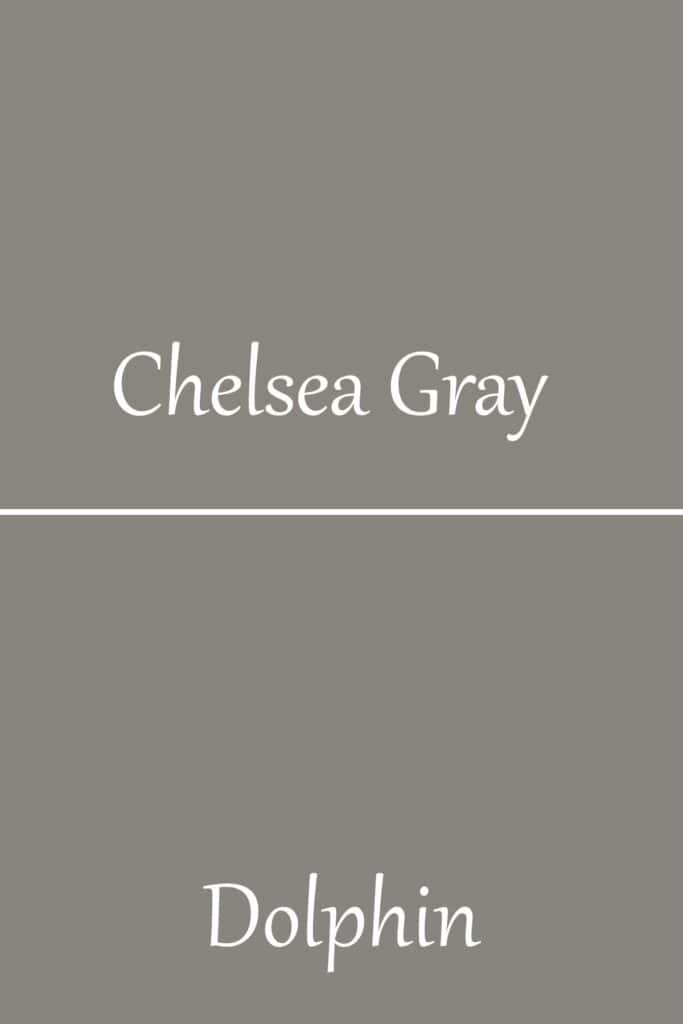
Dolphin is very similar to Chelsea Gray, with their LRV being so close; Dolphin sits at 24. Dolphin, however, has more violet undertones, making it much cooler.
Does Chelsea Gray look good on the exterior?
This color looks fabulous on the exterior. Exterior colors get very washed out with the amount of natural light they receive. Using a darker color is perfect for the exterior because it gives a great amount of color to your home!

Does Chelsea Gray look good on cabinets?
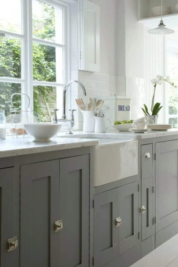
This is probably one of my favorite uses for Chelsea Gray. I love it on cabinets and furniture. Just make sure you consider your counters against the paint color because of the undertones in each.
Chelsea Gray in Real Homes
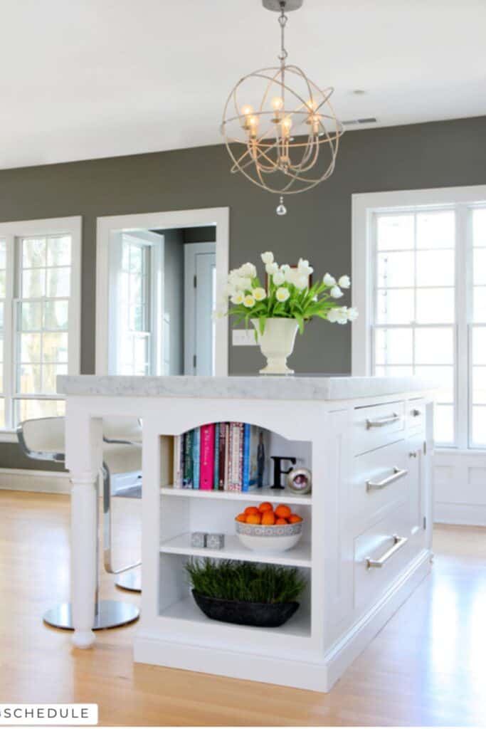
It’s tough to paint all the walls with a dark color like this, so I really like using it in spaces where it’s an accent color on one wall. This kitchen also has lots of white cabinets, light coming in lots of windows, and marble counters. All of these help brighten the room.
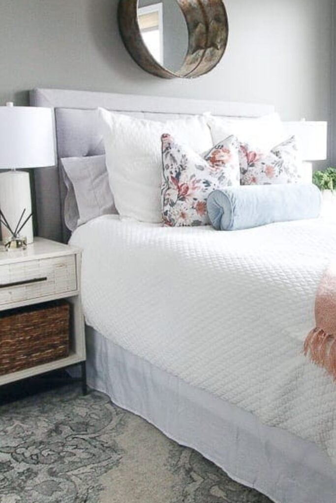
It’s been very on trend to use a dark color in bedrooms and dining rooms because it makes the space feel very cozy. This bedroom looks great, and you can see how well this color looks with pink colors!
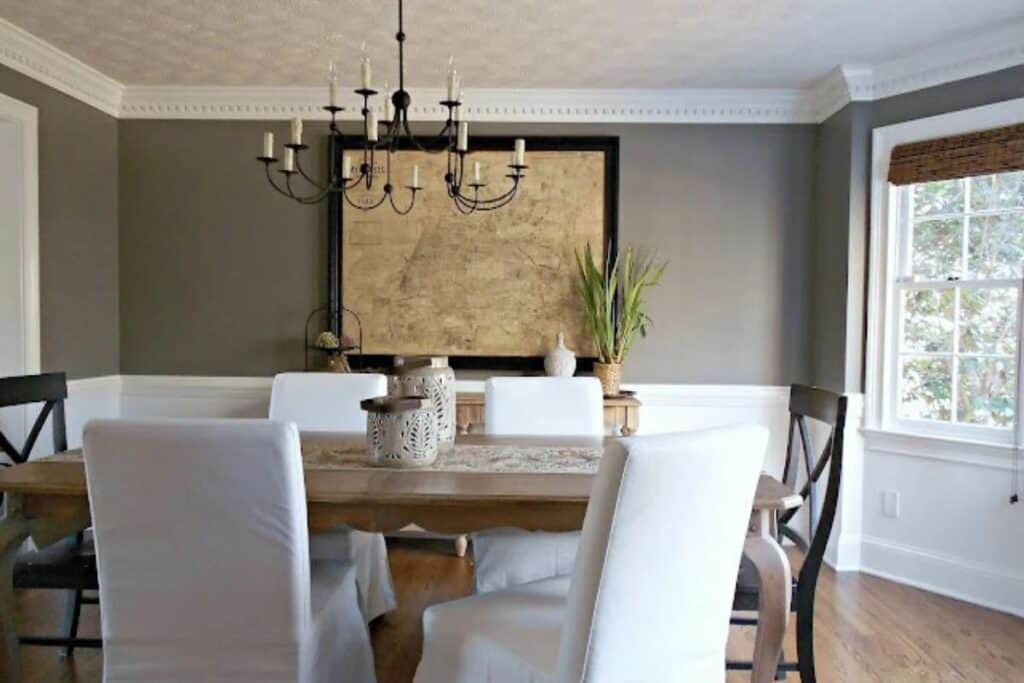
I love dark dining rooms, but I really love this dining room where they used a chair rail and painted the walls white on the bottom and Chelsea Gray on the top. All the trim detail also elevates this room!
Other Dark Gray Paint Colors You Might Like:
- Sherwin Williams Grizzle Gray
- Sherwin Williams Urban Bronze
- Benjamin Moore Kendall Charcoal
- Sherwin Williams Peppercorn


As a licensed Real Estate Agent and an avid home decorator, I strive to give my clients the very best I can when it comes to staging, selling, and decorating their homes. I have lots of experience with paint color choices and love to DIY my home so I can have everything just the way I want it. I share my ideas and projects with the world in the hopes that I can help others have their homes just the way they want as well.