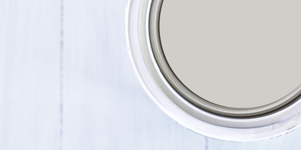
Sherwin Williams On The Rocks
If you are looking for a beautiful light gray paint color that is almost neutral then Sherwin Williams On The Rocks might just be the choice for you! I have all the details on why this is such a popular paint color.
*This post contains affiliate links. For more details see my full disclosure.
What color is Sherwin Williams On The Rocks?
All gray colors have undertones, let’s keep that in mind. When it comes to On The Rocks, the undertones are more muted which keeps the color from pulling too hard one way or another.
Because of these more undemanding undertones On The Rocks is more of a true gray paint color. I mean…almost…about as close as you can get. It’s as clear as mud right?! Don’t worry, stick around and we will get into all the details.
What are the undertones of On The Rocks?
There is no true gray paint color, although On The Rocks comes close to it. This paint color has very muted undertones and this is why it’s almost neutral.
However, it does still have undertones. On The Rocks pulls a tad to the purple side, sometimes feeling a little blue. I tested it in my house and I saw more of the blue undertones but in some of the photos, you will see later the purple can be very strong depending on the light.
Is Sherwin Williams On The Rocks warm or cool?
Because of the muted undertones On The Rocks can pull both warm or cool, or neither! I know, clear as mud.
The thing is, this color is very subjective to the light as well as the other elements in the room. For example, if you have a north-facing room the color will lean a little cooler but it never feels icy. The warmth in the color keeps it a cozy cool.
On the other hand, if you have a south-facing room the color will be slightly warmer, but not nearly as warm as a greige would be.
What is the LRV of SW On The Rocks?
If you haven’t read my other posts then here is a quick refresher on LRV. It stands for light reflective value. It’s a scale from 0-100 with 0 being the darkest black and 100 being the brightest white. The higher the number the more light a color reflects.
The LRV of On The Rocks is 62 which makes it a light color while still having a decent depth of color for your space.
How to know if a paint color is right for you?
The best way to judge if a color is good for you then you will want to put a swatch on the wall and look at it over a few days. Look at it in different lights and decide if you really like it.
You can do this by getting a sample from the paint store and using a brush putting it up on the walls, but then you are left with a can that you can’t do anything with. Those samples are used with poor-quality paint and aren’t meant for use on your walls permanently.
I recommend going with Samplize. They are a company that will send you a 12X12 peel-and-stick swatch of a paint color that you can stick to the wall. When you are done just peel it off and throw it away.
It’s easy and much less messy!
How Lighting affects On The Rocks
Lighting probably has the biggest effect on how the undertones look in a paint color. Here is how lighting affects On The Rocks:
- North-facing rooms tend to have a lot of cooler natural light coming through the windows. Therefore, the paint colors tend to look a little cooler and more washed out. On The Rocks definitely takes on its cooler undertones with a touch of purple or blue in these rooms.
- South-facing rooms tend to have warm light coming in and therefore bring out the warmer undertones in a color. For On The Rocks the warm sunlight brings out the purple but in a warm way and really gives this room more depth of color.
- East-facing rooms have the sunrise coming through and with it a warmth to start the day. This warm sunlight draws out the purple in On The Rocks but later in the day is the opposite, when the sun is on the other side of the house and the east side isn’t getting any direct light.
- West-facing rooms have the opposite effect as the east-facing room. They tend to be cooler in the morning with little direct light while in the afternoon the warm sunsets bring out the warmth in colors. For On The Rocks the warm sunlight will bring out the purple undertones slightly.
What white trim color looks good with On The Rocks?
There are a couple of colors that I highly recommend you choose from as trim colors for On The Rocks. Sherwin Williams Highly Reflective White and Benjamin Moore Chantilly Lace are great bright white colors that will really set off On The Rocks.
If you want something a little softer then I suggest Sherwin Williams Pure White.
On The Rocks vs. Repose Gray
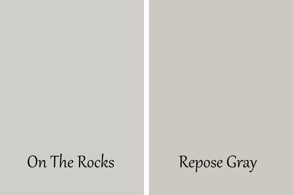
Repose Gray is probably Sherwin Williams’s second most popular gray paint color. As you can see from this side by side they are very similar colors with Repose Gray being only slightly darker.
Repose Gray is considered a greige meaning it has beige as an undertone. This causes the color to be warm where On The Rocks is considered a cooler gray, almost neutral.
Order a sample of these paint colors from Samplize!
On The Rocks vs Agreeable Gray
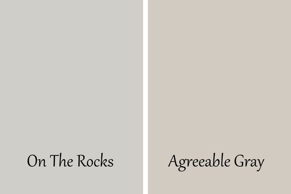
Sherwin Williams Agreeable Gray is the most popular gray color Sherwin William has. As you can see from this side-by-side Agreeable Gray is much warmer than On The Rocks. Agreeable Gray has beige in it which makes it so warm.
If you are looking for a color that is more of a true gray then I suggest going with On The Rocks.
Order a sample of these paint colors from Samplize!
On The Rocks vs Big Chill
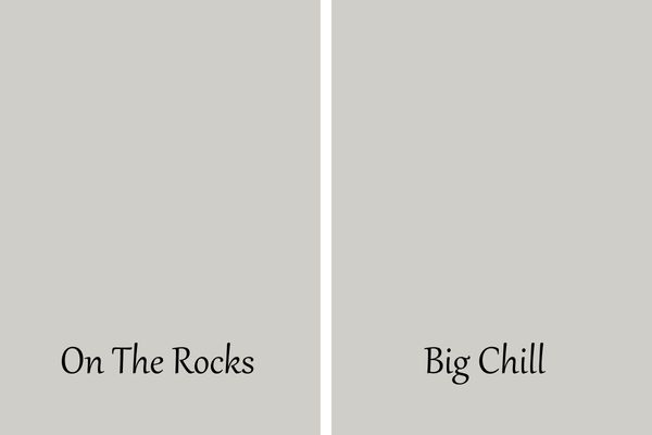
Both of these colors have an LRV of 62 so they will bounce around the same amount of light. They are very similar colors but Big Chill is slightly cooler.
Order a sample of these paint colors from Samplize!
Would you like to save this?
On The Rocks vs Crushed Ice
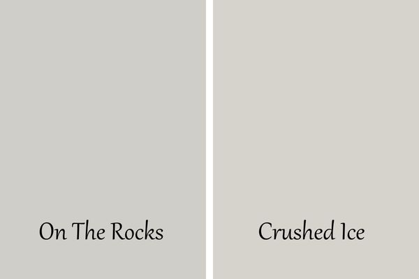
Crushed Ice has an LRV of 66 which makes it a tad brighter than On The Rocks. I think you will also see that while they have similar undertones of purple and blue Crushed Ice also has some green in it. This green gives it a touch of a warmer feel.
Order a sample of these paint colors from Samplize!
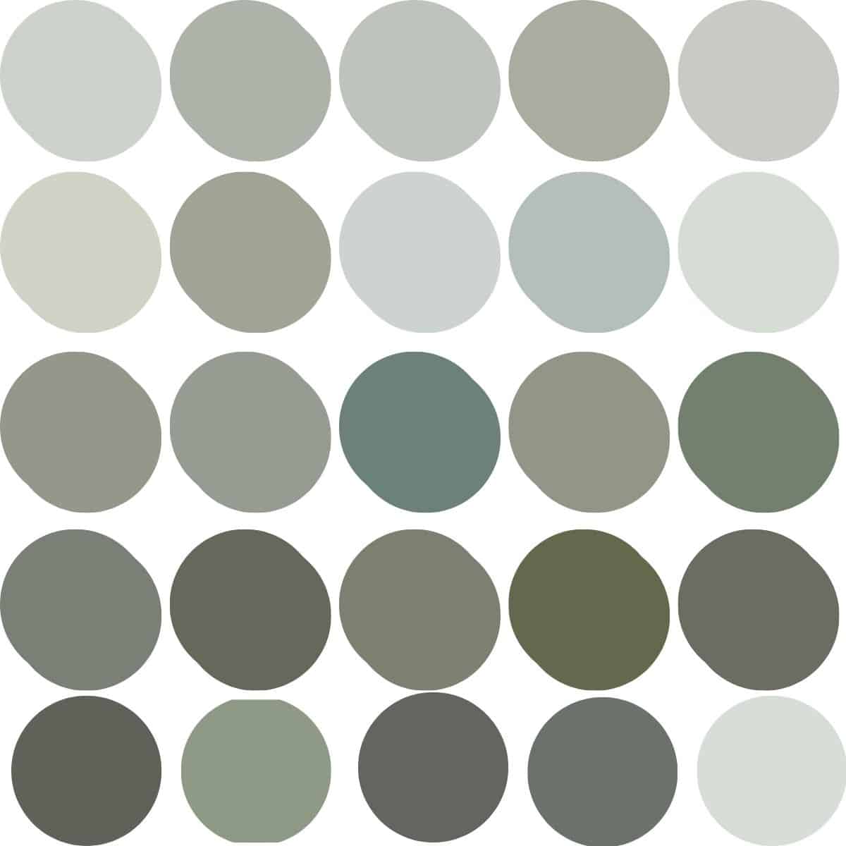
Coordinating Colors
Honestly almost any color will look amazing with On The Rocks. Sherwin Williams suggests pairing it with Extra White, Greek Villa, and Almond Roca.
I also really love these colors and think they would look amazing with On The Rocks:
- Sherwin Williams Network Gray
- Sherwin Williams Naval
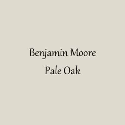
- Benjamin Moore Hale Navy
- Sherwin Williams Nebulous White
- Benjamin Moore Boothbay Gray
- Benjamin Moore Serious Gray
Order a sample of these paint colors from Samplize!
Sherwin Williams On The Rocks Whole Home Color Palette
Get this free whole home color palette for Sherwin Williams On The Rocks and you will also be part of the At Lane and High Community! You will receive weekly newsletters on new posts and you can unsubscribe anytime.
Sherwin Williams On The Rocks in Real Homes
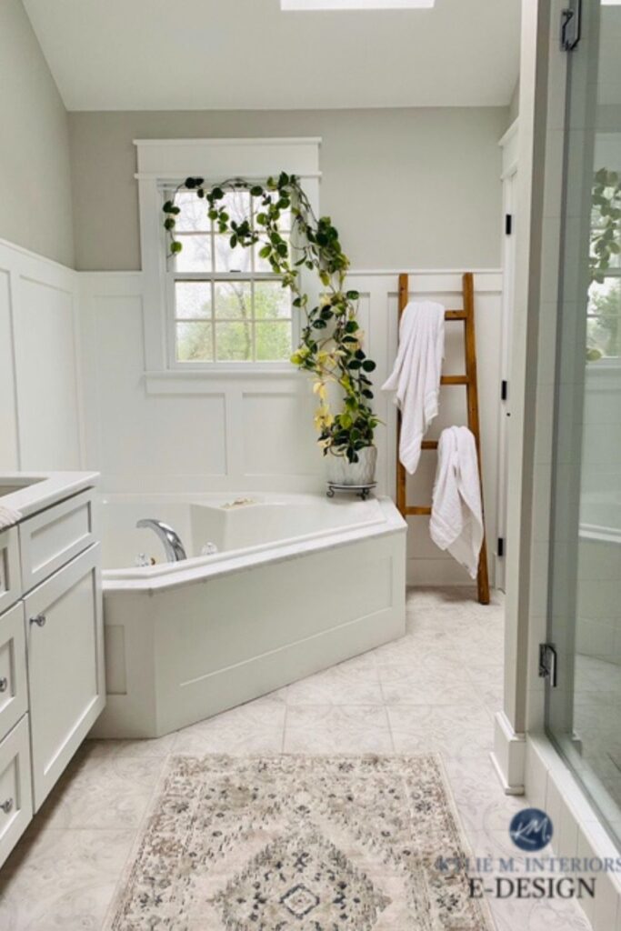
This bathroom doesn’t get a ton of natural light but by having the board and batten on the walls painted white it helps to keep the light bouncing around the room.
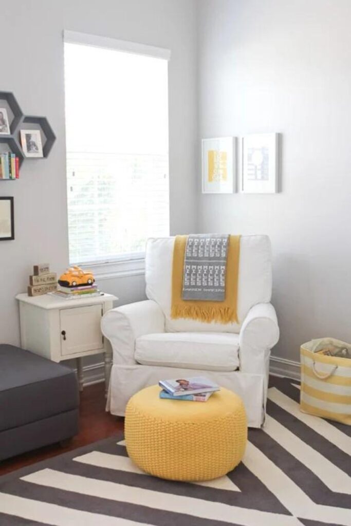
This nursery receives ample natural light so you can see how the paint colors can look lighter and a little cooler.
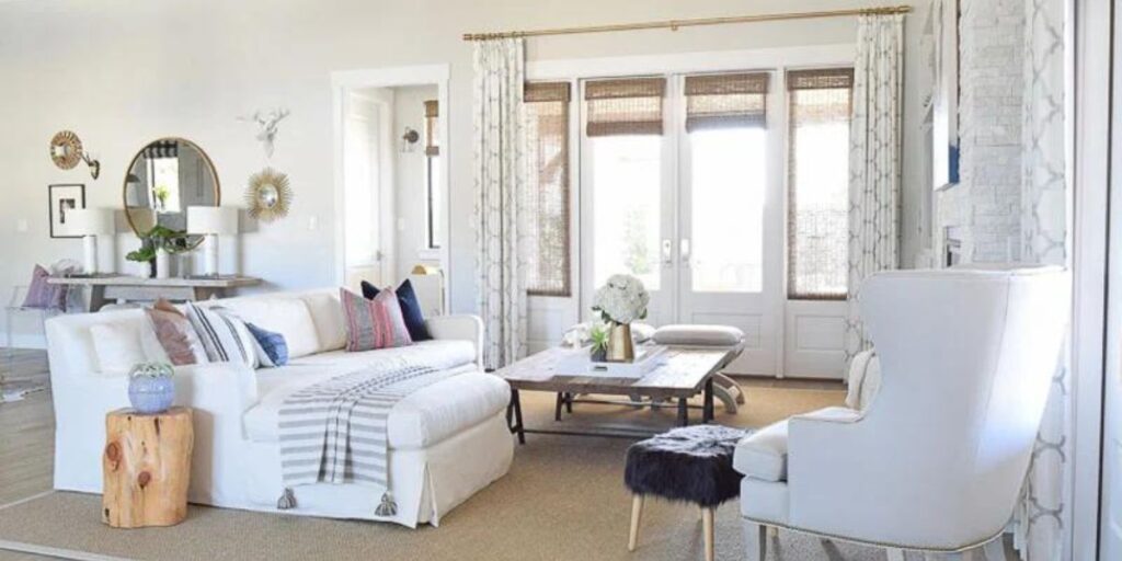
This gorgeous family room gets a lot of natural light as well so the paint color takes a back seat to the gorgeous furnishings.
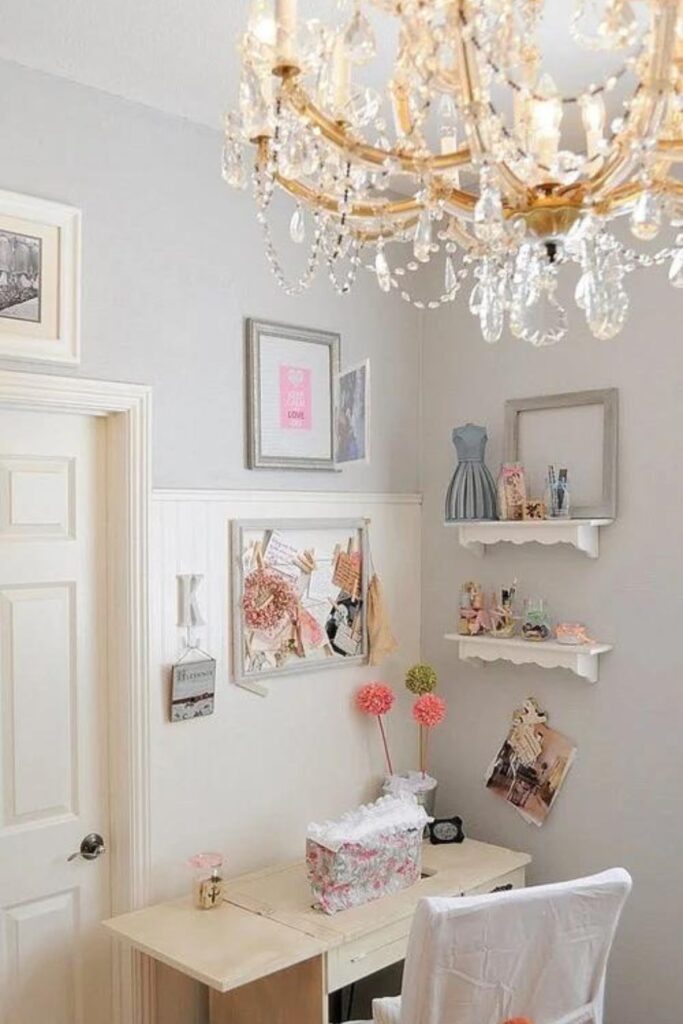
This little girls room is just adorable! I love how the paint color supports all the girlie accents and pastel colors.
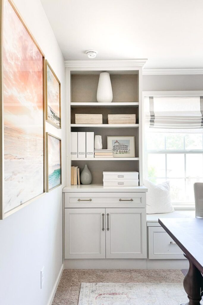
I remember when Kelley redid her office and I am just in awe today as I was then. I love the paint color and how neutral it is. You really notice the artwork and the gorgeous built-ins. The table also stands out and anchors the room.
If you plan to do the painting yourself then I highly suggest you check out these other posts:
- 5 Tips on Choosing the Perfect Paint Color for your Home
- The Best Paint Brushes for Latex Paint
- 11 Must-Have Supplies for Painting a Room Like a Pro
- The Right Way to Test Paint Samples in Your Home


As a licensed Real Estate Agent and an avid home decorator, I strive to give my clients the very best I can when it comes to staging, selling, and decorating their homes. I have lots of experience with paint color choices and love to DIY my home so I can have everything just the way I want it. I share my ideas and projects with the world in the hopes that I can help others have their homes just the way they want as well.