18 Romantic Bedroom Colors for 2026
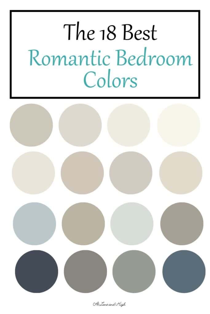
Are you on the lookout for the best romantic bedroom colors? Well, look no further! I have 18 of the best romantic colors for couples.
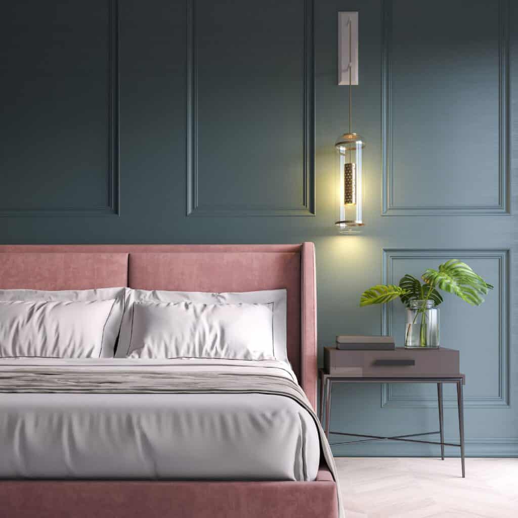
There are many different ways to bring a romantic feel into the bedroom. I have lots of tips and ways to achieve this in this post but the most important part is the best paint colors.
There is this thing called color psychology. The basic idea of this is that a color can make you feel a certain way.
Bright vibrant colors can make you feel awake or energized. Blues and greens can make you feel relaxed and more zen. Neutrals are great because they are the best of both worlds.
Color psychology comes into play if you are trying to create a mood in a certain room in your home. In this case, we are going for romance!
*This post contains affiliate links. For more details see my full disclosure.
Tips for choosing the best romantic bedroom colors:
Always, and I mean always, get a sample of several paint colors and put them on the wall to see if you like them in the space with different types of day and night lighting.
Consider the lighting in the room. Look at overhead lights to accent lighting.
Make sure your colors coordinate well with other fixed elements in the space such as flooring and furniture.
Always consult your partner when choosing a color. When we painted our bedroom I was going to paint it Pure White but my husband pointed out that the rest of the first floor was a very neutral color maybe we should go darker. And we did. It was a great idea.
How to know which paint color is right for your home?
You can purchase paint samples at the store and paint a swatch on your wall. But then you are left with a jar of paint that you can’t use for anything else (the paint quality of the samples is not good). Another option is Samplize.
Samplize is a company that will send you a peel and stick 12×12 inch vinyl sticker you can put on your wall. You can look at it over the course of a couple of days and even try it in different rooms. Then when you are done you can just throw it in the trash.
There is no mess and no waste! I highly recommend Samplize.
Romantic Bedroom Colors
Romantic bedroom colors would fall into one of these categories. Soft whites and neutral colors, blues and greens (or have blue and green undertones), and earthy browns that make you feel more grounded and bring in an earthy feel.
Sherwin Williams Smokey Blue

I chose this gorgeous color for my primary bedroom. My husband and I just love it!
It’s a dark color with an LRV of 15. Sherwin Williams describes it as a “chic, velvety blue with a gray undertone that is alluringly soft.”‘chic, velvety blue with a gray undertone that is alluringly soft.”
Get a sample of Smokey Blue from Samplize!
Sherwin Williams Fawn Brindle

Fawn Brindle is a medium gray color with an LRV of 36. It has green gray undertones that give it a very natural feel.
Get a sample of Fawn Brindle from Samplize!
Sherwin Williams Acacia Haze

Acacia Haze is a tad greener than gray and as you can see really lightens up in a room with ample natural light. It has an LRV of 32.
Get a sample of Acacia Haze from Samplize!
Sherwin Williams Neutral Ground

Neutral Ground is very aptly named. It’s a neutral color with khaki undertones. Its a very light and bright color with an LRV of 70.
Sherwin Williams recommends using it in living rooms and bathrooms for a cozy neutral feel.
Get a sample of Neutral Ground from Samplize!
Sherwin Williams Silver Strand

Silver Strand is a gorgeous mix of blue, green, and gray that will have the most beautiful look on your walls. It has an LRV of 59 which puts it right on the edge between light and mid-toned.
This color can change immensely depending on the light and other furnishings in the rooms so I highly recommend getting a sample of it.
Get a sample of Silver Strand from Samplize!
Sherwin Williams Agreeable Gray

Agreeable Gray is one of the most popular paint colors on the market. Real Estate Agents are using this paint color all the time for their clients. The reason this color is so popular is that it’s a light color, the most neutral of the grays, and goes with almost any decor and wood tones you can find.
Get a sample of Agreeable Gray from Samplize!
Sherwin Williams Accessible Beige

Accessible Beige is probably my favorite Sherwin Williams beige paint color. It also pulls towards taupe, so it has a bit of gray in it.
Its LRV is 58 so it falls in the mid-tone to light range on the LRV scale.
There is a reason this is one of Sherwin William’s most popular paint colors. This color is very neutral and light enough to brighten a room but not enough where it doesn’t contrast with white trim.
Get a sample of Accessible Beige from Samplize!
Benjamin Moore Coffeehouse Chocolate

Coffeehouse Chocolate is a rich velvety dark brown that has the look of gorgeous chocolate. It is perfectly named.
This color is dark with an LRV of 6.61!
Get a sample of Coffeehouse Chocolate from Samplize!
Benjamin Moore Pashmina
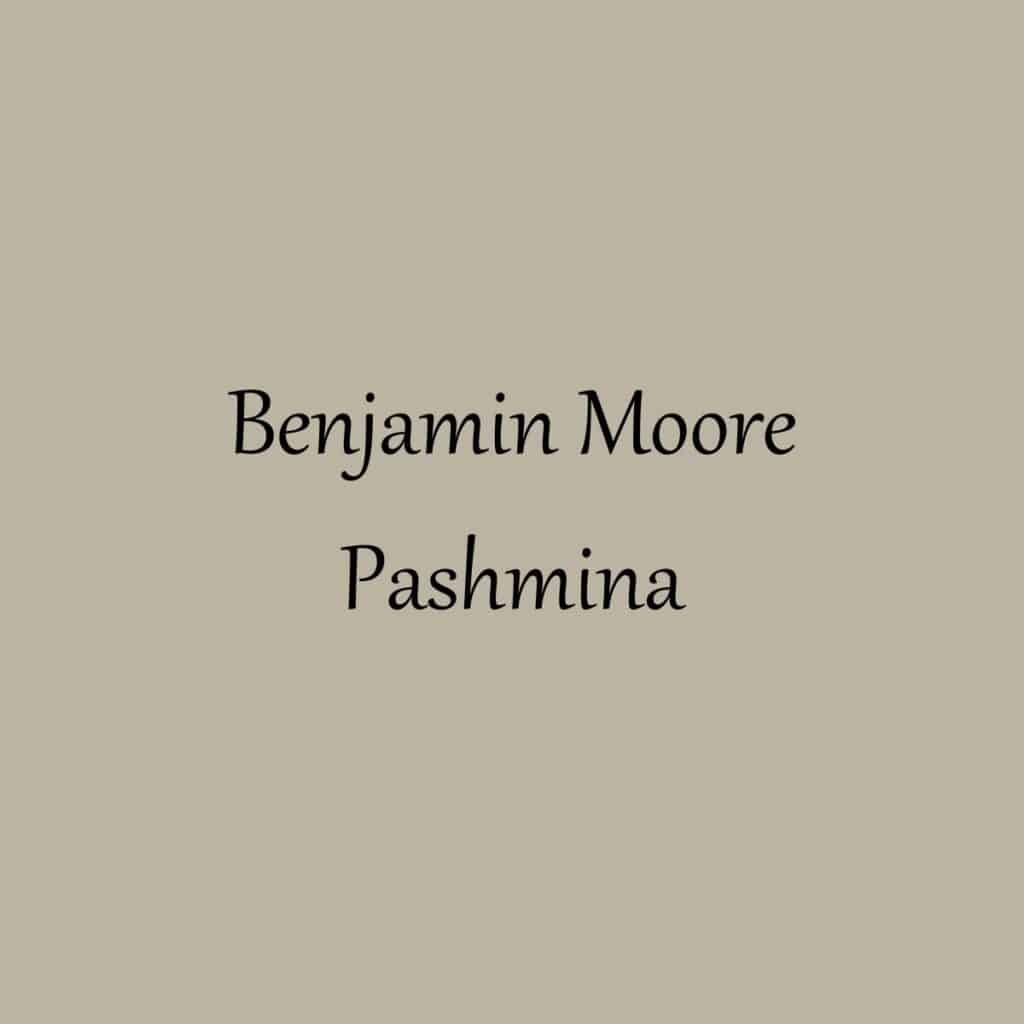
LRV = 44
Pashmina is a warm color but on the cooler side of things. This might make it one of the few perfect neutral colors!
Get a sample of Pashmina from Samplize!
Would you like to save this?
Benjamin Moore Chelsea Gray

Chelsea Gray is a mid-toned to dark charcoal gray, a bit lighter than Kendall Charcoal. It has green undertones with touches of blue, while it is warm-toned it’s not as warm as KC.
Get a sample of Chelsea Gray from Samplize!
Benjamin Moore Soft Chamois

Soft Chamois is a gorgeous soothing off-white with just the right amount of yellow, not too much and not too little. It has an LRV of 77.4 which makes it a really bright color.
This color has the amazing ability to make a room feel much larger than it really is!
Get a sample of Soft Chamois from Samplize!
Benjamin Moore Cloud White
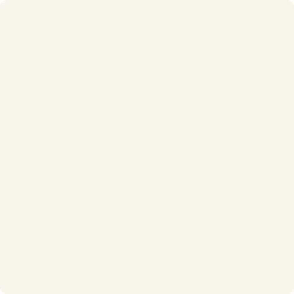
Cloud White is a warm white paint color with slight yellow undertones. What’s great about this color is that even though it has yellow undertones it has a neutral base which keeps it from being as warm as some of its counterparts.
The LRV of Cloud White is 87 which makes it very bright. While it is bright it also has this touch of softness that makes it like sitting on a cloud.
Get a sample of Cloud White from Samplize!
Benjamin Moore Swiss Coffee

Swiss Coffee is a complicated off-white paint color. It has undertones of yellow, green, and a touch of gray. The gray keeps the yellow and green from being too dominant.
What you see instead is a beautiful creamy paint color that goes really well with most other paint colors.
Get a sample of Swiss Coffee from Samplize!
Benjamin Moore Smoke

Smoke is a gorgeous gray paint color with strong blue undertones as well as a touch of green. This is a very calming color giving the feel of the ocean and nature.
This is considered a medium-toned color with an LRV of 56.39 but that’s pretty darn close to the border of being light.
Get a sample of Smoke from Samplize!
Benjamin Moore Hale Navy

Hale Navy might be one of the most popular navy paint colors. It has slight purple undertones but really shows more of a true navy. It’s a popular color that has been used on doors, cabinetry, furniture, as well as walls. You can’t go wrong with Hale Navy.
Get a sample of Hale Navy from Samplize!
Benjamin Moore Pale Oak
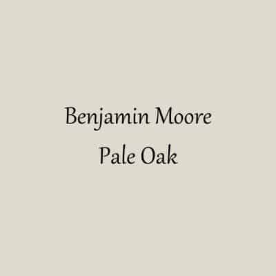
LRV = 68.64
Pale Oak is one gorgeous greige paint color. It’s on the lighter side but crosses into the mushroom range in certain lighting.
Get a sample of Pale Oak from Samplize!
Benjamin Moore Revere Pewter
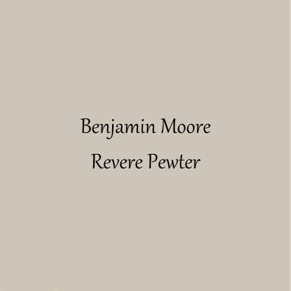
Revere Pewter is a mid-light-toned gray paint color with an LRV of 55.1.
It is considered a warm-toned paint color with undertones of beige and yellow. Because it has beige undertones it is considered a greige paint color.
Revere Pewter was once the go-to paint color by Realtors for people to paint their homes when they were selling. It’s still a great color but the go-to colors are lighter now to get that bright and airy look.
Get a sample of Revere Pewter from Samplize!
Vastu for Romantic Bedroom Colors
Vastu is from ancient India. It’s the
Traditional Hindu system of architecture based on ancient texts that describe the principal of design.
Wikipedia
Here are a few principles of Vastu to keep in mind when decorating your bedroom for romance:
- Keep fresh flowers in the room especially rose petals.
- The bedroom shouldn’t be in the southeast corner.
- The bedroom shouldn’t be located in the northeast corner. This is the ideas space for a home temple.
- Light and bright colors are better for understanding.
Frequently Asked Questions: Bedroom Colors for Couples
What is the most romantic color for a bedroom?
That is subjective but for me I like a dark color for a bedroom. It gives a more moody feel and makes the room cozy.
What is the most peaceful color for a bedroom?
Peaceful colors are those with blue and green undertones. They give you more of a beachy feel that is always relaxing.
How can I make my bedroom more romantic?
Choose from one of the colors suggested here. Then work on your lighting, add candles, and then choose some wonderful bedding.
Do you choose paint or bedding first?
This is a great question and the answer is it depends. If you like bedding that has a lot of patterns you might want to pick a color from that pattern.
If your bedding is solid or more basic and neutral then you can choose whatever color you like that coordinates with the colors in the bedding.
How can I make my bedroom more romantic?
Consider the lighting in the room. Accent lamps on bedside tables are a great idea for lighter and softer lighting.
Add a dimmer switch to the overhead light so you can lower the brightness. You can also hang a pendant or chandelier to add a touch of romance.
Here are a few other tips on making your bedroom more romantic:
- Add plants
- Candles for a romantic glow
- Luxurious bedding
Other paint colors you might be interested in:
- The Best Green Paint Colors
- The Best Blue Paint Colors
- Everything You Need to Know About Blush Paint Colors
- The Best Black Paint Colors
- Greige Paint Colors
- The Best Green Gray Paint Colors

Romantic Bedroom Colors
As a licensed Real Estate Agent and an avid home decorator, I strive to give my clients the very best I can when it comes to staging, selling, and decorating their homes. I have lots of experience with paint color choices and love to DIY my home so I can have everything just the way I want it. I share my ideas and projects with the world in the hopes that I can help others have their homes just the way they want as well.


