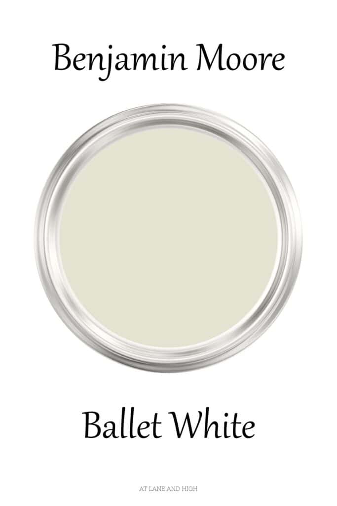
Benjamin Moore Ballet White
Benjamin Moore Ballet White is one of those rare paint colors that effortlessly bridges the gap between warm white and soft greige, making it a favorite among designers and homeowners alike. With its subtle beige undertones and creamy warmth, Ballet White creates a welcoming, elegant backdrop that works beautifully in both traditional and modern homes.
Whether you’re searching for the perfect whole-house neutral, looking to brighten a living room, or choosing a timeless color for kitchen cabinets, this versatile shade is worth considering. In this review, we’ll take a closer look at Ballet White’s undertones, Light Reflectance Value (LRV), the best coordinating colors, and where it looks best so you can decide if it’s the right paint color for your home.
What are the undertones of Benjamin Moore Ballet White?
Ballet White is a warm paint color with creamy beige undertones and a dose of yellow/green. There is a tad bit of gray in the undertones, which keeps the yellow/green under control and keeps the paint color from looking yellow or green.
It just looks warm and cozy, like wrapping you in a big hug!
What is Ballet White’s LRV?
LRV stands for light reflective value, and it’s a scale that measures the amount of light a paint color reflects. Why is this important? It helps the homeowner choose the right paint color for their space.
The scale runs from 0-100, with 100 being the brightest white and 0 being the darkest black.
Ballet White sits at 71.97. That makes it a pretty bright paint color, but not nearly the brightest out there. If you are looking for a fairly bright off-white, this is a good option.
*This post contains affiliate links. For more details see my full disclosure.
How to know if a paint color is right for you?
The best way to judge if a color is good for you is to put a swatch on the wall and look at it over a few days. Look at it in different lights and decide if you really like it.
You can do this by getting a sample from the paint store and using a brush to put it up on the walls, but then you are left with a can that you can’t do anything with. Those samples are used with poor-quality paint and aren’t meant for use on your walls permanently.
I recommend going with Samplize. They are a company that will send you a 12X12 peel-and-stick swatch of a paint color that you can stick to the wall. When you are done, just peel it off and throw it away.
It’s easy and much less messy!
Whole Home Paint Palette for Benjamin Moore Ballet White
What are the best coordinating colors?
The beauty about neutral colors like Ballet White is they really go with almost anything. Here are a few of my favorite colors to pair with it:
- smokey blue/gray colors from light to dark
- greens with a touch of gray in them.
- other whites with yellow undertones
- greige
- navy blue
- dark green
- black
What is the best trim color to go with Ballet White?
When choosing a white trim color to go with a light cream color it’s best to go with something with similar undertones but brighter on the LRV scale. Here are a few I like:
- Oxford White
- Chantilly Lace
- Sherwin Williams Extra White
- Sherwin Williams Pure White
What are some similar colors?
If you aren’t sure about Ballet White, let’s look at it next to other similar colors. Hopefully, this gives you a good idea of what white color you want.
Ballet White vs. Swiss Coffee
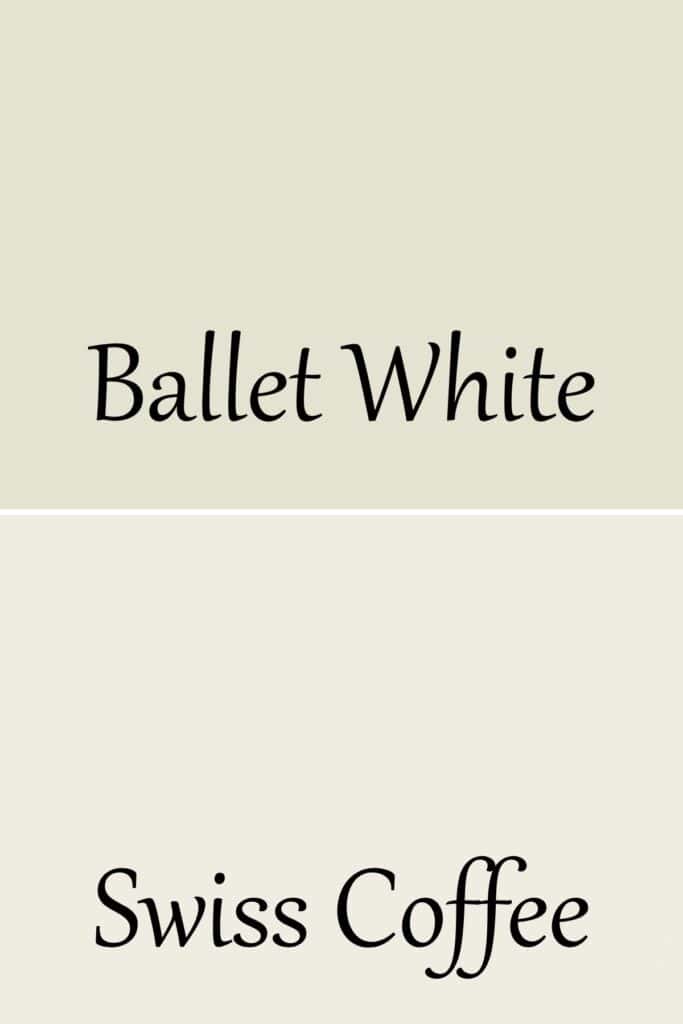
These two colors are very similar, Ballet White is just a darker version of Swiss Coffee. The LRV of Swiss Coffee is 81.91, much brighter than Ballet White’s 71.97.
Ballet White vs. Pale Oak
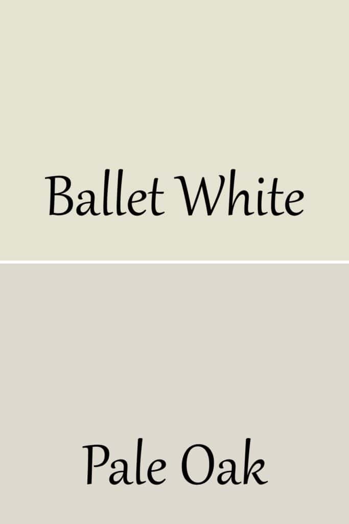
Pale Oak is darker than Ballet White with an LRV of 68.64. It also is a tad cooler and has more taupe undertones.
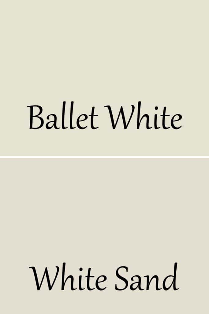
Ballet White vs. White Sand
Would you like to save this?
You might think when looking at these colors on the fan deck that they are similar, but look at them side by side. They are very different.
White Sand is darker with an LRV of 66.95, but the big difference is really the undertones. Ballet White has yellow/green undertones whereas White Sand definitely leans more heavily on the beige with a touch of pink.
Ballet White vs. Edgecomb Gray
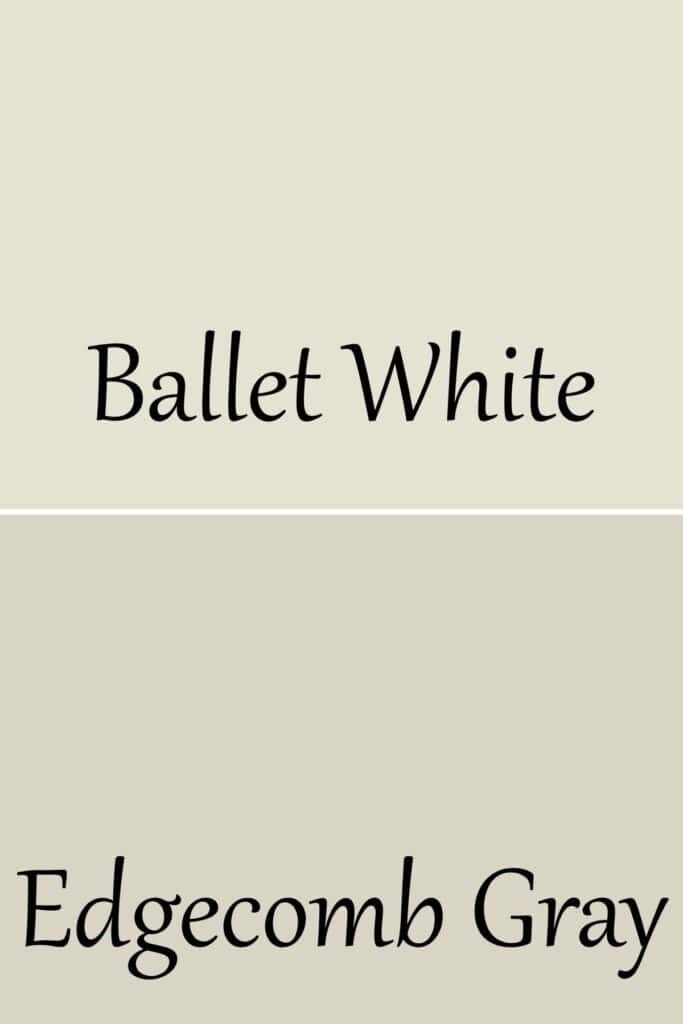
Edgecomb Gray is much darker than Ballet White with an LRV of 63.09. They also have the same undertones but Edgecomb Gray shows as more neutral than Ballet White.
Ballet White vs. Sherwin Williams Neutral Ground
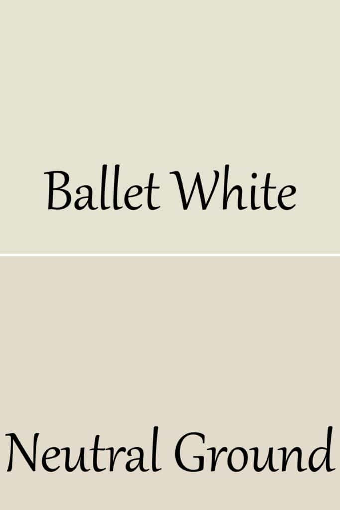
These colors are similar, but Neutral Ground has more taupe undertones than beige. Their LRV’s are similar, with Neutral Ground sitting at 70.
Ballet White vs. Sherwin Williams Alabaster
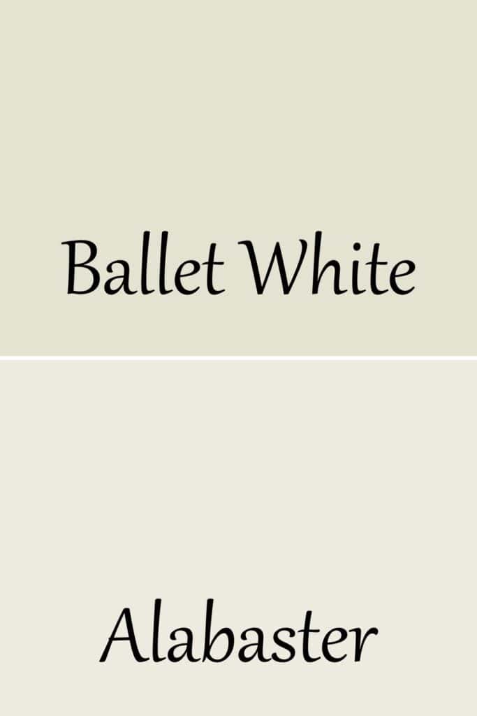
Alabaster is much brighter with an LRV of 82 and has more yellow undertones. Alabaster is much more netural than Ballet White.
Ballet White vs. Sherwin Williams Shoji White
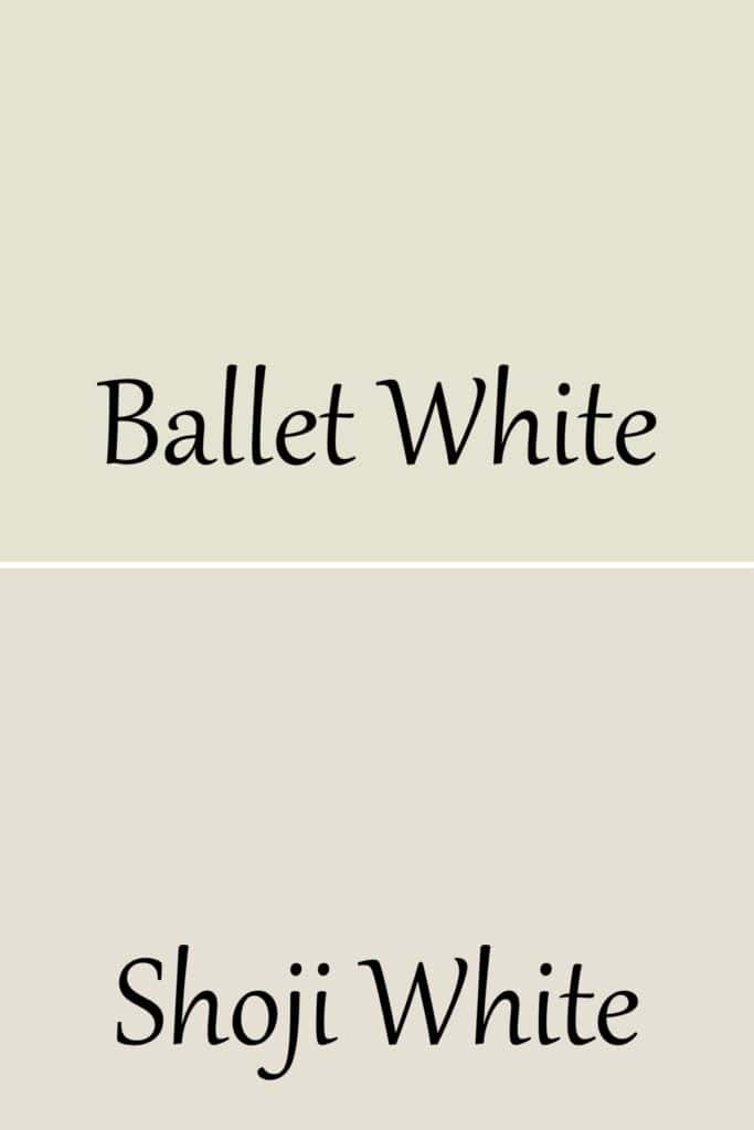
Shoji White is a tad brighter with an LRV of 74, but 2 points aren’t really perceptible. The big difference is again, the undertones. Ballet White has much more yellow/green.
Ballet White vs. Sherwin Williams White Duck
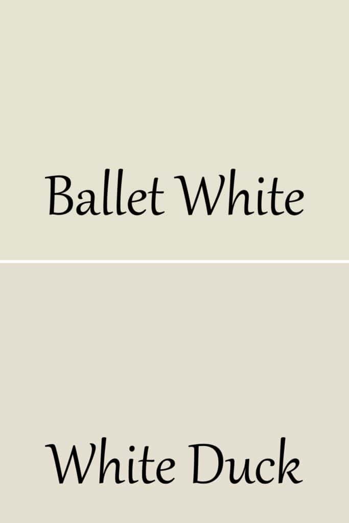
We have the same similarities with White Duck as with Shoji White. The LRV is 74, a tad brighter. It’s all in the undertones.
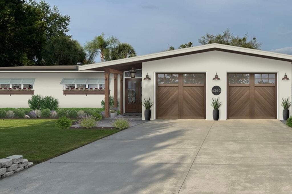
Does Ballet White look good on the exterior of the home?
The beautiful thing about Ballet White on the exterior is that it’s not super bright.
Any color, when put on the exterior of the home with a ton of natural light from the sun, looks much lighter. A really bright color can become waaaayyyy too white on the exterior.
Ballet White is perfect because it has just enough depth of color that it isn’t going to blind you, but it’s going to be very bright.
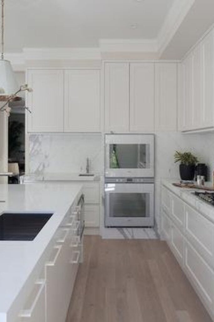
Does Ballet White look good on cabinets?
Absolutely! Cream colors are so nice on cabinetry. It gives you a touch of color without being stark white. And it adds a bit of softness to a room with a lot of hard surfaces.
Ballet White in Real Homes
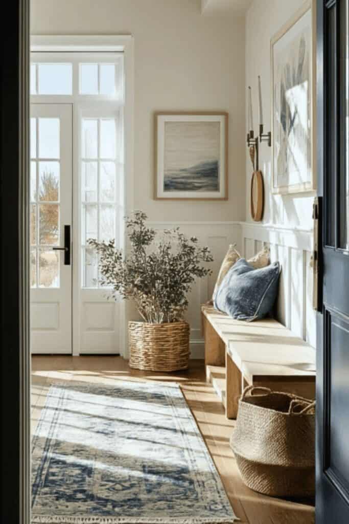
Look at how beautifully Ballet White looks with the sun bathing this entryway. It creates a warm and cozy space you want to be in.
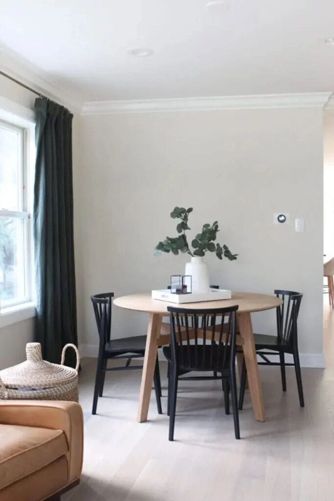
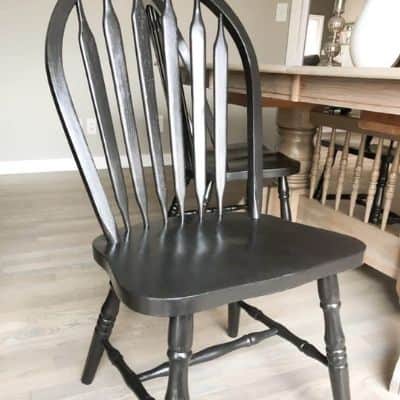
In this dining space, the paint color looks very neutral. I love how it looks with the black curtains and chairs.
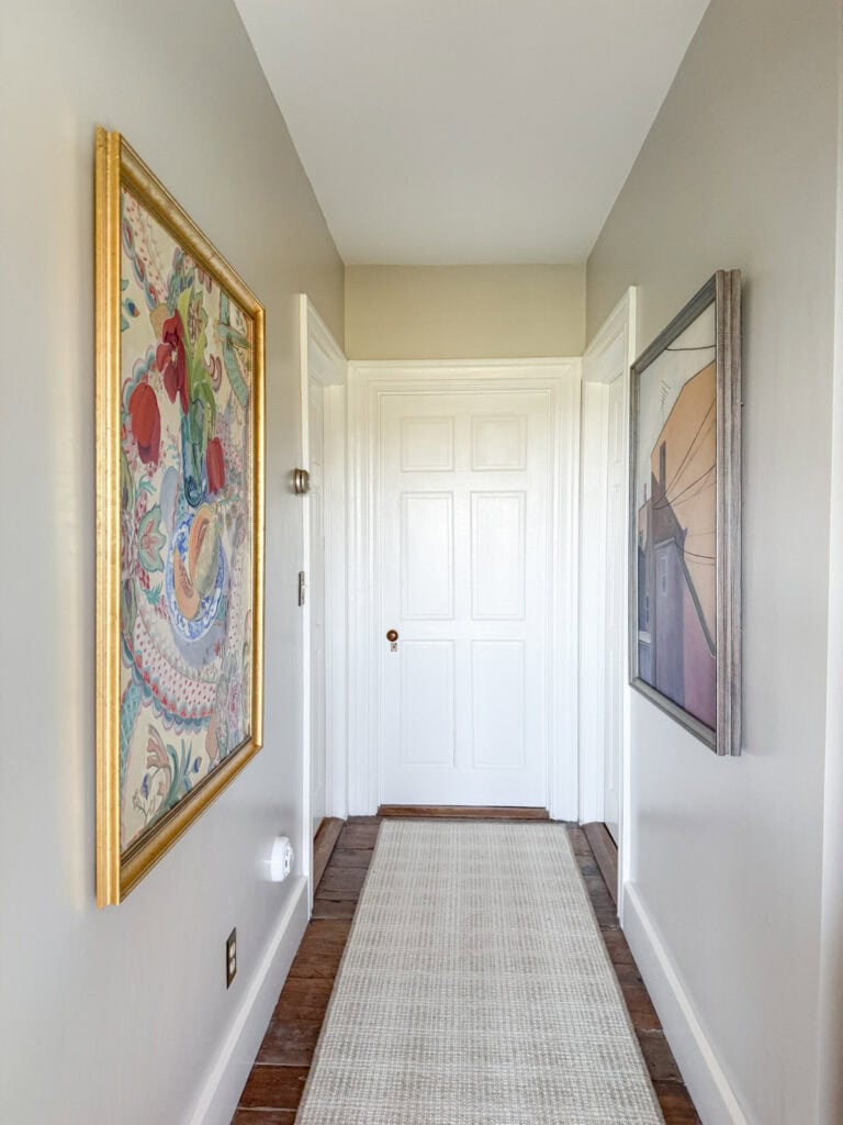
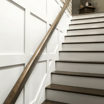
Ballet White in this hallway is the perfect backdrop for the artwork.
Other White Paint Colors You Might Like:
- Sherwin Williams Dover White
- Sherwin Williams Shoji White: Paint Color Review
- Benjamin Moore Paper White
- Sherwin Williams Snowbound
- Sherwin Williams Nebulous White
- Benjamin Moore Cloud White
- Benjamin Moore Chantilly Lace
- Sherwin Williams Pure White
- Benjamin Moore Simply White
- Benjamin Moore Decorator’s White


As a licensed Real Estate Agent and an avid home decorator, I strive to give my clients the very best I can when it comes to staging, selling, and decorating their homes. I have lots of experience with paint color choices and love to DIY my home so I can have everything just the way I want it. I share my ideas and projects with the world in the hopes that I can help others have their homes just the way they want as well.