Sherwin Williams Mindful Gray: A Gorgeous Neutral
Sherwin Williams Mindful Gray is quickly becoming a go-to choice for homeowners and designers alike, and it’s easy to see why. This soft, versatile gray strikes the perfect balance between warmth and coolness, making it an ideal backdrop for a wide range of interior styles.
Whether you’re looking to create a serene, contemporary living room or a soothing, neutral bedroom, Mindful Gray offers the kind of understated elegance that complements any space.
In this post, we’ll explore why this shade is so popular, how it pairs with different colors, and tips for incorporating it into your home.

*This post contains affiliate links. For more details see my full disclosure.
Mindful Gray Stats
Here are the details that make Mindful Gray such a pretty gray paint color:
- Red: 188
- Green: 183
- Blue: 173
- Hex Value: #BCB7AD
- Location Number:244-C2
- Color Family(s): Neutral
- Color Collections: Color ID (Nurturer), Living Well (Renew), Top 50 Colors, Top Interior Colors, Top Exterior Colors, Sleep Inn Scheme 1, MainStay Suites Scheme 1, Colormix Forecast 2025 (chrysalis), Southwestern Color Scheme 1
This paint color is considered a neutral and it’s very popular, you can tell by how many color collections it belongs to!
Mindful Gray Undertones
You can file Mindful Gray under the complicated file. It has several undertones and the type of lighting in the home as well as the furnishings used will make this color swing one way or another.
Mindful Gray is a warm gray paint color with undertones of green, beige, and purple. It’s considered a greige because of the beige in it.
In darker rooms, the green will be more prevalent especially if there is dark furniture in it. In a light-filled room the color will be more neutral and just look like a warm gray.
LRV of Sherwin Williams Mindful Gray
LRV stands for Light Reflective Value. It’s a scale from 0-100 that measures the amount of light a color reflects. Zero being the darkest black and 100 being the brightest white.
The LRV of Sherwin Williams Mindful Gray is 48. That puts it squarely into the mid-toned range. Once you get to about 60/65 you enter the light range and below 30 is dark.
This color is a gorgeous medium-light color with a good depth that will give you a wonderful backdrop to your accessories and artwork but also give your home some personality. You won’t feel like it’s a sterile space with this color.
How Light Affects Mindful Gray
Light can make a big difference when you look at a color. Here are some details on how light affects every color:
- North-facing rooms have a light that tends to be a little cooler in nature and will come off slightly blue. Light colors will be a bit more muted or washed out while darker colors will be stunning.
- East-facing rooms will have brighter light in the morning and less in the evenings. The evening light will be a bit cooler. In the morning with sunrise, the bright sun will be warm. Warm color palettes are great for these spaces because they will help balance the cool feel of the evenings.
- South-facing rooms have consistent warm light throughout the day. The light really shows off the colors, dark will be very bright, and light colors will shine. Both warm and cool color palettes look good in a south-facing room.
- West-facing rooms have warm light in the evening and cooler light in the morning. Basically, it’s the opposite of east-facing.
In north-facing rooms with cooler light Mindful Gray will look more neutral as a warm gray. In southern exposure rooms the warmer light will bring out the green undertones a little more.
How to know if a paint color is right for you?
The best way to judge if a color is good for you then you will want to put a swatch on the wall and look at it over a few days. Look at it in different lights and decide if you really like it.
You can do this by getting a sample from the paint store and using a brush to put it up on the walls, but then you are left with a can that you can’t do anything with. Those samples are used with poor quality paint and aren’t meant for use on your walls permanently.
I recommend going with Samplize. They are a company that will send you a 12X12 peel and stick swatch of a paint color that you can stick to the wall. When you are done just peel it off and throw it away.
It’s easy and much less messy!
Mindful Gray Whole Home Color Palette
Is Mindful Gray a good exterior paint color?
One thing to keep in mind when it comes to exterior colors is the sheer amount of natural light it will receive. It’s going to be about 10 times brighter than it will on the interior of the home.
Colors in the mid-toned LRV range make really good exterior colors because they have more depth so when used outside they can stand up well to all the natural light.
So the short answer is YES! This makes a great exterior paint color!
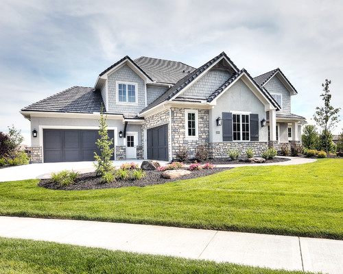
If you were in doubt before then I hope this picture puts those doubts out of your mind. As you can see, Mindful Gray on the body of this home is simply stunning!
The Best Place to Use It
Honestly, you can use this color almost anywhere. Here are some of my favorite places:
- Cabinetry
- Walls
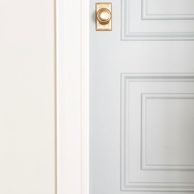
- Architectural features
- Furniture
- Exterior
Mindful Gray in the Family and Dining Rooms

In this gorgeous photo, you can see Mindful Gray on the walls of both the family room and dining room. There is a ton of natural light so the walls have the most perfect warm gray look.
This color also pairs really well with all the different wood tones.
Mindful Gray in an Office

Would you like to save this?
In this office, the amount of natural light is much less so the walls are a bit darker and the green undertones are shining through.

Jessica Bruno used Mindful Gray on her kitchen cabinets. They are a warm color but they pair beautifully with the silver hardware and light wood floors. Not to mention the quartz countertops.
What colors pair well with Sherwin Williams Mindful Gray?
Warm whites pair really well with Mindful Gray. So do dark warm grays such as a warm charcoal.
Blues and blue greens also look great with Mindful Gray! I also love pairing it with blush colors, perfect for nurseries!
What is the best white to use on the trim?
My favorite white paint color from Sherwin Williams is Pure White and it looks amazing with Mindful Gray. It’s a gorgeous warm white that is light and bright.
Another good option is Extra White, also from Sherwin Williams. This color is more neutral, neither warm or cool. It’s a good one to pair with almost any color.
What colors are similar to Sherwin Williams Mindful Gray?
I love doing color comparisons. When you put colors side by side you really can see the differences. Here are some that are closely related to Mindful Gray.
Mindful Gray vs. Repose Gray

Right off the bat, the first difference I notice here is Repose Gray is lighter. On the LRV scale it is 10 points higher, almost in the light range.
Both of these colors are greige paint colors with green undertones. Mindful Gray does have a tendency to show a touch in the purple range as well.
Get a sample of Repose Gray from Samplize!
Mindful Gray vs. Agreeable Gray

Again, the big difference between these colors is that Agreeable Gray is much lighter. It sits at 60 on the LRV scale making it just into the light range while Mindful Gray sits at 48.
They both are greiges but Agreeable Gray has a little blue in it with the green and purple. Mindful Gray doesn’t have any blue, but it’s definitely more green.
Get a sample of Agreeable Gray from Samplize!
Mindful Gray vs. Amazing Gray

These colors are almost identical on LRV, Mindful Gray is a 48 and Amazing Gray is at 47. The big difference here is Mindful Gray has a lot more green undertones than Amazing Gray.
The undertones of Amazing gray are a touch of green and definitely some brown.
Get a sample of Amazing Gray from Samplize!
Mindful Gray vs. Anew Gray

These colors are also close on the LRV scale with Anew Gray at 47 andMindful Gray at 48. The big difference between the two is definitely the undertones. Mindful Gray has more green and Anew Gray has more purple.
Get a sample of Anew Gray from Samplize!
Mindful Gray vs. Benjamin Moore Cumulous Cloud

I think these two are very similar. Cumulus Cloud doesn’t have as much green as Mindful Gray but their LRV’s are similar. Cumulus Cloud is a 52.31.
Get a sample of Cumulus Cloud from Samplize!
Frequently Asked Questions
Can I use Mindful Gray on kitchen cabinets?
Yes! This is a great color for cabinets and is often used on them. It looks amazing when used as two-tone cabinets with Mindful Gray on the island and a crisp white on the perimeter.
Or use white on the walls and Mindful Gray on the cabinets. Either way, your kitchen/bathroom will look great!
When should you not use Mindful Gray?
Because this color is in the mid-range you might want to consider not using it in dark rooms with very little natural light. It will show a lot of green and if you don’t want green stay away from it!
Sherwin Williams Mindful Gray Recap
Well we went through a ton of information here today so let’s do a little recap:
- Warm Gray Paint Color
- Green and a touch of purple undertones
- Is a Greige
- Has an LRV of 47
- Is considered a neutral
- The green undertones come out more in darker rooms
- Can be used anywhere
- Great for use on exterior and cabinets
- Pairs well with warm whites, warm charcoals, blush, blues, and blue greens
Other Greige Paint Colors You Might Like:
- Benjamin Moore Balboa Mist
- Benjamin Moore Edgecomb Gray
- Shewin Williams Worldly Gray
- Benjamin Moore Stonington Gray
- Benjamin Moore Revere Pewter


As a licensed Real Estate Agent and an avid home decorator, I strive to give my clients the very best I can when it comes to staging, selling, and decorating their homes. I have lots of experience with paint color choices and love to DIY my home so I can have everything just the way I want it. I share my ideas and projects with the world in the hopes that I can help others have their homes just the way they want as well.