The Best Neutral Paint Colors for 2026
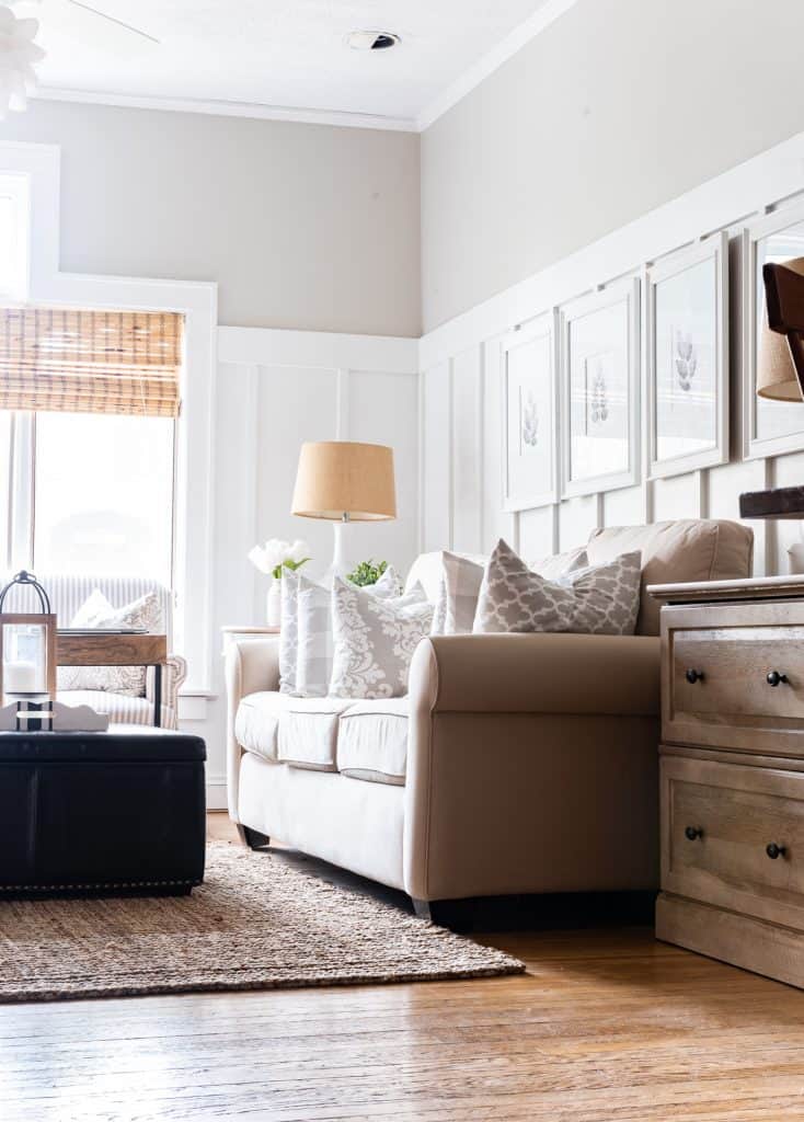
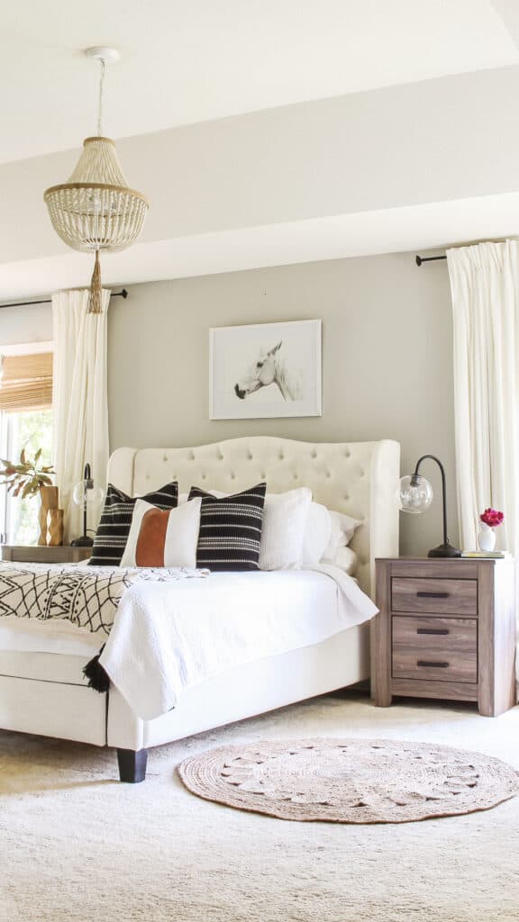
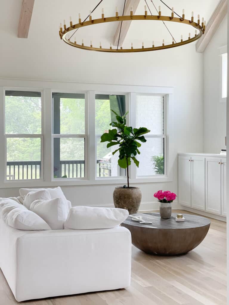
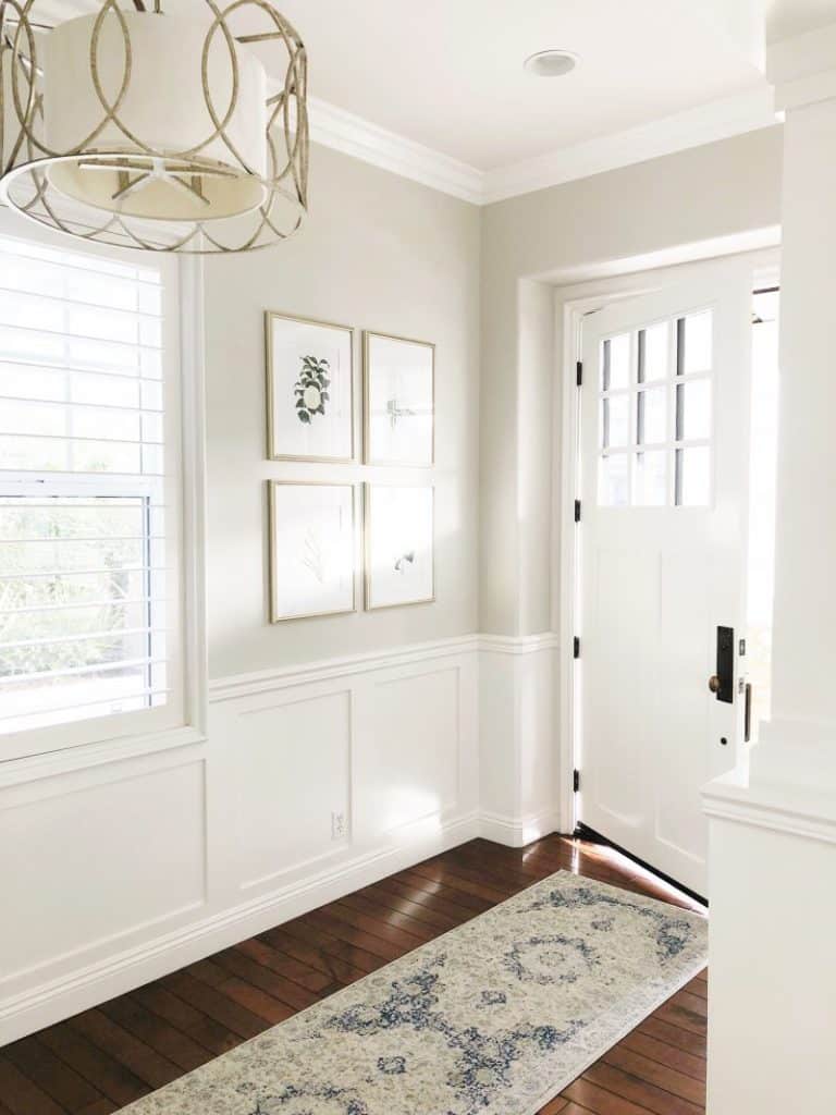
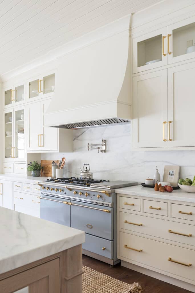
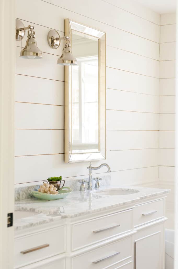
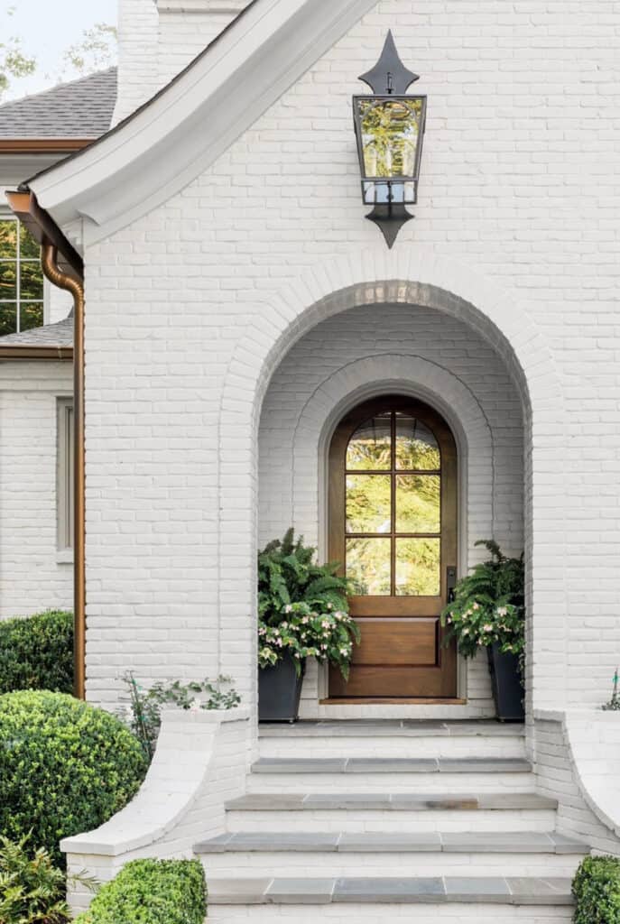
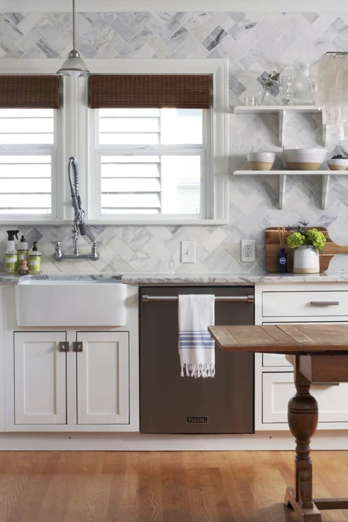
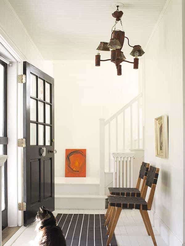
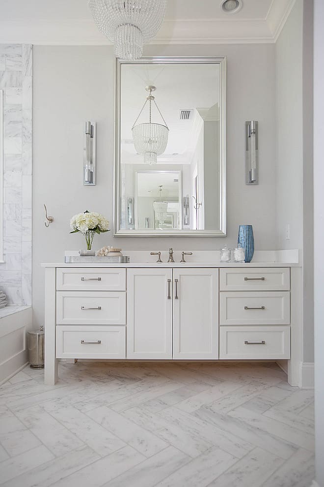
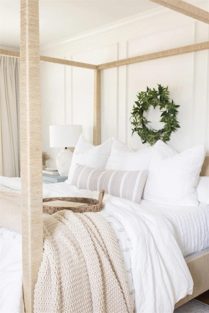
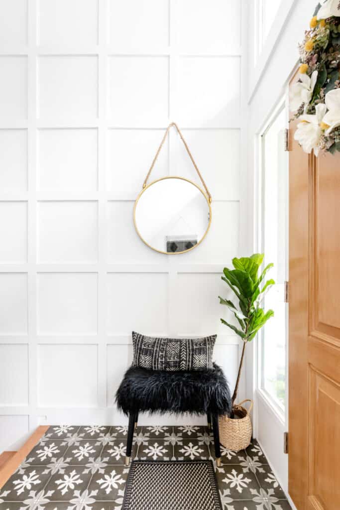
Neutral paint colors have always been popular because they are calming and so versatile! They pair really well with artwork, accessories, and bold colors that show off your design style. Here are the best of the best for 2025!
If you love minimalist decor then neutral is the way to go. If you love bold colors you need to balance them with neutrals. Everyone needs a good neutral paint color.
It doesn’t matter what your style is, modern, farmhouse, traditional, or any other, neutral paint colors will work for you!
Why neutral paint colors are still popular.
The easy answer to this is because neutral never goes out of style. Having neutral walls allows a room to breath, accessories to shine, and textures to warm you up.
*This post contains affiliate links. For more details see my full disclosure.
How to know if a paint color is right for you?
The best way to judge if a color is good for you then you will want to put a swatch on the wall and look at it over a few days. Look at it in different lights and decide if you really like it.
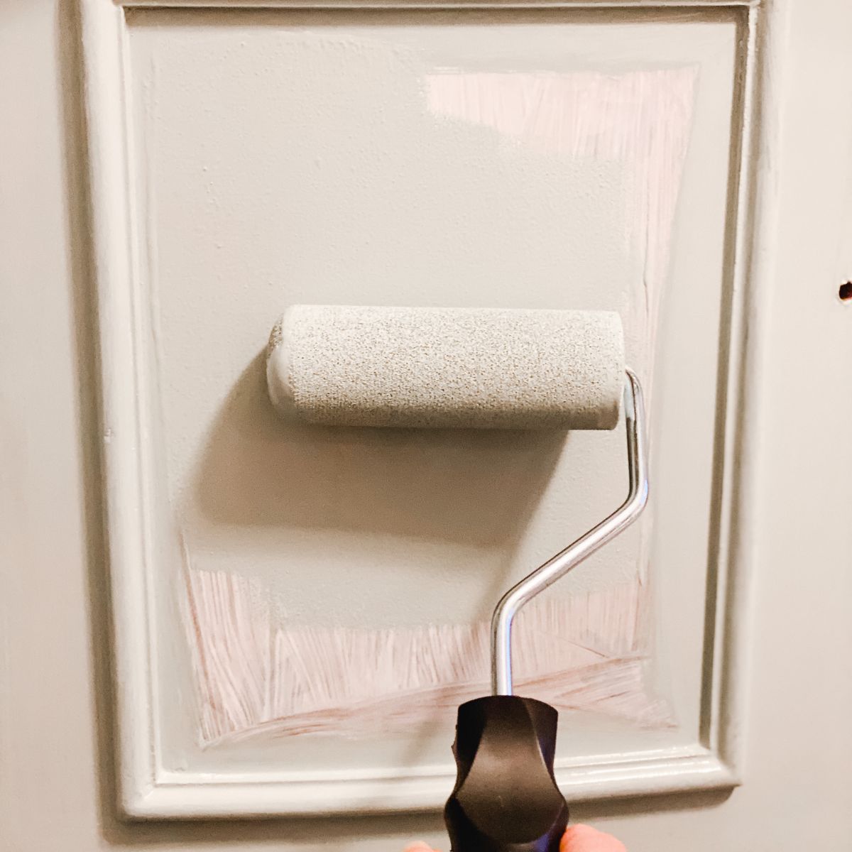
You can do this by getting a sample from the paint store and using a brush to put it up on the walls, but then you are left with a can that you can’t do anything with. Those samples are used with poor quality paint and aren’t meant for use on your walls permanently.
I recommend going with Samplize. They are a company that will send you a 12X12 peel and stick swatch of a paint color that you can stick to the wall. When you are done just peel it off and throw it away.
It’s easy and much less messy!
Best Neutral Paint Colors
Here are the best neutral paint colors from Sherwin Williams and Benjamin Moore.
Sherwin Williams Agreeable Gray

Agreeable gray is a light greige paint color. It has strong hints of beige with undertones in the green family as well as a touch of violet. The violet keeps the green calm. If you don’t like your paint to pull green then this is a great choice!
This color is my go-to color of choice if you have honey oak trim or cabinets. It blends really well.
I also have a post dedicated to the comparison of Agreeable Gray vs Repose Gray as well as coordinating colors to Agreeable Gray if you want more information.
Get a swatch of Agreeable Gray from Samplize!
Sherwin Wiliams Creamy

Creamy is a great paint color with an LRV of 81. This means it is really bright, almost a white. In a room with lots of natural light you will see it becoming more washed out while in a room with not a lot of light you will get more of the color that you are seeing here.
Get a swatch of Creamy from Samplize!
Benjamin Moore Classic Gray


This is the color I chose for my home office/den. I painted it and sometimes it looks beige and sometimes it looks gray depending on the time of day and light.
To see the before of my downstairs family room/teen space (that eventually turned into my home office/den) click here.
Get a sample of Classic Gray from Samplize!
Benjamin Moore Paper White


Benjamin Moore Paper White is a gorgeous off-white color that I used to paint my entire first floor with an open floor plan. It is a cool-toned paint color that pairs really well with other cool and warm colors. You can use it in rooms with warm tones in the furnishings and floors and it will look great!
It’s LRV is 74.41 making it a pretty bright color. It has lightened up my first floor immensely! It’s undertones are in the blue/green family.
Get a sample of Paper White from Samplize!
Sherwin Williams Repose Gray

Repose Gray is a fabulous color with subtle undertones of brown and a touch of purple. If you are thinking of selling your home this is a great color to paint your walls for a neutral backdrop.
Get a sample of Repose Gray from Samplize!
Sherwin Williams Snowbound

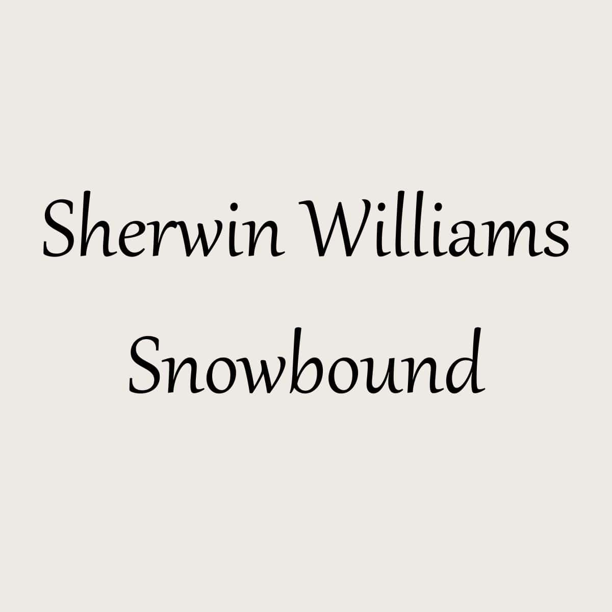
Last but not least, for Sherwin Williams, we have Snowbound. It is much brighter with an LRV of 83! Snowbound is a great neutral white, it has hints of purple and pink undertones which pulls it both warm and cool. I know, it’s so confusing! But this color will adjust to whatever you pair with it. It’s like a chameleon.
Get a swatch of Snowbound from Samplize!
Benjamin Moore Pale Oak
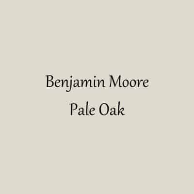
This is a beautiful greige paint color that pulls a little yellow/green. Pale Oak is a stunning color that was definitely on my short list of paint colors to paint my house.
Get a sample of Pale Oak from Samplize!
Benjamin Moore Swiss Coffee
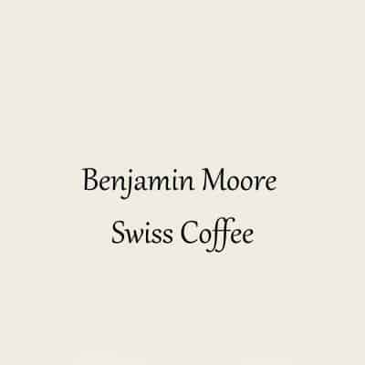
I love Swiss Coffee. It definitely falls into my favorite go-to paint colors.
Swiss Coffee is a complicated off-white paint color. It has undertones of yellow, green, and a touch of gray. The gray keeps the yellow and green from being too dominant. What you see instead is a beautiful creamy paint color that goes really well with most other paint colors.
Swiss Coffee is a warm-toned paint color.
Get a swatch of Swiss Coffee from Samplize!
Sherwin Williams Alabaster

Alabaster was actually Sherwin William’s Color of the Year in 2016! It pairs nicely with dark colors, such as Urban Bronze and Gray Area. Sherwin Williams says the color sets the tone for healing, calm, and restfulness so would be great in a bedroom.
Alabaster has decidedly yellow undertones which makes it a warm white paint color. It also has an LRV of 82.
Get a swatch of Alabaster from Samplize!
Sherwin Williams Accessible Beige

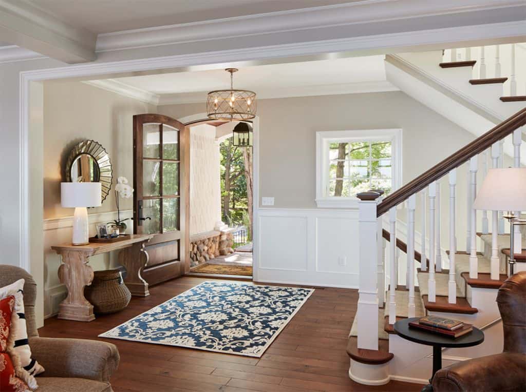
Accessible Beige is probably my favorite Sherwin Williams beige paint color. It also pulls towards taupe, so it has a bit of gray in it.
Its LRV is 58 so it falls in the mid-tone to light range on the LRV scale.
There is a reason this is one of Sherwin William’s most popular paint colors. This color is very neutral and light enough to brighten a room but not enough where it doesn’t contrast with white trim.
Get a swatch of Accessible Beige from Samplize!
Benjamin Moore Balboa Mist

Would you like to save this?
Benjamin Moore Balboa Mist OC-27 is a beautiful creamy color that sits between a gray and a beige. It has an LRV of 65.53 making it a bright paint color.
What I love most about this color is that it really ties together all the different elements of the home. From rustic hardwood floors to crisp white trim and all the different hard surfaces in a kitchen or bathroom, this color brings them all together and lets them shine.
Get a swatch of Balboa Mist from Samplize!
Benjamin Moore Simply White
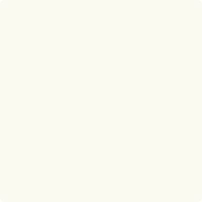
Simply White is the opposite of Decorators White, it pairs nicely with warm tones and looks beautiful in any room. It has slight undertones of yellow.
With an LRV of 91 this is by far one of the brightest paint colors you can find.
Get a swatch of Simply White from Samplize!
Sherwin Williams Zurich White

Zurich White is on the border of warm and cool. It is very neutral with very little yellow in it. This would be a good color if you are looking for one that isn’t too yellow.
Get a swatch of Zurich White from Samplize!
Sherwin Williams Everyday White

Everyday White is a soft creamy white color that makes a great backdrop for all your home decor. It has an LRV of 72 which makes it a pretty bright paint color but there are others that are brighter.
Get a swatch of Everyday White from Samplize!
Benjamin Moore White Dove
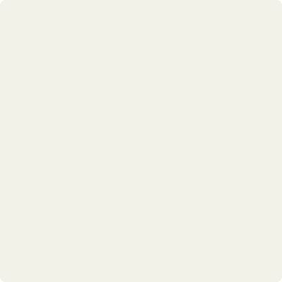
This is probably the most popular color to use on trim. It has a touch of gray in it so it’s a very soft white, not a stark white. White Dove also has an LRV of 85, so it’s a bit lighter than the ones we have already discussed.
Get a swatch of White Dove from Samplize!
Benjamin Moore Navajo White
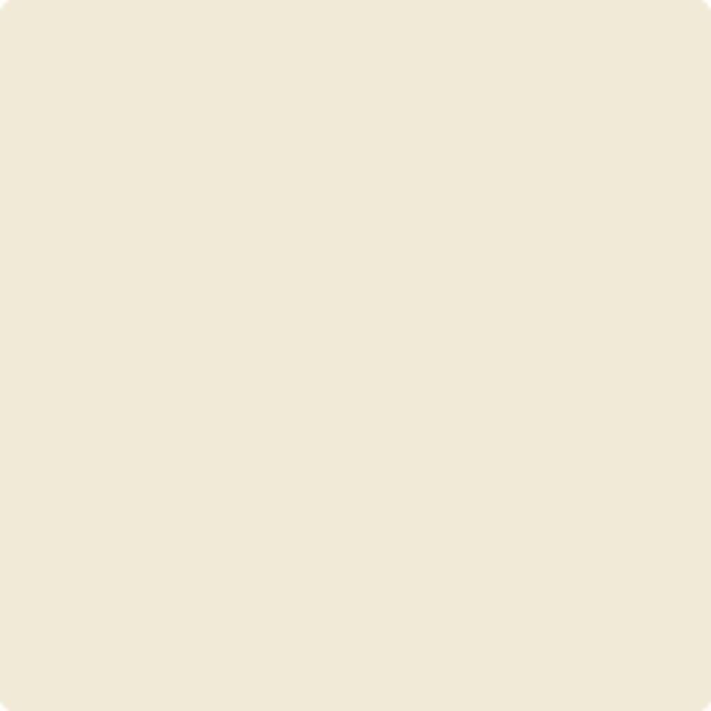
Both Benjamin Moore and Sherwin Williams have a paint color by this name. This BM version is a wonderful cream paint color but the neutral base is very stong which keeps the yellow subdued.
If you want a cream paint color but don’t want too much yellow this one might be right for you!
Get a swatch of Navajo White from Samplize!
Sherwin Williams Crushed Ice

Sherwin Williams has a lot of gorgeous warm gray paint colors and Crushed Ice is one that is really great but isn’t as popular. It’s a gray paint color that leans warm but is not by any means a beige or even greige.
It has an LRV of 66 making it a bright color but it still has a depth of color.
Get a swatch of Crushed Ice from Samplize!
Benjamin Moore Cloud White
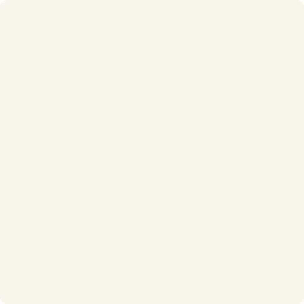
Cloud White is a warm white paint color with slight yellow undertones. What’s great about this color is that even though it has yellow undertones it has a neutral base which keeps it from being as warm as some of it’s counterparts.
The LRV of Cloud White is 87 which makes it very bright. While it is bright it also has this touch of softness that makes is like sitting on a cloud.
Get a swatch of Cloud White from Samplize!
Benjamin Moore Soft Chamois

Soft Chamois is a gorgeous soothing off-white with just the right amount of yellow, not too much and not too little. It has an LRV of 77.4 which makes it a really bright color.
This color has the amazing ability to make a room feel much larger than it really is!
Get a swatch of Soft Chamois from Samplize!
Benjamin Moore Chantilly Lace

Chantilly Lace is the lightest and brightest with an LRV of 92! That is one bright paint color. It’s very delicate and cool with slight blue undertones. But as far as whites go this one is probably the most neutral of them all.
Get a swatch of Chantilly Lace from Samplize!
Benjamin Moore Manchester Tan

Manchester Tan has an LRV of 64.41 which makes it a light paint color. This is a great choice if you are trying to lighten up a space. If you have lots of dark fixtures this is a great paint color to use to make the dark fixtures pop.
Manchester Tan has slight yellow undertones but like Grant Beige it is a very true neutral. It’s all in what kind of decor you have around this color. Certain reds will make the paint color look more yellow.
Get a swatch of Manchester Tan from Samplize!
Frequently Asked Questions
I get asked so many questions about paint colors. Here are some popular ones when it comes to neutral colors.
Do neutral colors make a room look bigger?
Yes they do! Especially when you use a monochromatic design in a space. Having neutral colors allows your accessories and art work to shine.
What is the best natural color for interior walls?
This all depends on the amount of natural light your room gets, what direction the room faces,etc. I highly recommend getting a sample and looking at it during different times of the day.
What is Sherwin Williams’s most popular neutral?
Agreeable Gray is probably the most popular followed by Repose Gray.
What paint color never goes out of style?
White never goes out of style!
What paint color is timeless?
White and black are timeless paint colors that will always be good choices. I wouldn’t necessarily go with black on the walls unless you want a dark room. As an accent color it’s fabulous!
Can I use natural paint colors with bold accent colors?
You absolutely can! This is a great idea to add depth and personality to your home.
Other Paint Posts You Might Like:
- The Best Black Paint Colors
- The Best Greige Paint Colors
- Best White Paint Colors
- The Best Blush Paint Colors
- The Best Beige Paint Colors


As a licensed Real Estate Agent and an avid home decorator, I strive to give my clients the very best I can when it comes to staging, selling, and decorating their homes. I have lots of experience with paint color choices and love to DIY my home so I can have everything just the way I want it. I share my ideas and projects with the world in the hopes that I can help others have their homes just the way they want as well.

